List Card
Intro
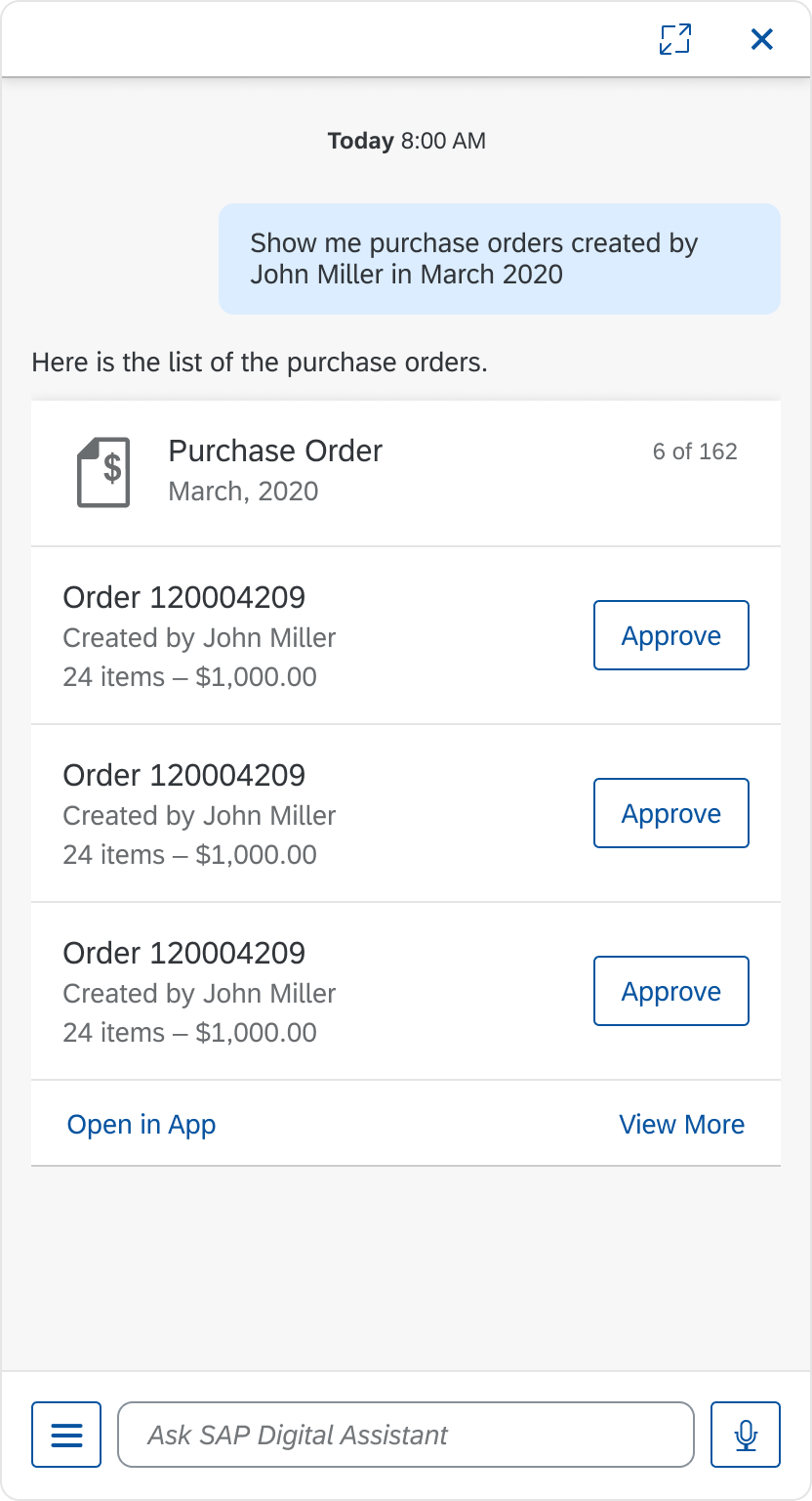
The list card shows a set of items or links in a list format. List cards are useful in conversational design to show links, action buttons, graphical text, and more. The user can view and share content, take actions, from the list card. It has a flexible structure to meet the needs for all kinds of use cases.
List Card
Usage
These are some best practices when using list cards with the digital assistant.
Do’s
- Do keep list items relevant to the topic. List items can display more options or information for context.
- Do keep titles consistent with list items.
- Do keep image usage consistent. List items will either all have an image or no image. Use a blank container with one of the Fiori accent colors in the case there is no applicable image.
- Do present relevant information and prioritize it accordingly in the list items, by level of importance from top to bottom.
Don’ts
- Don’t overwhelm users with too much content. Show only the most relevant information and keep it concise.
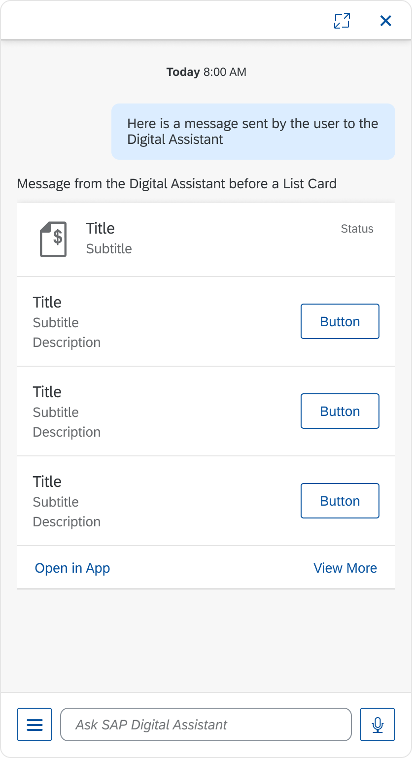
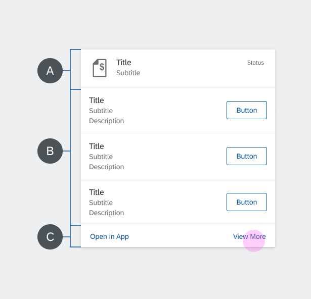
Structure
List cards follow the structure of a header, content, and footer. By default, the list card displays three items. If you have more items, “View More” displays in the footer bar. The user can select “View More” to see up to three more items (six total items). These are some best practices for the list card layout.
A. Header
B. Content
The content of the list card consists of the list items.
C. Footer
The footer redirects the user to further actions beyond the displayed list items.
List Items Structure
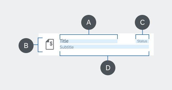
Header
The header includes some or all of the following.
A. Title
The title to introduce the header.
B. Icon (optional)
The icon gives a visual reference to the header.
C. Counter (Optional)
The counter indicates the number of list items currently shown in the list card.
D. Subtitle (Optional)
The subtitle provides further details of the header. This will truncate once it reaches the maximum of two lines.
Header Content
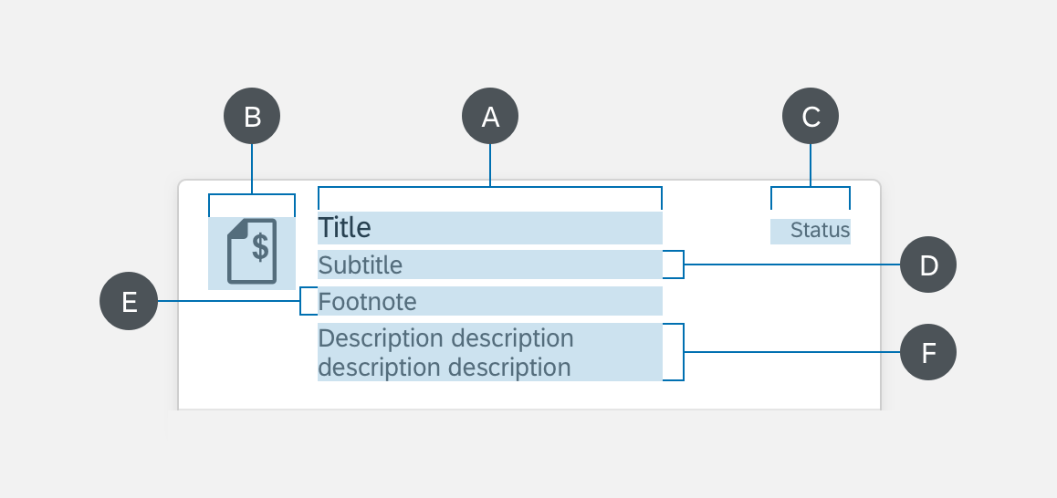
Content
The content includes some or all of the following.
A. Title
The title introduces the list item. This will truncate once it reaches the maximum of two lines.
B. Icon (Optional)
The icon provides a visual reference for the list item.
C. Status (Optional)
The status shows the current state of the list item. This will truncate once it reaches the maximum of three lines. The status can also be replaced with a Quick Reply or Menu Selection components.
D. Subtitle (Optional)
The subtitle provides further details of the list item. This will truncate once it reaches the maximum of two lines.
E. Footnote (Optional)
The footnote provides further details of the list item. This will truncate once it reaches the maximum of one line.
F. Description (Optional)
The description provides further details of the list item. This will truncate once it reaches the maximum of one line.
List Card Content
Footer
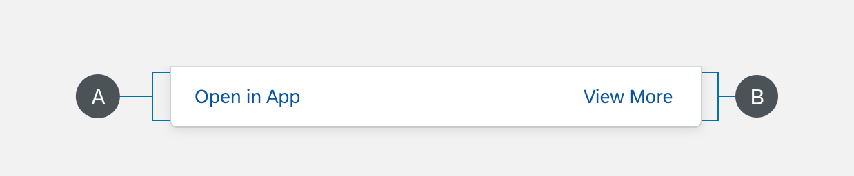
The footer includes some or all of the following.
A. “Open in App” Button (Optional)
The title introduces the list item. This will truncate once it reaches the maximum of two lines.
B. “View More” Button
The “View More” button appears when there are more than six items in the list. When the user selects “View More” the list expands to show up to three more items.
List Card Footer Content
Behavior and Interactions
These are best practices for a list card in a digital assistant.
The “View More” button appears when there are more than six items in the list. When the user selects “View More” the list expands to show up to three more items.

View More
Mockup