Checkboxes and Radio Buttons
Checkboxes and radio buttons are elements for making selections. Checkboxes allow the user to choose items from a fixed number of alternatives, while radio buttons allow the user to choose exactly one item from a list of several predefined alternatives.
Checkboxes
- Checkboxes are used to choose as many options as desired at a time from a limited number of options.
- You can select none, one, or as many options as desired in a group of checkboxes.
- There may also be only one checkbox.
- Choose a name that explicitly distinguishes two different states or contrasts.
Radio Buttons
- Radio buttons are used to choose one option at a time from a limited number of options.
- Arrange radio buttons in groups (you define graphical groups in the Screen Painter). Put at least two radio buttons in one group.
- One radio button in a group must always be selected.
- If the user should have the chance to choose no item from the offered options, create a separate radio button with a "No selection" label or similar text that turns off the other contents-related options.
Behavior
Due to accessibility requirements it is not allowed to modify the screen after clicking radiobuttons or checkboxes.
Special case: After selecting a radiobutton, already visible fields that are directly connected to the radiobutton can be made active or inactive (depending on the selected radiobutton).
Arranging Checkboxes and Radio Buttons on Screens
Whenever the following guidelines apply to checkboxes as well as to radio buttons, we speak of "elements". Otherwise we use the respective names.
The Element Refers to Adjacent Input Fields and Cannot be Separated
From the Context
Align the elements with the input fields they refer to and place them below the input fields. In the case of radio buttons, you always have to use at least two of them.
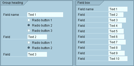
Figure 1: Radio buttons aligned with adjacent input fields
You can also place the elements to the right of the reference field(s) or to the right of one of the reference fields, separated by blanks. If several reference fields are available, place the element to the right of the bottom reference field. Arrange several elements of a group standing to the right in justified form. In the case of radio buttons, you always have to use at least two of them.
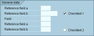
Figure 2: Checkboxes arranged to the right of the reference field
If there is not enough room to implement one of above mentioned solutions, proceed as follows: Place the graphical symbol to the right and left-align it with the input fields above. Left-align names with the field names above.
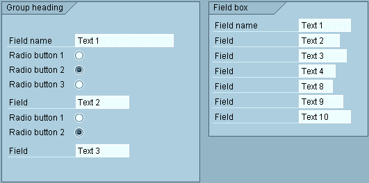
Figure 3: Radio buttons whose labels are left-aligned with the field names
The Element Refers to Several Fields
Elements that refer to several fields are to be left-aligned with the field names to the bottom end of the field group. You can insert a blank line between groups of information units (fields, radio buttons and checkboxes).
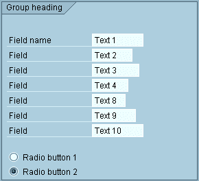
Figure 4: Radio buttons that refer to a group of fields
The Element Represents a Separate Independent Information Block
In this case, place checkboxes as a separate group with or without box next to or below other blocks.
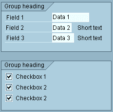
Figure 5: Checkboxes with group box that represent an independent information block
The same applies to radio buttons with one exception: As radio buttons are always related to each other, a group box (with group heading) is mandatory.
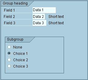
Figure 6: Radio buttons with group box that represent an independent information block
Sufficient Space Horizontally
If room is available horizontally but not vertically, you can position the elements next to each other in one line. In this case, leave at least two blanks between the elements.
You can write a name before the element, if required. Left-align the first element with the input fields.
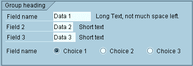
Figure 7: Horizontal arrangement of radio buttons with a descriptive name
If you do not use descriptive names, left-align the first element with the field names.
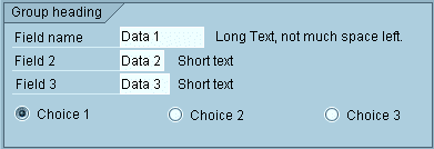
Figure 8: Horizontal arrangement of radio buttons without a descriptive name
Source: SAP R/3 Style Guide