Style
There are two sets of icons in the SAP R/3 System. The "Standard Toolbar" icons and the "Application Area" icons. Generally, both sets of icons are two-dimensional line art combined with highlights and shadows to create a 3-dimensional look. The SAP R/3 Color Palette is used as a tool to assist developers in making color selections for the icons.
Standard Toolbar Icons
The Standard Toolbar Icons by SAP should be used for a reference in creating new icons. The provide an excellent example of the look and feel of all SAP icons.
The Standard Toolbar Icons are created with a two-dimensional symbol and adding three-dimensional qualities to that icon. This is achieved through the application of highlight and shadow on the icon. Conceptually, the Application Area Icons are generated using the same system.
Application Area Icons
The design process for icons - the process of making icons - can be broken down into four steps. First, refer to other icons to see if similar icons are existing already. Second, create line art for the icon using black for your outline color. Third, add color to the line art from the SAP color palette. Lastly, add dimension to the icon.
The Steps
- Refer to Icon Library
- Create Line Art
- Add Color
- Add Dimension
Example Application Icons 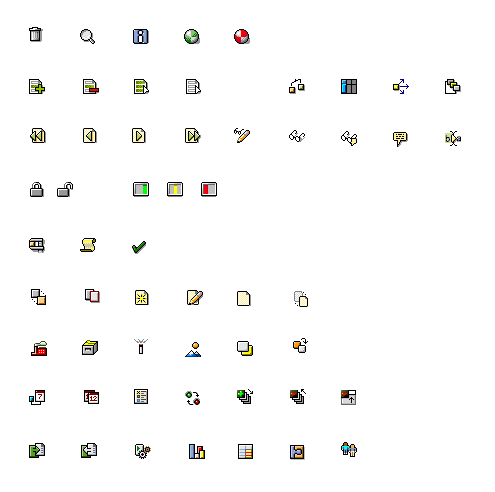
Step 1: Using the R/3 Icon Library
The purpose of the R/3 Symbol Library is to create consistency throughout the R/3 Icon set as well as speed the process of making icons.
Before generating line art, refer to the R/3 Icon Library to see if artwork for your concept has already been generated. The library contains arrows, pages, lists, etc. which are already colored with the R/3 Icon color sets. The pieces in the Icon Library are meant to be used in combination with new line art and with other pieces in the library. If the objects in the library are too large to fit the needs of a new icon, crop the object to fit. If this does not work and new line art must be generated, refer to the icon library for coloring of the icon.
Note: The complete R/3 Icon Library can be found in the SAP Reference Lists on the SAP User Experience Community.
Step 2: Generating Line Art
Once an icon concept has been conceived, line art must be generated to make the icon.
Examples


Color can be added in conjunction with generating line art. All colors must come from the SAP Icon Color Palette, however the black line art of the icon must be maintained.
Step 3: Adding Color
Please consult the color section before coloring icons. Rendering of icons should correspond to similar icons already created in the SAP style. For example, icons containing a list should contain the same "list" in previous SAP icons. Icons containing a "x" should borrow an existing "x" from a previously rendered icon.
Examples


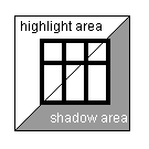
Step 4: Adding Dimension
Dimension is added to icons through the use of highlight and shadows. In general, icons are highlighted with a one pixel wide highlight color in the top and left sides of the icon, shadows are added with a one pixel wide shadow color in the bottom and right sides of the icon. Drop shadows should be added to the bottom right of icons and also to symbols within an icon. A diagram is provided for general highlight and shadow rules. This diagram is based on a light position at the top left corner of the icon.
Examples


 top
topSource: SAP R/3 Icon Style Guide