
Object Card
Fiori: ObjectCard
Intro
The object card is a flexible container with critical information regarding a single object. It previews the object and serves as the entry point to the full object detail page. The object card is highly customizable to accommodate various content types and use cases.
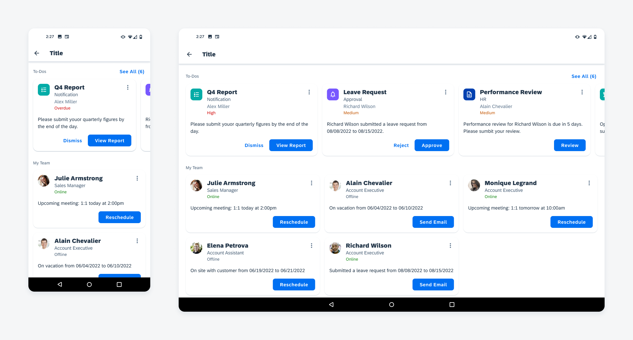
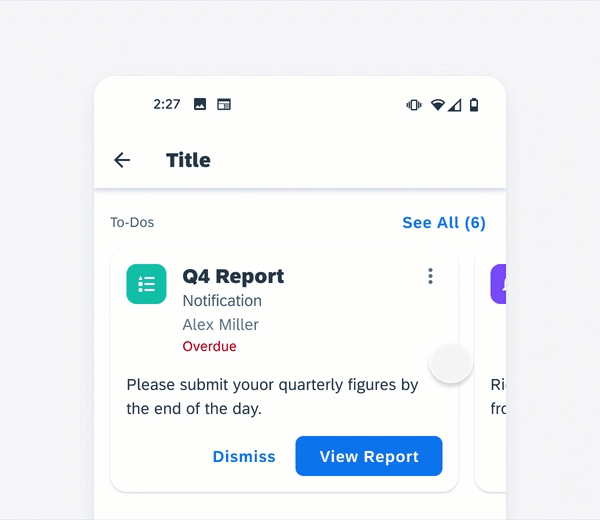
Collections of object cards on mobile (left) and tablet (right)
Usage
- To keep the card content scannable, use concise text and include only high-priority information
- Each object card is about one object. Content in one card is independent of other cards
- Surface no more than two direct actions in the object card. Use the overflow button to access more actions
- Don’t include very long information in the object card. Users can always drill down to view the full details
- Don’t use cards if objects are homogeneous and can be more efficiently displayed in regular object cells
Anatomy
A. Image (Optional)
Like in the object cell, a detail image provides a visual representation of the object within a 40dp frame. The image may have a square or circular frame depending on the type of object that the object cell represents. If the object cell represents a user, use a circular frame. If the object cell represents an object, use a squared frame.
B. Title Area
The title area is used to place the main text content related to the object. The title area contains a title (required), a subtitle (optional), a footnote (optional), and attributes (optional) like statuses.
C. Overflow Button
The overflow button allows users to access additional actions on the card and/or the represented object via a menu.
D. Description (Optional)
The description is typically a long string of text than what is displayed in the header area to provide additional information.
E. Actions (Optional)
Object cards allow up to two buttons at the bottom of the card so the user can perform the actions without drilling down to object details. Only surface the most relevant or frequently used actions. Use the overflow button for additional or general actions.
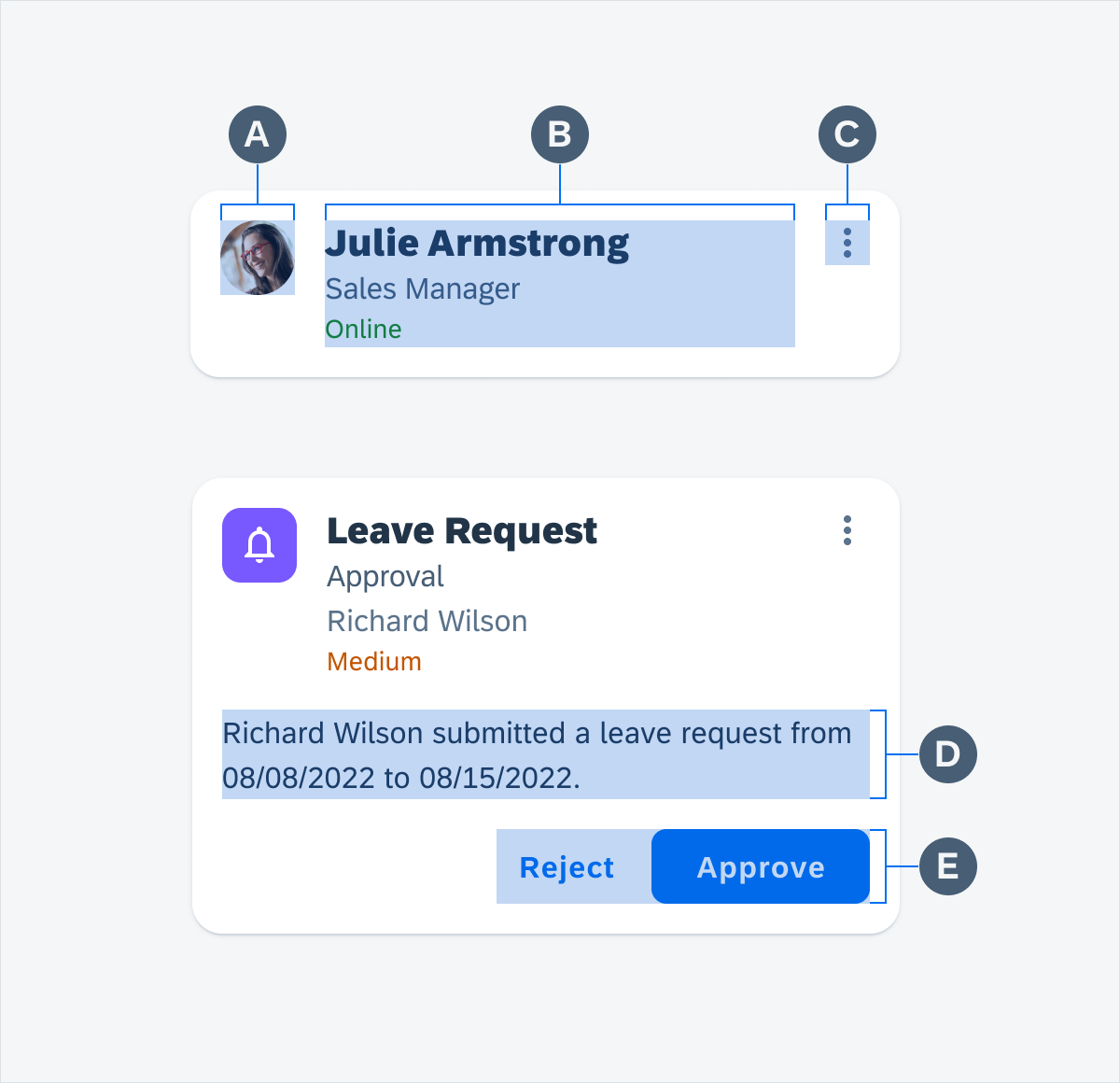
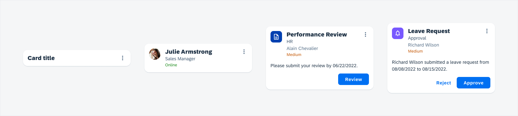
Anatomy of object cards
Behavior and Interaction
Touch Targets
By default, the card area is one touch target. Within the card area, there could be two additional touch areas: the overflow button, and up to two action buttons.
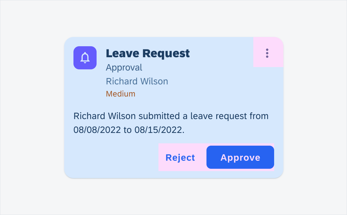
Possible touch targets on an object card
Overflow Button
When the user taps on the overflow button, a menu<link to Menu> will pop up listing available actions the user can take. The options in the menu depend on the object type or user role.

Tap on the overflow button opens the menu
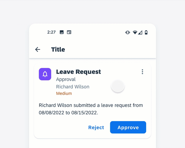
Action Buttons
When the user taps an action button at the bottom of the object card, said action will be performed directly, or a specific workflow will be triggered based on the app’s configuration.

Approve leave request from an object card
Card Area
By default, tapping on the card area (outside the overflow button and action buttons) will navigate the user to the object’s detail page, where they can view additional information about the object.
Tap on the card area navigates to the detail page
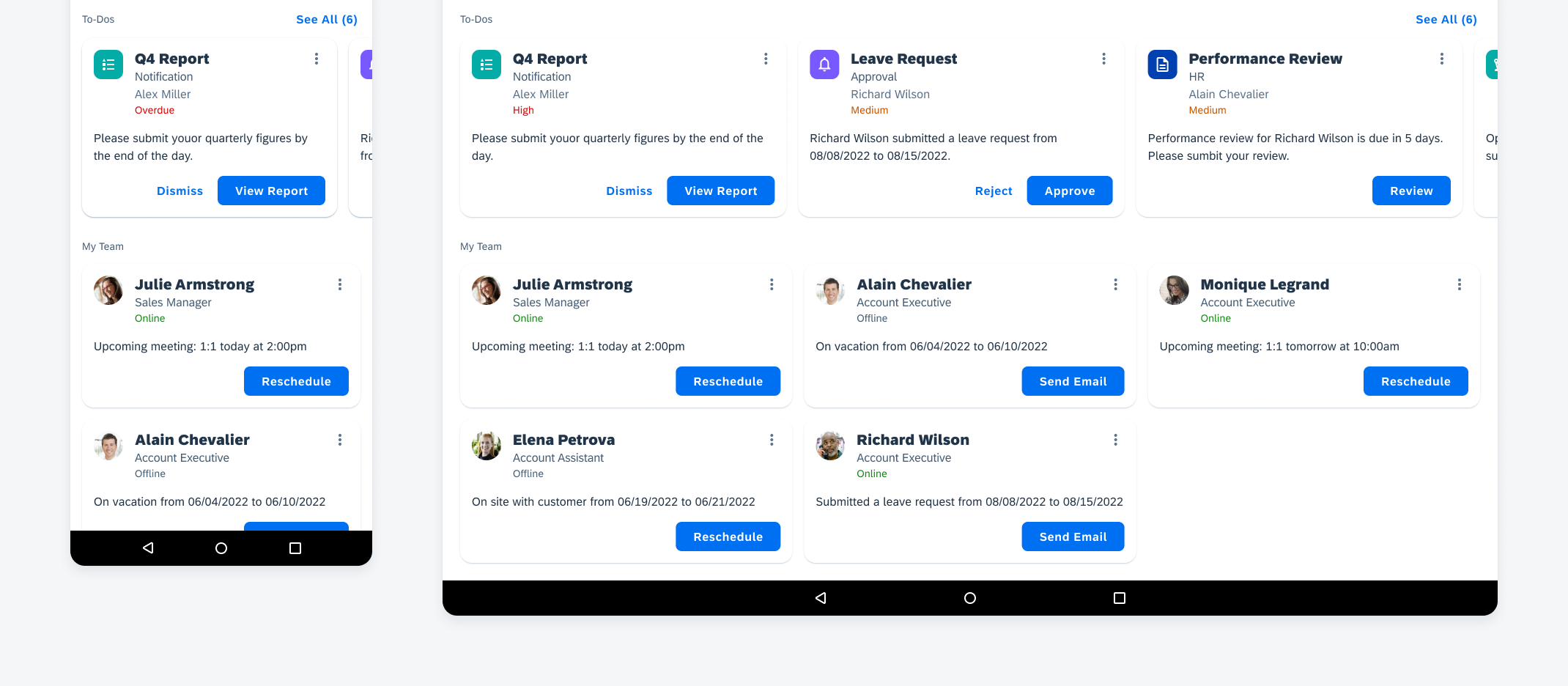
Card Carousel
A group of object cards can be displayed in one row like a collection view. Users can scroll horizontally to view more cards or tap the “See All” button to view all cards in this group.
Horizontal scroll in card carousel
Variations
The content within the object card is designed to be flexible to support different use cases. Choose the most relevant content based on context and keep a consistent information hierarchy. Focus on information that could help the user take the immediate next step.
The examples below show some different object card contents.
Object card variations (left to right): minimal content, full title area, full content with one action, and full content with two actions
Adaptive Design
Like chart cards, the object cards on mobile follow a single column vertically stacked layout. The tablet displays a two or three-column grid layout.
The card carousel follows the same number of columns as the grid with adjusted card width, so an additional card is visible and cut off at the end. The slice of a card at the end indicates horizontal scrolling.
Object cards layout on mobile (left) and tablet (right)
Resources
Development: ObjectCard
SAP Fiori for iOS: Object Card View
Related Components/Patterns: Cards Overview, Object Cell, Menus
 Your feedback has been sent to the SAP Fiori design team.