Skip to search Skip to content
  • Home
  • Get Started
  • Explore SAP Fiori for Android
  • What’s New
  • Foundation
    • SAP Fiori Design Principles
    • Colors
    • Design Tokens
    • Theming
    • Typography
    • Iconography
    • Product Icon
    • Accessibility
    • Layout
  • UI Components
    • Basic Components
      • Introduction
      • Banners
      • Bottom Sheet
      • Buttons
      • Dialogs
      • Menus
      • Pickers
      • Snackbar
    • Calendar
    • Cards & Layouts
      • Cards Overview
      • Card Header
      • Card Body
      • Card Footer
      • Layouts Overview
      • Carousel Layout
      • Staggered Layout
    • Collection View
    • Data Table
    • Filter Feedback Bar
    • Headers
      • Header
      • KPI Header
      • Object Header
      • Profile Header
    • Hierarchy View
    • Input & Selection
      • Checkboxes
      • Chips
      • List Picker Form Cell
      • Radio Button
      • Signature Capture Inline
      • Signature Form Cell
      • Sliders
      • Switches
      • Text Inputs
      • Time Picker Form Cell
    • Key Value Cell
    • KPIs
    • Navigation & Search
      • Navigation Bar
      • Navigation Drawer
      • Navigation Rail
      • Search
      • Top App Bar
    • Object Cell
    • Contact Cell
    • Persistent Footer
    • Progress Indicators
      • Circular Progress Indicator
      • Linear Progress Indicator
      • Step Progress Indicator
    • Rating Control
    • Signature Capture
    • Status Info Label
    • Tags
    • Timeline View
    • Timeline Preview
  • Patterns
    • Attach
    • Augmented Reality
      • AR Annotations
      • AR Card
      • AR Markers
      • AR Scanner
    • Charts
      • Chart Overview
      • Chart Card
      • Chart Types
    • Create
    • Illustrated Message
    • Map
    • OCR Scan
    • Onboarding
      • Single-User Onboarding
      • Multi-User Onboarding
    • Privacy Notice
    • Search
    • Sort and Filter
    • Sort By Multiple Criteria
    • Widgets
  • Resources
    • Resources
    • SAP Fiori Mentor App
  • SAP Fiori for Wear OS
    • Get Started
    • Foundation
      • Design Principles
      • Colors
      • Type System
      • Layout
      • Navigation
    • Resources
  • Contact Us

Fiori for Android Design Guidelines

Explore SAP Fiori for Android

Explore SAP Fiori for Android

Categories

Attachment Form Cell

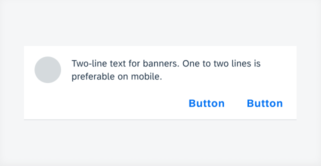
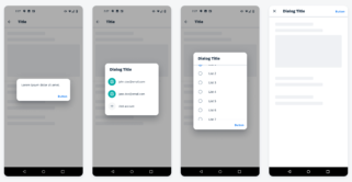
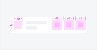
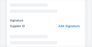
The attachment form cell is usually part of the create or editing workflow, located at the end of the form. All the attached files should be associated with a certain business object. Adding attachments on compact (left) and medium and expanded screens (right) Anatomy Basic Anatomy A. Header The header is at the top of [...]
Category: UI Components
Type: -

Banners

Banners show a short and concise message that displays at the top of the screen. It allows the user to take action or ignore it at any time. Apps may choose to use it for communicating internet connectivity, errors, synchronization statuses, or in-app notifications. Banner on mobile (left) and on tablet (right) Usage Do Banners [...]
Category: UI Components
Type: -

Buttons

Buttons allow users to perform actions, make decisions, or begin a process. The label of a button communicates the action that it is going to initiate. Examples of different buttons Usage Buttons should only be used for actions. Avoid using too many buttons – if users have too many options, it is difficult for them [...]
Category: UI Components
Type: -

Calendar

The calendar view provides a visual overview of a week, a month, or multiple months. It can filter and display different types of content, such as events, agendas, or schedules, based on the time dimension. Example of calendar view on compact (left) and expanded screen (right) Usage Do Use calendar view to display a visual [...]
Category: UI Components
Type: -

Card Body

The card body is the central part of the card that is used to display additional information alongside the content shown in the card header. By using the card body, several components from the SAP BTP SDK for Android can be integrated into a card, enabling the recreation of card types such as object cards, [...]
Category: UI Components
Type: -

Card Footer

The card footer is the bottom part of a card that contains important or routine actions that directly impact the card, such as “Approve” or “Submit”. The footer can accommodate a maximum of two action buttons.  Card with a highlighted card footer Usage When using the card footer to integrate important user actions related to [...]
Category: UI Components
Type: -

Card Header

The card header is the uppermost part of the card that provides important information about the card and its related content on the detail page. The optional card header allows for a quick overview of key information, such as the title, subtitle, and status of the card. Card header examples Usage When using the card [...]
Category: UI Components
Type: -

Carousel Layout

A carousel layout is a design pattern that displays multiple cards horizontally, one after the other, with a glimpse of the next card visible on the edge of the screen. This partial visibility encourages users to swipe or scroll left or right to reveal more cards. Carousel with cards compact window size class (left) and [...]
Category: UI Components
Type: -

Chart Card

Chart cards display a preview and key information of the full screen chart. Users can tap to navigate to the full interactive card view. Chart cards in mobile (left) and tablet (right) Usage Do Use the chart card if you want to provide users with an entry point to the full chart view. Don't Do [...]
Category: Patterns
Type: -

Chart Types

SAP Fiori for Android supports different chart types. Each chart type visualizes data differently and emphasizes various aspects of the data. Choose a chart type based on the data type and purpose of the chart to best fulfill users’ needs. Line chart (left), column chart (center left), stacked column chart (center right), horizontal bar chart [...]
Category: Patterns
Type: -

Chips

Chips are interactive elements that provide users with a set of options. Users can tap a chip to make selections. Chips can be used for single and multiple selection. A single selection chip is an alternative for a radio button and a multiple selection chip is an alternative for a checkbox. Chips form cell on [...]
Category: UI Components
Type: -

Circular Progress Indicator

circular progress indicator thumbnail
A circular progress indicator is a visual element that displays the status of ongoing processes, such as logging in, uploading files, or refreshing content in a circular shape. It typically consists of a circular track and a moving indicator that fills up the track as the progress increases. Content refresh with circular progress indicator (left) [...]
Category: UI Components
Type: -

Colors

Color sets the visual balance of SAP Fiori for Android apps. On screen, color is used to define the visual hierarchy of UI elements and to direct the user’s attention to complete their tasks. Horizon Theme Color Palette The Horizon color palette introduces a unified color palette that brings our brand and products together to [...]
Category: Foundation
Type: -

Colors

The right choice of colors is an important aspect that should be considered in smartwatch apps. It communicates the meaning and relationship of content, providing users with guidance to help them complete their tasks. Horizon Reference Colors The color palette for SAP Fiori for Wear OS is based on the color parameters from the Horizon [...]
Category: SAP Fiori for Wear OS
Type: -

Contact Cell

A contact cell, commonly found in an object detail, gives quick access to the various methods of communicating with a contact. A contact cell consists of an image, labels (headline, subheadline), description, and contact actions. Contact cell on mobile (left) and tablet (right) Anatomy A. Detail Image (Optional) A rounded frame that displays an image [...]
Category: UI Components
Type: -

Date & Time Picker Form Cell

The date and time picker form cell is used for selecting time-based data types. Time picker form cells in compact (left) and expanded layouts (right) Anatomy Single Value Picker Form Cell Single value picker form cells are used for selecting only a single value, which includes the date picker, range picker, time picker, and duration [...]
Category: UI Components
Type: -

Date & Time Pickers

The picker provides a dialog for date or time-based selections. It can be used to select a date, a range of dates, a time, or a duration of time.  Picker types in compact size from left to right: date picker, range picker, time picker, duration picker Usage Do Use a picker for a time-related decision [...]
Category: UI Components
Type: -

Design Principles

SAP Fiori for Wear OS provides a consistent and holistic user experience for SAP software on wearables. Wearables are computer technologies that users wear on their bodies, creating a more personalized experience. Common types of wearable devices are smartwatches. The purpose of wearables is to support an activity in the real world by providing additional [...]
Category: SAP Fiori for Wear OS
Type: -

Design Tokens

Design tokens are our cross-platform solution to managing color across iOS and Android. Design tokens are stored pieces of UI information such as color, spacing, sizing, and typography that collectively make up our design system's visual identity. Additionally, design tokens help us to maintain visual consistency, scale design decisions, and are simple to maintain and [...]
Category: Foundation
Type: -

Dialogs

Alert dialog (first), simple dialog (second), confirmation dialog (third), full-screen dialog (fourth)
Dialogs are a type of modal that are used to provide high priority information, display critical information, or ask for specific user action or decisions. It prompts the user to react and it interrupts the process of the application. Alert Dialog Prompts the user by displaying urgent information, detail, or actions. Simple Dialog Displays a [...]
Category: UI Components
Type: -

Filter Feedback Bar

The filter feedback bar is a horizontal scroll area containing interactive chips that provide users quick access to filter controls. The bar appears below the app bar and above the list of objects. The interactive chips in the filter feedback bar indicate which filters have been applied and what filters are available. Filter feedback bar [...]
Category: UI Components
Type: -

Header

A header is a section title that summarizes the content within that section. It is used to organize screen content into logical parts, making it easier for users to navigate and understand the information. Headers should be brief and concise, allowing users to quickly identify what each section contains. Section header in forms: compact screen [...]
Category: UI Components
Type: -

Hierarchy View

The hierarchy view is a set of columns that show the hierarchical relationships between objects. Typically, the hierarchy view shows a parent/child and sibling relationship but may also show more complex relationships that are several levels deep, such as a great-grandparent/great-grandchild. Example of hierarchy view on mobile (left) and tablet (right) Usage Do Use the [...]
Category: UI Components
Type: -

Iconography

SAP icon library SAP icons have been redesigned for the Horizon visual theme with a fresh, friendly, and bold style. The new icons maintain consistency of size, stroke, and visual balance and are tailored for simple and direct user interaction, using metaphors that are easy to understand in an enterprise setting. Usage Do Use the [...]
Category: Foundation
Type: -

Illustrated Message

The illustrated message communicates empty, error, and success states through a combination of solution-oriented messages, engaging illustrations, and a conversational tone. The illustrated message turns a situation, even a negative one, into a better experience for your users, while ensuring consistency. General empty state example Usage Use the illustrated message when you want to improve [...]
Category: Patterns
Type: -

Key Value Cell

The key value cell is a table view cell that fits inside the table view container. It is ideal for displaying sets of data that also need to display their labels. Key value cell on mobile (left) and on tablet (right) Usage Do Use a key value cell to display a piece of information with [...]
Category: UI Components
Type: -

KPI Header

The KPI header displays a quick summary of KPI data to the user. It is typically used in an overview pattern to provide the user with contextual information at a glance KPI header on mobile (left) and tablet (right) Anatomy The KPI header is a container that includes multiple KPIs that are important to the [...]
Category: UI Components
Type: -

KPIs

KPIs (key performance indicators) are metrics used to evaluate the success of an organization, an individual, a group, or an activity. They serve to highlight the current value of an object or as a summary of the object. KPIs can be displayed in a header, in the content area of an object, on a card, [...]
Category: UI Components
Type: -

Layout

When designing for small screens, it is important to keep content within the layout legible, aligned, organized, and accessible. The following article presents some best practices that offer guidance for the design of a smartwatch layout, such as rules for handling different screen shapes, margins, text alignment, and touch targets. Screen Shapes Smartwatches on which [...]
Category: SAP Fiori for Wear OS
Type: -

Linear Progress Indicator

linear progress indicator thumbnail
A linear progress indicator visually represents the status of ongoing processes, such as logging in, uploading files, or refreshing content by animating an indicator along a fixed track. It communicates the state of an app and indicates available actions, such as whether users can navigate away from the current screen.   Login screen with linear [...]
Category: UI Components
Type: -

List Picker Form Cell

The list picker form cell allows for the selection of one or more options among values within a defined category. It serves as the entry point to a list of available values for that category and summarizes the selected value. List picker form cell on a compact (left) and expanded screen (right) Usage Do Use [...]
Category: UI Components
Type: -

Multi-User Onboarding

…The multi-user onboarding pattern addresses onboarding scenarios where more than one user may share a device. Users can select from a list of existing accounts on the device to log in with or add a new account. The multi-user onboarding pattern is an extension of the single-user onboarding pattern….

Category: Patterns
Type: -

Navigation

Navigation Thumbnail
Navigating on the smartwatch should be quick and easy. To help users find their way around, it is important to keep the number of taps to complete an action and the overall app hierarchy to a minimum.  Choose a suitable navigation concept for smartwatch apps with more than one screen. Page-based and hierarchical navigation are [...]
Category: SAP Fiori for Wear OS
Type: -

Navigation Bar

The navigation bar provides fast access to two to five core destinations in an app.  Navigation bar with three destinations Usage Do Use the navigation bar for two to five core destinations.  Use the navigation bar on mobile and small tablet interfaces. Keep the title of destinations short and concise.  Don't Don’t use the navigation [...]
Category: UI Components
Type: -

Navigation Drawer

The navigation drawer provides access to different destinations in an app. Navigation drawers can be permanently visible or opened and closed by tapping a menu icon. Modal navigation drawer (left) and standard navigation drawer (right) Usage Do Use the navigation drawer for five or more destinations. Use the modal navigation drawer primarily on mobile Use [...]
Category: UI Components
Type: -

Object Cell

Object cells consist of text, images, or icons. They can be configured in various ways to accommodate a wide range of use cases. Object cell on compact (left) and expanded screen (right) Usage Do Use an object cell to preview information about an item in a list format.  Don't Don't use an object cell to compare [...]
Category: UI Components
Type: -

Object Header

The object header is the topmost area in the object’s detail page that provides a detailed glimpse of that object. The object header provides an area that contains information such as object title, subtitle, and description amongst other supplementary information. Object header with two pages on mobile (left) and tablet (right) Usage Do Use concise [...]
Category: UI Components
Type: -

Overview

SAP Fiori for Android leverages various window size classes to provide a pleasant user experience across different form factors. This adaptive design functionality allows content to be dynamically rearranged and resized in response to changes in device orientation or when the app is used on different . By shifting the focus from specific devices, such [...]
Category: Foundation
Type: -

Persistent Footer

A persistent footer component is used for closing or finalizing actions that impact the current view. It is fixed at the bottom edge of the screen and comes in two different layouts: one for related actions with one or more buttons and one for opposite actions with two buttons and a helper/status text. Persistent footer [...]
Category: UI Components
Type: -

Profile Header

The profile header gives a quick intro of a person to the user. It also includes methods to contact that person quickly without needing to access a different area of the profile page. Profile header on mobile (left) and on tablet (right) Usage Do Use the profile header on a user profile or an object [...]
Category: UI Components
Type: -

Rating Control

The rating control can be used in various contexts to provide insight regarding the opinions and preferences of an object. Rating control on mobile (left) and tablet (right) Anatomy A. Icon The icons represent the average object rating value through several states: on, off, and half. The states of these icons depict a rating from [...]
Category: UI Components
Type: -

Signature Capture

The signature capture allows users to input their signature by signing directly on a dialog. The signature is captured and then saved with an optional watermark for additional information. Signature capture on mobile (left) and tablet (right) Usage The signature capture may be used when users must sign to authorize workflows. It can be used [...]
Category: UI Components
Type: -

Signature Capture Inline

Signature capture inline is a variation of the signature capture component. This variation allows users to input their signature on a screen that is shared with other components. Signature capture inline on mobile (left) and tablet (right) Usage Signature capture inline may be used when users need to view content on the screen along with [...]
Category: UI Components
Type: -

Signature Form Cell

The signature form cell is an entry point for users to launch the signature capture component. Signature form cell on mobile (left) and on tablet (right) Usage Do Use the signature capture form cell when user consent is required. Use a concise header to communicate the purpose and importance of the signature requirement. Use an [...]
Category: UI Components
Type: -

Single-User Onboarding

For enterprise software, onboarding is the process of activating an account by providing the user with key instructions. Existing user accounts are typically assigned by an admin or the IT department. The onboarding process can vary depending on the configuration of the app by the admin or the IT department in terms of data sensitivity, security [...]
Category: Patterns
Type: -

Sliders

A slider is a control that enables the user to adjust single values within a specified numerical range. Sliders on compact (left) and expanded screens (right) Anatomy Slider Control A. Container A slider control always stays in a container with reserved paddings to provide enough touch area for users to operate the slider. B. Track A [...]
Category: UI Components
Type: -

Sort and Filter

Sorting and filtering are two ways of refining the results from a long list of objects. These two features help users navigate through a big amount of data and find the specific data they want to focus on easier. Typically, a full-screen dialog on compact or a modal dialog for medium and expanded screens is [...]
Category: Patterns
Type: -

Staggered Layout

The staggered layout for cards is a design pattern where cards are arranged in a flexible, grid-like structure, with each card adapting to the available space while maintaining alignment with adjacent cards. It optimizes space usage and provides an aesthetically pleasing visual layout. Cards displayed in a list (left) and staggered layout (right) Usage Do [...]
Category: UI Components
Type: -

Status Info Label

The status info label component can be used to provide complementary bits of information. Status info label displayed in a horizontal and stacked layout Usage The status info label displays complementary information that relates to the object. It is a flexible combination of a text value and an icon. When incorporating a status info label [...]
Category: UI Components
Type: -

Step Progress Indicator

The step progress indicator is a progress indicator for tracking and displaying a user’s state in a user flow. It allows the user to navigate to another step in both the horizontal view and the vertical “All Steps” view. A step can be displayed as either a regular step or a dynamic step.   Step [...]
Category: UI Components
Type: -

Switches

The switch control mimics a physical switch that allows users to turn on/off individual settings, such as personalization or display settings. When users change a switch to “on”, they expect an instantaneous action as soon as the switch changes state. Switch on mobile (left) and on tablet (right) Usage Do Use switches in a switch [...]
Category: UI Components
Type: -

Tags

Tags are used to display quick and useful bits of information to the user, such as keywords, labels, categories, or statuses.   Tags displayed in a row Usage Tags display complementary information that relates to the object. They use a different visual representation than plain text and serve as independent bits of information. When incorporating [...]
Category: UI Components
Type: -

Text Inputs

Text input controls are used to request a text entry from the user. They are usually found in the create or edit pattern. Text input controls on mobile (left) and tablet (right) Usage Do Use capital case for labels. Use an asterisk next to the label to indicate that the text input is required. Use [...]
Category: UI Components
Type: -

Theming

Theming refers to using a color palette and a logo to define a system-wide appearance for an application. It’s achieved by applying colors to major UI elements, such as text and background, with the intention to create visual harmony. It gives users a holistic visual experience throughout the application. This visual experience can be leveraged to [...]
Category: Foundation
Type: -

Top App Bar

The top app bar contains actions and content based on the current screen in an app. This includes navigation, title, and actions. The elements in the top app bar are specific to the current screen, but the top app bar can also contain consistent elements across an app. Top app bar on mobile (left) and [...]
Category: UI Components
Type: -

Type System

SAP Fiori for Wear OS uses Roboto as its primary font, which is based on Material Design’s type hierarchy. With its variety of styles, the Roboto font family matches the needs of Wear OS.  Roboto type system Resources SAP Fiori for watchOS: Typography Material Design: Typography 
Category: SAP Fiori for Wear OS
Type: -

Typography

SAP Fiori for Android type system maps SAP's 72 typeface to Material Design's type hierarchy. This respects the established visual harmony of Material Design's components while introducing SAP Fiori's unique visual identity. SAP Fiori for Android 72 type system 72 Typeface SAP Fiori for Android uses SAP's proprietary 72 typeface to maintain consistency with other SAP [...]
Category: Foundation
Type: -

Widgets

…Android widgets provide a quick overview of key information across the user’s home screens. They retain simplicity by showing only the most valuable information and functionality from the application first, guiding users to access more complex data and actions within the app. While the widget’s content focuses on one…

Category: Patterns
Type: -
© 2025 SAP SE. All rights reserved.

The SAP Fiori Design Guidelines will soon be moving to the new SAP Design System portal. Check out the new experience here.

We'd appreciate your feedback!

Processing your feedback

Thank you Your feedback has been sent to the SAP Fiori design team.

Thank you for your helping us to improve our guidelines!

 
We'd appreciate your feedback!
Please fill out the form to send us your feedback.
    • Can you tell us why?

Your feedback is anonymous, so you won't receive a reply. If you'd like help with a specific question, please visit the SAP Fiori Community