
Layouts Overview
Intro
Card layouts are structured containers that determine how cards are arranged and displayed in a user interface. These layouts control the placement, order, and visual presentation of cards, ensuring an aesthetically pleasing design. The layouts adjust to multiple devices, window size classes, and orientations, ensuring consistency across layouts.
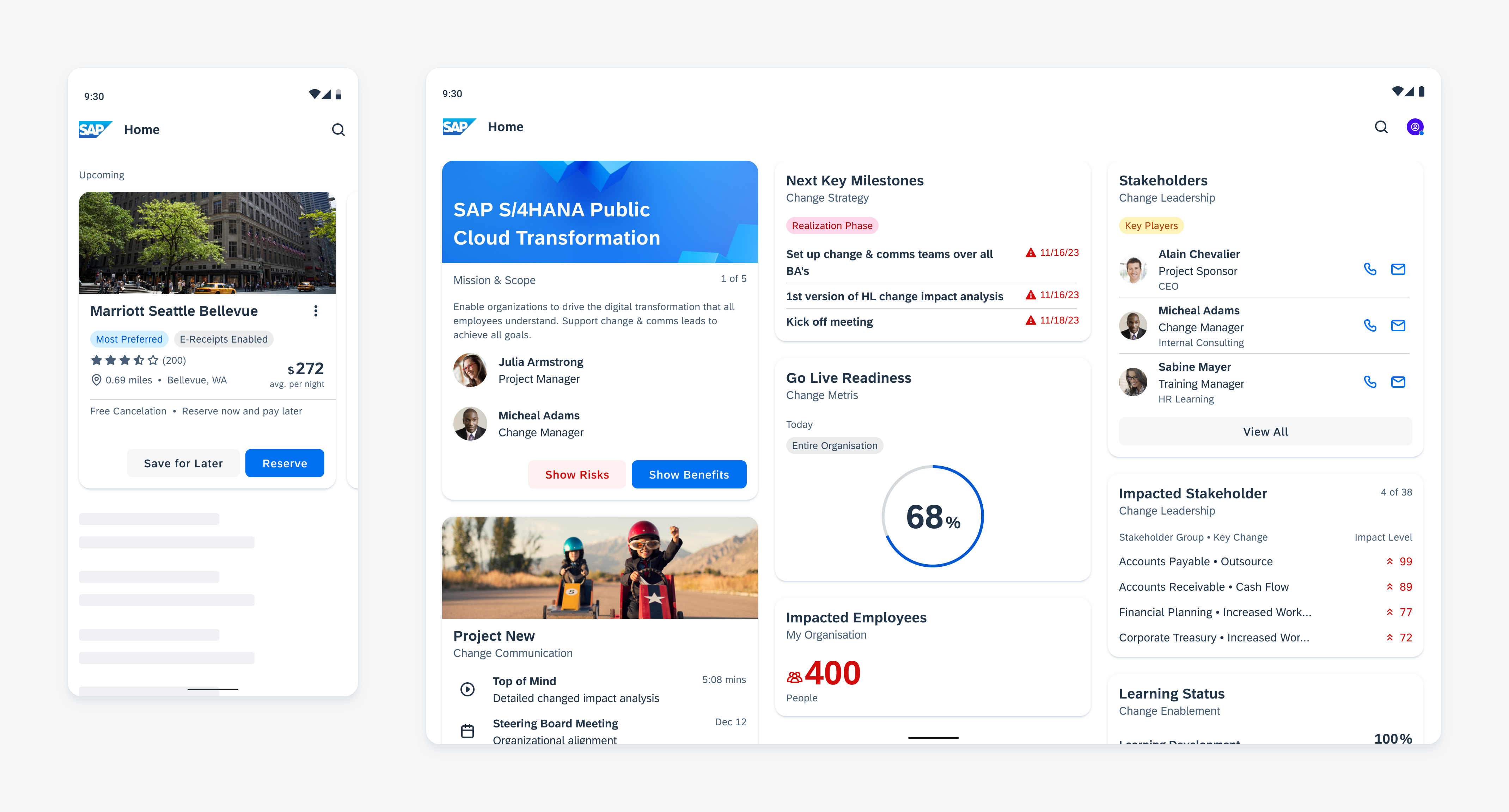
Cards in a carousel (left) and staggered layout (right)
Usage
A layout is used to group cards with similar content, ensuring a visually structured arrangement. The proper usage of a grid layout draws the user’s attention to the most important cards on a page, resulting in improved efficiency and higher quality.
Make sure that the layout is optimized for different window size classes to display the cards in the best way possible. Find more information in the staggered layout and carousel layout articles.
Anatomy
When designing card layouts for native apps, consider the following key factors that determine the horizontal width of the screen.
A. Columns
Content is organized into columns on the screen. This is where the cards are placed.
In responsive layouts, the column width is not defined by fixed values. This allows the content to adjust to any screen size. The number of columns displayed in the grid is determined by the breakpoints of window size classes, ranging from 4, 8, or 12 columns.
B. Gutters
A gutter is the space between columns that helps to visually separate content.
Gutter widths have predefined values at each breakpoint range. To enhance the content’s adaptability to a given screen size, gutter widths can change at different breakpoints.
C. Margins
Margins are the spaces between the content and the left and right edge of a window area. Margin widths are defined by specific values for each window size class and change at different breakpoints to better fit the screen size.
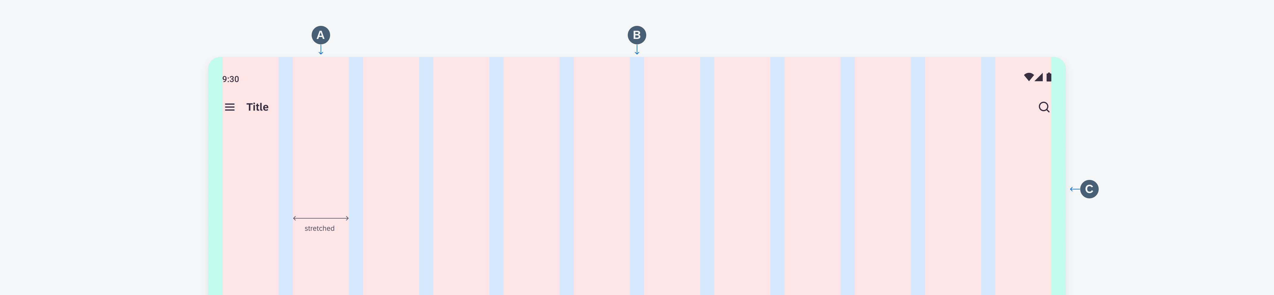
Schematic grid layout anatomy
Behavior and Interaction
Scrolling
Cards can be scrolled vertically or horizontally, depending on the layout. You can also combine different layouts, for example, a carousel with cards and a list with cards below it.
Animation: Horizontal scrolling in carousel combined with a vertical scrolling list
Adaptive Design
The layouts are designed to be compatible with multiple devices. They change according to the window size class and automatically adjust the number of columns to ensure a visually appealing and user-friendly layout. Depending on the window size class, the card width and height adjust automatically, ensuring that the content remains fully visible.
If there is a navigation rail or navigation drawer, the number of columns decreases and adjusts to the remaining screen width.
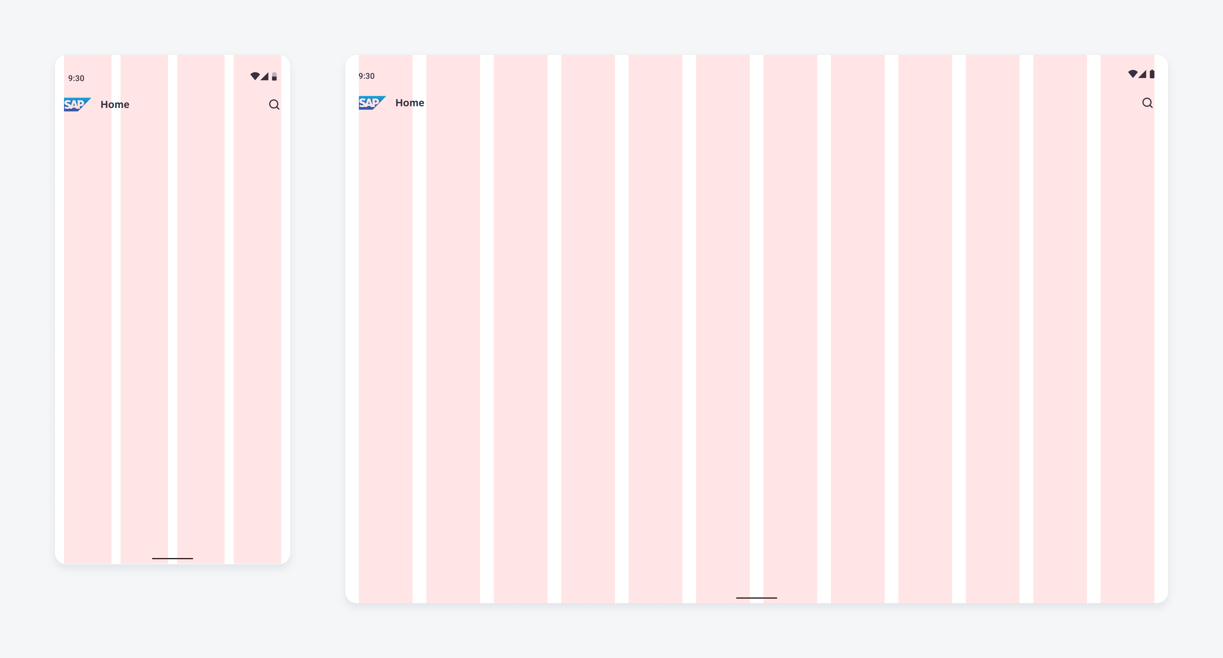
Schematic compact grid layout with 4 columns (left) and expanded with 12 columns (right)
Resources
SAP Fiori for Web: Cards (SAPUI5), Cards (Web Component)
Related Components/Patterns: Carousel Layout, Staggered Layout, Cards Overview
 Your feedback has been sent to the SAP Fiori design team.