
List Report
FUIListFloorplan
Intro
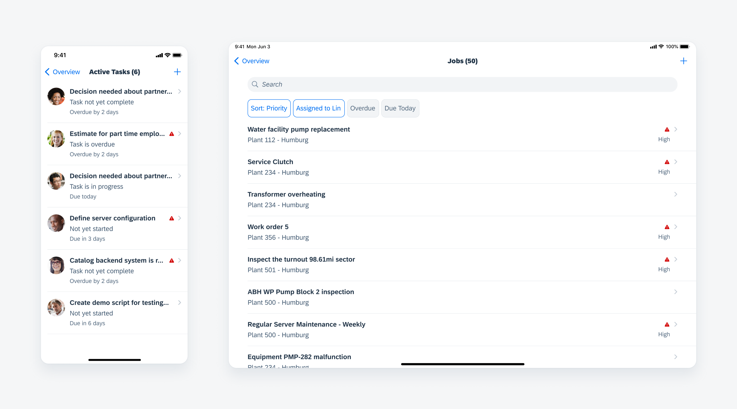
A list report displays a large list of items of the same object type and allows users to take actions on them. This page type provides the functions of searching, sorting, filtering, and grouping the data in the large list.
Use a list report when there is a large list of items and the data is of the same object type. Do not use a list report when it contains different object types – for example, a mixed list of people profiles and tasks. The main functions of this page type are for users to search, group, or filter the list to narrow down the list.
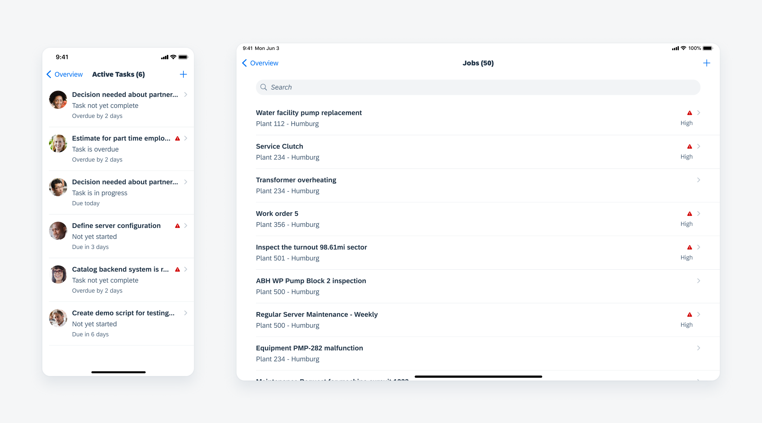
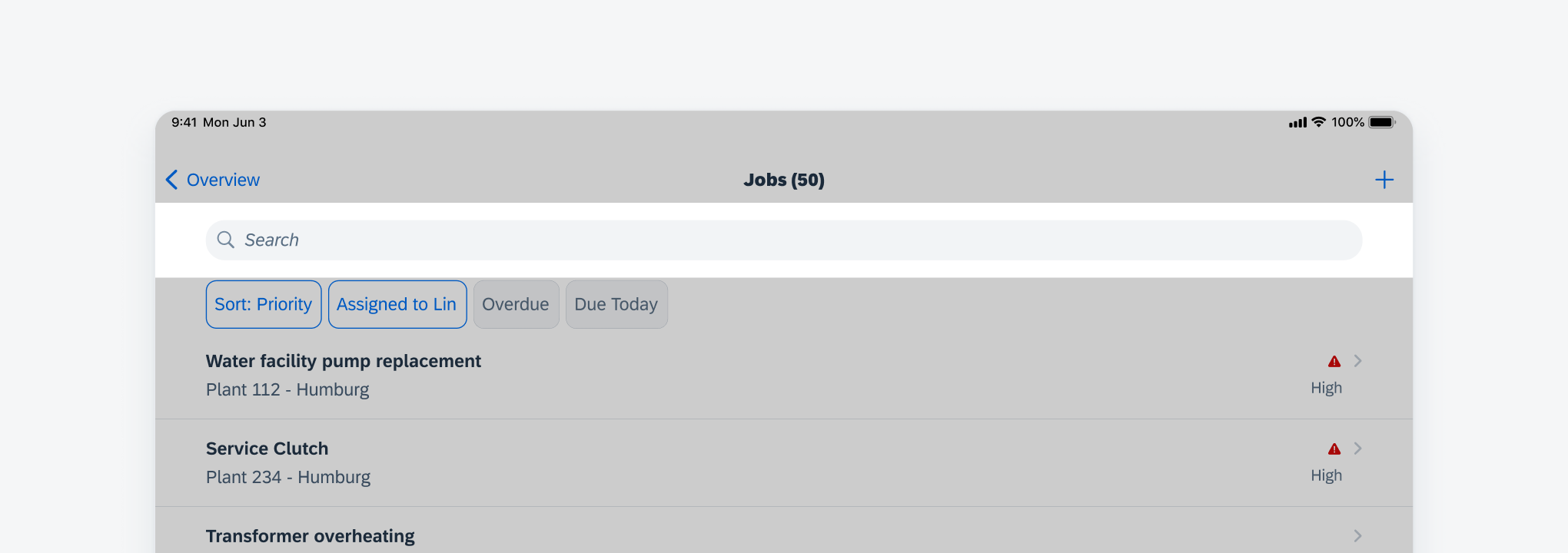
List report in compact width (left) and regular width (right)
Use a list report when there is a large list of items and the data is of the same object type.
Do not use a list report when it contains different object types – for example, a mixed list of people profiles and tasks. The main functions of this page type are for users to search, group, or filter the list to narrow down the list.
Navigational Structure
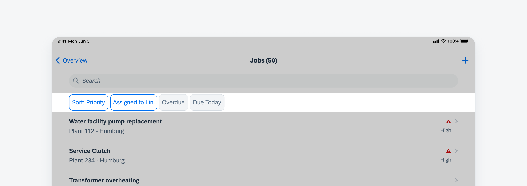
A user typically navigates to a list report from an overview screen or an object screen. In most cases, a user can tap on each line item to view details of the object. This is normally a drill-down navigation. However, in use cases where there are no more details for each line item and the primary action is to edit the item, it is appropriate to use a modal in edit mode when the user taps on the line item.
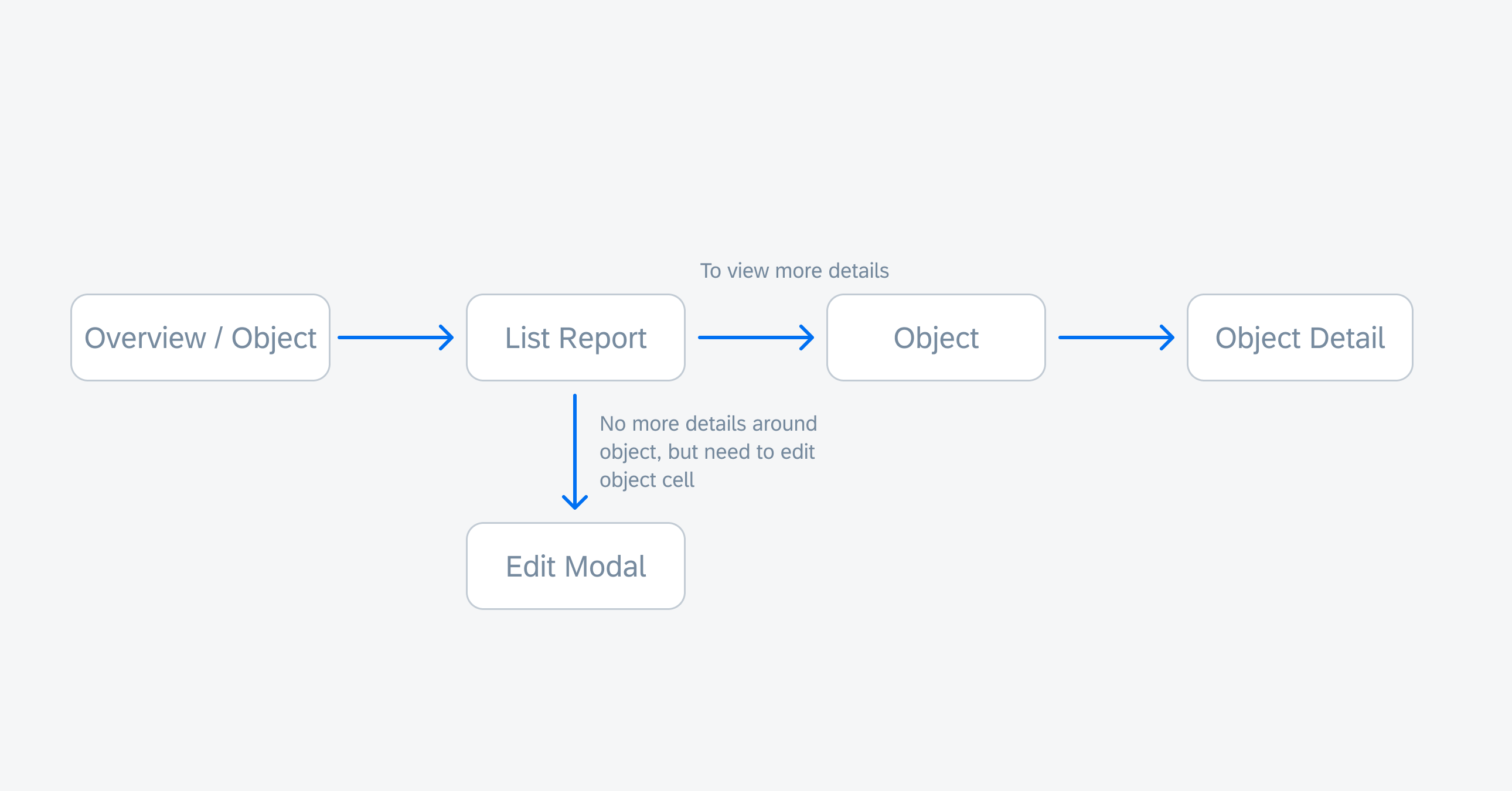
Navigational structure for list report
Content Structure
A. Navigation Bar
Contains the list actions, including “Filter” (which combines sorting, grouping, and filtering functions), “Add New Item”, and “Edit” for group actions such as “Delete”.
B. Search Bar
May be either always visible or hidden to a user until they pull the list down.
C. Filter Feedback Bar (Optional)
Can display frequently used filters. The more common usage of the filter feedback bar is to show the users what filters have been applied when the list is filtered.
D. Content Area
Displays a list of items of the same type. It can either be a list of object cells or a table.
E. Toolbar (Optional)
If there are any more list-related actions besides “Filter”, “Add”, and “Edit”, use the toolbar for these actions. In compact view, the toolbar is used when the navigation bar doesn’t have enough space for all of the actions.
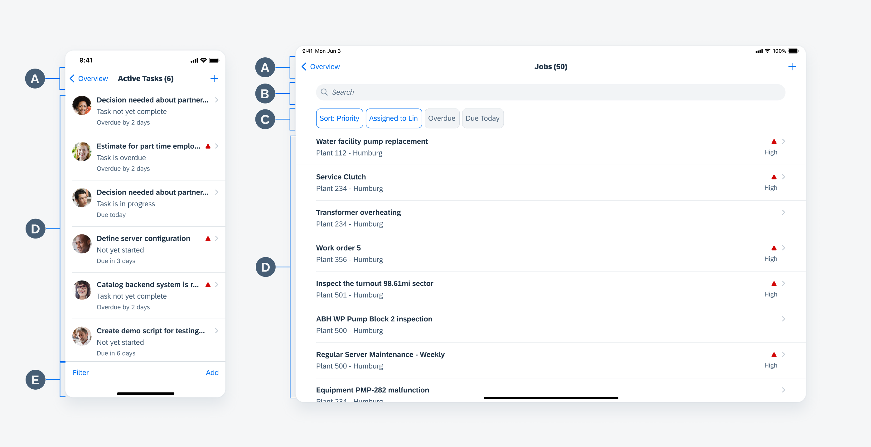
List report anatomy in compact width (left) and regular width (right)
Content Guideline
A. Navigation Bar
Back Button
Use the title of the previous screen for the “Back” button label with a chevron. Avoid using an ambiguous word such as “Back”.
Screen Title
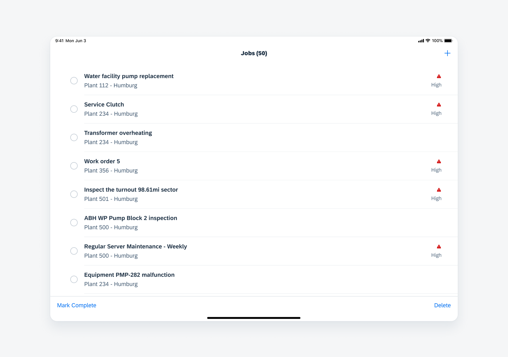
The screen title of the list report is composed of two parts: the name of the list and the counter in parentheses to reflect the number of items in the list. For example, “Tasks (100)” can be the screen title for a task list when using the list report page type.
Buttons
The navigation bar contains controls for managing the content area, such as “Filter”, “Edit”, and “Add”. Normally, the “Edit” action, if there is one, sits on the right side of the navigation bar with any other buttons beside it to the left. If there is no “Edit” action, the “Filter” button should be on the right side of the navigation bar.
In compact width, actions on the navigation bar should have a minimum of one icon and a maximum of two icons. If you require more actions, they must be placed on the toolbar.
In regular width, actions on the navigation bar should have a minimum of one icon and a maximum of three icons.
List report navigation bar
B. Search Bar
The search bar sits between the navigation bar and content area. It allows users to search for specific items. The search bar can be always visible to the users or can be hidden under the navigation bar until the users pull the list down.
See more in search bar.
List report search bar
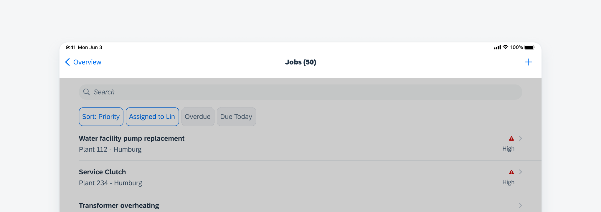
C. Filter Feedback Bar
In the default list report floorplan, use the filter feedback bar only when there are frequently used filters to help users quickly narrow down the list.
If there are no frequently used filters, the filter feedback bar can be displayed after users sort, group, or filter the items on the list. Users can tap the interactive buttons to remove the active filter.
See more in filter feedback bar.
List report filter feedback bar
D. Content Area
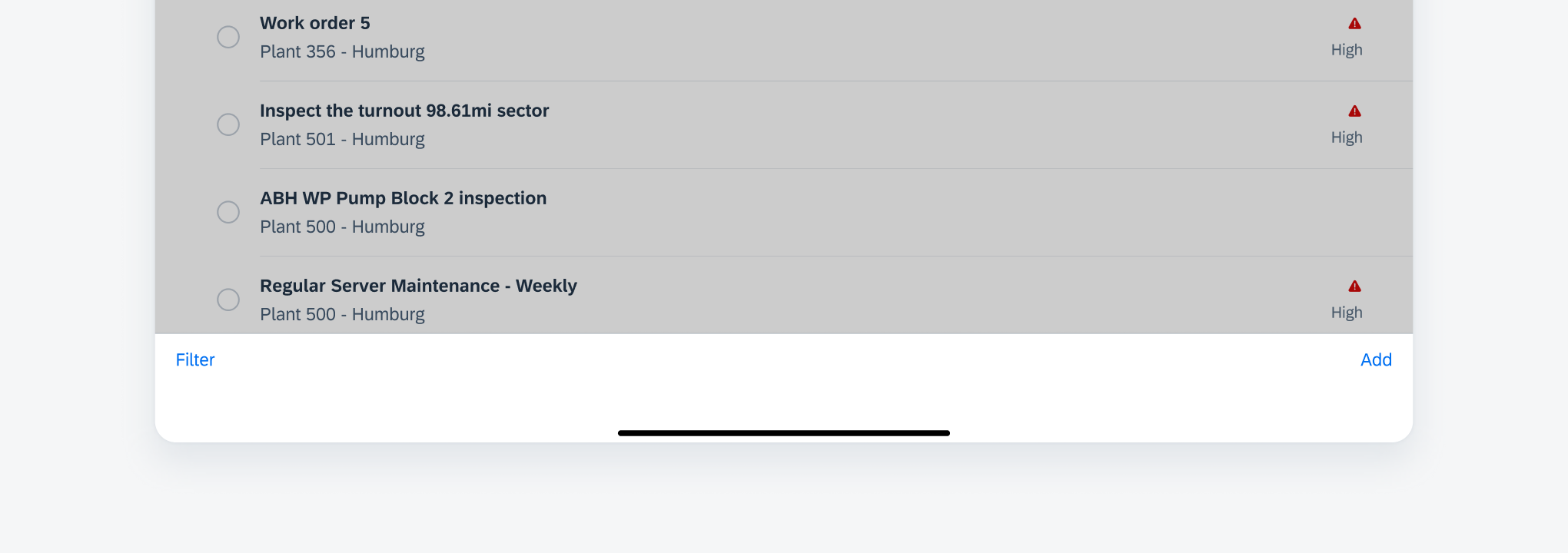
The content area consists of either a list of object cells or a table to display the items.
Object cells
When using object cells in a list, ensure that all key information is properly presented in the object cells. In regular width, ensure that the information is balanced on the screen and avoid creating large empty areas. Tapping on one object cell navigates to its related object screen, which includes detailed information and actions for that object.
Table
When there is no data available in the content area, for example, when filters are applied with no matching results, inform users with the appropriate placeholder text.
List report content area
E. Toolbar
The toolbar contains relevant actions buttons for the content area and may be used when there is not enough space for all of the buttons to fit in the navigation bar.
Buttons in the navigation bar and buttons in the toolbar are both list actions, which impact the whole list instead of one single item.
List report toolbar
List Actions
Filter: The “Filter” button provides the sorting, grouping, and filtering options to narrow down the list.
Edit: The “Edit” button activates the multi-selection mode of the list. Users can select one or more items on the list and perform group actions, such as Delete and other line item actions.
Add: The “Add” button allows users to add a new line item of the same object type to the list. Typically, the add button on the list report floorplan doesn’t provide other functions.
Share: The “Share” button allows users to share the list through email and other supported channels in the app.
Other list actions: The app can have other list actions depends on the use cases. Keep in mind that these actions should impact the whole list, not just specific line items.
List report list actions
Line Item Actions
Line item actions directly impact the item rather than the whole list.
For example, Approve can be a line item action.
The maximum number of quick action buttons available via swipe is three. If there are more than three actions, include a “More” button that, when tapped, brings up an action sheet allowing users to make further selections. Use text or an icon with a label to communicate the purpose of each button and use consistent color coding.
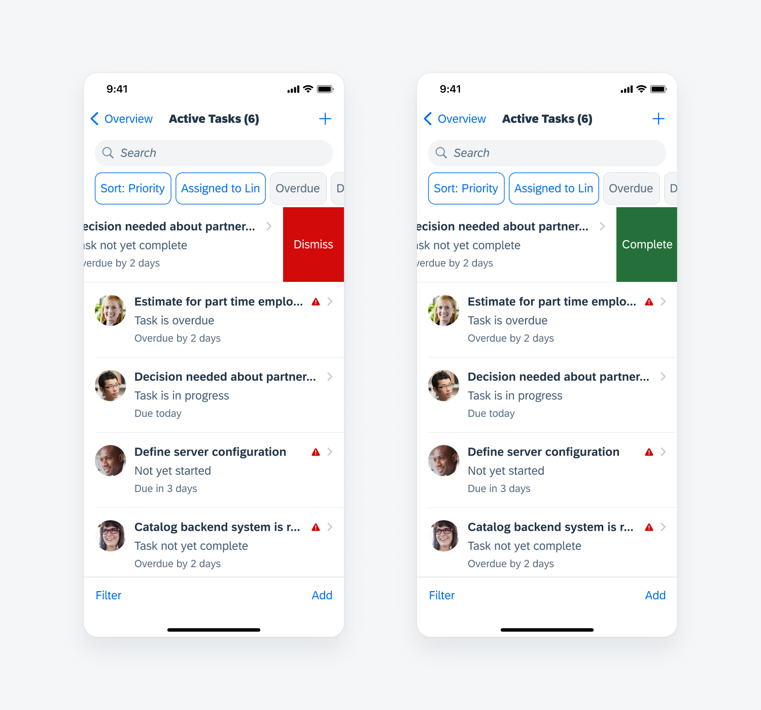
List report line item actions
Filtering
When filters or sorting are applied to the list, show the filter feedback bar on top of the list to indicate that this is a filtered list. The screen title will change to reflect the count of items on the current list and the count of items on the original list. A user can tap the buttons to remove the filters.
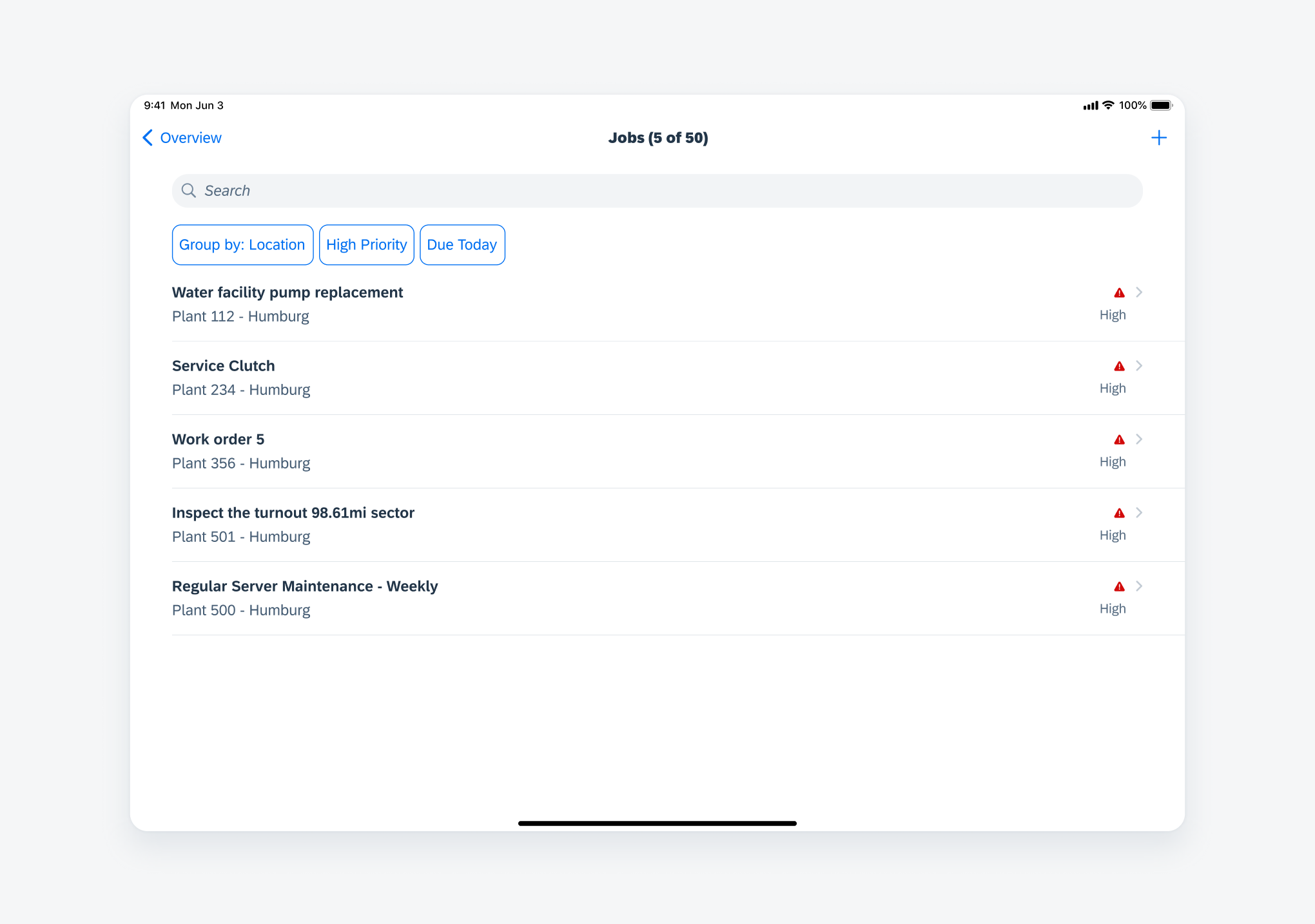
Filtering list report items
Grouping
A user can apply grouping to the list, at which point the group title and a count of the grouped items appear. Grouping doesn’t affect the screen title when no filters are applied. Please note that the filter feedback bar should reflect that grouping has been applied to the list.
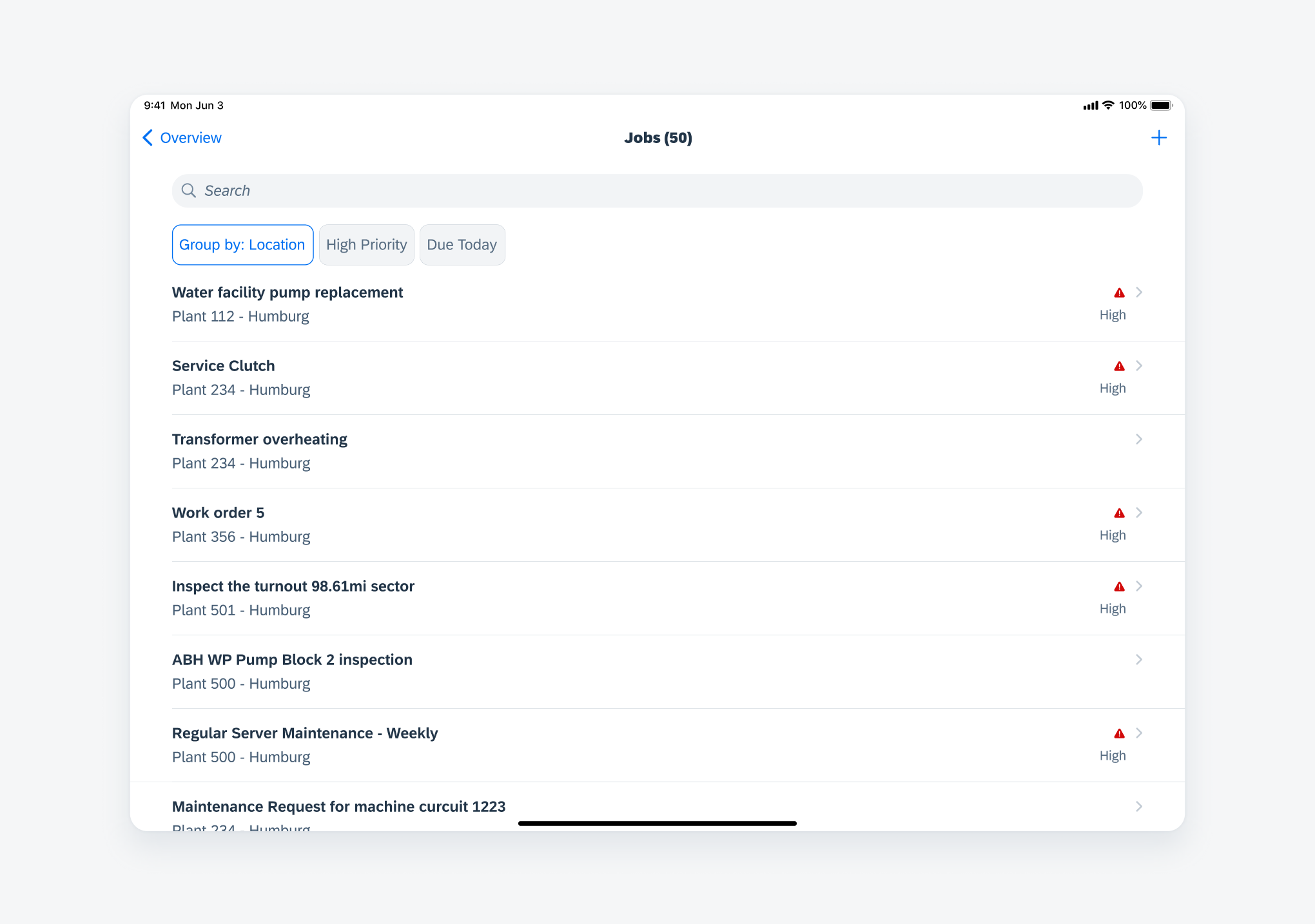
Grouping list report items
A list report page type supports both regular and compact widths. Sections in the content area maintain the same vertical structure across compact and regular width layouts. Individual cells expand horizontally to fit the screen size. In regular width, detailed descriptions for each item may be provided.
Readable margins may also be applied to screens that use regular width in order to make content appear less spread out.
Compact width (left) and regular width (right)
Development: FUIListFloorplan
 Your feedback has been sent to the SAP Fiori design team.