
Sort & Filter Form
Intro
The sort and filter pattern allows users to narrow down results from a large set of data by setting complex sort and filter criteria in a fullscreen modal.
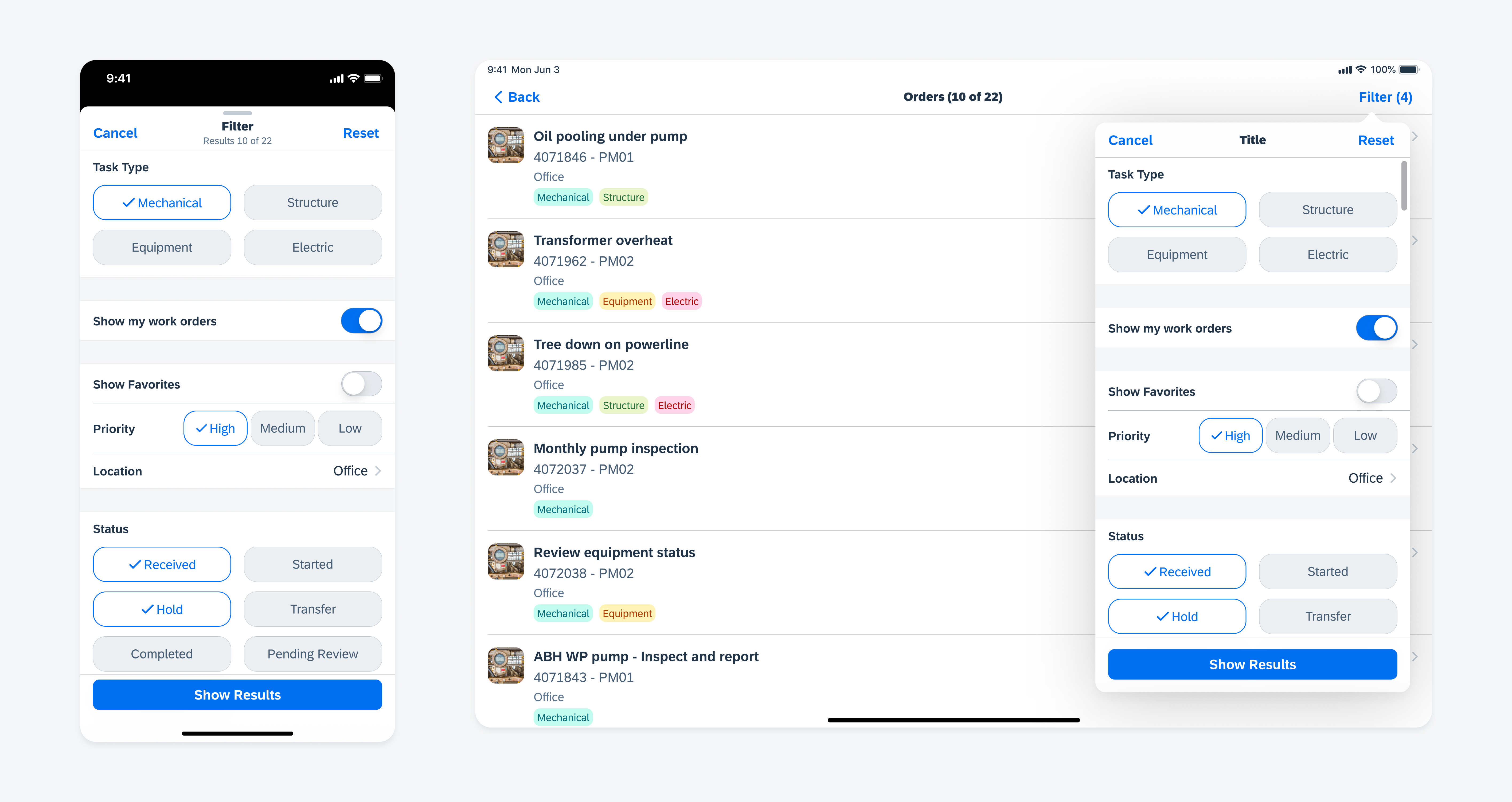
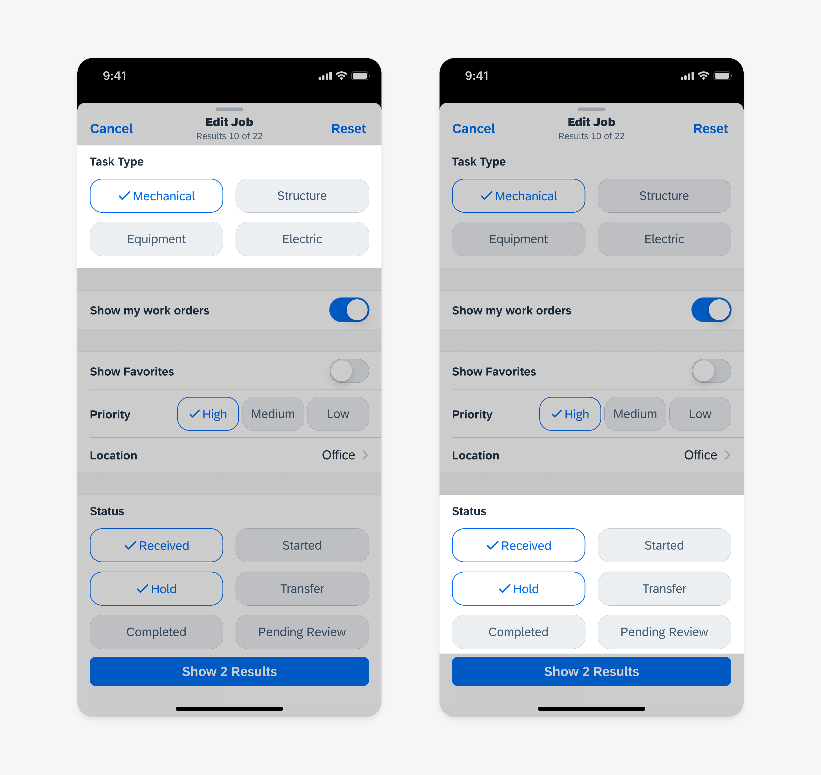
Sort and filter form in compact width (left) and regular width (right)
The sort and filter form should be used for large complex filters with a lot of sort and filter options if there is a large amount of data. It helps the user to focus on the filter task by providing more space to work with. The sort and filter form requires the user to perform more actions compared to using the filter feedback bar. For a more simple, contextual filter option, see Filter Feedback Bar.
- Keep the sort and filter form as short and uncluttered as possible.
- Sorting and filtering is often used interchangeably. Sorting allows users to go through an entire set of data sorted by specific criteria. As filtering limits the data, only certain parts of data are displayed to the user.
- If sorting is needed, it should come first, followed by filter options, with the most important or frequently used filters on top.
- Filtering options should be concise and easy to understand.
- Consider grouping filters that belong together.
Avoid putting everything into filters. Important top-level choices that are being made by almost all users are best being made upfront. It also declutters and simplifies the user experience.
The sort and filter form consists of reusable and modular sections. It can contain several filter form components, such as a filter form cell (single/multiple selection), slider, switch form cell, segmented control form cell, pickers, and order picker form cell.
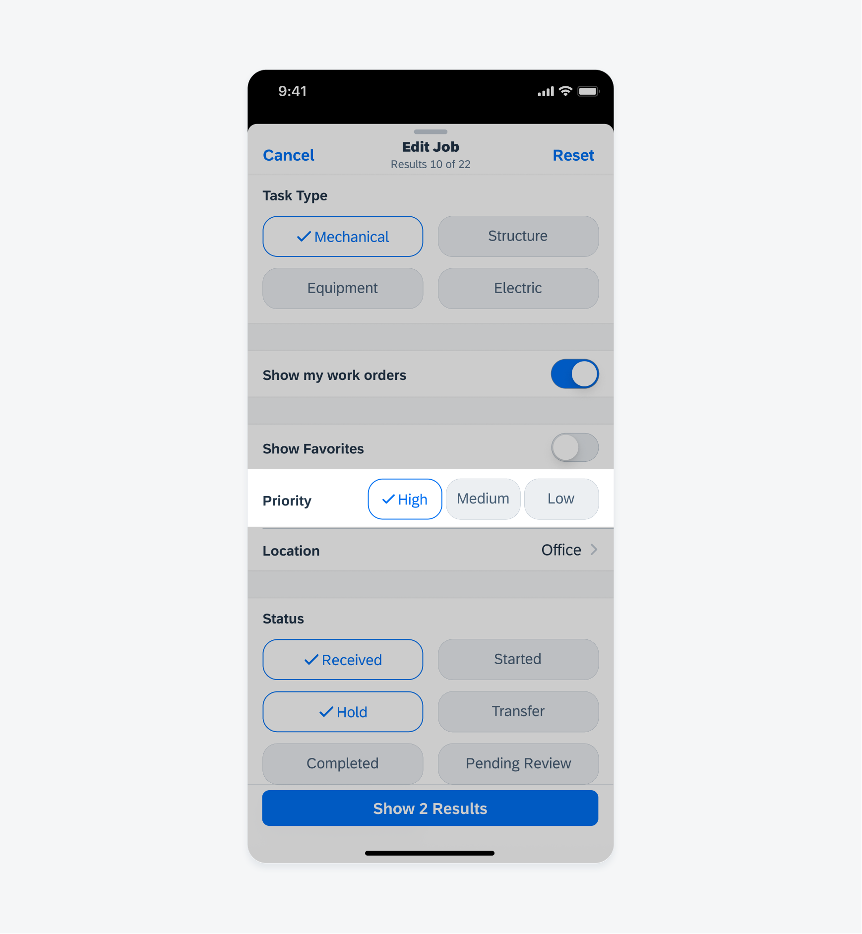
A. Title and Search Results
Navigation bar title: “Filter”
Navigation bar subtitle: <name of filtered content/list, default “Results”> <number of filtered items> of <number of all items> The text in the subtitle should be automatically adopted to the content of the list that is filtered, for example, orders, products, equipment, notifications, etc., so that the user is always aware of what is being filtered.
B. Cancel
Closes the view without applying filters.
C. Reset
Resets all filter settings to the initial state.
D. Sort Components
Used for sorting the results by a certain logic. Sort should always have a preselected value as the default sorting method. Use the filter form cell for single selection and the order picker form cell for multiple sort criteria and sort direction.
D. Filter Components
Used to narrow down the list. Common controls include slider, switch form cell, filter form cell (single/multiple selection), segmented control form cell, pickers, and order picker form cell.
E. Action Toolbar with Result Button
Action toolbar with default label: Show <number of filtered items> <name of filtered content/list>, default “results”)
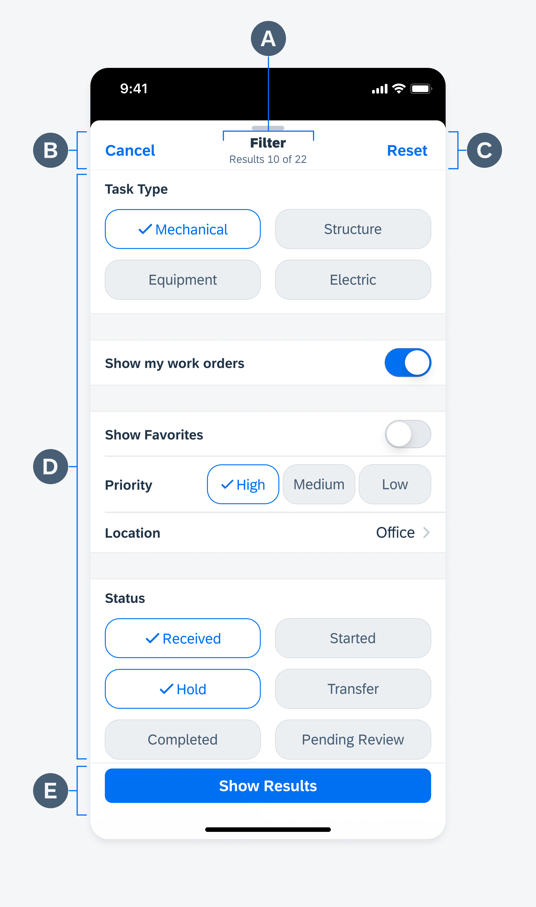
Sort and filter form anatomy
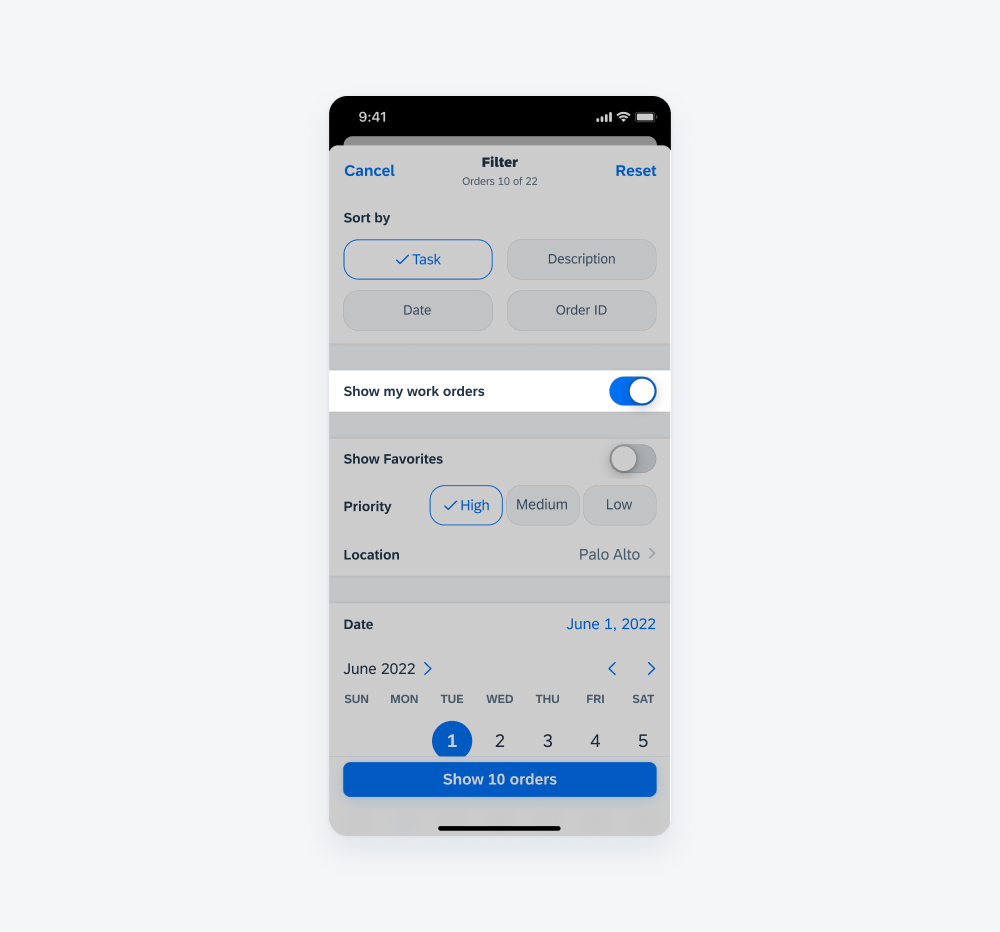
- Trigger Sort and Filter Form: The filter modal is usually triggered by tapping on the filter button on the navigation bar. As a secondary option, the filter button can be placed on the toolbar if there is no available space in the navigation bar. The filter button should be a text button.
- Sort and Filter Form: The sort and filter form is opened as a fullscreen modal and contains sort and filter options. Sort does not affect the number count.
- Filtered Results: As soon as a filter is applied, the filter button in the navigation bar should display the number of applied filters. This helps users to understand how many filters have been applied.
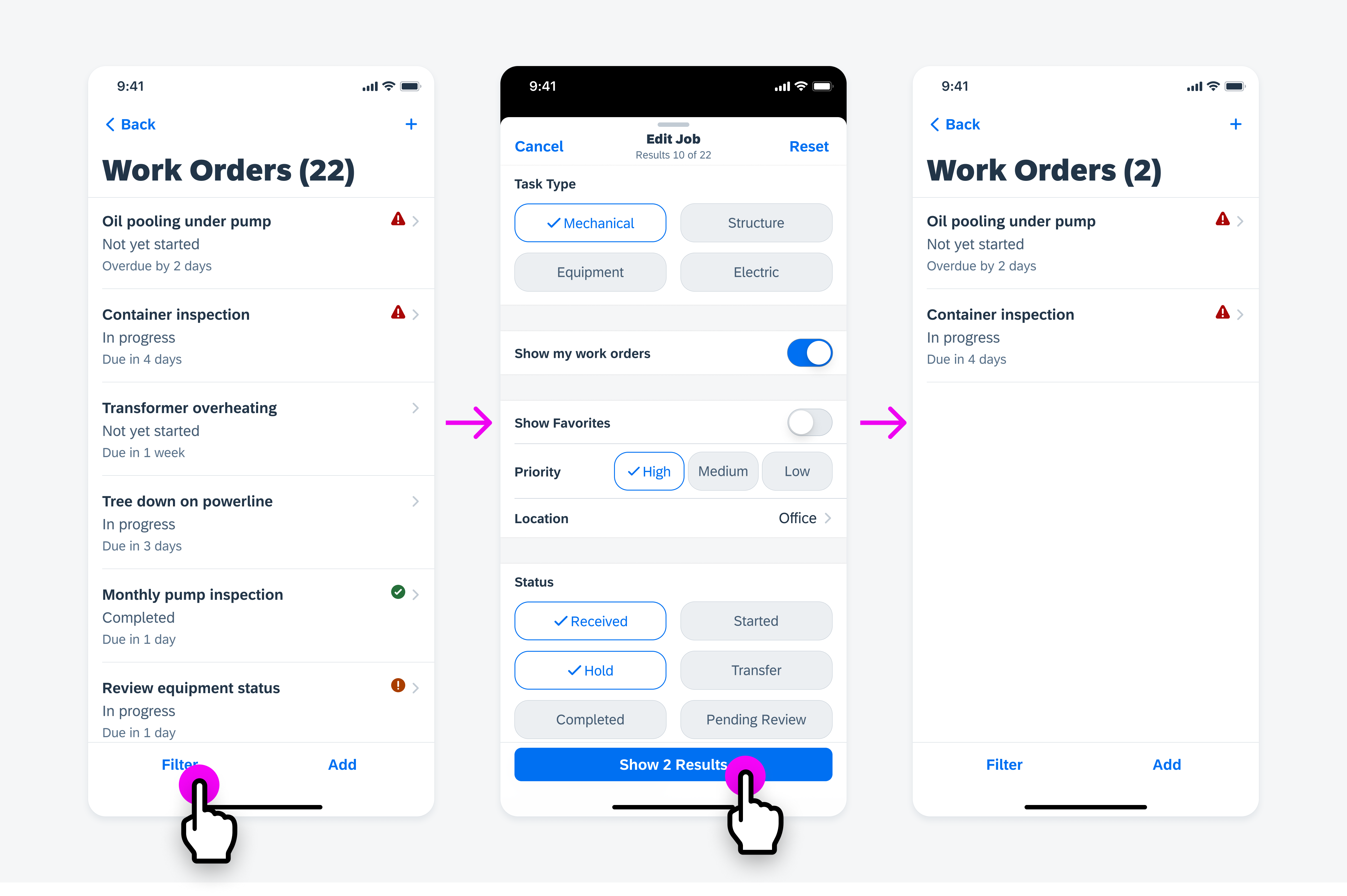
The filter button in navigation bar (left) triggers the sort and filter form (middle). The results button applies the filters and results are shown (right)

Several form cell controls can be used with a sort and filter form, for example, filter form cell (single/multiple selection), stepper, slider, switch form cell, segmented control form cell, pickers, and order picker form cell.
Tip:
Different types of filters require different components. A switch allows users to set something on or off, a stepper increases or decreases a value, a range slider could be used to set a range, a filter form can set several textual filter options. Use the appropriate component that meets the users’ needs.
Don’t give the user extremely nuanced options to set filters. Too many detailed filter options only take up screen space.
Sort
Always put the sort option at the beginning of the filter view. Sorting allows users to change the order of the entire results. Popular sort options are sorting by alphabet, date, or rating.
If the data needs to be sorted by one criterion, use the filter form cell (single selection). If it is necessary to sort by multiple criteria where the sort order direction and the sequence of criteria matter, use the order picker form cell.
The sort form should always have a preselected value as the default sorting method.
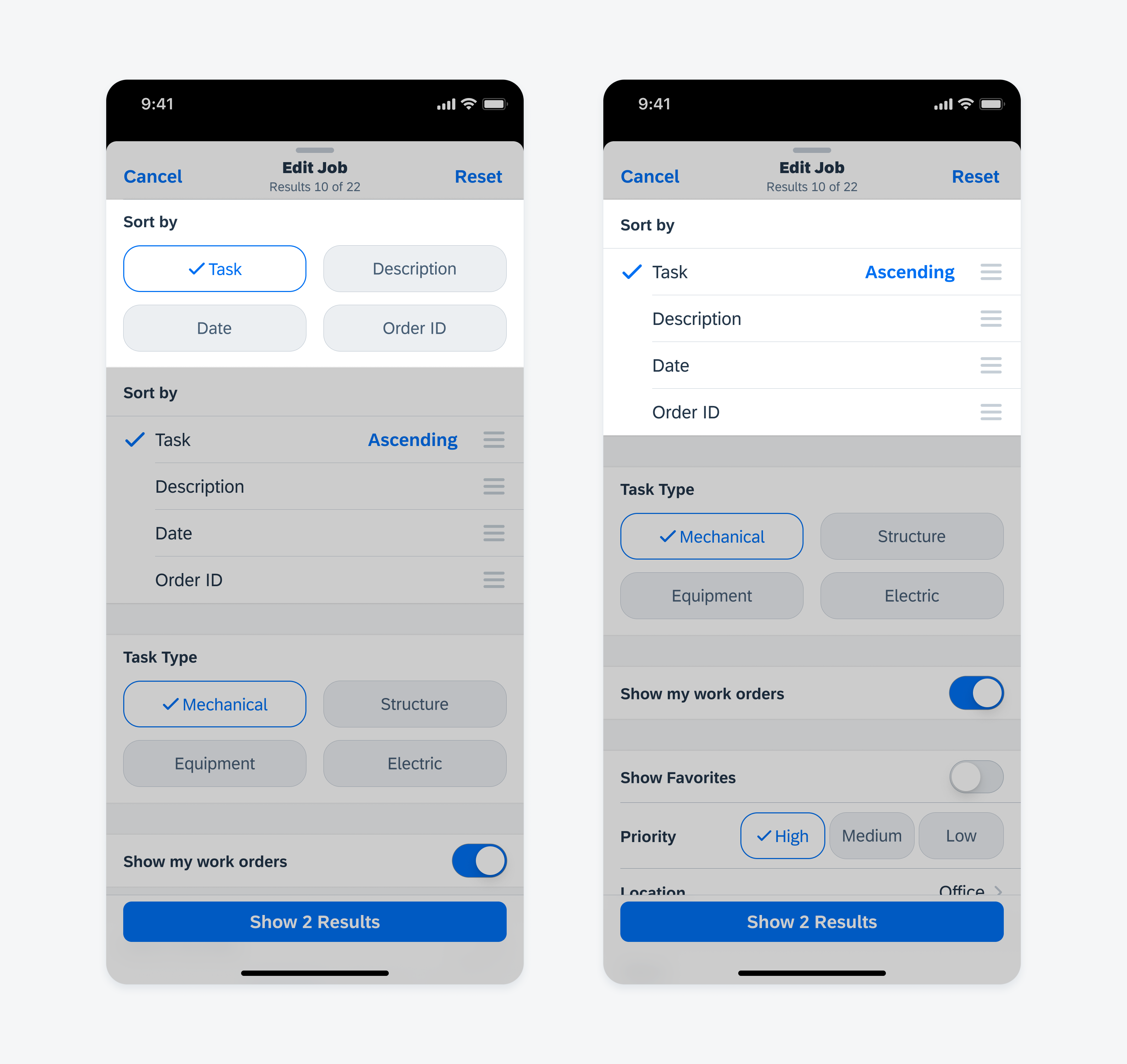
Filter form cell (single selection) is used for sorting by one criterion (left). Order picker form cell has for more advanced sorting options (right)
Filter
Single Selection
Filter form cells are used to filter one or more values within a data category. If the text of value is too long to display within the cell, or when there are more than eight values to select from, use a list picker instead.
Multiple Selection
To allow users to select multiple values, use the multi-selection of the filter form cells.
Filter form cell single selection (left) and multiple selection (right)
Segmented Control
Use a segmented control button variant if the value of the label is not too long and there are less than three values to filter for. Single selection and multi-selection are available for this variation.
Segmented control button variant for up to three short filter values
Switch
Use switches if the type of filter has two mutually exclusive states only – on and off. In some use cases, if a switch is set to “on,” the user can enter additional data, for example, by using a date and time picker.
Switch to turn a filter on or off
Stepper
A stepper is useful to incrementally increase or decrease a selected value.
Stepper to increase or decrease a value
List Picker – Single Selection
A list picker is used if there are more than eight values to select from in a filter category. Use a value list if the number of values is dynamic or unpredictable.
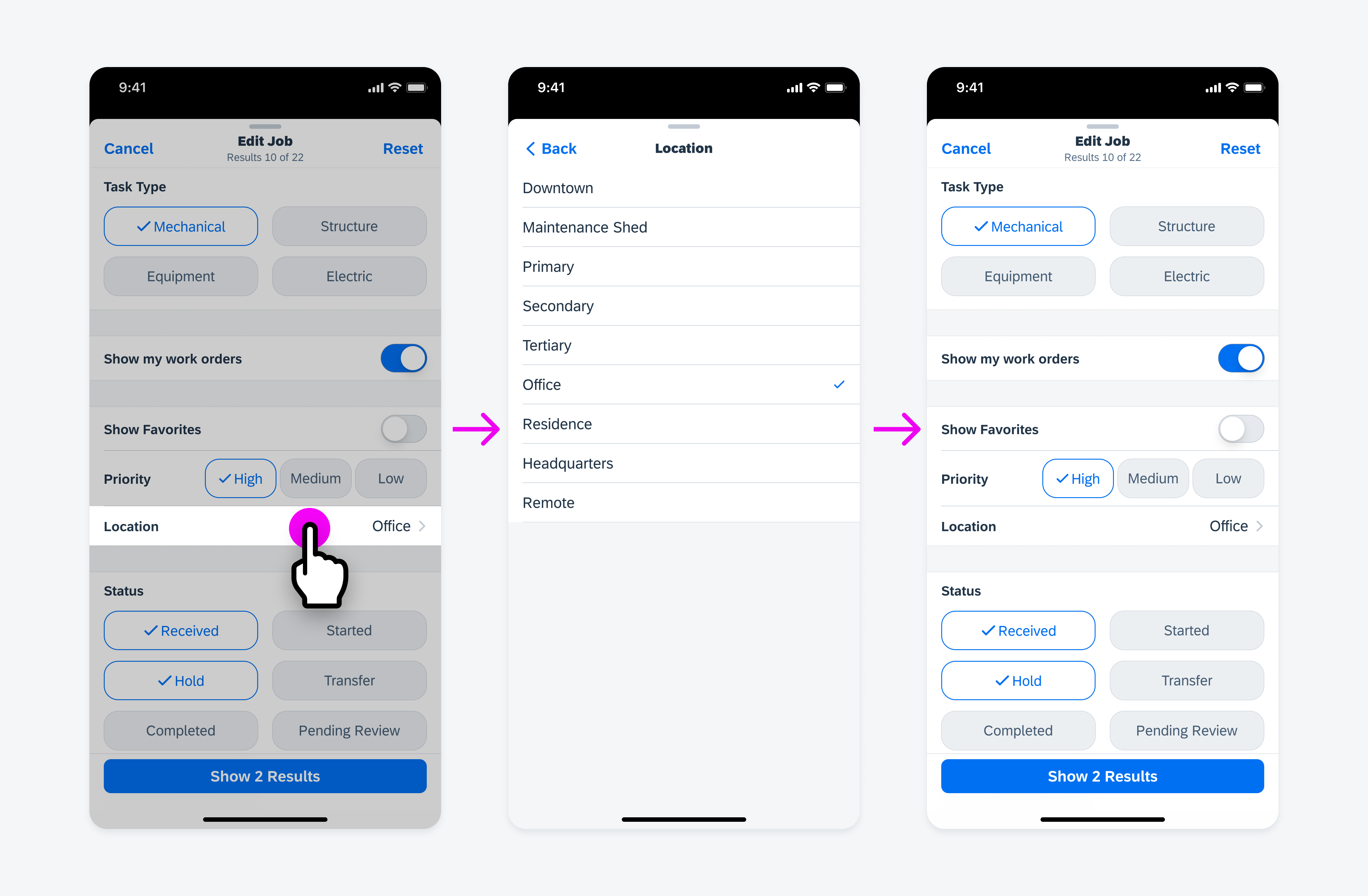
User taps list picker form cell (left), makes single selection (center), returns to filter page (right)
List Picker – Multiple Selection
In some use cases, a list with a search bar is used to search through a large collection of values. If a list picker allows multiple selection, the selections may be grouped in a selected group to enable users to deselect without having to scroll through a large list.
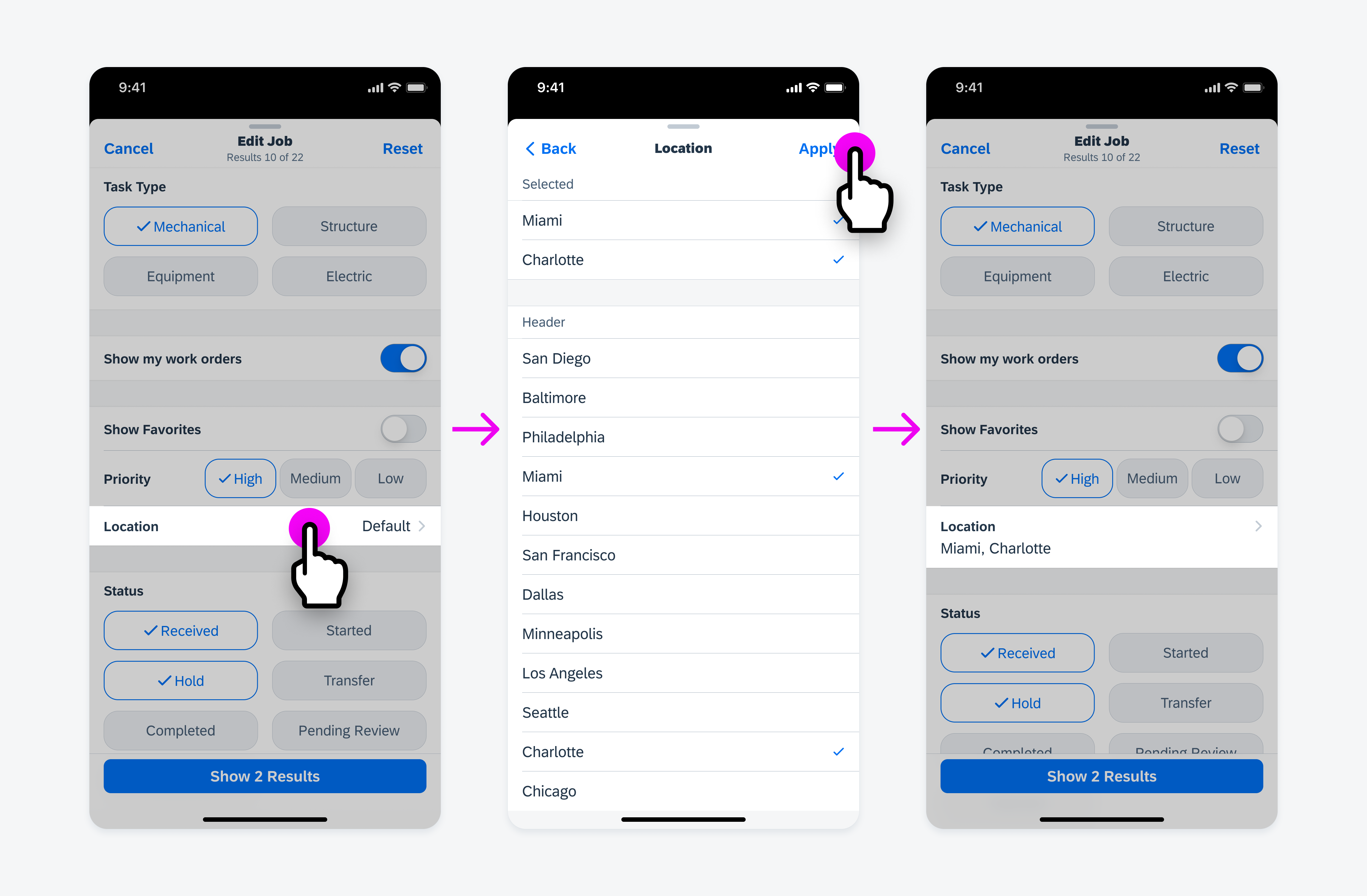
User taps list picker form cell (left), makes multiple selections (center), returns to filter page (right)
Data Range
Picker
A picker can be used to select date and time, or to select a duration of time.
When inputting data sets such as setting the price range, “Min” value automatically affects the starting value of the “Max” picker.
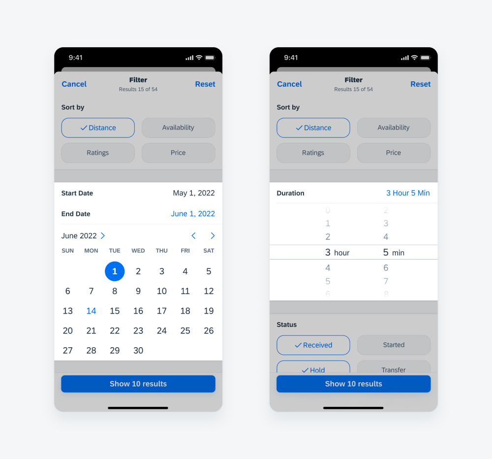
Date picker (left) and duration picker (right)
Slider
A slider is best used when the minimum and maximum values are established. A slider form cell can be used when selecting a precise value is not important. If the exact value matters, use a picker control.
Use a range slider if the user should be able to select a range of values between a given range.
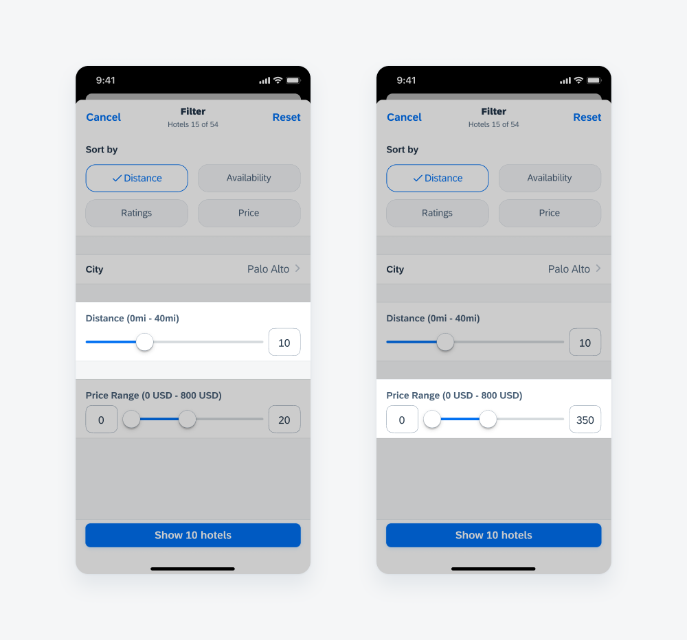
Slider (left) and range slider (right)
Development: Create and Filter Patterns
SAP Fiori for Android: Sort and Filter Pattern, Sort by Multiple Criteria
Related Components/Patterns: Sort & Filter Overview, Filter Feedback Bar
 Your feedback has been sent to the SAP Fiori design team.