
Iconography
Intro
Iconography is essential to creating a cohesive and enjoyable app experience. Icons play a crucial role in communicating actions, information, feedback, and navigation.
By providing a comprehensive icon library, our goal is to enhance the accessibility and overall ease of use of our customers’ apps.
SAP icons have been redesigned for the Horizon visual theme with a fresh, friendly, and bold style. The new icons maintain consistency of size, stroke, and visual balance and are tailored for simple and direct user interaction, using metaphors that are easy to understand in an enterprise setting.
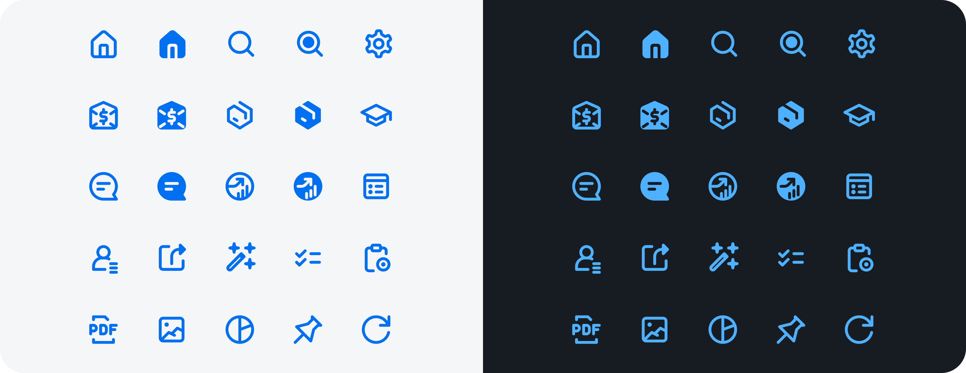
SAP Fiori for iOS icons in light and dark mode
- Use the SAP icon library.
- Use icons to efficiently communicate important actions to users.
- Use icons to indicate navigation actions to other screens.
- Don’t use third party icons.
- Don’t place icons too close together.
- Don’t place icons with half pixel increments.
- Don’t use light-colored icons against light backgrounds.
The SAP icon library communicates the following SAP Design principles:
- Simple
- Fresh
- Neutral
- Modern
By utilizing the SAP Fiori Icon Library, we have created an SAP Fiori custom symbol library, which is part of the SDK. This library offers a diverse selection of SAP Fiori custom symbols in various weights and scales, enabling you to design with flexibility and adaptability. Some of the weight options include thin, light, bold, heavy, etc. The image below shows the weights available.
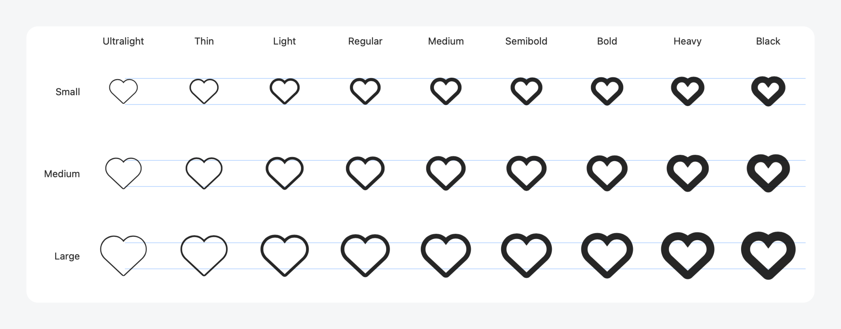
SAP Fiori custom symbols
SAP Icons: SAPUI5 Icon Explorer
Learn about SF Symbols in the Apple Human Interface Guidelines
 Your feedback has been sent to the SAP Fiori design team.