
Object Card View
FUIObjectCardView
Intro
The object card view is a flexible visual container that holds and groups information together. Like the object card, it is highly customizable to accommodate a wide variety of uses and works best when used in a collection view with clear distinctions between groups or a card carousel.
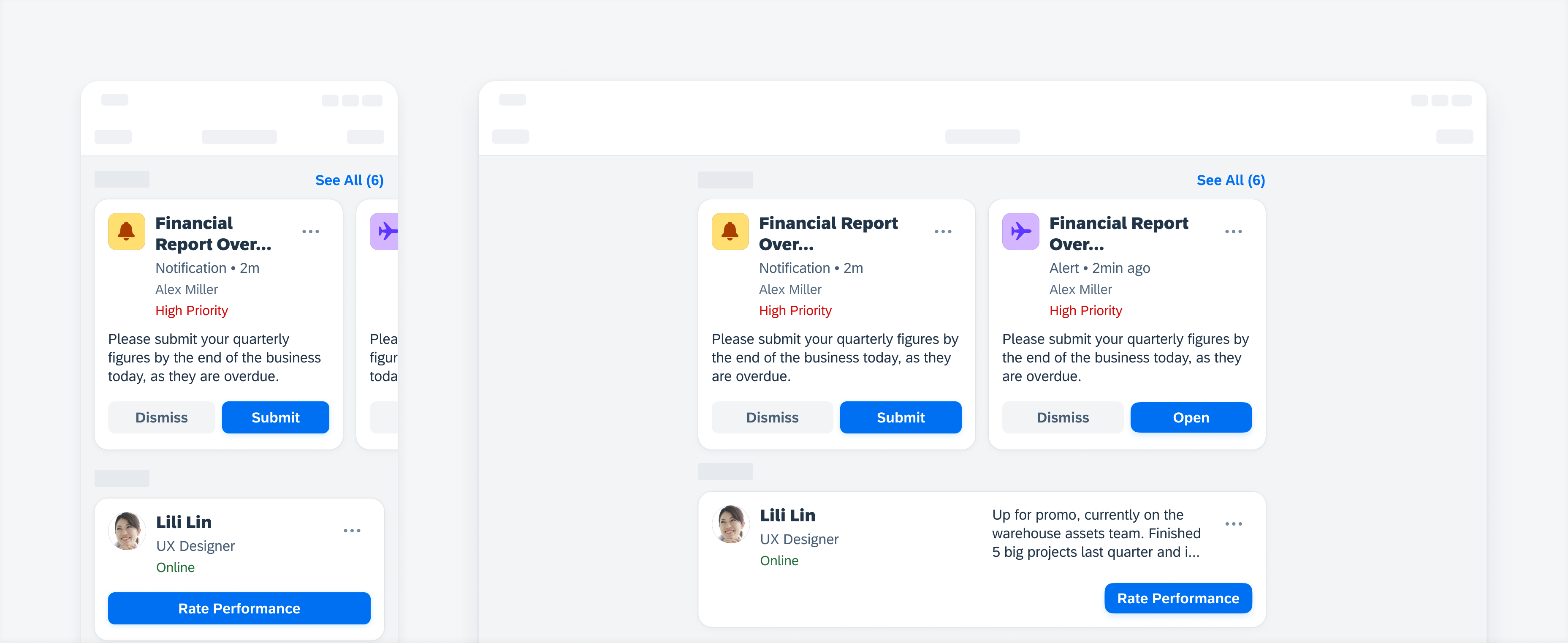
Object card view examples
Use the object card view when users need visual grouping and scannability to related content or perform actions on said objects. Keep the content (labels and description) in the object card view concise, only including information that is necessary for the user to easily understand on the surface level.
- Keep the text short and concise
- Ensure that the user can still interact with the device
- Don’t allow the labels to be longer than one or two lines
- Don’t use cards if objects are homogeneous and can be more efficiently used in regular object cells

Example of object card view with short labels and content groupings in a card carousel
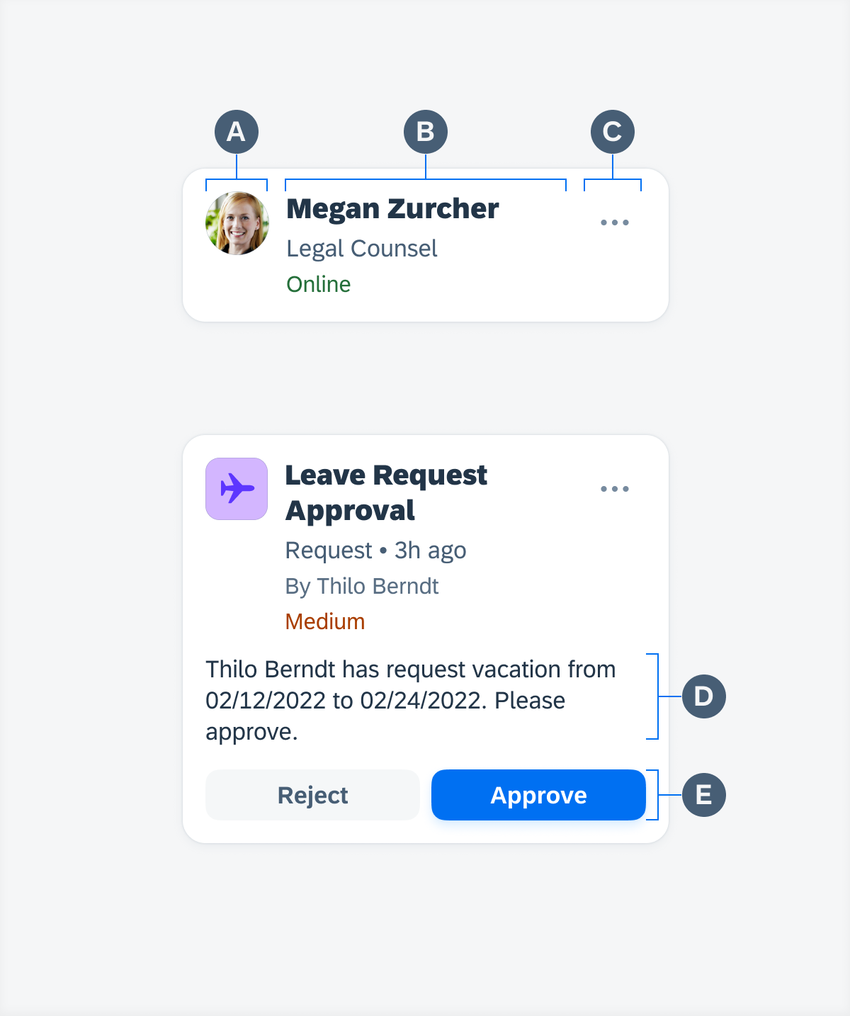
Object Card View Anatomy
A. Detail Image (Optional)
Just like in the object cell, an image representing the object can be included and be set to either thumbnail (square) or avatar (circular) with all the same sizing properties. Since space is limited in the object card view, we recommend using a 45 pixel image or smaller.
B. Object Labels
This is the header, the main area for text content. It allows for a title, subtitle (optional), footnote (optional), and attributes like statuses (optional).
C. Overflow Button
This is where the user can trigger and access additional actions via a menu that they can take on the card and/or the represented object.
D. Description (Optional)
Unlike the object cell, If there is a description defined – it will appear in both compact and regular mode. This is typically a long string of text than what is displayed in the header area meant to provide additional information.
E. Actions (Optional)
Aside from the overflow, users can quickly access and perform select actions (limited to two) on the object.
Touch Targets
At most, the object card view has three possible tough targets: the overflow button, action button(s), and the card area itself.
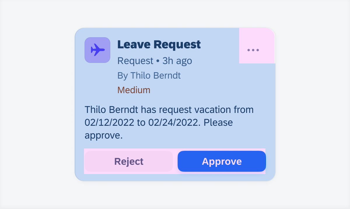
Possible touch targets on an object card view
Overflow Button
When a user taps on the overflow button it triggers a menu of actions. Depending on the card type or object the menu, actions can change.
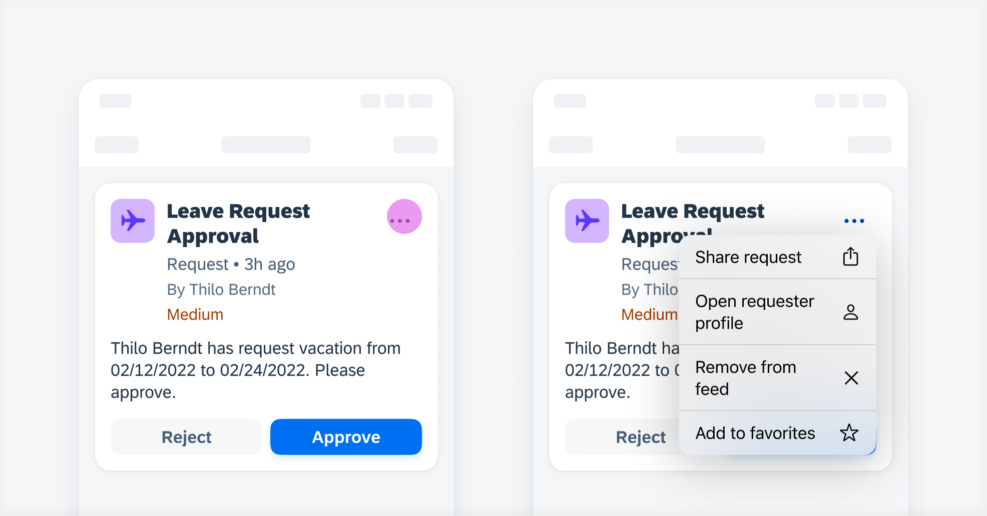
Example of the overflow menu being triggered
Actions
When a user taps on an action button at the bottom of the object card view, said action will be performed and the button will be disabled or altered.
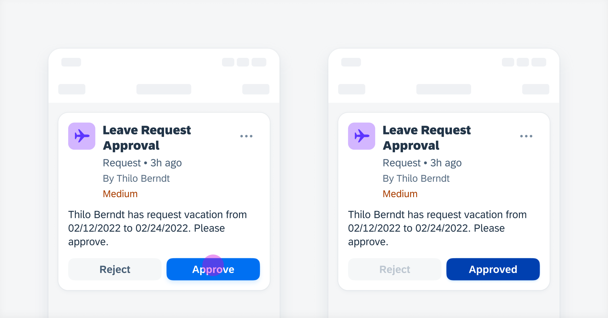
Example of a pressed action button on an object card view
Card Area
When a user taps or presses on an object card view, the card’s object detail page will be pushed into view – effectively renavigating the user to the object card view’s source.
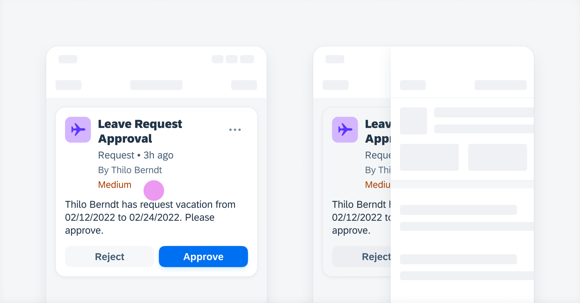
Example of a pressed object card view being tapped and pushing to object detail page
Card Carousel
A user can swipe horizontally on a card carousel to scroll horizontally. By tapping the “See All” button on the top-right header, a list report of the total objects is triggered.
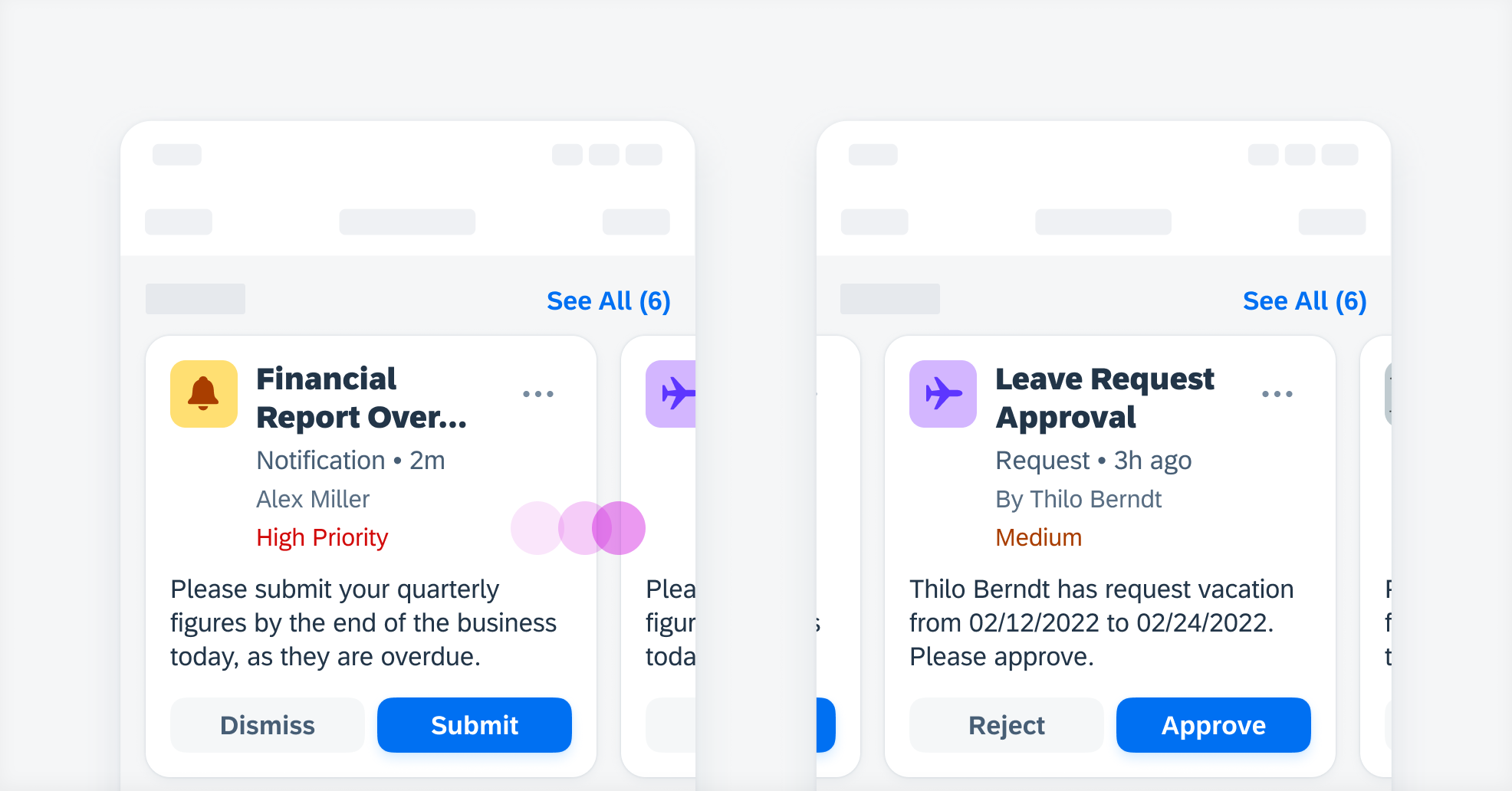
Example of a horizontal scroll on card carousel

Object card view variations (left to right): simple, default, supplementary 1 action, and supplementary 2 actions
Development: FUIObjectCardView
Related Components/Patterns: Cards Overview, Object Cell, Object Card, List Card
 Your feedback has been sent to the SAP Fiori design team.