
Object Cell
FUIObjectTableViewCell
Intro
The object cell is a table view cell that fits inside the table view container. It is highly customizable so as to accommodate a wide variety of uses.

Object cell examples
An object cell is intended to be used to preview information about an object and can be tapped to navigate to a full view of that object’s information, usually displayed as an object page.
Keep consistent height and alignment of all object cells in a table view or list report.
Do not mix object cells with different height and content types in a table view or list report.
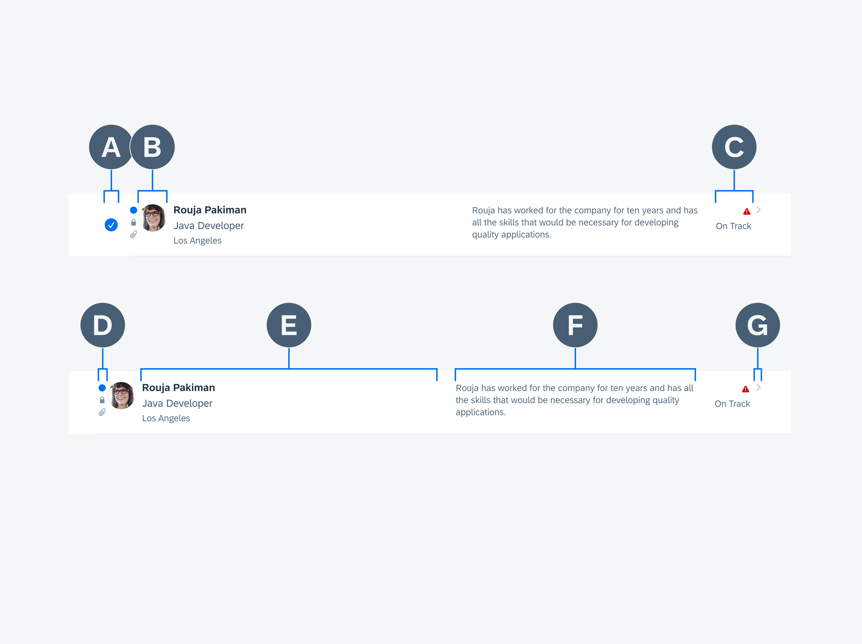
A. Editing Control (In Edit Mode)
An editing control appears only when in edit mode. When this mode is triggered, the content shifts to the right, and the control appears on the left. Any navigational indicator, such as the chevron or information disclosure icon, disappears while in edit mode.
B. Detail Image
An image representing the object can be set. The image can be square or circular and has a minimum size of 28 pixels and a maximum of 60 pixels. When using the detail image to display an individual’s profile image, it must be set as circular at 45 pixels.
C. Attributes
If an object has an attribute, such as a status, associated with it, it can be displayed on the right, in front of the accessory view. Up to two attributes can be displayed, stacked vertically. The attribute can be in the form of text or icon.
D. Icon Stack
A set of up to three vertically stacked icons can be displayed on the far left. These icons indicate something about the object, such as its unread status or that it has attachments.
E. Main Content
The main content is the main area for text content. It allows for a title, subtitle, and footnote. The title is the only mandatory content for the object cell.
F. Description
Depending on the layout (portrait or landscape) the location of the description will change. In portrait mode, it will appear at the bottom of the main content container. For landscape mode, the description will appear in its own column shown above, this is typically a long string of text than what is displayed in the title content area.
G. Accessory View
The accessory view is usually a navigational icon, such as a chevron, which would trigger a push navigation, or an information disclosure icon, which would bring up a model. It can also be used for a single action, such as download.
Preview
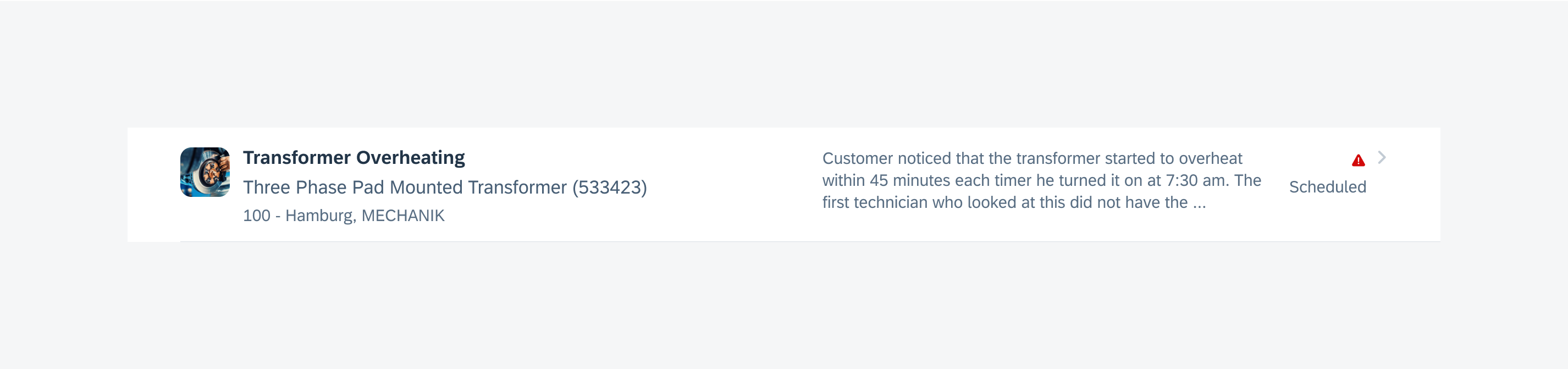
The preview object cell variation is the most common variation. It is used to display a preview of an object. A chevron icon is used in the accessory view on the right to indicate a drill down to the complete content, usually shown as an object page.
Example of an object cell preview variation
Quick View
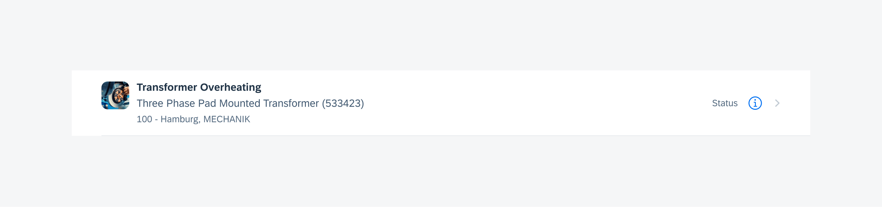
The quick view object cell variation is used to display a simple object that doesn’t need a full object page. Instead, an information disclosure icon is used on the right, which brings up a modal when tapped. In the modal, some more information for the object can be viewed and a few simple actions can be performed.
Example of an object cell quick view variation
Single Action
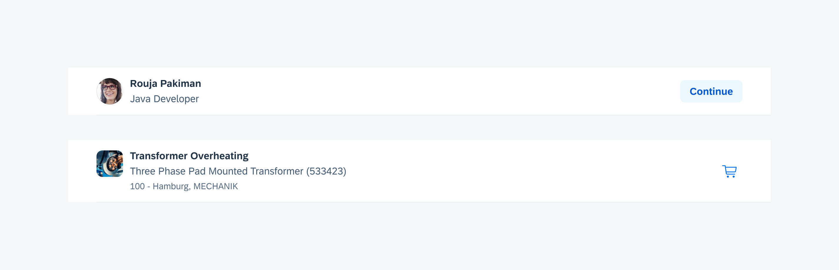
The single action object cell variation is used to display an object that has a specific action associated with it, such as downloading a document or adding an item to your cart. An icon or button is used on the right, indicating what the action is. The button can also be set to act as a toggle like in the example “Follow/Unfollow”.
Example of an object cell single action variation
Select (Edit Mode)
When the edit mode is triggered, users can select single or multiple object cells at once to perform an action, such as delete, change status, and so on.
Quick Actions
Quick actions are activated by a gesture such as swipe to delete.
Peek & Pop
Users can activate a peek & pop preview of an object by holding a long press on the object cell.
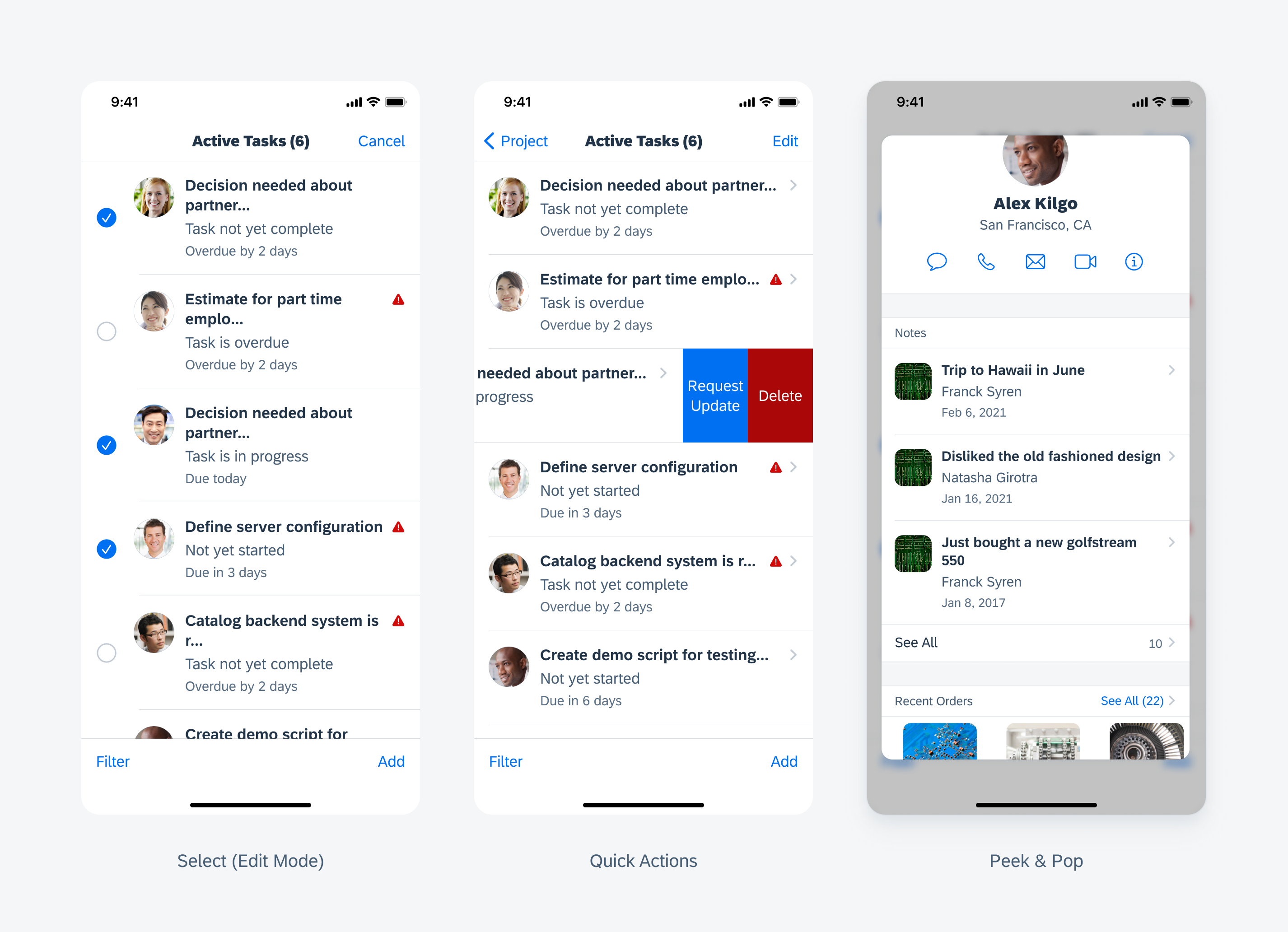
From left to right: select (edit mode), quick actions, and peek & pop
Navigation
The preview and quick view variations both include a navigational aspect. The preview uses a chevron icon to indicate a push to the full content of the object, while the quick view uses an information disclosure icon to indicate that a modal will pop up with the full content of the object.
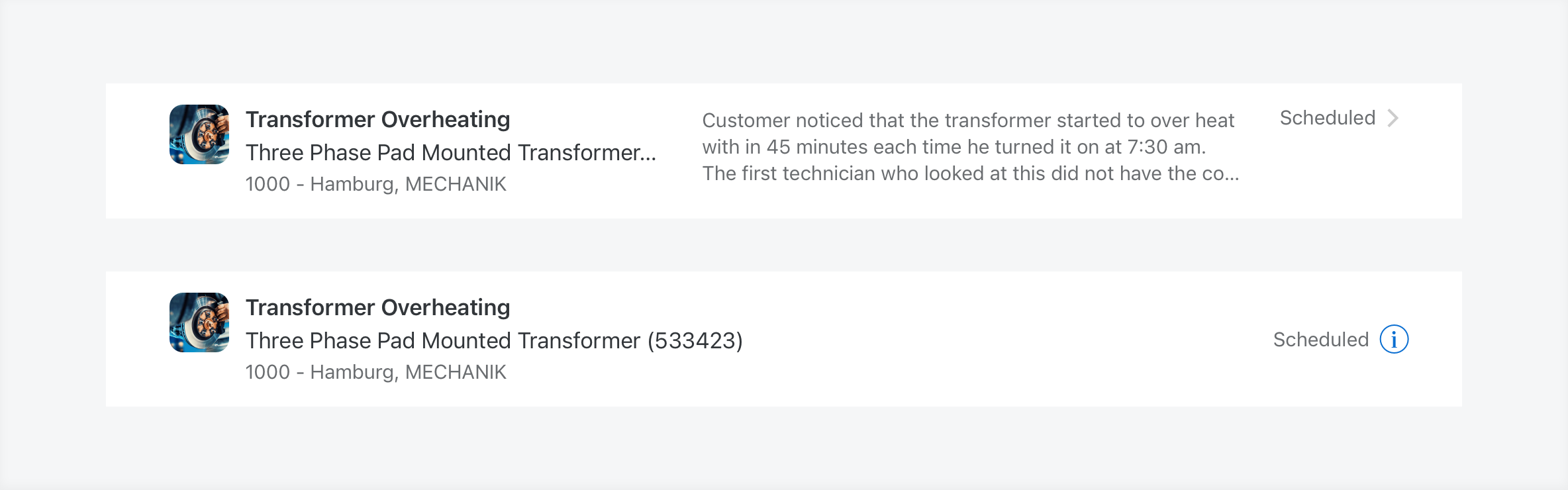
Example of preview and quick preview navigation
Compact and Regular Width
The object cell is supported in both regular and compact width layouts. An optional description is available to be displayed in regular width. The width of the title content container and description container is flexible and can be set according to your liking.
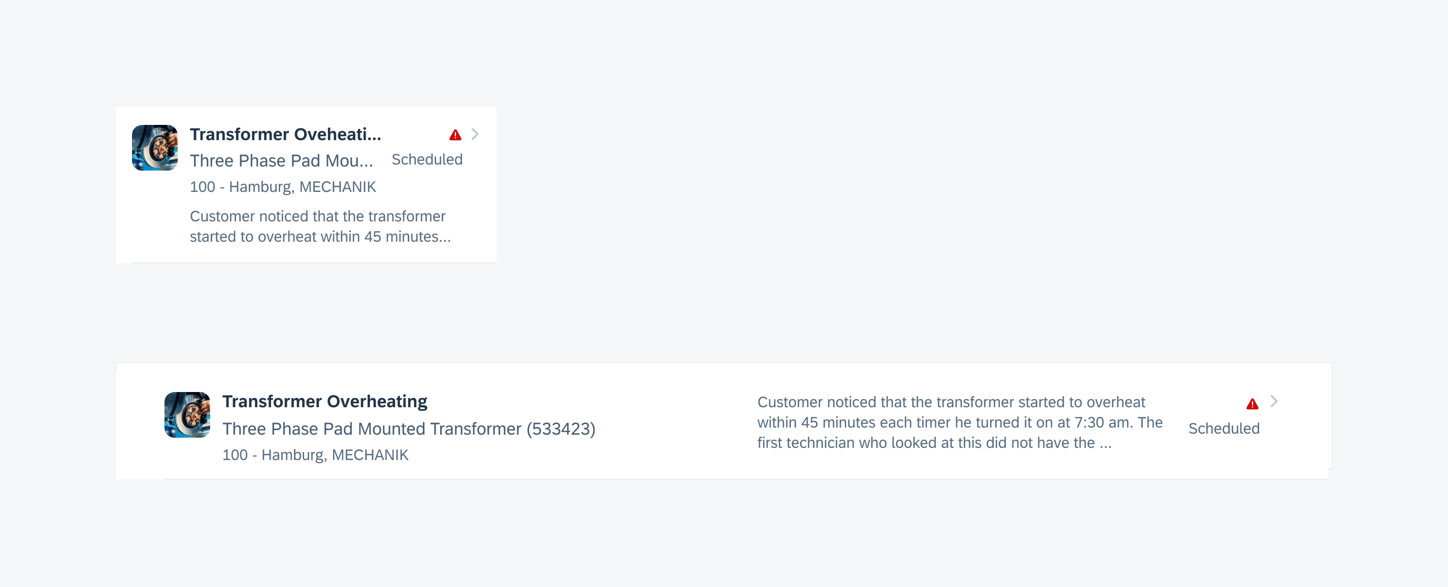
Example of an object cell's adaptivity for compact and regular width
Compact and Regular Height
The object cell also supports layouts with compacts height, allowing more objects to be exposed in smaller screens.
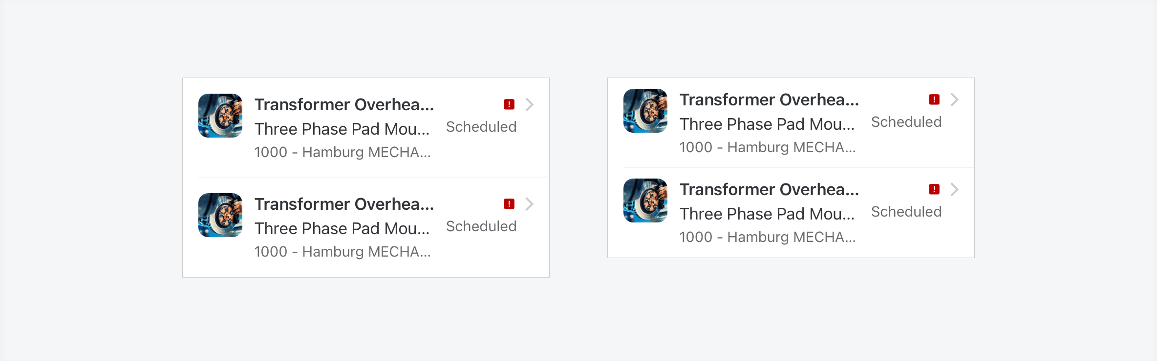
Example of an object cell's adaptivity for compact and regular height
Resources
Development: FUIObjectTableViewCell
SAP Fiori for Android: Object Cell, Key Value Cell
Related Components/Patterns: Contact Cell, List Picker, Collection View
 Your feedback has been sent to the SAP Fiori design team.