
Segmented Control
FUISegmentedControl
Intro
A segmented control is a horizontal bar divided into two or more mutually exclusive buttons. This control provides users easy access to specific categories of content.
- Ensure the control’s segments are related to each other.
- Use a segmented control to switch between views. In the Campus app, for example, a segmented control is used to switch between map and list views.
- Use the segmented control in a navigation bar, modal window, popover, or “drawer” (i.e., a pulley view controller).
- Do not use a segmented control if the segments are not related to each other.
- Do not use a segmented control to narrow a list. Use a filter instead.
- Do not include more than one segmented control on the same screen.
A. Inactive Control Item
There is at least one inactive control item in a segmented control.
B. Active Control Item
There is at least one active control item in a segmented control.
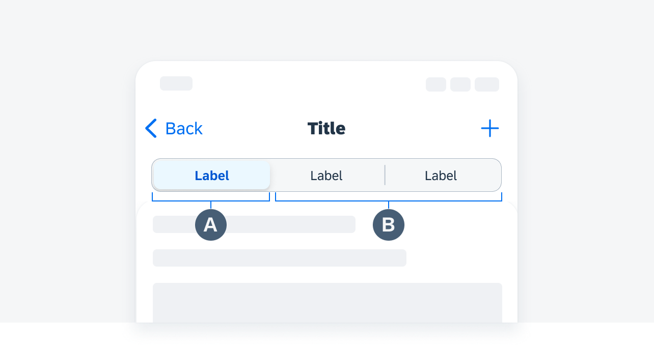
Segmented control anatomy
When a button is tapped, the data corresponding to that segment is displayed and the button remains highlighted. Each segment allows the user to view a different set of information.
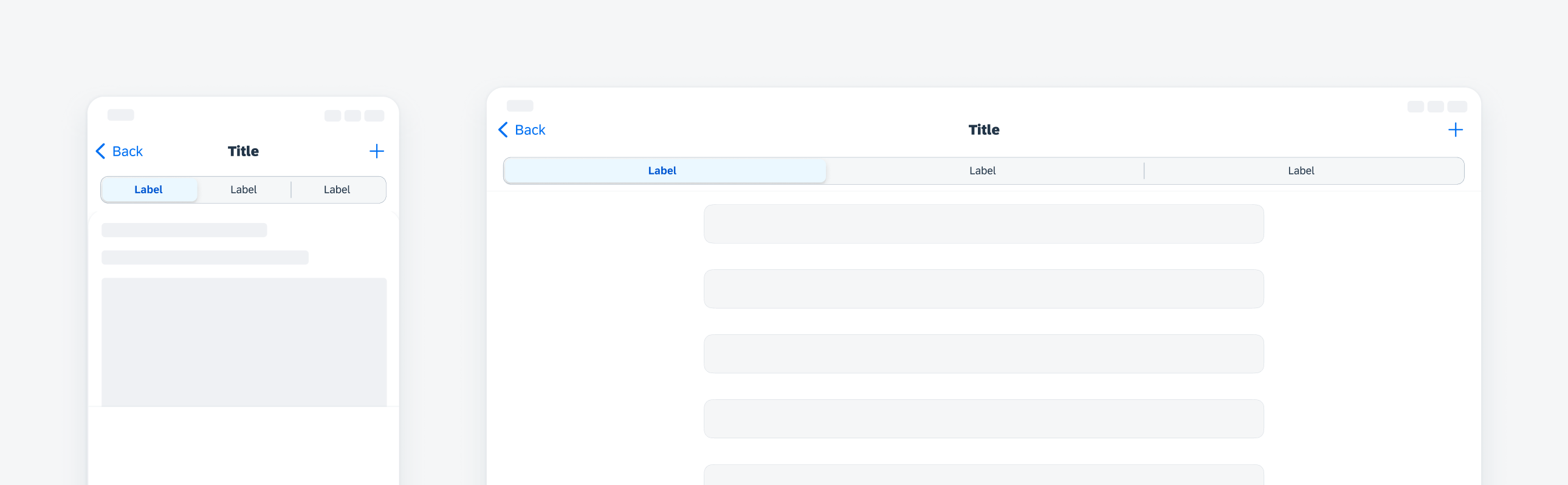
The maximum number of buttons that may appear in a segmented control varies depending on whether the navbar also includes a title.
In compact width, the maximum number of buttons is five when there is a title in the navigation bar and four when there is no title.
In regular regular, the maximum number of buttons is five whenever there is a title in the navigation bar.
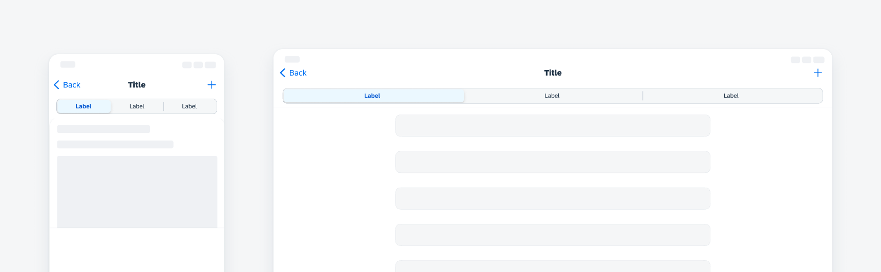
Segmented control with navigation title
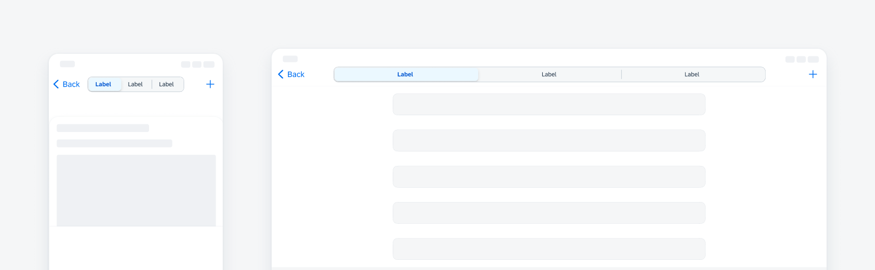
Segmented control without navigation title
Resources
Development: FUISegmentControl
SAP Fiori for Android: Chips
Related Components/Patterns: Segmented Control Form Cell
 Your feedback has been sent to the SAP Fiori design team.