
- Version 1.118
- SAPUI5 Version 1.116
- SAPUI5 Version 1.114
- SAPUI5 Version 1.112
- SAPUI5 Version 1.110
- SAPUI5 Version 1.108
- SAPUI5 Version 1.106
- SAPUI5 Version 1.104
- SAPUI5 Version 1.102
- SAPUI5 Version 1.100
- SAPUI5 Version 1.98
- SAPUI5 Version 1.96
- SAPUI5 Version 1.94
- SAPUI5 Version 1.92
- SAPUI5 Version 1.90
- SAPUI5 Version 1.88
- SAPUI5 Version 1.86
- SAPUI5 Version 1.84
- SAPUI5 Version 1.82
- SAPUI5 Version 1.80
- SAPUI5 Version 1.78
- SAPUI5 Version 1.76
- SAPUI5 Version 1.74
- SAPUI5 Version 1.72
- SAPUI5 Version 1.70
- SAPUI5 Version 1.68
- SAPUI5 Version 1.66
- SAPUI5 Version 1.64
- SAPUI5 Version 1.62
- SAPUI5 Version 1.60
- SAPUI5 Version 1.58
- SAPUI5 Version 1.56
- SAPUI5 Version 1.54
- SAPUI5 Version 1.52
- SAPUI5 Version 1.50
- SAPUI5 Version 1.48
- SAPUI5 Version 1.46
- SAPUI5 Version 1.44
- SAPUI5 Version 1.42
- SAPUI5 Version 1.40
- SAPUI5 Version 1.38
- SAPUI5 Version 1.36
- SAPUI5 Version 1.34
- SAPUI5 Version 1.32
- SAPUI5 Version 1.30
- SAPUI5 Version 1.28
- SAPUI5 Version 1.26
- Latest SAPUI5 Version 1.120
- Version 1.118
- SAPUI5 Version 1.116
- SAPUI5 Version 1.114
- SAPUI5 Version 1.112
- SAPUI5 Version 1.110
- SAPUI5 Version 1.108
- SAPUI5 Version 1.106
- SAPUI5 Version 1.104
- SAPUI5 Version 1.102
- SAPUI5 Version 1.100
- SAPUI5 Version 1.98
- SAPUI5 Version 1.96
- SAPUI5 Version 1.94
- SAPUI5 Version 1.92
- SAPUI5 Version 1.90
- SAPUI5 Version 1.88
- SAPUI5 Version 1.86
- SAPUI5 Version 1.84
- SAPUI5 Version 1.82
- SAPUI5 Version 1.80
- SAPUI5 Version 1.78
- SAPUI5 Version 1.76
- SAPUI5 Version 1.74
- SAPUI5 Version 1.72
- SAPUI5 Version 1.70
- SAPUI5 Version 1.68
- SAPUI5 Version 1.66
- SAPUI5 Version 1.64
- SAPUI5 Version 1.62
- SAPUI5 Version 1.60
- SAPUI5 Version 1.58
- SAPUI5 Version 1.56
- SAPUI5 Version 1.54
- SAPUI5 Version 1.52
- SAPUI5 Version 1.50
- SAPUI5 Version 1.48
- SAPUI5 Version 1.46
- SAPUI5 Version 1.44
- SAPUI5 Version 1.42
- SAPUI5 Version 1.40
- SAPUI5 Version 1.38
- SAPUI5 Version 1.36
- SAPUI5 Version 1.34
- SAPUI5 Version 1.32
- SAPUI5 Version 1.30
- SAPUI5 Version 1.28
- SAPUI5 Version 1.26
Overview Page – Custom Card
Intro
Adaption of standard cards
Custom cards allow you to define the appearance of a card on an overview page, and the type of content that appears in the card content area. They offer additional flexibility when you require features that are not offered by the standard cards for overview pages.
Usage
Use a custom card if:
- Your use case cannot be satisfied in any way by the standard cards provided for the overview page. Always consider the requirements below before using a custom card.
Do not use the custom card if:
- You can satisfy your use case to a certain extent with the existing standard cards. Even if there are technical or visual limitations, stick with the standard cards if they are still workable for your scenario.
- You are not using the overview page floorplan.
Standard Requirements
Custom cards must meet the standard SAP Fiori requirements, especially:
- Responsiveness: Ensure that the cards can run on different devices (touch, mouse and keyboard), using breakpoints supported by SAPUI5.
- Cozy/compact: Provide different control dimensions as described by the visual design. If your existing design already covers both use cases (mouse and touch input), you do not have to provide two different designs. For more information on cozy and compact form factors, see content density.
- Theming: Custom designs must allow theming and use the LESS parameters provided by the official Belize theme. Implementation of the customized design must be tested in all themes (high-contrast white, high-contrast black, and Belize Deep).
- Accessibility: Support keyboard navigation and screen readers (as stipulated by accessibility requirements).
- Browsers: Support all types of browser.
- Performance: Ensure the performance of the implementation is satisfactory.
Components
Custom cards have two components:
- A mandatory header area
- A mandatory content area
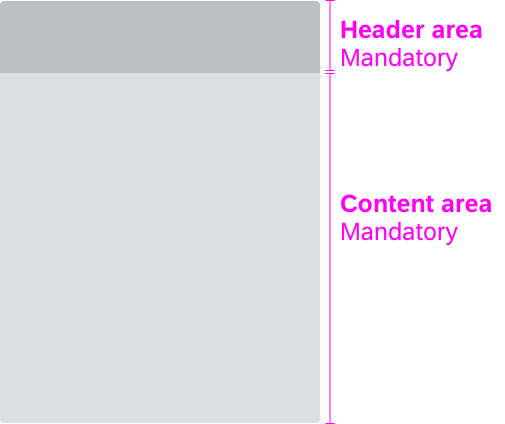
Custom card – card components
Header Area
The title and subtitle of custom cards follow the guidelines for standard titles and subtitles.
From the header area, users can navigate to the parent app. Since the entire header area is clickable, only one navigation target is allowed. We highly recommend offering this navigation option to give users access to the full-blown app with the complete set of results and actions. If a card displays a subset of grouped items, use a text label to show how many of the relevant items are showing on the card. Also refer to the guidelines for the overview page card header.
If a card features content with a single focal point (detail/entity), the header area navigation must always lead to this specific focal point. If a card features a subset of items grouped by a common criterion, the header area navigation must always lead to all items.
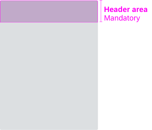
Custom card – header area
The content area is reserved for application content and shows an entry-level view of the content. The use case determines what should be shown in the content area of a custom card. The content must adhere to the standard content guidelines.
Make sure that the content is responsive.
Provide a stable context for the content area and sustain it when the user navigates away from the overview page into another app. Transfer any sort or filter criteria to the application. In other words, show the same context, but with additional information.
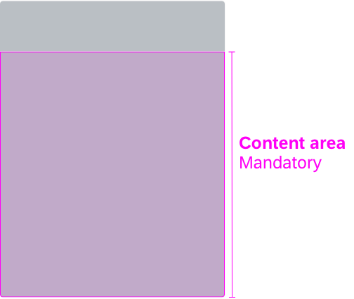
Custom card – content area
Card Size
Follow the guidelines for the fixed card layout or the resizable card layout. Make sure that the card is responsive whichever layout you use.
Guidelines
Custom cards inherit the drag and drop behavior from the standard cards. Only place custom cards on the overview page itself (not in the object stream).
Custom cards must:
- Provide information that is relevant for the user’s specific domain or role
- Offer an entry-level view of application content
- Represent a single topic, task, or context
- Provide a stable context and sustain it after navigating from the overview page to another application
- Be integrated in the Manage Cards dialog (show/hide cards)
- React on filtering (when a smart filter bar is used)
- Follow the guidelines for formatting dates, times, amounts, currencies, as well as for truncation (ellipsis). These guidelines are the same as for standard cards.
- Contain consistent texts and formatting, aligned with the other cards on the overview page. Check the UI text guidelines for the overview page for details.
Resources
Want to dive deeper? Follow the links below to find out more about the SAP Fiori overview page.
Elements and Controls
- Overview Page (SAP Fiori Element) (guidelines)
- Overview Page – Card (guidelines)
- Overview Page – UI Text Guidelines (guidelines)
Implementation
- No links
 Your feedback has been sent to the SAP Fiori design team.