
- Latest SAPUI5 Version 1.120
- Version 1.118
- SAPUI5 Version 1.116
- SAPUI5 Version 1.114
- SAPUI5 Version 1.112
- SAPUI5 Version 1.110
- SAPUI5 Version 1.108
- SAPUI5 Version 1.104
- SAPUI5 Version 1.102
- SAPUI5 Version 1.100
- SAPUI5 Version 1.98
- SAPUI5 Version 1.96
- SAPUI5 Version 1.94
- SAPUI5 Version 1.92
- SAPUI5 Version 1.90
- SAPUI5 Version 1.88
- SAPUI5 Version 1.86
- SAPUI5 Version 1.84
- SAPUI5 Version 1.82
- SAPUI5 Version 1.80
- SAPUI5 Version 1.78
- SAPUI5 Version 1.76
- SAPUI5 Version 1.74
- SAPUI5 Version 1.72
- SAPUI5 Version 1.70
- SAPUI5 Version 1.68
- SAPUI5 Version 1.66
- SAPUI5 Version 1.64
- SAPUI5 Version 1.62
- SAPUI5 Version 1.60
- SAPUI5 Version 1.58
- SAPUI5 Version 1.56
- SAPUI5 Version 1.54
- SAPUI5 Version 1.52
- SAPUI5 Version 1.50
- SAPUI5 Version 1.48
- SAPUI5 Version 1.46
- SAPUI5 Version 1.44
- SAPUI5 Version 1.42
- SAPUI5 Version 1.40
- SAPUI5 Version 1.38
- SAPUI5 Version 1.36
- SAPUI5 Version 1.34
- SAPUI5 Version 1.32
- SAPUI5 Version 1.30
- SAPUI5 Version 1.28
- SAPUI5 Version 1.26
- Latest SAPUI5 Version 1.120
- Version 1.118
- SAPUI5 Version 1.116
- SAPUI5 Version 1.114
- SAPUI5 Version 1.112
- SAPUI5 Version 1.110
- SAPUI5 Version 1.108
- SAPUI5 Version 1.106
- SAPUI5 Version 1.104
- SAPUI5 Version 1.102
- SAPUI5 Version 1.100
- SAPUI5 Version 1.98
- SAPUI5 Version 1.96
- SAPUI5 Version 1.94
- SAPUI5 Version 1.92
- SAPUI5 Version 1.90
- SAPUI5 Version 1.88
- SAPUI5 Version 1.86
- SAPUI5 Version 1.84
- SAPUI5 Version 1.82
- SAPUI5 Version 1.80
- SAPUI5 Version 1.78
- SAPUI5 Version 1.76
- SAPUI5 Version 1.74
- SAPUI5 Version 1.72
- SAPUI5 Version 1.70
- SAPUI5 Version 1.68
- SAPUI5 Version 1.66
- SAPUI5 Version 1.64
- SAPUI5 Version 1.62
- SAPUI5 Version 1.60
- SAPUI5 Version 1.58
- SAPUI5 Version 1.56
- SAPUI5 Version 1.54
- SAPUI5 Version 1.52
- SAPUI5 Version 1.50
- SAPUI5 Version 1.48
- SAPUI5 Version 1.46
- SAPUI5 Version 1.44
- SAPUI5 Version 1.42
- SAPUI5 Version 1.40
- SAPUI5 Version 1.38
- SAPUI5 Version 1.36
- SAPUI5 Version 1.34
- SAPUI5 Version 1.32
- SAPUI5 Version 1.30
- SAPUI5 Version 1.28
- SAPUI5 Version 1.26
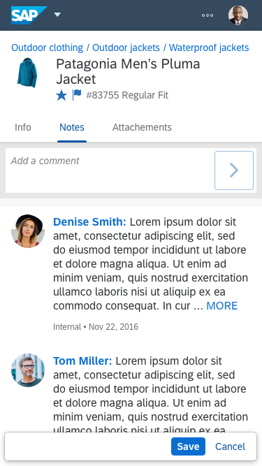
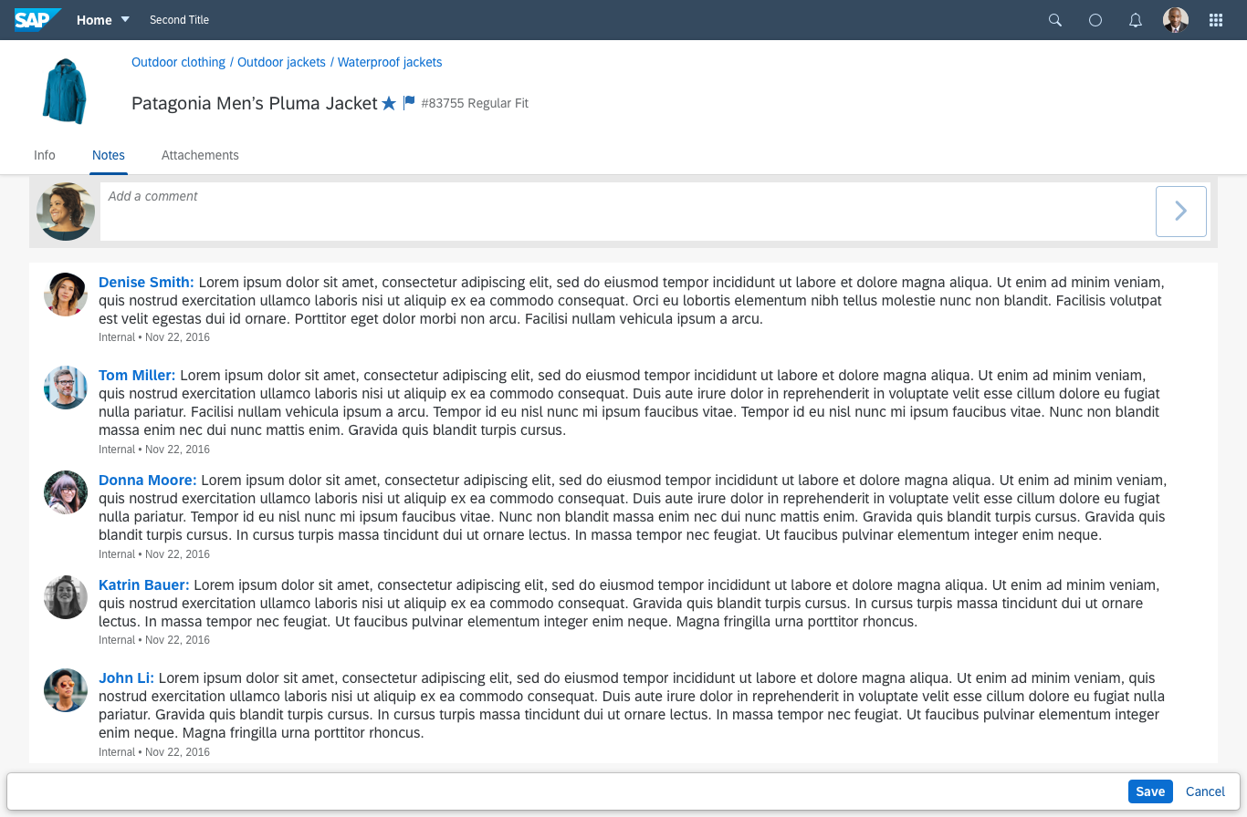
Feed and Notes
sap.m.FeedInput | sap.m.FeedListItem
Intro
Feeds and notes are commonplace in many SAP Fiori applications. The sap.m.FeedInput control allows users to input and post plain text, while the sap.m.FeedListItem control handles and displays this text. Both can be used individually, but they also complement each other well to create a simple feed or notes control.
Usage
Feed Input
Use the feed input if:
- A user needs to input small amounts of text without formatting.
- You expect multiple instances, such as notes or feed entries.
Do not use the feed input if:
- The user needs to format the text (rich text editor).
- You need only a single text box instance. In this case, use the text area (for multiple lines) or the text control (for a single line).
Combination of Both Controls (as Feed or Notes Control)
Use both controls if:
- You need a feed to show textual posts.
- Your users need to input notes.
Do not use both controls if:
- You expect extensive social interaction in the feed.
- Users need to reply at item level instead of creating a new post.
- You want to display SAP Jam feeds.
In these cases, use the social timeline instead (requires SAP Jam).
Responsiveness
Due to their responsive behavior, both controls can be used in small and large view ports or screens.
For better usability, we highly recommend that you do not stretch the controls across the full width on large screens – 2/3 or even 1/2 works just fine. This can easily be achieved using the grid layout .
Feed – Size S

Feed – Size M
Feed – Size L
When the width of the available space falls below 25 rem (for example, in portrait mode on smartphones), the two controls respond as follows:
- If a user image previously appeared in the feed input, it will be omitted in narrow screens to give the text field more space.
- If there is no user image, there will be no visual change.
Feed input – Responsiveness
In the feed list item, the user’s name, image, and the time stamp move on top of the text. If there is no image, the name and time stamp are left-aligned together with the text.

Feed list item – Responsiveness – With image
Feed list item – Responsiveness – Without image
Layout
Feed Input
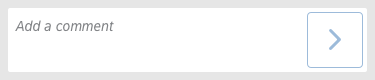
The feed input consists of:
- A text input field with a placeholder (input prompt)
Example: Add a comment - A Send button
- An optional user image
You can also choose not to show user images at all. In this case, the size of the input area increases automatically.
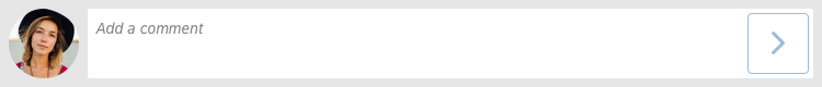
Feed input – Layout – With user image
Feed input – Layout – With generic user image
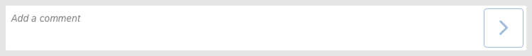
Feed input – Layout – Without user image
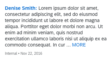
Feed List Item
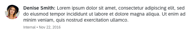
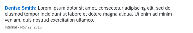
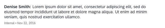
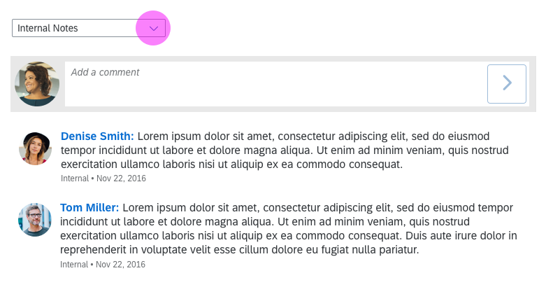
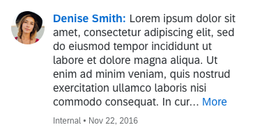
The feed list item consists of the user’s name and an optional picture of the user who wrote the note or update. The name can contain a link that triggers a quick overview of the user’s profile data. The actual text written by the user follows the name. Below it is a separate byline that can contain a time stamp and an attribute in the form of free text. This allows you to put in your own attribute, such as Approval, Internal, or External. Both the time stamp and the attribute are optional.
If the name is a link, the picture should also be linked with the same attributes.
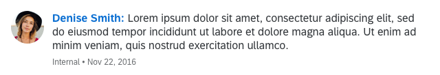
Feed list item – With user image and linked name
If the user does not have a picture assigned, a placeholder is shown instead:
Feed list item – With generic user image and linked name
The name (and picture) can also be read-only, that is, without a link:
Feed list item – With user image but without links
If the app does not support user images, they can be omitted:
Feed list item – Without user image but with linked name
Here, too, the name can be read-only:
Feed list item – Without user image and read-only name
It’s also possible to display rich text (formatted text) in the feed list item. This feature should be handled with care as it allows for countless custom layouts.
Please see that you use it responsibly and provide your users with a consistent experience. Only deviate from the default layout and font if absolutely required by the use case.
Example use case: Render URLs as links.
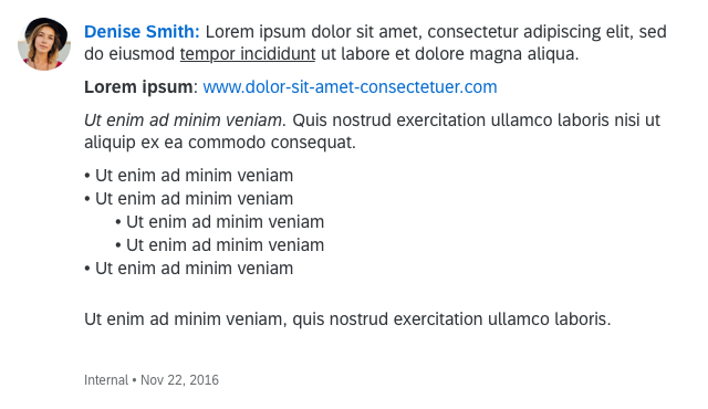
Feed list item – Layout – Rich text
Special Case: Multiple Types of Notes
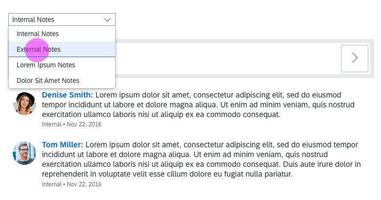
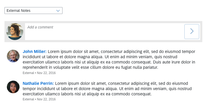
Apps sometimes need to discern between different types of notes. There is an easy way to allow users to choose which type they want to see or add to the list.
You can place a toolbar containing a select control at the top of the feed input control. From there, users can select the type of notes, such as Internal Notes or External Notes. The list of notes must contain only the type selected. If the user adds a note via the feed input, the type must be set automatically according to the selection.
Interaction – Note Types
Components
The feed input and feed list item do not contain subcontrols. However, you can easily combine them to create a simple feed or notes control.
Although the feed input counts as a single control, the input area inherits its behavior from the sap.m.TextArea control.
Behavior and Interaction
Send Message
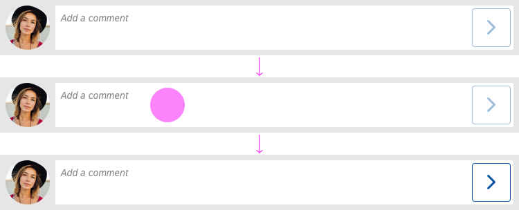
Initially, the feeder contains a placeholder (input prompt), and the Send button is disabled, with reduced opacity.
Clicking into the input field puts the focus on the field and allows to start typing.
When the user starts to type, the placeholder disappears and the Send button becomes active and more prominent.
If the available width is below 25 rem (for example, in portrait mode on a smartphone), the picture is removed.
To send the text, the user must explicitly click the Send button. Pressing Enter on the keyboard (on-screen or physical) results in a line break.
Feed input – Behavior
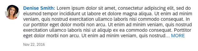
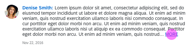
Show More Text
When the text exceeds a certain number of characters (you can overwrite the default value), the rest of the text is truncated and a MORE link appears after the truncated section.
The MORE link indicates the possibility of expanding the section of the feed list item itself. Hovering over the link underlines it.
Show Less Text
When the user expands the text, the name of this link changes to LESS, but still behaves the same way as before.
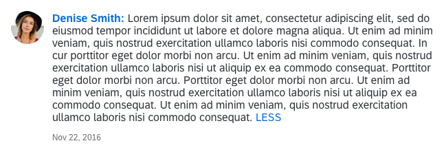
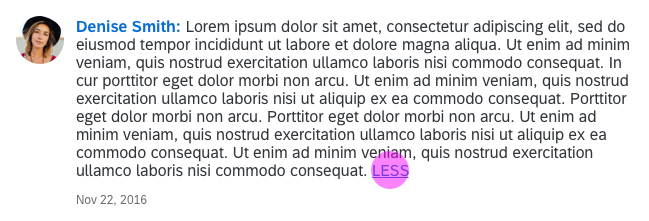

Modify “MORE” / “LESS” links to “More / Less” to be consistent with other components.
More link
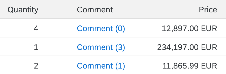
Feed and Notes in Tables
In tables, users sometimes need to see if an object has a comment (or feed or note) without further navigation, and even be able to add/edit right from the table.
Add an additional column, named according to the type of user input, such as Comment, Note, or Feed.
Place a link inside each cell with the appropriate action (row: Comment, link: Comment / row: Feed, link: Post).
If there can be more than one item, add a counter after the text as well (see example on the right).
This solution works with every table control.
Feed and notes in tables (1)
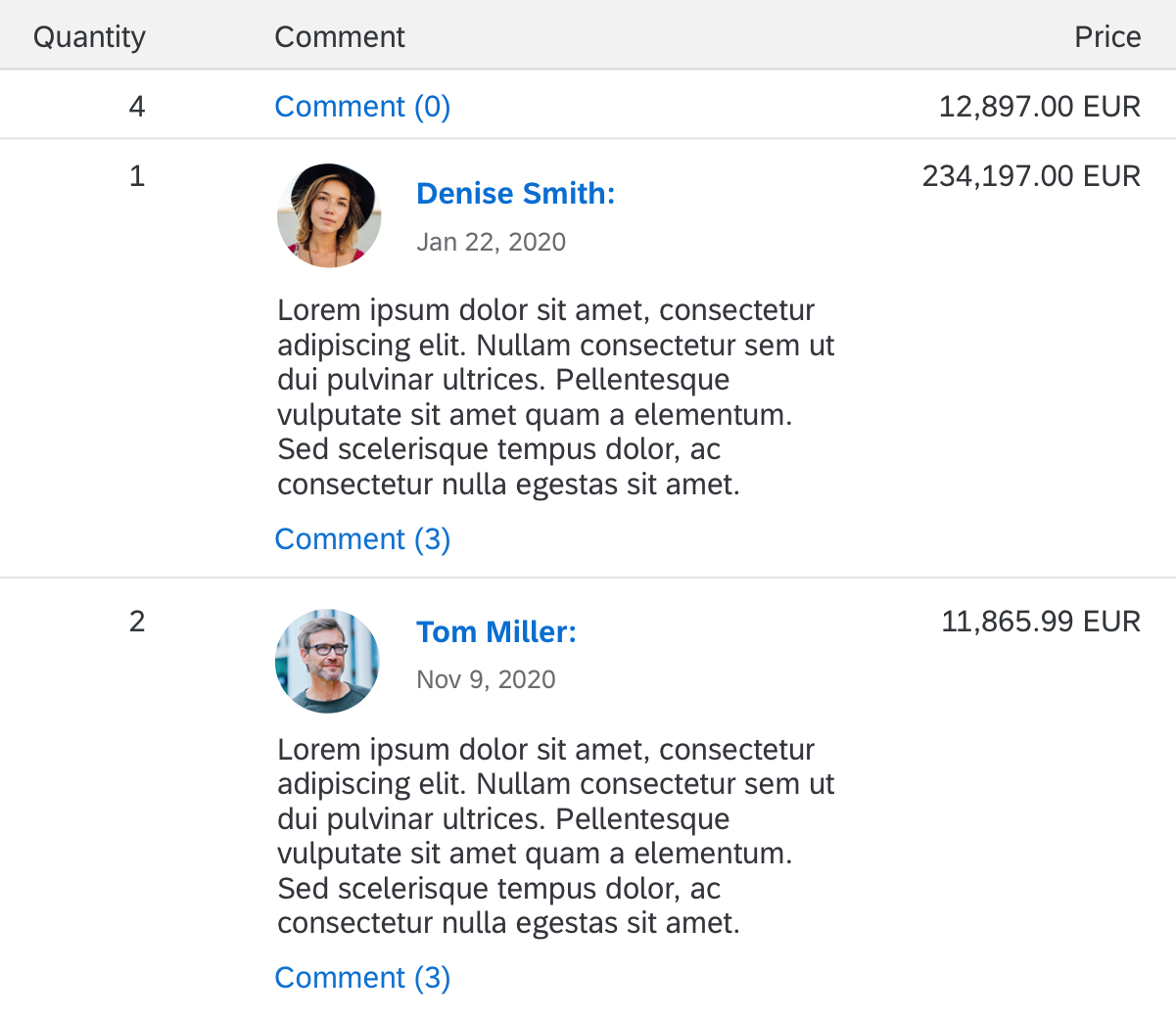
Optional:
Depending on the use case, it might help users if they can see the latest note. The responsive table allows the feed list item (sap.m.FeedListItem) to be used inside a cell.
Reduce the property “maxCharacters” to an amount that your table can handle.
Note that once the maximum number of characters has been reached, a MORE link allows users to expand the text. Technically, this is no problem for the responsive table, but you need to ensure that the layout of your page allows this kind of expansion.
Place a link below the feed list item to allow users to add something (as described above).
Feed and notes in tables (2)
When the user clicks a link, such as Comment or Note, display a dialog showing all comments (notes, feed entries, and so on) along with possible actions, such as Add or Edit, depending on your use case.
There are several ways to show notes (comments, feed entries, and so on) in a dialog:
- You can use the feed list item (and feed input) as described in this article.
- If only one single note is allowed, you can use the text area.
- For a large feed, you can use the timeline control (SAP Jam is required for social features).
Actions On Feed List Items
Applications can define actions that users can perform on individual feed posts. The two most typical actions are Edit and Delete. Other actions can be introduced as required by the use case. To keep the feed as lightweight as possible, don’t overwhelm users with too many actions or complicated actions (max. 5 per post).
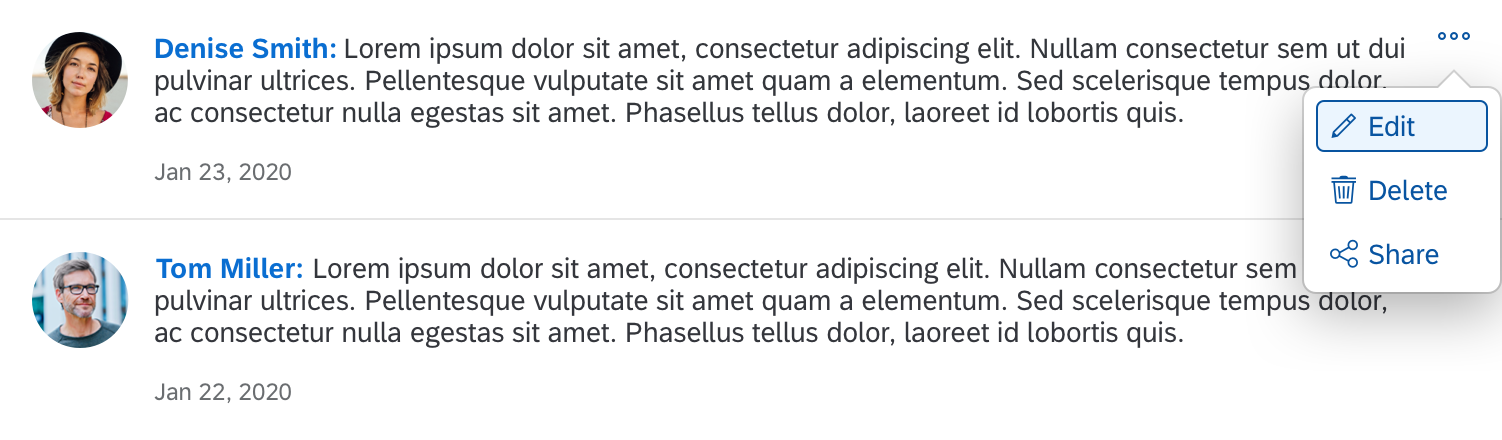
Interaction - Actions
Styles
By default, feed entries are separated by divider lines. We recommend that these separators remain enabled, since they help distinguish between individual posts. However, if your list is expected to hold only a handful of entries, you can disable the separators by setting the showSeparators property at list level (not at list item level) to none.
Guidelines
Because the feed list item is built on the basis of the standard list item, it inherits multiple properties that may not make sense in a feed use case.
Use only properties that are described in this article. Especially making the entire feed list item clickable can lead to functional issues and usability problems.
Don’t stretch the feed input or the feed list items across large screens (size L and beyond). This will have a negative effect on usability and readability. Instead, only use 1/3 or even 1/2 of the screen. Implement this with the grid layout .
If you display formatted text (rich text) in the feed list item, use formatting that is beneficial to users, not decorative formatting. Use formatting responsibly, and provide your users with a consistent experience. Deviate from the default layout and font only if absolutely required by the use case (example: render URLs as links).
Resources
Want to dive deeper? Follow the links below to find out more about related controls, the SAPUI5 implementation, and the visual design.
Elements and Controls
- No links.
Implementation
- Feed Input (SAPUI5 samples)
- Feed List Item (SAPUI5 samples)
- Feed Content (SAPUI5 samples)
- Feed Input (SAPUI5 API reference)
- Feed List Item (SAPUI5 API reference)
- Feed Content (SAPUI5 API reference)
 Your feedback has been sent to the SAP Fiori design team.