
- Latest SAPUI5 Version 1.120
- Version 1.118
- SAPUI5 Version 1.116
- SAPUI5 Version 1.114
- SAPUI5 Version 1.112
- SAPUI5 Version 1.110
- SAPUI5 Version 1.108
- SAPUI5 Version 1.104
- SAPUI5 Version 1.102
- SAPUI5 Version 1.100
- SAPUI5 Version 1.98
- SAPUI5 Version 1.96
- SAPUI5 Version 1.94
- SAPUI5 Version 1.92
- SAPUI5 Version 1.90
- SAPUI5 Version 1.88
- SAPUI5 Version 1.86
- SAPUI5 Version 1.84
- SAPUI5 Version 1.82
- SAPUI5 Version 1.80
- SAPUI5 Version 1.78
- SAPUI5 Version 1.76
- SAPUI5 Version 1.74
- SAPUI5 Version 1.72
- SAPUI5 Version 1.70
- SAPUI5 Version 1.68
- SAPUI5 Version 1.66
- SAPUI5 Version 1.64
- SAPUI5 Version 1.62
- SAPUI5 Version 1.60
- SAPUI5 Version 1.58
- SAPUI5 Version 1.56
- SAPUI5 Version 1.54
- SAPUI5 Version 1.52
- SAPUI5 Version 1.50
- SAPUI5 Version 1.48
- SAPUI5 Version 1.46
- SAPUI5 Version 1.44
- SAPUI5 Version 1.42
- SAPUI5 Version 1.40
- SAPUI5 Version 1.38
- SAPUI5 Version 1.36
- SAPUI5 Version 1.34
- SAPUI5 Version 1.32
- SAPUI5 Version 1.30
- SAPUI5 Version 1.28
- SAPUI5 Version 1.26
- Latest SAPUI5 Version 1.120
- Version 1.118
- SAPUI5 Version 1.116
- SAPUI5 Version 1.114
- SAPUI5 Version 1.112
- SAPUI5 Version 1.110
- SAPUI5 Version 1.108
- SAPUI5 Version 1.106
- SAPUI5 Version 1.104
- SAPUI5 Version 1.102
- SAPUI5 Version 1.100
- SAPUI5 Version 1.98
- SAPUI5 Version 1.96
- SAPUI5 Version 1.94
- SAPUI5 Version 1.92
- SAPUI5 Version 1.90
- SAPUI5 Version 1.88
- SAPUI5 Version 1.86
- SAPUI5 Version 1.84
- SAPUI5 Version 1.82
- SAPUI5 Version 1.80
- SAPUI5 Version 1.78
- SAPUI5 Version 1.76
- SAPUI5 Version 1.74
- SAPUI5 Version 1.72
- SAPUI5 Version 1.70
- SAPUI5 Version 1.68
- SAPUI5 Version 1.66
- SAPUI5 Version 1.64
- SAPUI5 Version 1.62
- SAPUI5 Version 1.60
- SAPUI5 Version 1.58
- SAPUI5 Version 1.56
- SAPUI5 Version 1.54
- SAPUI5 Version 1.52
- SAPUI5 Version 1.50
- SAPUI5 Version 1.48
- SAPUI5 Version 1.46
- SAPUI5 Version 1.44
- SAPUI5 Version 1.42
- SAPUI5 Version 1.40
- SAPUI5 Version 1.38
- SAPUI5 Version 1.36
- SAPUI5 Version 1.34
- SAPUI5 Version 1.32
- SAPUI5 Version 1.30
- SAPUI5 Version 1.28
- SAPUI5 Version 1.26
Wizard Floorplan
Intro
The wizard floorplan allows users to complete a long or unfamiliar task by dividing it into sections and guiding the user through it. The wizard consists of the walkthrough screen, where the form sections are revealed in sequence after each one is completed, and the summary page, where the form is displayed in read-only mode for assessment and final submission. In general, you can use the wizard both in full screen mode and in a modal dialog. Beyond that, the wizard in full screen mode can also be used in a flexible column layout.
Wizard in full screen mode - Steps
Wizard in a modal dialog - Steps
Usage
Wizard in Full Screen Mode
When to Use the Wizard Floorplan
The wizard aims to help users by dividing large or complex tasks into segments. Use the wizard if the user has to accomplish a long task (such as filling out a long questionnaire) or a task that is unfamiliar to the user. The flow should consist of a minimum of 3 and a maximum of 8 steps.
The wizard can be used for both create and edit scenarios. If your application contains both, consider using the same format for both scenarios – either the wizard, or another create/edit screen (edit flow or object page).
When Not to Use the Wizard Floorplan
If you have a task with only 2 steps or a format that the user is familiar with (for example, it is part of their daily routine), do not use the wizard as it only adds unnecessary clicks to the process. If your process needs more than 8 steps, the wizard will not support those steps, as the process is too long and can be confusing for the user. In this case, consider restructuring the task.
Consider whether the classic edit screens (edit flow or object page) are more suitable for your use case.
Wizard in a Modal Dialog
When to Use the Wizard in a Modal Dialog
We recommend using the wizard in a modal dialog if:
- The wizard is closely connected to the triggering page, and the user needs to return to that page quickly.
- Users need to be able to open the wizard from any part of the product/page.
- The size of the wizard needs to be flexible.
When Not to Use the Wizard in a Modal Dialog
Don’t use the wizard in a modal dialog if the app you are using is a standalone application that has no relation to the page it has been triggered from. Instead, use it in a full screen layout.
Structure
The wizard has two screens: the walkthrough screen, where users complete a segmented task, and the summary screen, where they can check the data they are about to submit. Wizard content is not restricted to forms; you can also use other elements, such as a value help dialog.
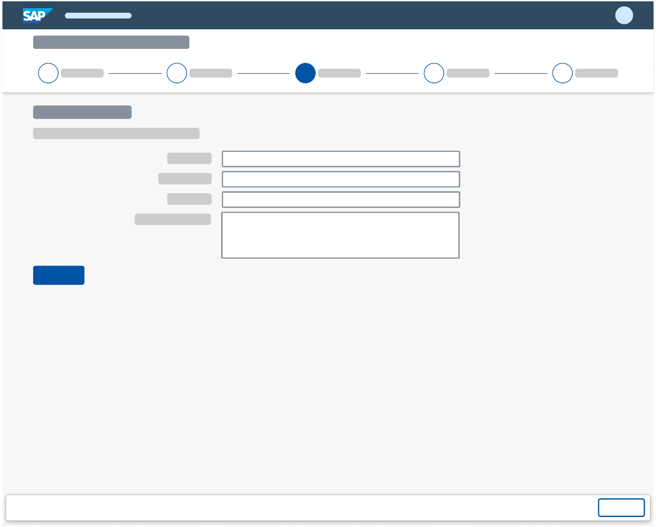
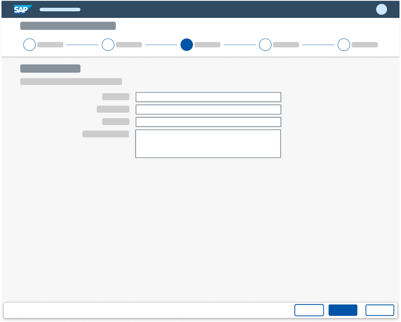
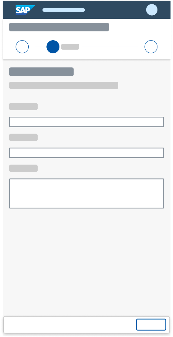
Walkthrough Screen
After triggering the wizard from a floorplan, the user is taken to the main walkthrough screen, which shows only the first section of the form. Users can also trigger the wizard app from another application, from the launchpad, or from a notification. The wizard always starts at the initial walkthrough page and ends after the user has clicked the main action (such as Create or Submit) on the summary screen.
The wizard comes with two different behaviors, which have different navigation patterns. Their usage depends on the use case.
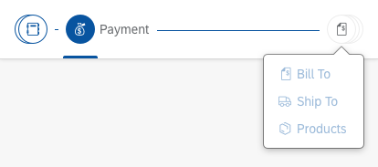
Anchor Bar / One-Page Behavior
The anchor bar behaves in the same way as the anchor bar in an object page. It consists of a series of links (steps) that are arranged horizontally at the top of the page. Clicking a link navigates to the respective step on the page.
The Next Step button is only used on the walkthrough page. Once the user has filled out all the necessary fields, a Next Step button appears below the content, which allows the user to continue with the next section of the form. If the user needs to navigate to the previous section of the form, it is possible either to scroll up the page or to navigate back by using the progress bar. When the user has completed the last section of the wizard, the button label changes to Review, and the user is taken to the summary screen. On the summary screen, the user can use either the Edit button in the footer or the Back arrow to return to the wizard and edit any of the fields. The wizard footer is used to display the Cancel button, which exits the wizard. If the user has modified any fields, a data loss warning appears. If the form is long, and the user may have to save it before finishing, you can offer a Save as Draft option in the footer.

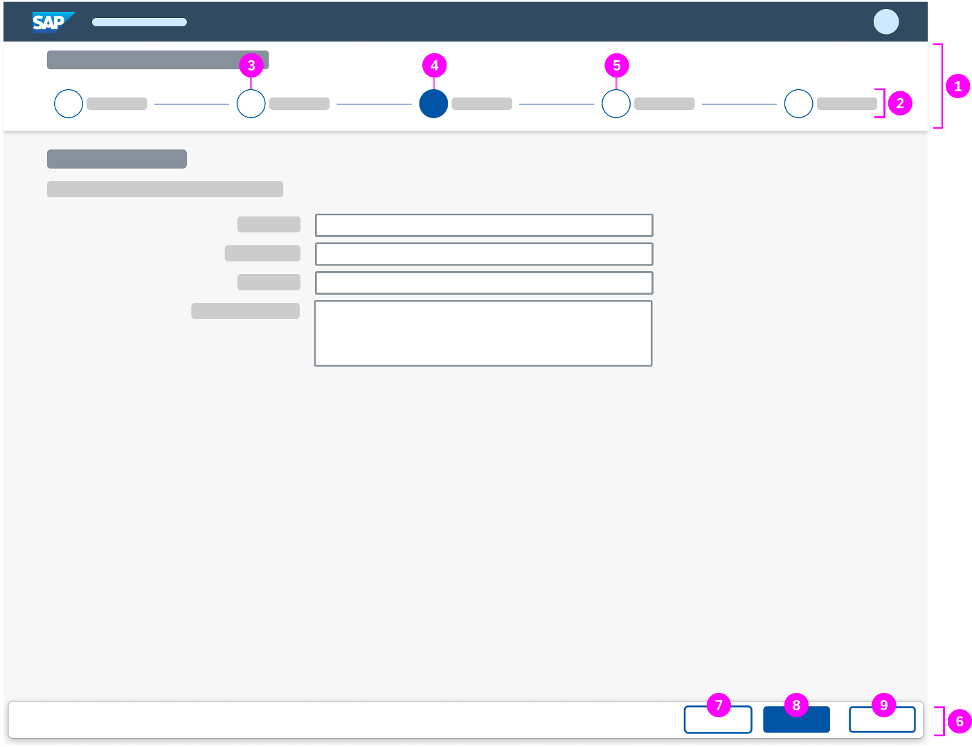
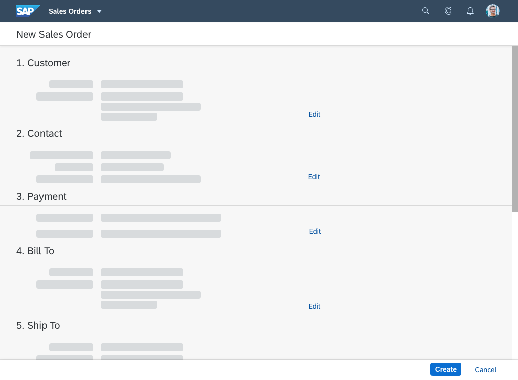
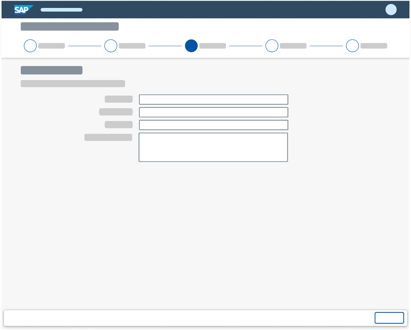
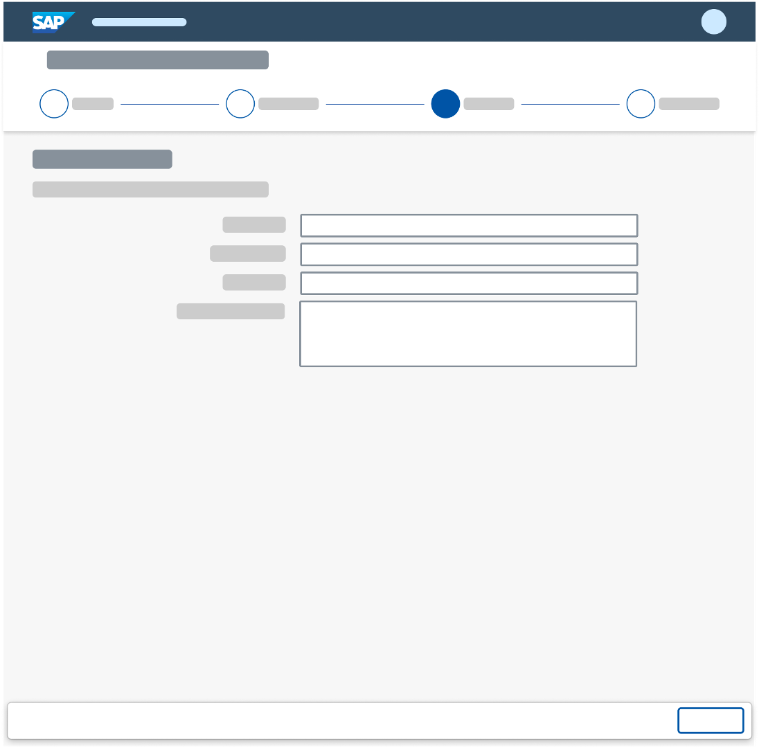
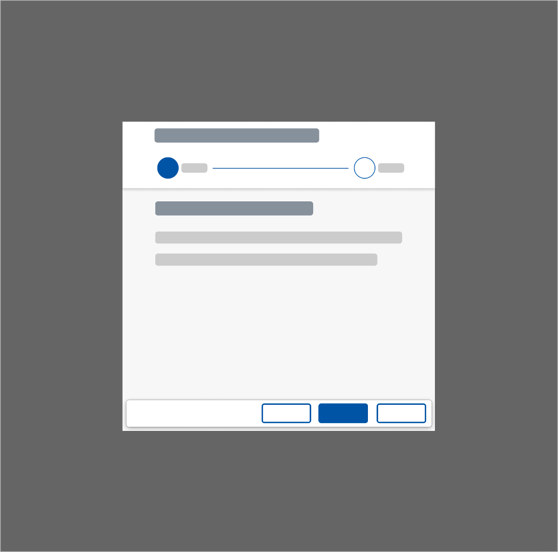
Walkthrough screen in full screen layout used with an anchor bar
- Header toolbar with title
- Progress bar
- Completed step
- Current step
- Upcoming step
- Step title (for example: 3. Payment)
- Action for the next step
Tab Bar
As an alternative to the anchor bar, you can also use the tab mode (property: rendermode, value: Page). It is visualized in the same way, but shows a series of tabs (steps). These are arranged horizontally at the top of the page and each represents a subpage. Clicking a tab displays the respective subpage.
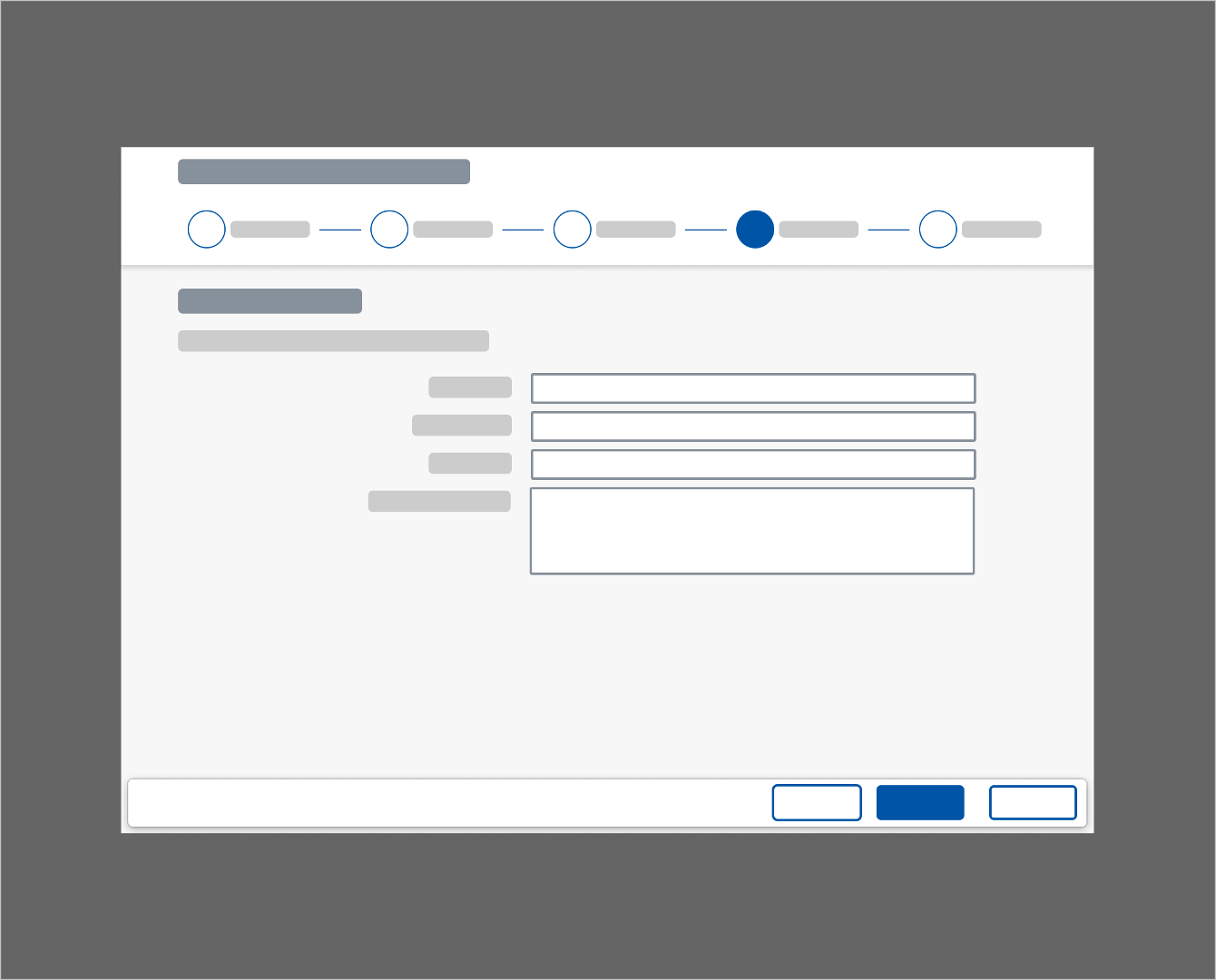
Unlike the anchor bar, the tab bar comprises not only a Next Step button but also a Previous Step button. Place the Next Step button in the footer toolbar, as in the summary screen. As soon as users move to the following step, show an additional Previous Step button on the left. This follows the guidance for action placement: if the primary action (such as Next Step) is a forward path, it needs to appear to the right of the secondary action. In the case of the wizard, the secondary action is Previous Step. The negative path action Cancel remains unchanged.
After filling out all the necessary fields for a step, the user can navigate to the next step by clicking the Next Step button. To navigate back to the previous step, the user can either click the Previous Step button or use the progress bar at the top of the wizard. If you use tabs, each tab is a single wizard step.
When the user has completed the last wizard step of the walkthrough screen, the Next Step button changes to Review, and the user is taken to the summary screen. Since the tab bar is also used for the summary screen, the user can either use the Previous Step button to return to the prior wizard step or use the Next Step button, which changes to the Create/Submit button to finalize the wizard application.
To go back and edit entries for single wizard steps, the user can either use the Edit buttons on the summary screen or select the step in the progress bar. Beneath the Next Step/Previous Step buttons for processing the wizard, the wizard footer toolbar is also used to display the Cancel button, which exits the wizard.
If the user has modified any fields and navigates away, a data loss warning appears. If the form is long, and the user may have to save it before finishing, you can offer a Save as Draft option in the footer.
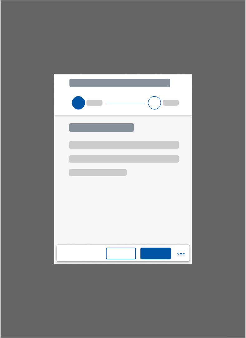
Walkthrough screen in full screen layout used with a tab bar
- Dynamic page header with title
- Progress bar
- Completed step
- Current step
- Upcoming step
- Dynamic page footer toolbar
- Previous step button
- Next step/finalizing button
- Cancel button to exit wizard
The title in the header toolbar above the wizard remains unchanged during all the wizard steps. Align this title left, and make it clear to users where they are and what they are doing (for example, New Sales Order or Sales Order 4815162342). Especially in edit scenarios, it is vital to give users a unique identifier for the object they are changing.
The progress bar below the header highlights the completed steps and the current step. It also allows the user to navigate between steps by clicking any of the circles. If there are multiple steps, and the screen width is reduced, the steps on the progress bar are grouped. This behavior is the same on smartphone, tablet, and desktop screens.
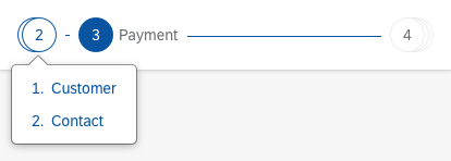
Wizard tooltip – Grouped steps
In certain use cases, the steps in the wizard depend on the choices the user makes along the way. The user’s entries for one step determine the follow-on steps (“branching”). In these cases, a dotted line shows that more steps will follow.

Wizard branching
Since the wizard is a lightweight way to create or edit objects, applications can use a quick confirmation popover instead of the heavier data loss message when the user selects Cancel.
If the wizard is used to create an object, the text in the popover should read Discard this <object>?’ . If the wizard is used to edit an object, use the text Discard changes? In both cases, use Discard as the action on the popover.

Structure – Quick confirmation
Modifying dependent steps: If there are steps that depend on each other (for example, a selection in step 2 triggers an additional step), and the user modifies the parent step, the dependent step is changed or deleted. Beforehand, the user is warned that data will be lost.
On the summary screen, users can check all their entries before the object is actually created or changed. Depending on the use case, and whether the wizard is used with an anchor bar or a tab bar, the structure of the summary screen differs.
- If the wizard is used with an anchor bar, the summary screen has no progress bar or anchor navigation, and shows the form sections for all the steps in read-only mode.
- If the wizard is used with a tab bar, the summary screen is included as a step in the progress bar, and therefore the progress bar and the tab bar are still visible. It shows the form sections for all the steps.
To allow the user to go back and edit entries, provide an Edit button in each form section. Alternatively, users can click the Previous Step button or scroll up to go to the previous step/section.
On the summary page, show the finalizing action, such as Create or Save.
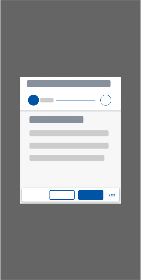
Wizard summary page example
Layout
The wizard floorplan can be used in both the full screen layout and in a modal dialog. Thanks to its responsive behavior, it is also possible to use the full screen layout in the flexible column layout. Since there are no subsequent pages after the wizard, it always occupies the rightmost column – there is no navigation from the wizard to a subsequent page. After completing (or canceling) the wizard, the user is always returned to the triggering page.
Wizard in full screen layout used with tab bar
Wizard in a modal dialog used with tab bar
Wizard in full screen layout used with anchor bar
Wizard in flexible column layout (2/3)
Wizard in flexible column layout (1/3)
Types
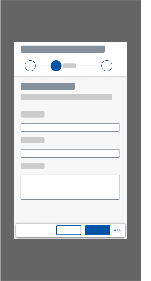
There are two types of wizard – “standard” and “branching” – which differ in terms of the functions they offer.
Use the standard type if:
- The total number of steps is known in advance.
- The number of steps does not change during usage.
- There is linear progression from one step to the next.
Use the branching type if:
- The total number of steps is not known.
- The number of steps may change during usage.
- There is non-linear progression. In other words, the user’s choice during one step determines which step comes next.
In both types of wizard you can let users skip steps. Label these steps as “Optional”.
Styles
In addition to the functional types, there are also different visual styles.
Numbers and Icons
By default, both versions use a number inside a circle to represent each step. You can also use icons instead of numbers to help users identify the steps. If you plan to use icons, be sure to assign icons to all the steps (not just to some). Always choose unique, clearly distinguishable icons for each step.

Steps represented by numbers
Steps represented by icons
Labels
To help users identify the individual steps even more easily, app developers can assign labels. As with icons, labels must be applied to all or none of the steps.
If there is enough horizontal space, all labels are shown.

All labels are visible
As the width is reduced, the label is only shown for the currently selected step.

Labels - reduced width
The unselected and outermost steps are stacked on top of each other to further accommodate the reduced space.

Stacked labels
To access steps inside a stack, users click can open a list of hidden steps.
Labels - stacked popover
Optional Steps
For optional steps, add an (Optional) label. Place the (Optional) label below the content label for the step.

Correct: '(Optional)' label below the content label for the step
Explanatory Texts
Ideally, the headlines and field labels for each step should provide enough information for users to complete their tasks. However, if additional explanations are needed, applications can put a simple text underneath a step headline – either via the sap.m.Text or the sap.m.FormattedText control.
Responsiveness and Adaptiveness
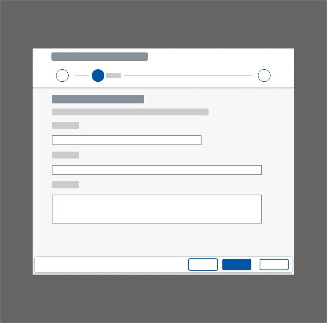
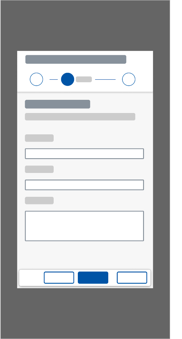
The wizard floorplan is available in the sizes: S, M, L and XL. This is also applicable to the wizard in a modal dialog.
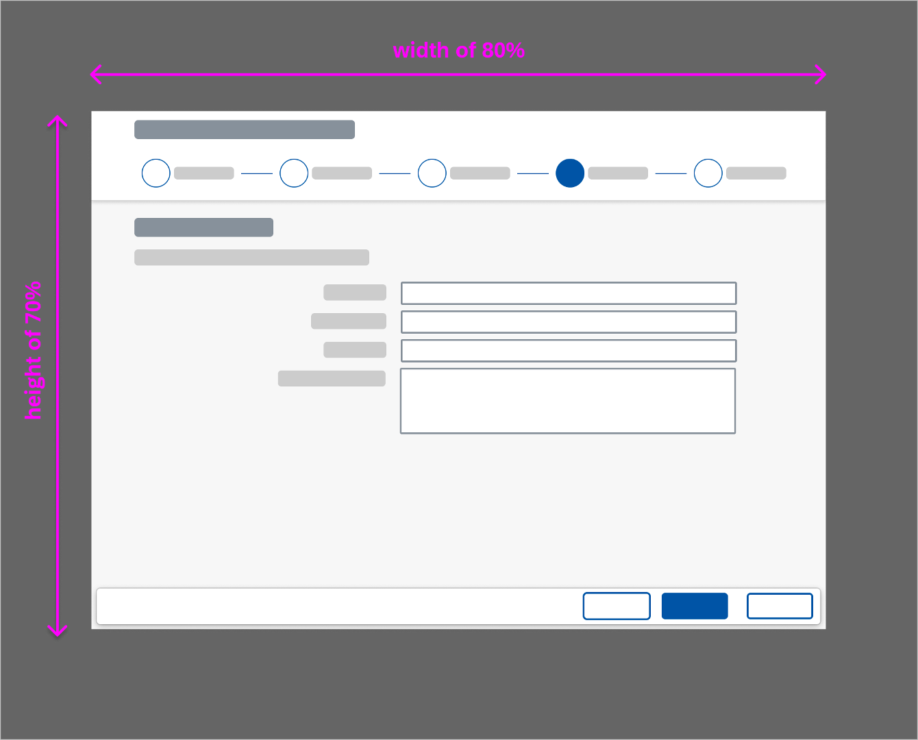
As the size being used highly orientates on the content and the space that is needed for it, there aren’t any fixed sizes available. For a wizard with a lot of content, in modal dialog it is recommended to use width of 80% and height of 70%. For less content, the size of the modal dialog should match the content.
Wizard - Size L
Wizard - Size M
Wizard - Size S
Wizard modal dialog - Size L
Wizard modal dialog - Size M
Wizard modal dialog - Size S
If there is not much content available with a lot of whitespace around it, the wizard in a modal dialog could look like this:
Micro wizard - Size M (1)
Micro wizard - Size M (2)
Micro wizard - Size S
The wizard in full screen layout as well as in the modal dialog supports all common screen sizes and is available in cozy and compact modes, as well as high-contrast black (HCB).
On small screen if the space needed for the action buttons located in the footer toolbar (Previous/Next step) is not enough an overflow appears on the right side, containing the cancel button.
Wizard modal dialog overflow behavior - Size S
Behavior and Interaction
Initial Focus
When the wizard is first loaded, focus on the first editable control in the first step.
Exceptions:
- The user opens a page using a link that jumps directly to a specific step. In this case, focus on the first editable control in this step.
- The user opens the wizard using one of the Edit actions from the review screen. In this case, focus on the first editable control in the selected editing step.
Error and Draft Handling
Error Handling
Error handling is done via message popovers. When the user clicks the button for the next step, the form sections and fields are validated. When the user clicks the Create button on the summary page, the entire form is validated. If there are any errors, the message popover is displayed, and clicking any of the error items scrolls the page to the relevant field, which is also highlighted in red.
Section validation differs from validation of the entire form:
- Section validation: Validates the entries in the form fields.
- Form validation: Checks the entire form for back-end system errors (such as duplicated data entry).
Draft Handling
If a draft already exists when a user enters the wizard, show a dialog to inform the user. For more information, see Draft Handling.
Expand to Full Screen
If the wizard is displayed in a modal dialog, the user can switch between the standard size and a near full screen size. This is done by clicking the Enter Full Screen icon on the top-right corner.
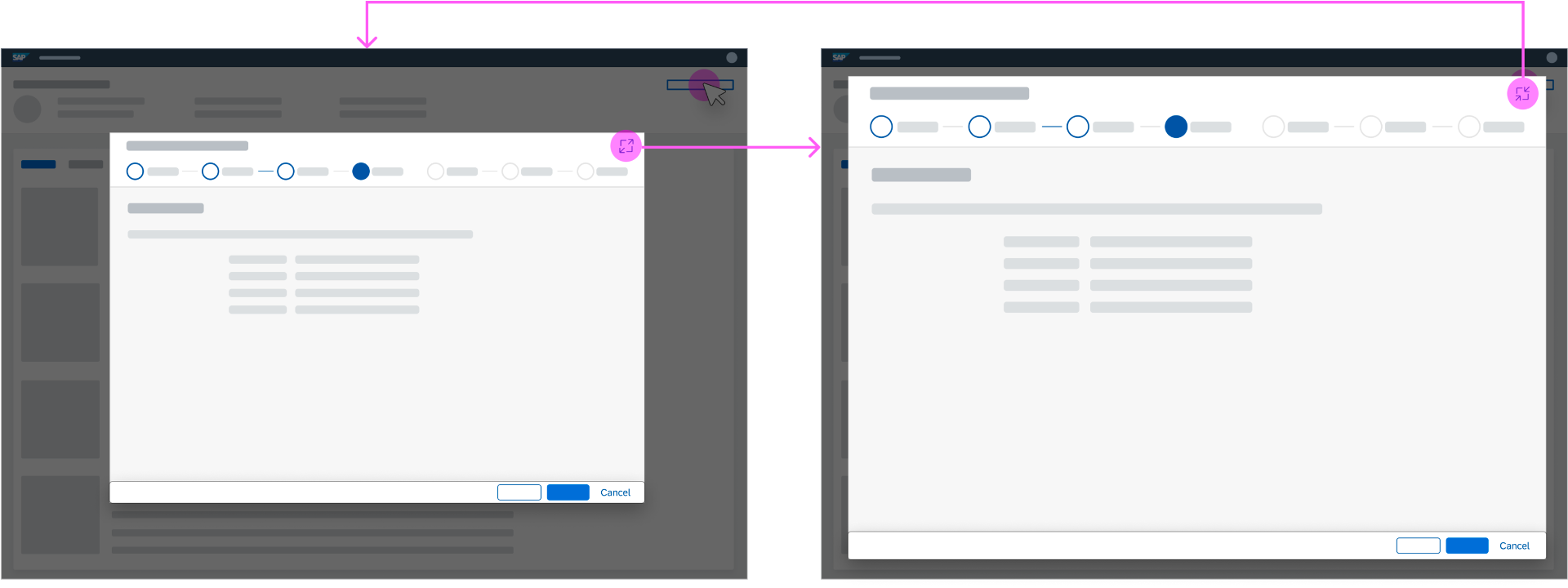
Wizard modal dialog - Expand to near full screen size
Resizing & Dragging
Resizing
If the wizard is in a modal dialog, we advise against allowing users to resize the dialog freely. This distracts users and prevents them from solving their tasks quickly.
Dragging
If the wizard is in a modal dialog, you can allow users to drag and drop the dialog to a different position on the page by clicking on the top of the dialog window. This can be helpful if the user needs information from the underlying page.
Busy States
You can also use busy states. Currently, there are two different types of busy states available. One for initiating the wizard from a floorplan, and another for loading the single content parts of a wizard step.
Initiating the Wizard from a Floorplan
If initiating the wizard from a floorplan takes longer than one second, the control shows a busy state. As soon as the wizard is available, the busy state is removed, and the single parts of the wizard step are loaded.
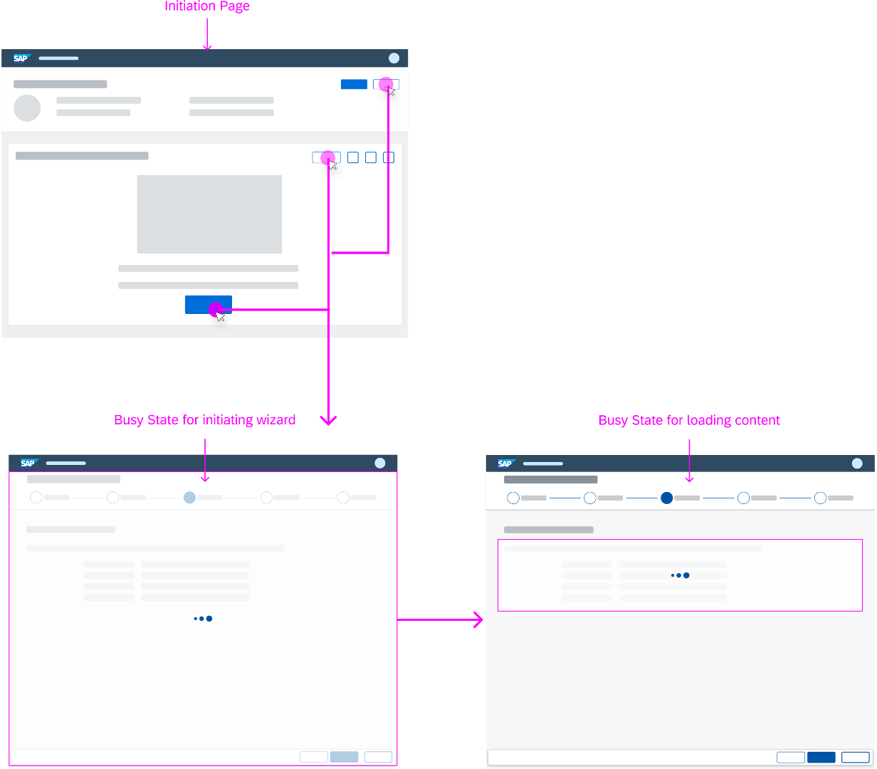
Busy state - Initiating wizard from a floorplan (example)
Loading the Single Parts of a Wizard Step
If loading the single parts of a wizard step takes longer than one second, set the control to the busy state. If loading was successful, the busy indicator is removed and the content is shown. If loading wasn’t successful, the busy indicator is removed, an error message strip appears, and the content isn’t shown.
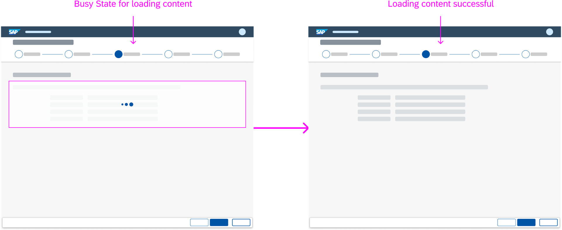
Busy state - Loading the single parts of a wizard step (successful)
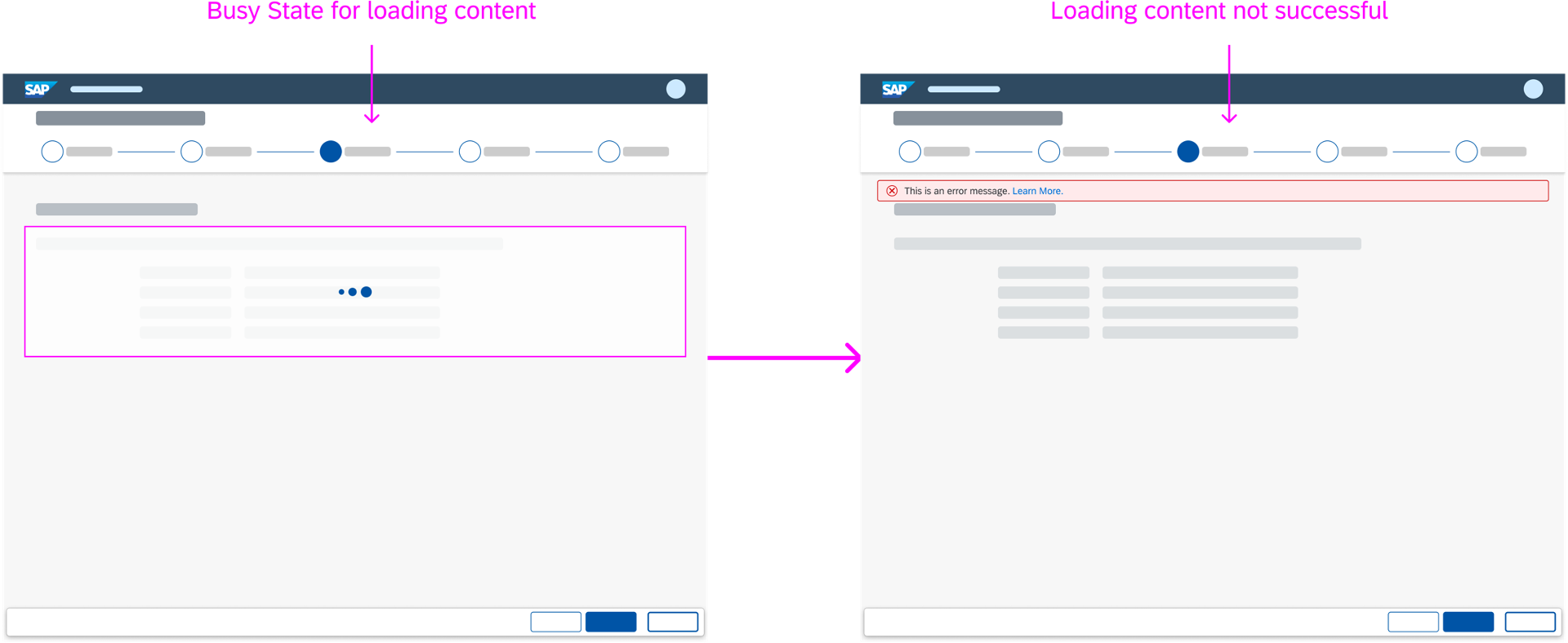
Busy state - Loading the single parts of a wizard step (not successful)
Dynamic Page
Header
Even though the wizard floorplan consumes the dynamic page, the wizard header does not allow snapping. The wizard floorplan comes with its own step-based header that already saves space.
Footer Toolbar
The footer toolbar of the wizard floorplan conforms to the standard dynamic page layout and uses the sap.m.bar control.
Resources
Want to dive deeper? Follow the links below to find out more about related controls, the SAPUI5 implementation, and the visual design.
 Your feedback has been sent to the SAP Fiori design team.