- Latest Version 1.128
- Version 1.126
- SAPUI5 Version 1.122
- SAPUI5 Version 1.120
- SAPUI5 Version 1.118
- SAPUI5 Version 1.116
- SAPUI5 Version 1.114
- SAPUI5 Version 1.112
- SAPUI5 Version 1.110
- SAPUI5 Version 1.108
- SAPUI5 Version 1.106
- SAPUI5 Version 1.104
- SAPUI5 Version 1.102
- SAPUI5 Version 1.100
- SAPUI5 Version 1.98
- SAPUI5 Version 1.96
- SAPUI5 Version 1.94
- SAPUI5 Version 1.92
- SAPUI5 Version 1.90
- SAPUI5 Version 1.88
- SAPUI5 Version 1.86
- SAPUI5 Version 1.84
- SAPUI5 Version 1.82
- SAPUI5 Version 1.80
- SAPUI5 Version 1.78
- SAPUI5 Version 1.76
- SAPUI5 Version 1.74
- SAPUI5 Version 1.72
- SAPUI5 Version 1.70
- SAPUI5 Version 1.68
- SAPUI5 Version 1.66
- SAPUI5 Version 1.64
- SAPUI5 Version 1.62
- SAPUI5 Version 1.60
- SAPUI5 Version 1.58
- SAPUI5 Version 1.56
- SAPUI5 Version 1.54
- SAPUI5 Version 1.52
- SAPUI5 Version 1.50
- SAPUI5 Version 1.48
- SAPUI5 Version 1.46
- SAPUI5 Version 1.44
- SAPUI5 Version 1.42
- SAPUI5 Version 1.40
- SAPUI5 Version 1.38
- SAPUI5 Version 1.36
- SAPUI5 Version 1.34
- SAPUI5 Version 1.32
- SAPUI5 Version 1.30
- SAPUI5 Version 1.28
- SAPUI5 Version 1.26
- Latest Version 1.128
- Version 1.126
- SAPUI Version 1.124
- SAPUI5 Version 1.122
- SAPUI5 Version 1.120
- SAPUI5 Version 1.118
- SAPUI5 Version 1.116
- SAPUI5 Version 1.114
- SAPUI5 Version 1.112
- SAPUI5 Version 1.110
- SAPUI5 Version 1.108
- SAPUI5 Version 1.106
- SAPUI5 Version 1.104
- SAPUI5 Version 1.102
- SAPUI5 Version 1.100
- SAPUI5 Version 1.98
- SAPUI5 Version 1.96
- SAPUI5 Version 1.94
- SAPUI5 Version 1.92
- SAPUI5 Version 1.90
- SAPUI5 Version 1.88
- SAPUI5 Version 1.86
- SAPUI5 Version 1.84
- SAPUI5 Version 1.82
- SAPUI5 Version 1.80
- SAPUI5 Version 1.78
- SAPUI5 Version 1.76
- SAPUI5 Version 1.74
- SAPUI5 Version 1.72
- SAPUI5 Version 1.70
- SAPUI5 Version 1.68
- SAPUI5 Version 1.66
- SAPUI5 Version 1.64
- SAPUI5 Version 1.62
- SAPUI5 Version 1.60
- SAPUI5 Version 1.58
- SAPUI5 Version 1.56
- SAPUI5 Version 1.54
- SAPUI5 Version 1.52
- SAPUI5 Version 1.50
- SAPUI5 Version 1.48
- SAPUI5 Version 1.46
- SAPUI5 Version 1.44
- SAPUI5 Version 1.42
- SAPUI5 Version 1.40
- SAPUI5 Version 1.38
- SAPUI5 Version 1.36
- SAPUI5 Version 1.34
- SAPUI5 Version 1.32
- SAPUI5 Version 1.30
- SAPUI5 Version 1.28
- SAPUI5 Version 1.26
Calendar
ui5-calendar | v.1.0
Intro
The calendar shows time-related data at a glance. It allows the user to select a single day, multiple days, or date ranges and to navigate through different months and years.
Calendar – live example
When to Use
Don’t use the calendar:
- Тo enter a lot of data quickly or primarily using the keyboard. Use the date picker instead.
- To primarily select date ranges. Use the date range picker instead.
- If the available screen space is limited.
- To select a combination of date and time values. Use the date/time picker instead.
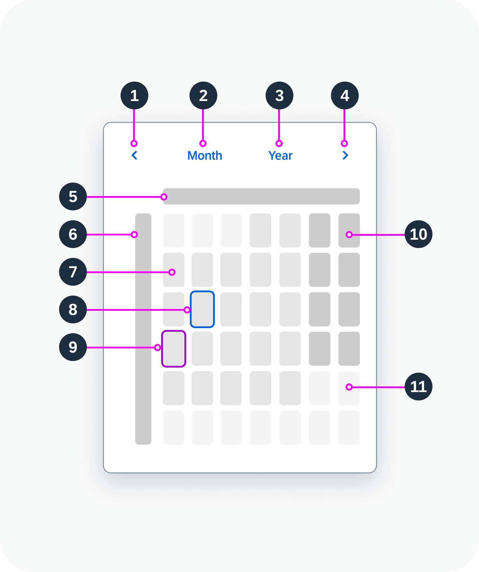
Anatomy
- Previous button: Navigates back to previous month.
- Month view button: Opens the view for month selection.
- Year view button: Opens the view for year selection.
- Next button: Navigates to next month.
- Days of the week
- Calendar weeks: Gregorian calendar type only. Can be hidden.
- Working day
- Selected day
- Today
- Non-working day
- Days from next month

Calendar anatomy
Variants
You can show one calendar type or two:
- Single calendar type: Gregorian, Japanese, Buddhist, Islamic, or Persian
- Two calendar types: A primary and a secondary calendar
Islamic calendar – live example
Calendar with a secondary calendar type – live example
You can hide the calendar weeks. They are hidden by default for all calendar types except the Gregorian calendar.
Calendar with hidden calendar weeks
Behavior and Interaction
Selection
The calendar supports different types of selection:
- Single day: The user can select a single day at a time.
- Multiple days: The user can select multiple days, which do not have to be next to each other. Navigating to other months doesn’t cancel the selection.
- Range: The user can select multiple days from a start date to an end date.
Selection of a single day – live example
Selection of multiple days – live example
Range selection – live example
Navigation
To change the month, the user can either use the previous/next arrows or select a specific month in the month view.
To change the year, the user can either scroll through the months with the previous/next arrows or select a specific year in the year view.
Calendar – month view
Calendar – year view
Minimum and Maximum Dates
You can define the earliest and latest valid dates for the calendar (minimum and maximum dates). Selection and navigation are then disabled for dates outside this range.
Calendar with minimum and maximum dates
Responsive Behavior
Use the calendar within a responsive layout container. The calendar itself is not responsive.

 Your feedback has been sent to the SAP Fiori design team.