- Latest Version 1.128
- SAPUI Version 1.124
- SAPUI5 Version 1.122
- SAPUI5 Version 1.120
- SAPUI5 Version 1.118
- SAPUI5 Version 1.116
- SAPUI5 Version 1.114
- SAPUI5 Version 1.112
- SAPUI5 Version 1.110
- SAPUI5 Version 1.108
- SAPUI5 Version 1.106
- SAPUI5 Version 1.104
- SAPUI5 Version 1.102
- SAPUI5 Version 1.100
- SAPUI5 Version 1.98
- SAPUI5 Version 1.96
- SAPUI5 Version 1.94
- SAPUI5 Version 1.92
- SAPUI5 Version 1.90
- SAPUI5 Version 1.88
- SAPUI5 Version 1.86
- SAPUI5 Version 1.84
- SAPUI5 Version 1.82
- SAPUI5 Version 1.80
- SAPUI5 Version 1.78
- SAPUI5 Version 1.76
- SAPUI5 Version 1.74
- SAPUI5 Version 1.72
- SAPUI5 Version 1.70
- SAPUI5 Version 1.68
- SAPUI5 Version 1.66
- SAPUI5 Version 1.64
- SAPUI5 Version 1.62
- SAPUI5 Version 1.60
- SAPUI5 Version 1.58
- SAPUI5 Version 1.56
- SAPUI5 Version 1.54
- SAPUI5 Version 1.52
- SAPUI5 Version 1.50
- SAPUI5 Version 1.48
- SAPUI5 Version 1.46
- SAPUI5 Version 1.44
- SAPUI5 Version 1.42
- SAPUI5 Version 1.40
- SAPUI5 Version 1.38
- SAPUI5 Version 1.36
- SAPUI5 Version 1.34
- SAPUI5 Version 1.32
- SAPUI5 Version 1.30
- SAPUI5 Version 1.28
- SAPUI5 Version 1.26
- Latest Version 1.128
- Version 1.126
- SAPUI Version 1.124
- SAPUI5 Version 1.122
- SAPUI5 Version 1.120
- SAPUI5 Version 1.118
- SAPUI5 Version 1.116
- SAPUI5 Version 1.114
- SAPUI5 Version 1.112
- SAPUI5 Version 1.110
- SAPUI5 Version 1.108
- SAPUI5 Version 1.106
- SAPUI5 Version 1.104
- SAPUI5 Version 1.102
- SAPUI5 Version 1.100
- SAPUI5 Version 1.98
- SAPUI5 Version 1.96
- SAPUI5 Version 1.94
- SAPUI5 Version 1.92
- SAPUI5 Version 1.90
- SAPUI5 Version 1.88
- SAPUI5 Version 1.86
- SAPUI5 Version 1.84
- SAPUI5 Version 1.82
- SAPUI5 Version 1.80
- SAPUI5 Version 1.78
- SAPUI5 Version 1.76
- SAPUI5 Version 1.74
- SAPUI5 Version 1.72
- SAPUI5 Version 1.70
- SAPUI5 Version 1.68
- SAPUI5 Version 1.66
- SAPUI5 Version 1.64
- SAPUI5 Version 1.62
- SAPUI5 Version 1.60
- SAPUI5 Version 1.58
- SAPUI5 Version 1.56
- SAPUI5 Version 1.54
- SAPUI5 Version 1.52
- SAPUI5 Version 1.50
- SAPUI5 Version 1.48
- SAPUI5 Version 1.46
- SAPUI5 Version 1.44
- SAPUI5 Version 1.42
- SAPUI5 Version 1.40
- SAPUI5 Version 1.38
- SAPUI5 Version 1.36
- SAPUI5 Version 1.34
- SAPUI5 Version 1.32
- SAPUI5 Version 1.30
- SAPUI5 Version 1.28
- SAPUI5 Version 1.26
Calendar
sap.ui.unified.Calendar
Intro
The calendar control lets users select a single date, multiple days, entire week(s), or a date range. The calendar shows all time-related data (year, month, week, day, date) at a glance. It also allows users to navigate directly from one month or year to another, or to display multiple months.
When to Use
Use the calendar if:
- You want the user to select a single date, multiple days, entire week(s), or a date range.
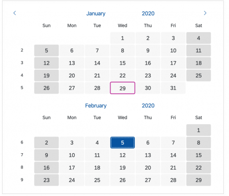
- You want to display multiple months at once.
- The calendar always needs to be visible and prominent.
- Users need to see the year, month, week, weekday and date at a glance to decide which date to select. For example, a user might want to select a date based on the day of the week.
- Users might be used to different locale-specific date formats (such as day-month-year or month-day-year). Enabling them to select the date visually using the calendar bypasses format-specific interpretation.
- You want to highlight special days or hide/disable specific days.
Do not use the calendar if:
- The user is a power user who has to enter a lot of data fast. In this case, use the date picker.
- The keyboard is the primary input device. In this case, use the date picker.
- The available screen space is limited and displaying the calendar permanently would take up too much space.
- The user’s primary goal is to select a date range. In this case, use date range selection.
- You want to display a range of weekdays in a single row. In this case, use the calendar date interval.
- The user wants to compare calendars from different people. In this case, use the planning calendar.
- The user wants to select combined date and time values. In this case, use the date/time picker.
Components
The calendar can stand alone as a control, but is also part of many other controls, such as the date picker, date/time picker or the date range selector.
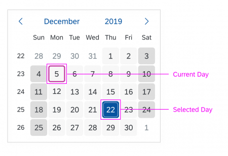
By default, the focus starts on the current day, but can be customized to fit the use case.
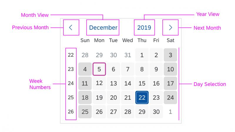
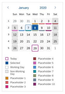
The control allows you to show or hide the calendar weeks. You can also customize the calendar by defining the start and end of a week, or by defining the earliest or latest date.
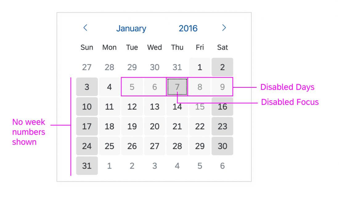
Specific days can also be disabled, for example non-working days or public holidays.
Month and Year View
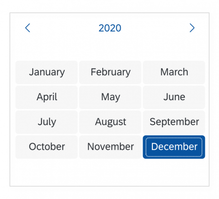
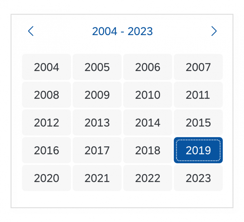
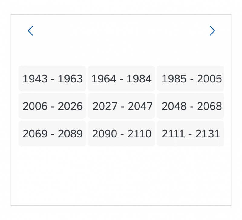
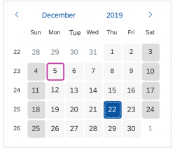
The control offers a day view, month view, year view, or year ranges.
Legend for Highlighted Days
Types
The following calendar types are available:
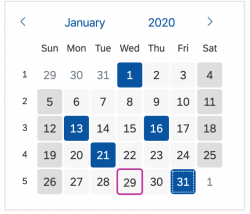
- Single day selection: The user can select a single day at a time.
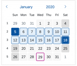
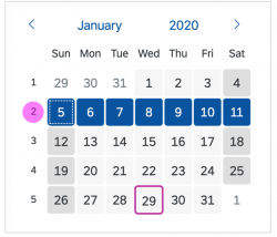
- Single interval selection: The user can select an interval or one entire week.
- Multiple day selection: The user can select multiple days, which do not have to be next to each other. It’s also possible to select entire week(s) and a date range.
- Multiple months: Use this calendar type if users need to see more than one month to make their selection. You can offer single day selection or multiple selection (such as multiple days, entire weeks, or date ranges). We recommend showing no more than two or three calendars at the same time.
Behavior and Interaction
The behavior and interaction of the calendar depends on the calendar type. Some interactions are only available for specific calendar types.
Selecting a Single Date
Clicking the date selects it. Clicking the date again deselects it.
Selecting a Single Interval
The user selects a single interval by clicking the first and last day of the date range, which also selects all the days in between. Alternatively, the user can select two different dates and press Shift+Enter twice.
Selecting an Entire Week
To select an entire week, the user clicks the number for calendar week (if displayed). Alternatively, the user can select one day within the week and press Shift+Space simultaneously.
Selecting Multiple Days
Multiple days are selected by clicking the desired days individually. Clicking the selected days again deselects them.
Changing Months
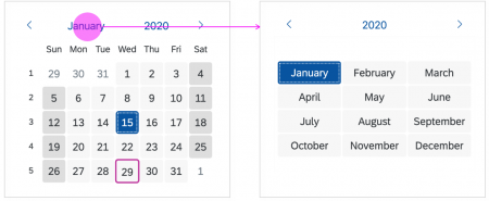
If the current month is selected, the view changes to the month view and the user can change the month. By clicking a month, the user changes the month and the view changes back to the day view.
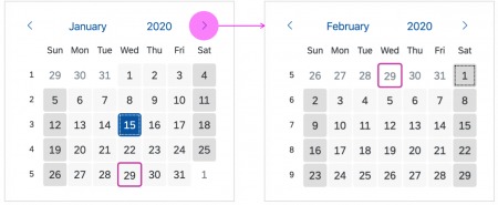
Clicking the arrow in the day view of the calendar shows the next month of the same year.
Changing Years
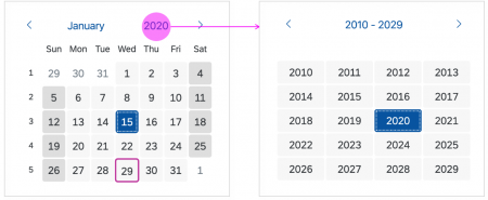
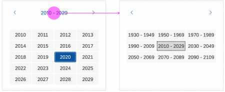
Clicking the current year changes the view to year view. When the user selects a year, the view changes back to the day view.
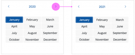
Clicking the arrow in the month view shows the same selected month in the next year.
Clicking the year range changes the view to year range view. When the user selects a year range, the view changes back to the year view.
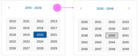
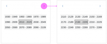
Clicking the arrow in the year view shows the next year range, changing in increments of 20 years.
Responsiveness
Use the calendar within a responsive layout container. The calendar control itself is not responsive.
When using the multiple month view, the calendar adapts to the size of the screen. On small screens, only one calendar is displayed.
Related Topics
Elements and Controls
- Date Picker (guidelines)
- Date Range Selection (guidelines)
- Calendar Date Interval (guidelines)
- Planning Calendar (guidelines)
- Date/Time Picker (guidelines)
- Time Picker (guidelines)


 Your feedback has been sent to the SAP Fiori design team.