- Latest Version 1.128
- SAPUI Version 1.124
- SAPUI5 Version 1.122
- SAPUI5 Version 1.120
- SAPUI5 Version 1.118
- SAPUI5 Version 1.116
- SAPUI5 Version 1.114
- SAPUI5 Version 1.112
- SAPUI5 Version 1.110
- SAPUI5 Version 1.108
- SAPUI5 Version 1.106
- SAPUI5 Version 1.104
- SAPUI5 Version 1.102
- SAPUI5 Version 1.100
- SAPUI5 Version 1.98
- SAPUI5 Version 1.96
- SAPUI5 Version 1.94
- SAPUI5 Version 1.92
- SAPUI5 Version 1.90
- SAPUI5 Version 1.88
- SAPUI5 Version 1.86
- SAPUI5 Version 1.84
- SAPUI5 Version 1.82
- SAPUI5 Version 1.80
- SAPUI5 Version 1.78
- SAPUI5 Version 1.76
- SAPUI5 Version 1.74
- SAPUI5 Version 1.72
- SAPUI5 Version 1.70
- SAPUI5 Version 1.68
- SAPUI5 Version 1.66
- SAPUI5 Version 1.64
- SAPUI5 Version 1.62
- SAPUI5 Version 1.60
- SAPUI5 Version 1.58
- SAPUI5 Version 1.56
- SAPUI5 Version 1.54
- SAPUI5 Version 1.52
- SAPUI5 Version 1.50
- SAPUI5 Version 1.48
- SAPUI5 Version 1.46
- SAPUI5 Version 1.44
- SAPUI5 Version 1.42
- SAPUI5 Version 1.40
- SAPUI5 Version 1.38
- SAPUI5 Version 1.36
- SAPUI5 Version 1.34
- SAPUI5 Version 1.32
- SAPUI5 Version 1.30
- SAPUI5 Version 1.28
- SAPUI5 Version 1.26
- Latest Version 1.128
- Version 1.126
- SAPUI Version 1.124
- SAPUI5 Version 1.122
- SAPUI5 Version 1.120
- SAPUI5 Version 1.118
- SAPUI5 Version 1.116
- SAPUI5 Version 1.114
- SAPUI5 Version 1.112
- SAPUI5 Version 1.110
- SAPUI5 Version 1.108
- SAPUI5 Version 1.106
- SAPUI5 Version 1.104
- SAPUI5 Version 1.102
- SAPUI5 Version 1.100
- SAPUI5 Version 1.98
- SAPUI5 Version 1.96
- SAPUI5 Version 1.94
- SAPUI5 Version 1.92
- SAPUI5 Version 1.90
- SAPUI5 Version 1.88
- SAPUI5 Version 1.86
- SAPUI5 Version 1.84
- SAPUI5 Version 1.82
- SAPUI5 Version 1.80
- SAPUI5 Version 1.78
- SAPUI5 Version 1.76
- SAPUI5 Version 1.74
- SAPUI5 Version 1.72
- SAPUI5 Version 1.70
- SAPUI5 Version 1.68
- SAPUI5 Version 1.66
- SAPUI5 Version 1.64
- SAPUI5 Version 1.62
- SAPUI5 Version 1.60
- SAPUI5 Version 1.58
- SAPUI5 Version 1.56
- SAPUI5 Version 1.54
- SAPUI5 Version 1.52
- SAPUI5 Version 1.50
- SAPUI5 Version 1.48
- SAPUI5 Version 1.46
- SAPUI5 Version 1.44
- SAPUI5 Version 1.42
- SAPUI5 Version 1.40
- SAPUI5 Version 1.38
- SAPUI5 Version 1.36
- SAPUI5 Version 1.34
- SAPUI5 Version 1.32
- SAPUI5 Version 1.30
- SAPUI5 Version 1.28
- SAPUI5 Version 1.26
Form
ui5-form | v1.0
Intro
When to Use
Don’t use the form:
- For presenting and editing a set of repeating data. Use a table instead.
Top Tips
- Order the form logically from a user’s perspective. For example, ask for a user’s name before asking them for their address.
- Group related information by using form and group titles.
- Try to arrange form groups (especially in size L and XL) in a way that the form:
- Is easy to read and understand.
- Does not contain too much white space (split groups if necessary).
- If an input element is in an error or warning state, provide a meaningful message for the user.
- If you display the unit of measurement after the input field, make sure that it’s properly visualized and doesn’t wrap to the next row.
- When the form is in edit view, right-align amounts to avoid gaps between the amount and the unit of measurement.
- When a form is in display view, left-align amounts to avoid large gaps between the labels and values.
- If the expected input isn’t obvious from the label alone, provide a brief placeholder (word or phrase) as a hint to help the user with data entry.
Anatomy
Structure
A form is structured into form containers. Each form container consists of form elements.
- Container: The form is the top-level container component. It controls the content layout and the responsiveness.
- Group: The form group enables grouping of the form content.
- Form item: A pair of label and form field.
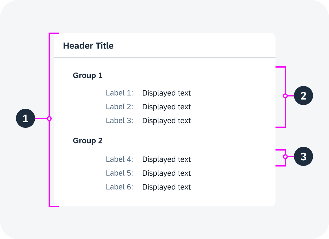
Structure of a single form container
Form Components
A simple form consists of a header area and a content area with pairs of label and form field.
- Header area: The header area is on top and displays a header text.
- Label: The label of a single form item. It serves as the name of the input field.
- Value: In display mode, the value is read only. In edit mode, a value can be added or edited.
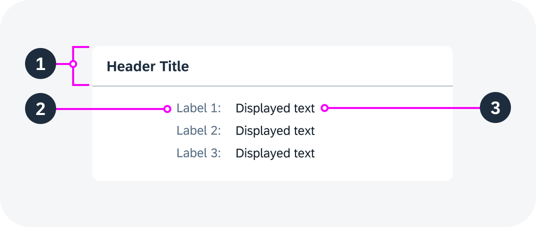
Anatomy of a simple form
Variants
Form Variants
Form with Custom Header
You can use a custom form header (for example, with additional buttons).
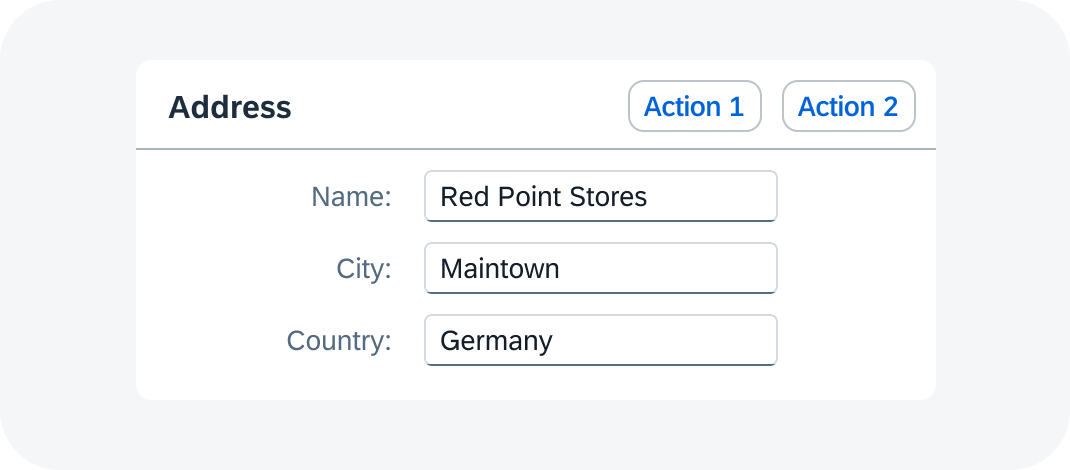
Simple form with custom header
Freestyle Form
Layout Variants
Single Form on a Page
A single form can contain one or more groups.
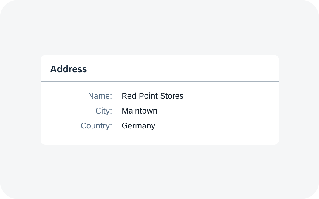
Form with only one group and a header title
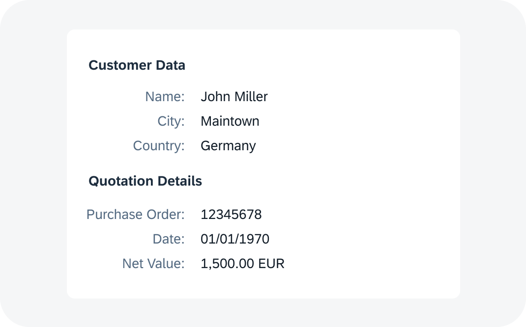
Form with two groups and no header title
Multiple Forms on a Page
You can also use multiple forms on one page. Separate forms are more distinct visually than groups within a form.
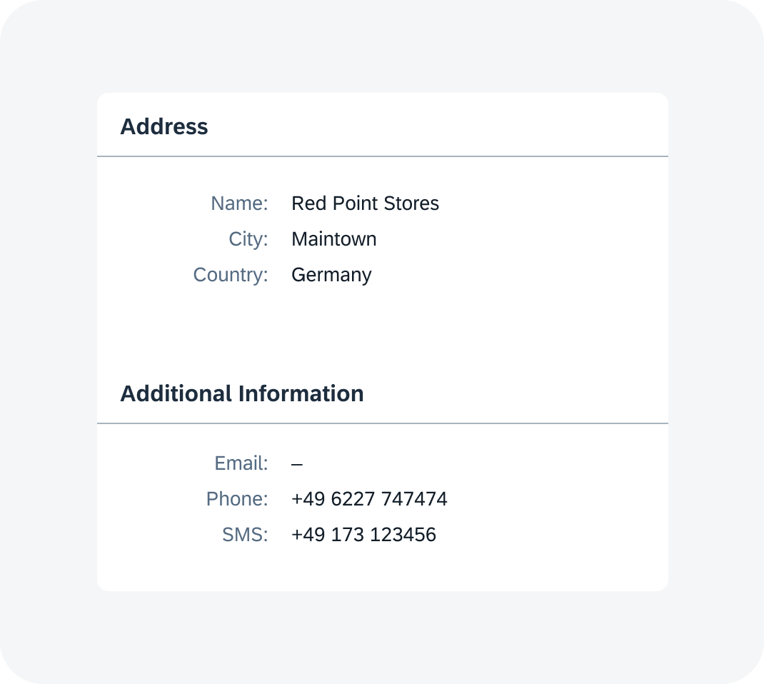
Two forms on one page
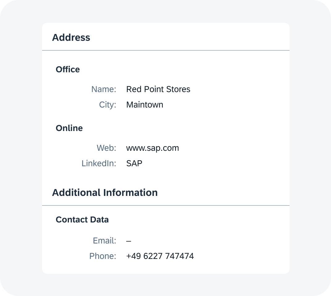
Two forms on one page, with form groups
Label-Value Alignment
You can align labels vertically or horizontally.
Vertical alignment: The vertically-aligned form best supports the reading flow and avoids unnecessary eye movements.
Horizontal alignment: If there is enough space, the label can be right-aligned next to the value.
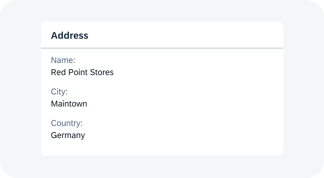
Form - vertical alignment
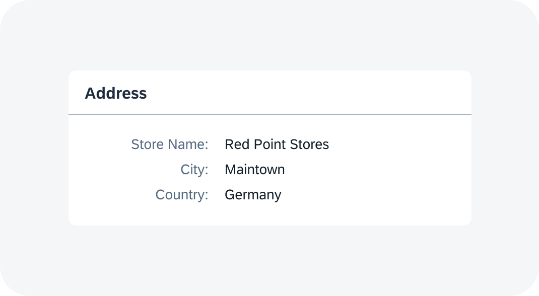
Form - horizontal alignment
Form Group Span
Form Item Span
A form item can span several columns.
Example:
Form item “Full Name” spans in two columns.
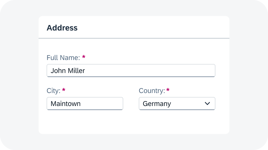
Form item spanning two columns
Features
Label for Required Fields
The label of a required field is marked with an asterisk (*).
The asterisk is visible in edit view only.

Required field marked with an asterisk (*)
Empty State Indicator
If a form field doesn’t have a value, an empty state indicator is shown by default in read-only mode.
The indicator helps the user to better scan the form and perceive the field label and empty content as one unit.
If a field is empty in the edit view, there is no empty state indicator. The field is either empty or displays a placeholder text, if defined.
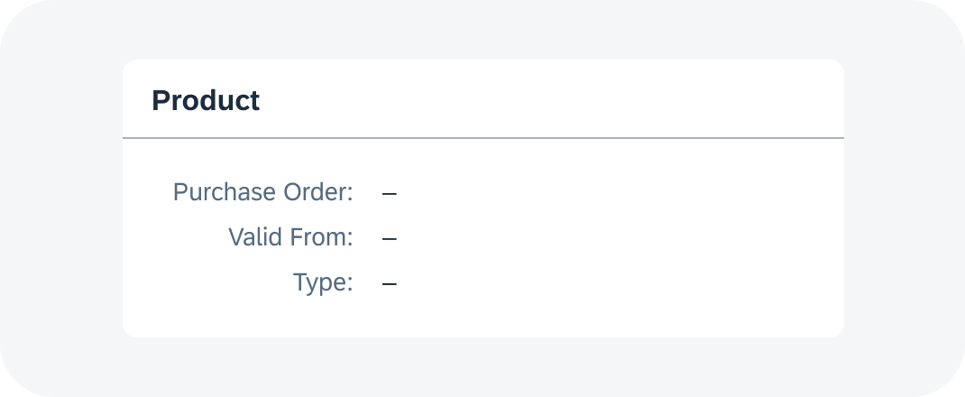
Empty state indicator in a form (display view)
Behavior and Interaction
The visual appearance of the form depends on the component state of the form fields. As a result, three form views are possible: display, edit, and edit with read-only fields.
Display View
The data is presented as label-value field pairs, without editable fields.
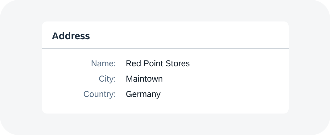
Form in display view
Edit View
The data is presented as label-input fields pairs, so users can enter or edit data.
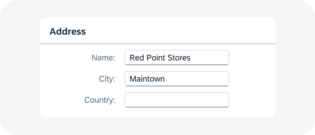
Form in edit view
Edit View with Read-Only Fields
Some fields are editable and some are not (shown in read-only state).
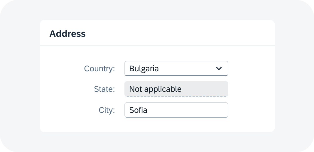
Form in edit view with read-only fields
Responsive Behavior
Breakpoints
The form component reacts and changes its layout on predefined breakpoints. Depending on its size, the form content gets divided into one or more columns.
Example
S1 M2 L3 XL6: 1 column for S, 2 columns for M, 3 columns for L, and 6 columns for XL.
Wrapping
To avoid text truncation, all values and labels within a form wrap by default.

Wrapped labels and texts in a form
By default, form titles wrap up to 3 rows and then truncate.

Form header wrapping and truncation
Alignment
If there isn’t enough space to show a horizontally-aligned form, the display switches to vertical alignment.
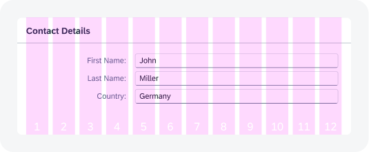
Form Label Span
The width ratio of the label and form field can be defined by a breakpoint.


 Your feedback has been sent to the SAP Fiori design team.