
- Latest SAPUI5 Version 1.120
- Version 1.118
- SAPUI5 Version 1.116
- SAPUI5 Version 1.114
- SAPUI5 Version 1.112
- SAPUI5 Version 1.110
- SAPUI5 Version 1.108
- SAPUI5 Version 1.106
- SAPUI5 Version 1.104
- SAPUI5 Version 1.102
- SAPUI5 Version 1.100
- SAPUI5 Version 1.98
- SAPUI5 Version 1.96
- SAPUI5 Version 1.94
- SAPUI5 Version 1.92
- SAPUI5 Version 1.90
- SAPUI5 Version 1.88
- SAPUI5 Version 1.86
- SAPUI5 Version 1.84
- SAPUI5 Version 1.82
- SAPUI5 Version 1.80
- SAPUI5 Version 1.78
- SAPUI5 Version 1.76
- SAPUI5 Version 1.74
- SAPUI5 Version 1.72
- SAPUI5 Version 1.70
- SAPUI5 Version 1.68
- SAPUI5 Version 1.66
- SAPUI5 Version 1.64
- SAPUI5 Version 1.62
- SAPUI5 Version 1.60
- SAPUI5 Version 1.58
- SAPUI5 Version 1.56
- SAPUI5 Version 1.54
- SAPUI5 Version 1.52
- SAPUI5 Version 1.50
- SAPUI5 Version 1.48
- SAPUI5 Version 1.46
- SAPUI5 Version 1.44
- SAPUI5 Version 1.42
- SAPUI5 Version 1.40
- SAPUI5 Version 1.38
- SAPUI5 Version 1.36
- SAPUI5 Version 1.34
- SAPUI5 Version 1.32
- SAPUI5 Version 1.30
- SAPUI5 Version 1.28
- SAPUI5 Version 1.26
Object Header
sap.m.ObjectHeader
Intro
The object header usually represents an object instance. As such, it contains the most important information a user needs to see in order to understand what the object is about and what its status is. It is the first control on a page dedicated to a single object instance, usually the object view or flat object view.
The control can also be used as the header of other pages, such as a full screen. In that case, the object header contains the most important aggregated information of the items that are listed below.
Usage
Use the object header:
- As the first component on a page that handles a single object instance (object view or flat object view) to enable the user identify it easily.
- As the header of other pages, such as a full screen. In this case, the object header contains the most important aggregated information of the items that are listed below.
Do not use the object header:
- Inside the content area as a work-around for visualizing something that is not possible with current means.
Responsiveness
In general, the object header adjusts to different screen sizes. In order to achieve this, there is a built-in rule set which defines which content wraps or truncates when necessary:
- The object title wraps one time before it truncates.
- The attributes wrap once and then get cut off in the second line.
- The status is a single line and does not wrap.
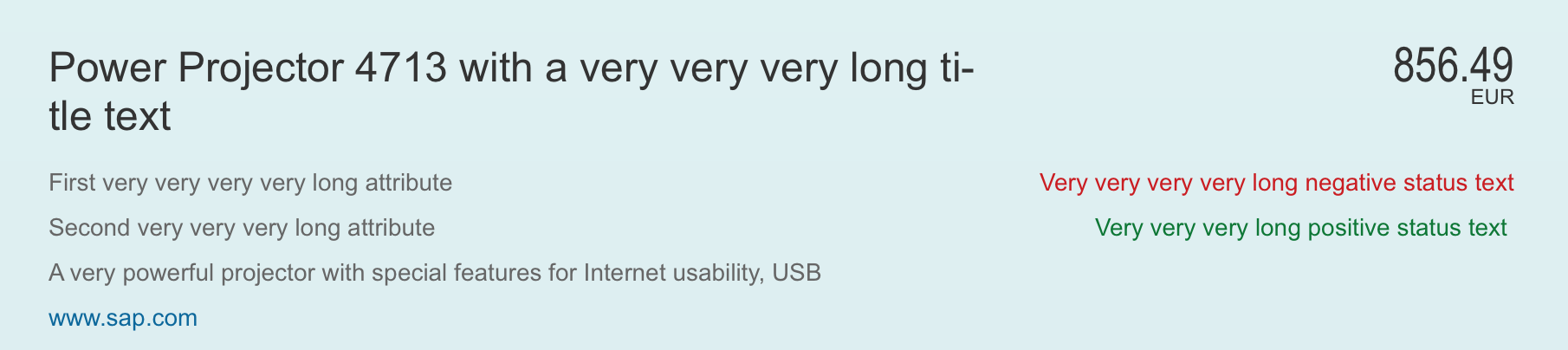
Object header - Long text example (on large screen)

Object header - Long text example (on small screen)
Please note: The object header provides a responsive flag. However, we do not recommend turning this feature on at the present time. This is currently being fixed and we will update this article as soon as it is running properly.
Components
Title
- The object header has a mandatory title that serves as key identifier of the object instance (property: title).
- Very long titles wrap two times before they truncate in the third line.
- A title can be actionable (property: titleActionable). In this case, it shows as a link and can trigger an event. Typically, the title links to a company or employee overview.
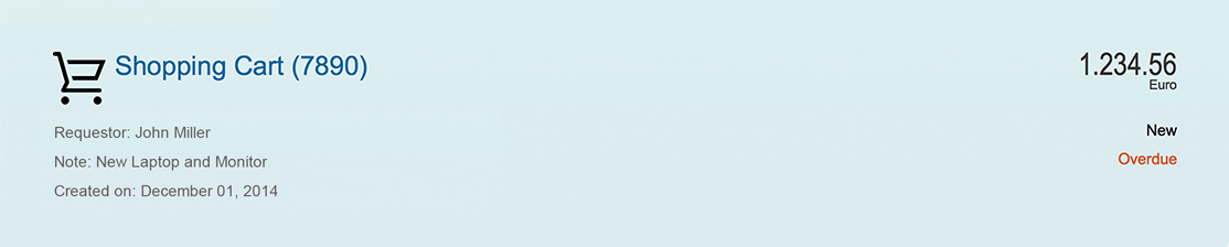
- The title can show an additional icon or image in front of the title that identifies the object (property: icon). The icon/ image can be set to actionable as well (property: IconActionable).
- The title can also show a title selector (which is visualized like a menu). It is mainly used to provide navigation targets allowing the object to be opened in a different app.
Object header - Title not actionable
Object header - Title actionable
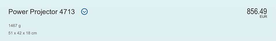
Object header - Title selector
Object Number
- The object number holds the key attribute of the object instance.
- The object number consists of piece of text representing the key attribute of an object, usually a number (property: number), and its unit (property: numberUnit). The object number has a semantic color (property: state). The unit inherits the semantic color from its number.
- As usual in SAP Fiori, available semantic colors are negative (property: error), critical (property: warning), positive (property: success), neutral (property:none).

Object header - Negative object number
Object Attribute
- The object header can hold 0…n attributes (property: objectAttribute).
- The attributes are listed on the left hand side of the object header.
- Attributes can either be text (property: text) or actionable (property: actionable). In the latter case, the header renders like a link.
Object header - Attribute active
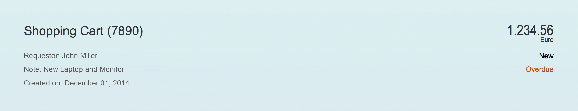
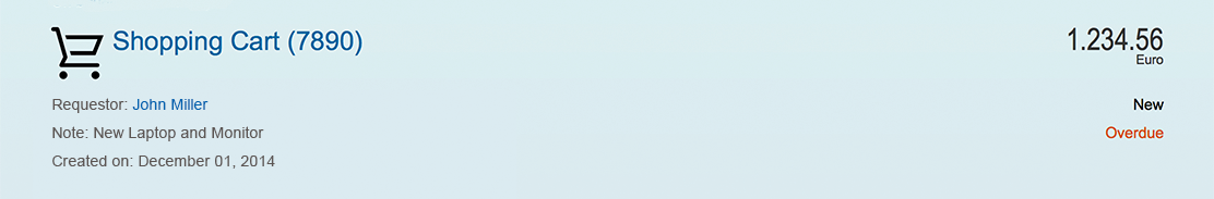
Object Status
- The object header can hold a list of 0…n object status (property: objectStatus).
- The status are listed on the right hand side in the object header
- The status has a semantic color.
- Status can be text or icons. Technically, a combination of the two is also possible, in that case the icon comes before the text. In general, we recommend using text only (see guidelines below).
- It is also allowed to show a progress indicator as status. If used, the progress indicator should be the last item in the list of status.

Object header - Flag, favorite and two object status
Flag and Favorite
- Objects can be shown flagged and marked as favorite. The object header provides flags for both (properties: markFavorite, markFlagged).
- To show them in the object header the respective (property: showMarkers) flag needs to be turned on additionally.
- When used and shown, they appear as the first entries in the list of status.
Intro
- From the first SAP Fiori days, there is another component available called Intro (property: intro).
- It is shown on top of the title
- The intro can call an event when it is set to actionable (property: introActionable).
- This component is used rather rarely nowadays. It was mainly used to indicate the origin of an object. As such it displayed information which forwarded the object, on behalf of whom I need to work on etc. on top of the object identifier.
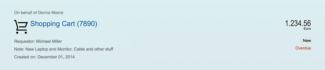
Object header - Intro text
Condensed
- The object header provides a condensed flag for cases where it is used as page header with very little information (property: condensed)
- When turned on, the object header only displays the title, the object number and one attribute

Object header - Condensed mode
Guidelines
Title
- The Object Header contains a mandatory title, that serves as key identifier of the object instance (property: title). The title should be in general a human readable text (no IDs). In case an ID is absolutely crucial to the user, e.g. to distinguish same named titles it can be put in brackets, e.g. “Product ABC (1234567)”. If this is usually a very long number you can also consider adding it as first attribute. But in that case give it a label (property: title of the Object Attribute).
- Though the title can truncate you should keep the title as short as possible and only as long as needed.
- In case you make the title actionable and use an image/icon as well, both should be actionable and in general trigger the same event.
- If used at all, the title selector should usually opening an action sheet, allowing the user to choose from different options.
Object Number
- The Object Number holds the key attribute of the Object Instance, which is usually a numeric attribute. In rare cases it can also be used with text, if that is the key attribute of the item. Be careful when using text, as it will usually cause issues during translation if the texts get to long.
- As usual throughout SAP Fiori available semantic colors are Negative (property: error), Critical (property: warning), Positive (property: success), Neutral (property:none).
- For very long numbers use a formatter.
- The Object Number can be left blank in case there is no key attribute that makes sense to be shown.
Object Attribute
- In general these object attributes do not need a label if it is clear what they are referring to. If attributes are not distinct, you can use a “label” (property: title).
- In order to anticipate the Object Header fast, we do not recommend using more than 4 attributes.
Object Status
- Though it is technically possible to show icons together with text, we recommend using text only.
- Use icons only when they are obvious and understood. If you feel your icon would need a descriptive text in order to be understood, use text only.
- In case of locked items it is though allowed to add the additional information who is currently locking the item (when available).
- The same rule for choosing semantic color as elsewhere in SAP Fiori applies for the status:Negative (property: error), Critical (property: warning), Positive (property: success), Neutral (property:none).
- For showing priorities within the status general guidance is: Very high (property: error) High (property: warning), Medium, Low, Other (property:none).
- It is also allowed to show a progress indicator as status. If used the progress indicator should be the last item in the list of status.
- Similar to the attributes, the status do not need a label if it is clear what they are referring to. If status are not distinct, you can use a “label” (property: title).
- Also here in general it is not recommended having more than four entries in the status list (including Progress Indicators and Flag/Favorite).
Intro
- The intro should not be used if not absolutely necessary. Usually it contains information in approvals about the origin (e.g. “Forwarded by XY”, “On behalf of YZ”).
- Do not use the intro for standard attributes.
Master/Detail
- When used in the Details Area of the Split Screen (Master/Detail), and the master list contains Object List Items, the Object Header should in general show the same information as the Object List Item plus additional information if necessary.
- In contrary to the Object List Item, the Object Number would use large number formatting, as the Object Header has more space to handle long text.
Resources
Want to dive deeper? Follow the links below to find out more about related controls, the SAPUI5 implementation, and the visual design.
 Your feedback has been sent to the SAP Fiori design team.