
- Latest SAPUI5 Version 1.120
- Version 1.118
- SAPUI5 Version 1.116
- SAPUI5 Version 1.114
- SAPUI5 Version 1.112
- SAPUI5 Version 1.110
- SAPUI5 Version 1.108
- SAPUI5 Version 1.106
- SAPUI5 Version 1.104
- SAPUI5 Version 1.102
- SAPUI5 Version 1.100
- SAPUI5 Version 1.98
- SAPUI5 Version 1.96
- SAPUI5 Version 1.94
- SAPUI5 Version 1.92
- SAPUI5 Version 1.90
- SAPUI5 Version 1.88
- SAPUI5 Version 1.86
- SAPUI5 Version 1.84
- SAPUI5 Version 1.82
- SAPUI5 Version 1.80
- SAPUI5 Version 1.78
- SAPUI5 Version 1.76
- SAPUI5 Version 1.74
- SAPUI5 Version 1.72
- SAPUI5 Version 1.70
- SAPUI5 Version 1.68
- SAPUI5 Version 1.66
- SAPUI5 Version 1.64
- SAPUI5 Version 1.62
- SAPUI5 Version 1.60
- SAPUI5 Version 1.58
- SAPUI5 Version 1.56
- SAPUI5 Version 1.54
- SAPUI5 Version 1.52
- SAPUI5 Version 1.50
- SAPUI5 Version 1.48
- SAPUI5 Version 1.46
- SAPUI5 Version 1.44
- SAPUI5 Version 1.42
- SAPUI5 Version 1.40
- SAPUI5 Version 1.38
- SAPUI5 Version 1.36
- SAPUI5 Version 1.34
- SAPUI5 Version 1.32
- SAPUI5 Version 1.30
- SAPUI5 Version 1.28
- SAPUI5 Version 1.26
Shopping App
Intro
A collect app is used to browse and collect objects in order to apply a more complex action or a process to them. A typical example of this is the shopping app.
A shopping app enables users to browse through products, collect them in a shopping cart and to order them. In general, it consists of three parts:
• Product list (all products)
• Shopping cart
• Check out step(s)
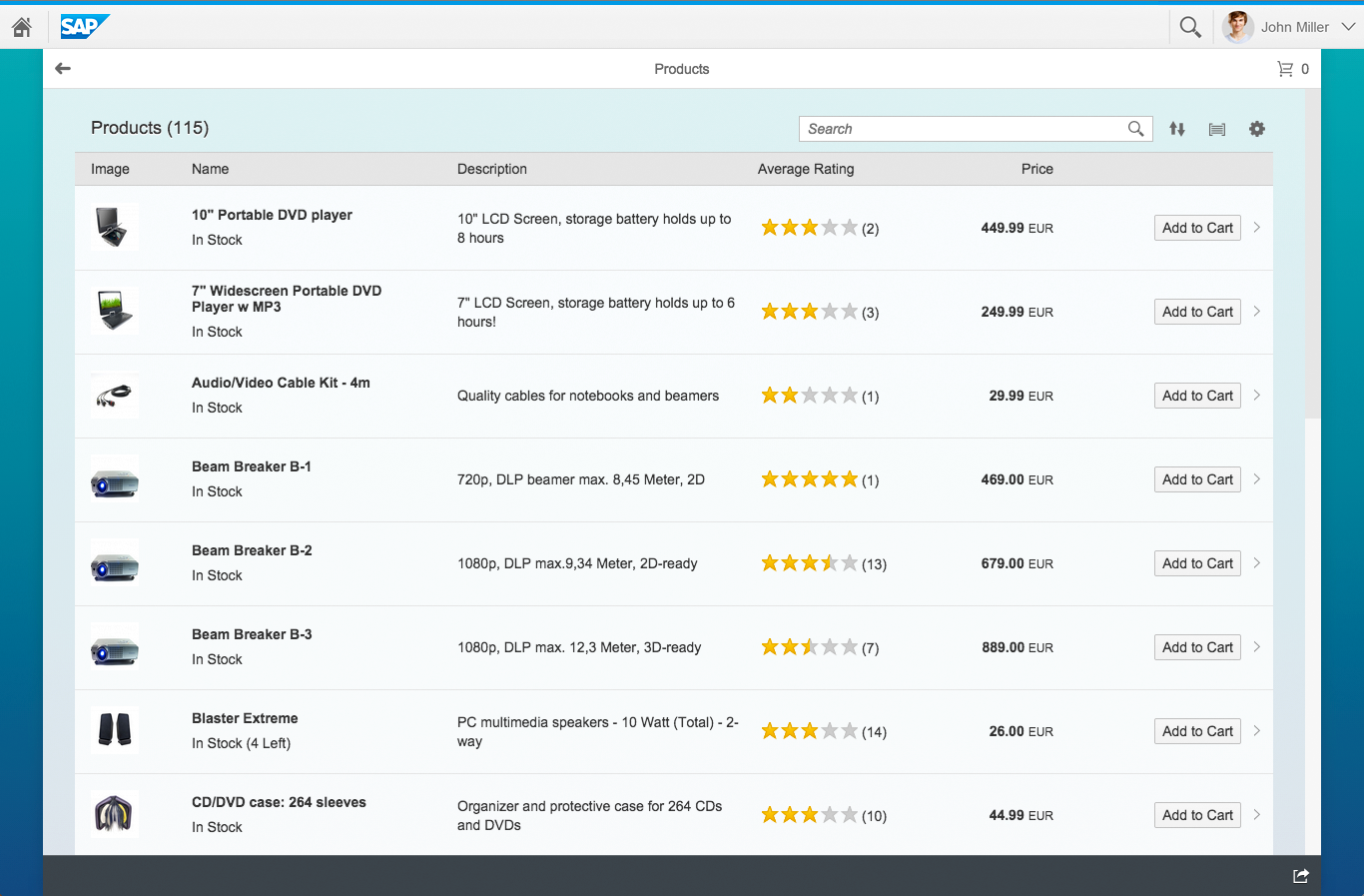
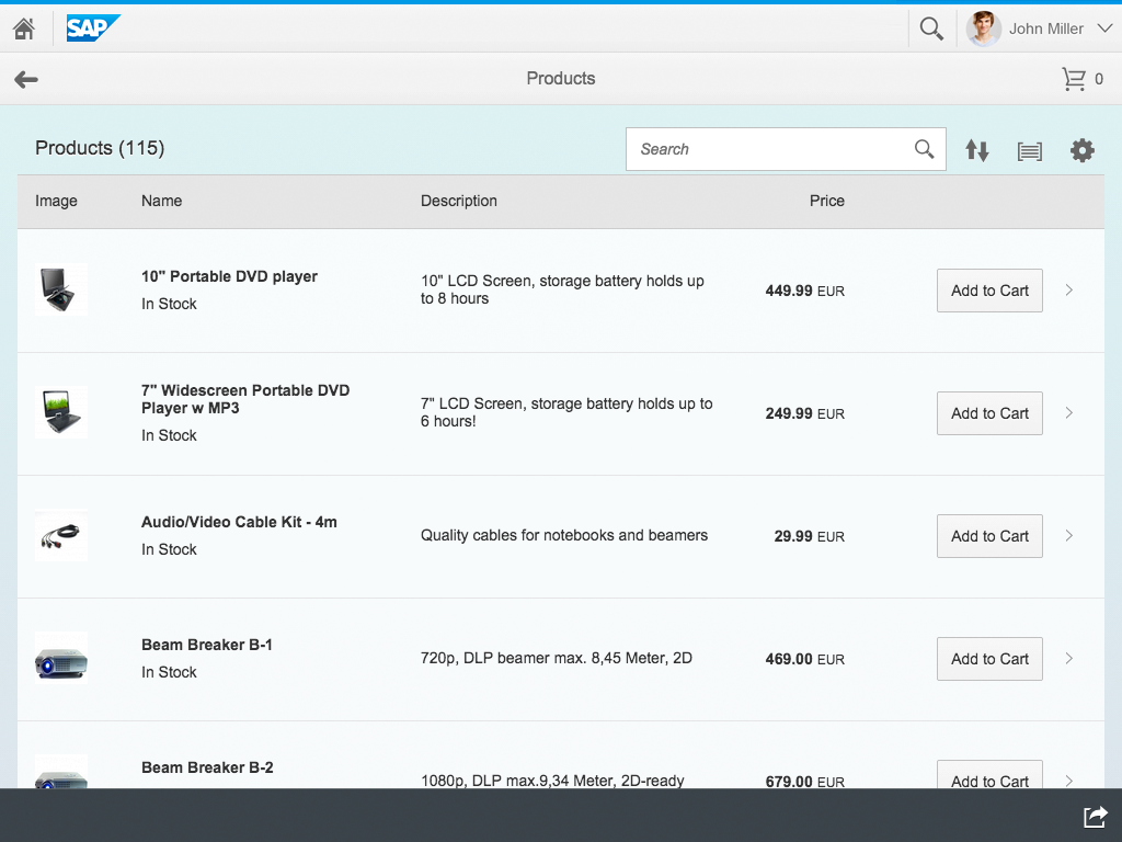
Shopping app on desktop
Responsiveness
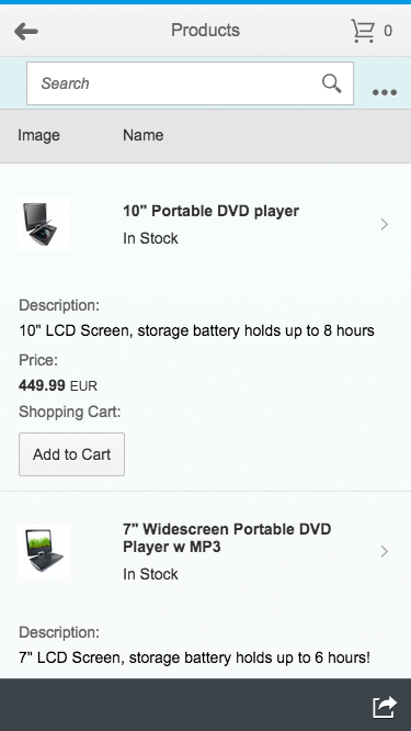
Shopping app on phone
Shopping app on tablet
The shopping (collect) app works well on any form factor. It inherits the responsive behavior from the full screen layout.
Behavior and Interaction
Product List (All Products)
The master screen contains a responsive table with all products and is usually a full-screen app. The header contains an indicator of how many products are in the shopping cart. This indicator also serves as navigation trigger to the shopping cart. The user can filter the items using the filter bar above the table.
Sort, group, and personalization is positioned in the table toolbar. The Personalize button allows the user to show/ hide or rearrange columns.
Any filters that are set and the personalization of the table can be saved with the variant management in the object header.
Product Detail Page
The detail screen contains the product details of a selected product.
The object header can contain following items:
product name, picture, price, category, subcategory, the status and if applicable, a favorite icon marks objects as favorites.
Besides other information like manufacturer, supplier and so on can be listed in the content area.
With a click on the product picture it will be enlarged. The user can also add a review to the product.
Finally the user can add the product from the detail screen to cart via “Add to Cart” button in the footer tool bar.
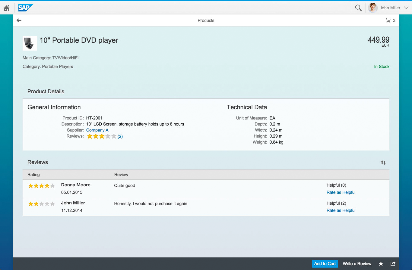
Product detail page on desktop
Add to Cart (Action)
The user has two possibilities to add a product to the cart:
- Add a product directly on the product list.
- Add a product on detail page.
A message toast confirms the success. If an error occurred, an error dialog will be shown.
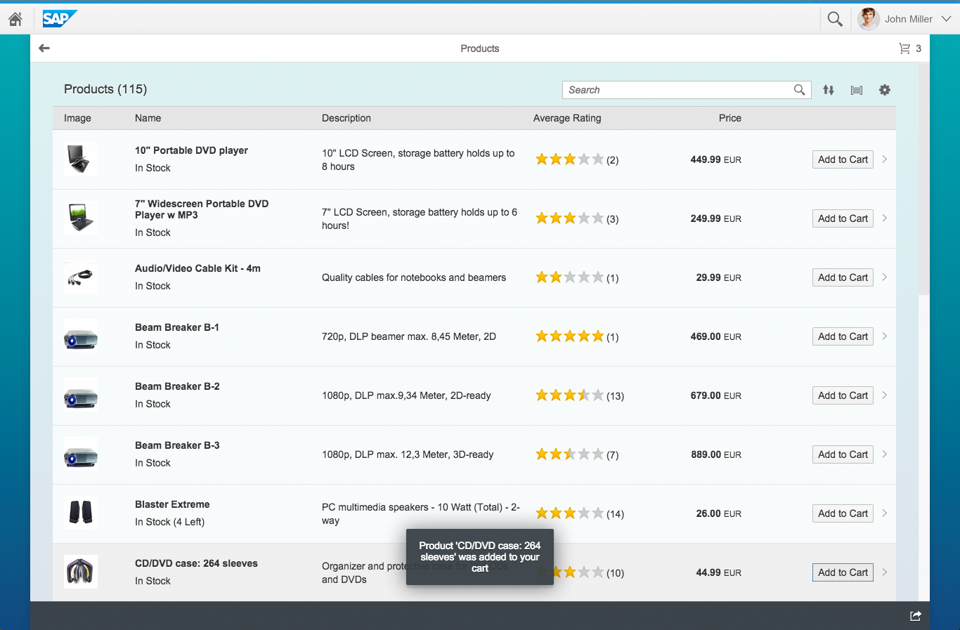
Success message on desktop
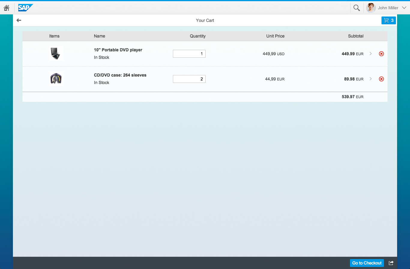
Shopping Cart
Shows all collected products with quantity, unit price, and subtotal.
The users can change the quantity of the containing products or remove items from the cart.
With a click on the item the product details page will be shown.
The back button in the header brings the users back to the last page.
The Go to Checkout button brings the users to the check out step(s).
Shopping cart on desktop
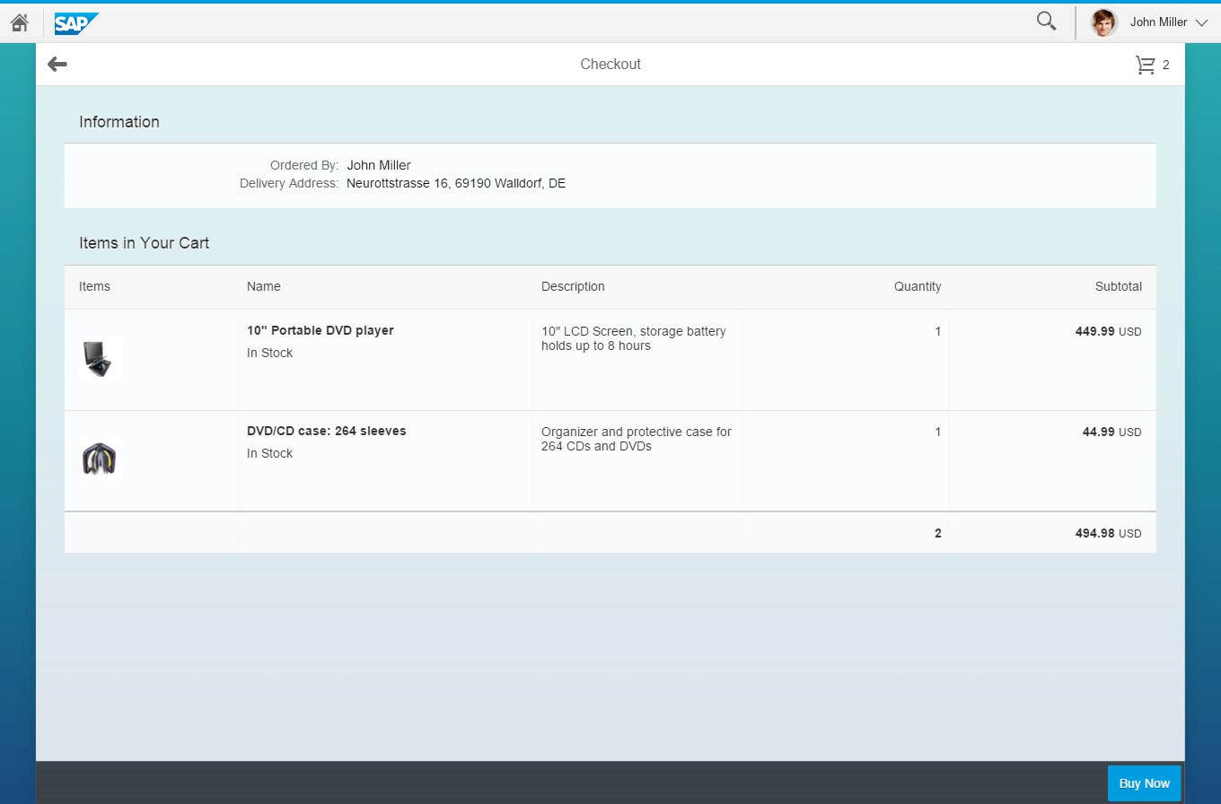
Checkout
The checkout consists of one or more steps and ends with the ordering of the products.
Usually the users need to enter delivery information. Other steps might be necessary too, e.g. entering accounting information.
The screen also contains a list of the products that will be ordered.
Checkout on desktop
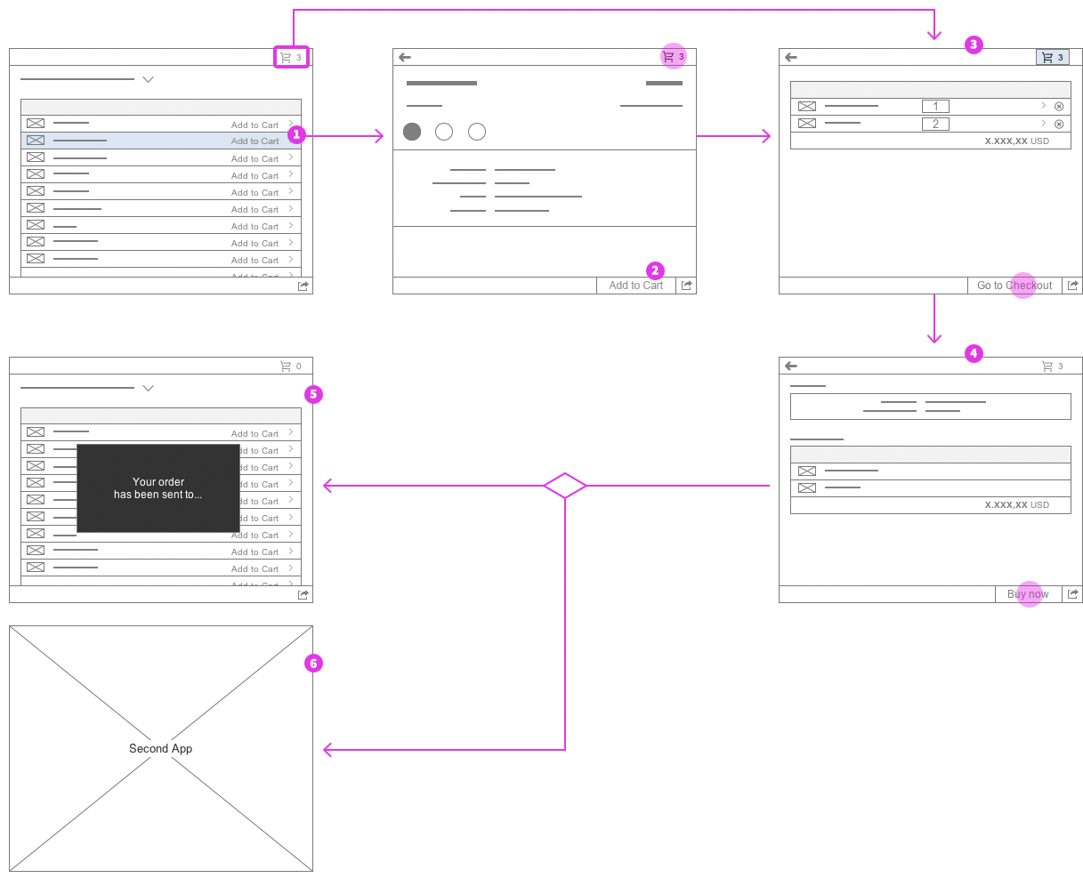
Page Flow
The shopping (collect) flow shows how a user navigates from a product list through the whole ordering process.
 Your feedback has been sent to the SAP Fiori design team.