- Latest Version 1.128
- Version 1.126
- SAPUI Version 1.124
- SAPUI5 Version 1.122
- SAPUI5 Version 1.120
- SAPUI5 Version 1.118
- SAPUI5 Version 1.116
- SAPUI5 Version 1.114
- SAPUI5 Version 1.112
- SAPUI5 Version 1.110
- SAPUI5 Version 1.108
- SAPUI5 Version 1.106
- SAPUI5 Version 1.104
- SAPUI5 Version 1.102
- SAPUI5 Version 1.100
- SAPUI5 Version 1.98
- SAPUI5 Version 1.96
- SAPUI5 Version 1.94
- SAPUI5 Version 1.92
- SAPUI5 Version 1.90
- SAPUI5 Version 1.88
- SAPUI5 Version 1.86
- SAPUI5 Version 1.84
- SAPUI5 Version 1.80
- SAPUI5 Version 1.78
- SAPUI5 Version 1.76
- SAPUI5 Version 1.74
- SAPUI5 Version 1.72
- SAPUI5 Version 1.70
- SAPUI5 Version 1.68
- SAPUI5 Version 1.66
- SAPUI5 Version 1.64
- SAPUI5 Version 1.62
- SAPUI5 Version 1.60
- SAPUI5 Version 1.58
- SAPUI5 Version 1.56
- SAPUI5 Version 1.54
- SAPUI5 Version 1.52
- SAPUI5 Version 1.50
- SAPUI5 Version 1.48
- SAPUI5 Version 1.46
- SAPUI5 Version 1.44
- SAPUI5 Version 1.42
- SAPUI5 Version 1.40
- SAPUI5 Version 1.38
- SAPUI5 Version 1.36
- SAPUI5 Version 1.34
- SAPUI5 Version 1.32
- SAPUI5 Version 1.30
- SAPUI5 Version 1.28
- SAPUI5 Version 1.26
- Latest Version 1.128
- Version 1.126
- SAPUI Version 1.124
- SAPUI5 Version 1.122
- SAPUI5 Version 1.120
- SAPUI5 Version 1.118
- SAPUI5 Version 1.116
- SAPUI5 Version 1.114
- SAPUI5 Version 1.112
- SAPUI5 Version 1.110
- SAPUI5 Version 1.108
- SAPUI5 Version 1.106
- SAPUI5 Version 1.104
- SAPUI5 Version 1.102
- SAPUI5 Version 1.100
- SAPUI5 Version 1.98
- SAPUI5 Version 1.96
- SAPUI5 Version 1.94
- SAPUI5 Version 1.92
- SAPUI5 Version 1.90
- SAPUI5 Version 1.88
- SAPUI5 Version 1.86
- SAPUI5 Version 1.84
- SAPUI5 Version 1.82
- SAPUI5 Version 1.80
- SAPUI5 Version 1.78
- SAPUI5 Version 1.76
- SAPUI5 Version 1.74
- SAPUI5 Version 1.72
- SAPUI5 Version 1.70
- SAPUI5 Version 1.68
- SAPUI5 Version 1.66
- SAPUI5 Version 1.64
- SAPUI5 Version 1.62
- SAPUI5 Version 1.60
- SAPUI5 Version 1.58
- SAPUI5 Version 1.56
- SAPUI5 Version 1.54
- SAPUI5 Version 1.52
- SAPUI5 Version 1.50
- SAPUI5 Version 1.48
- SAPUI5 Version 1.46
- SAPUI5 Version 1.44
- SAPUI5 Version 1.42
- SAPUI5 Version 1.40
- SAPUI5 Version 1.38
- SAPUI5 Version 1.36
- SAPUI5 Version 1.34
- SAPUI5 Version 1.32
- SAPUI5 Version 1.30
- SAPUI5 Version 1.28
- SAPUI5 Version 1.26
Flexible Grid
sap.ui.layout.cssgrid.CSSGrid
Intro
The flexible grid control allows you to divide a layout into multiple columns and rows in which you can place UI elements. You can also customize the grid by aligning and arranging your elements to suit your content.
Since the flexible grid behaves responsively, it is suitable for both desktop and mobile devices. Depending on the available screen width, an optimized layout is loaded to ensure the best possible user experience on each device.
When to Use
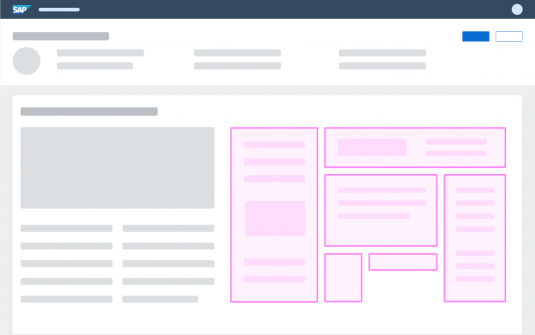
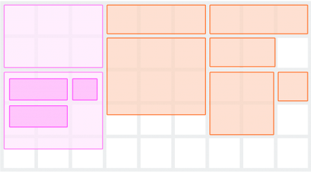
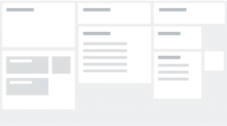
The flexible grid can be used as an underlying layer for different types of page layouts, much like a template. You place elements such as cards or other SAP Fiori UI elements in the grid. This layout approach helps maintain one coherent experience within a page or across several pages.
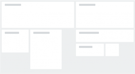
Keep in mind that the elements placed in your grid are empty containers. Therefore, your grid layout is invisible until there is content in them to display.
The flexible grid can be used within different types of pages, such as the home page or other pages of an application. For an overview of the application page types, see the Explore page.
You can determine how you want to use the available space in your grid and how the content flows by adding breakpoints.
Some features and behaviors are configurable to enable the flexible grid for a variety of use cases.
Use the flexible grid if:
- You want to display your content in columns and rows so that it adapts flexibly to changes in the screen size.
- You want to display your content in full-page layouts so that your content flows but stays aligned and spaced out evenly.
- The focus of your layout is on flexibility and responsiveness, not on constraining the content to grid cells.
- You want to include explicit or nested grid elements to have your elements or content adapt to any row or column size and to any breakpoints.
- You want to have only one implementation for all devices.
- You want to embed elements from another page into one of the columns.
Do not use the flexible grid if:
- Your content is not appropriate for a card-like format, or for simple forms. For example, do not use the flexible grid for displaying a list or table that a user can edit or that needs to show a large number of items. Use a grid table instead.
- You want to manage complex content, such as datasets that need to be extensively sorted, grouped, filtered, or edited. In this case, use a grid table instead.
- You want to display a set of items on a grid. Consider using the grid list instead.
- Your layout needs to be defined only by columns or only by rows, not both. Use a flex box instead.
Components
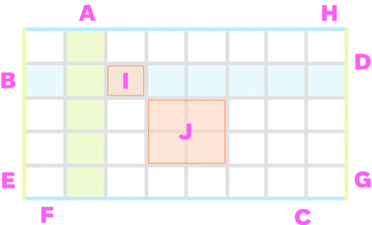
| A Column | Elements can be placed in columns so they align horizontally in the layout. |
| B Row | Elements can be placed in rows so they align vertically in the layout. |
| C Gutter – Column | The gutters define the spacing between cells (space between columns). |
| D Gutter – row | The gutters define the spacing between cells (space between rows). |
| E Margin – left | The margins define the outer spacing of the grid layout (left, right, top, bottom). |
| F Margin – bottom | |
| G Margin – right | |
| H Margin – top | |
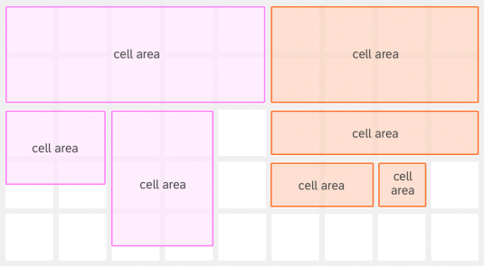
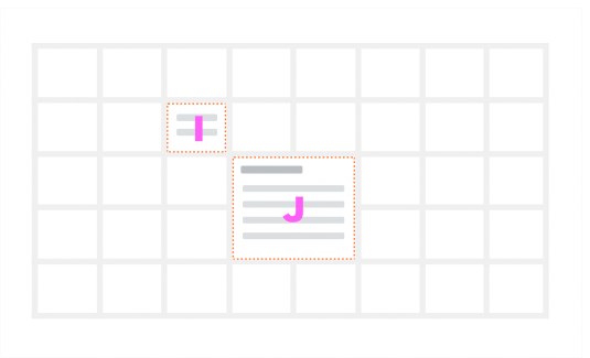
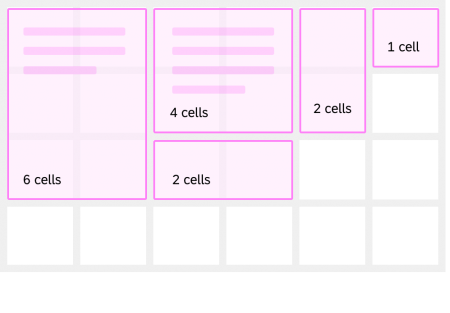
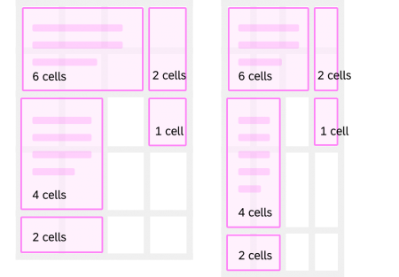
| I Cell | The cell is the smallest feature of the flexible grid. It is conceptually much like a table cell, and elements can be placed in a cell (or combination of cells) and aligned in columns and rows. The size of a cell depends on the width of a column and the height of a row. The width may differ from the height. |
| J Cell area | In this example, the elements are placed or mapped to 2 cells (aligned horizontally) and 2 cells (aligned vertically). |
Flexible Grid Elements
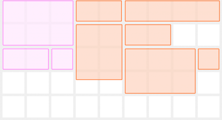
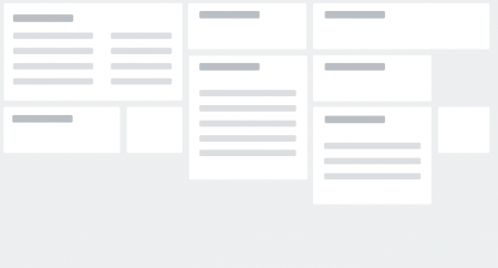
You can place elements (SAP Fiori controls) in the flexible grid and then define the size of the elements by how they are laid out in the grid.
The order in which you add the elements determines how they appear in the layout.
Placement and Nesting
The grid layout can be used as a standalone, or inside other layout containers such as another page, a header, or a dialog.
The grid layout supports nesting, which allows you to place a flexible grid layout inside a grid element.
Behavior and Interaction
Layout Flexibility
You can use the flexible grid to define a layout for more than one page. This means you don’t need to define a template for each page.
Size of Elements in a Flexible Grid
Depending on the use case, you can assign specific sizes to a grid element to ensure that the content in the grid layout is displayed correctly.
Minimum and maximum size
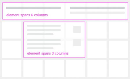
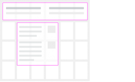
If necessary, you can apply a minimum and/or maximum size to a grid element. For example, if the minimum width for a grid element is three columns, the space used by the element will never be less than three columns, even when the layout is resized.
Grid elements can also have a combination of specified minimum and maximum sizes (such as a range of sizes). However, you can only use whole (not half) columns or rows when referencing a size unit (for example, 2×3, 4×4).
Note: Keep in mind that the number of columns for a grid element should never be less than the minimum number of columns of the flexible grid layout in its smallest form factor.
Full-width elements
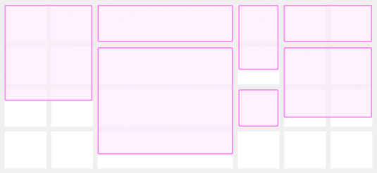
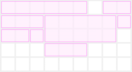
Grid elements can be defined to span the full width of the grid (using all the columns) for one or several rows in the grid layout.
Defining How the Content Fills the Space
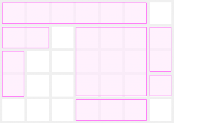
You can define how the content fills the space of grid elements by adjusting the content to the height of the row. This can affect visual balance and consistency in the overall flexible grid layout. You can also choose to constrain content to the height of the elements (with a card control, for example).
Conversely, if the content doesn’t fill up all the space of the layout elements, you can include areas of white space (or empty space) to have “breathing” room in your layout.
Defining columns
Always use the full width of the layout elements, so that the content spans across the full width of the page or the width of the column.
Defining rows
When placing grid elements in rows, we recommend adding some white space (breathing space) between rows, especially if the content displayed in the elements is dense.
Note: You can choose whether to use the full height of the layout elements or only the desired space.
Responsiveness
You can enable your flexible grid to adapt to the size of the screen on a device (desktop, tablet, or phone), as well as to the display orientation or the available space on the screen.
Responsiveness is fully configurable by the developer. It is possible to create an adjustable layout with the flexible grid so that the content “breathes” (includes empty space). In this case, the columns adjust the content in the layout depending on the width of the overall grid.
You can define a new flexible grid at any breakpoint. With the flexible grid properties it is possible to define:
- Columns, rows, and their sizes in the grid
- Vertical and horizontal gaps, space between the grid elements
- The flow algorithm when new elements are added to the grid.
The size of grid elements (or controls) is overridden when you specify how much space is used in the grid, or how many columns and rows the grid contains overall. If you specify the row or column from which an element starts, this overrides the automatically calculated position.
Row Height
There are only as many rows as needed by the grid elements. When resized, the grid adjusts the number of rows as content is added based on your predefined settings, such as the maximum number of rows and the minimum/maximum width of the grid.
Number of Columns
There are three options for defining the number of available columns in your flexible grid:
- Predefined number of columns using breakpoints
You can apply a predefined number of columns by using breakpoints based on the width of the screen. The width of the screen depends on the size of the device (S, M, L, and XL). When resizing the screen, the columns can “breathe” and every column width can be adjusted until a breakpoint is reached. - Flexible number of columns
The number of columns is calculated based on the available width of the screen. When you resize the screen, the columns adjust in width to allow the content to adapt to the space on the page when new columns are added or removed. - Fixed number of columns and column width
In this case, the number and size of columns is predefined. Therefore, depending on the width of the flexible grid, it might be necessary to show horizontal scroll bars. This approach is not responsive and should be avoided in layouts used on different form factors.
Columns and Breakpoints
Note: For reference only. For more information, see Responsive Spacing System.
| Screen | Breakpoints |
| S (phone) | ≤ 599 px |
| M (Tablet) | 600 – 1023 px |
| L (Desktop) | 1024 – 1439 px |
| XL (Desktop) | 1440 – 1919 px |
Arranging Grid Elements
We recommend arranging flexible grid elements in a sequence so that the elements have a specific position in the layout.
Whether you add, remove, or rearrange elements, elements already in the grid will shift to the next or previous column (or row), depending on where they were initially positioned.
Content Flow
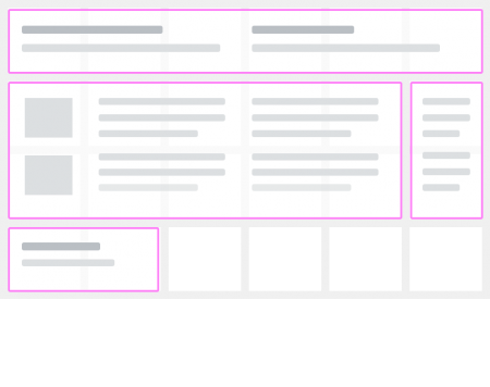
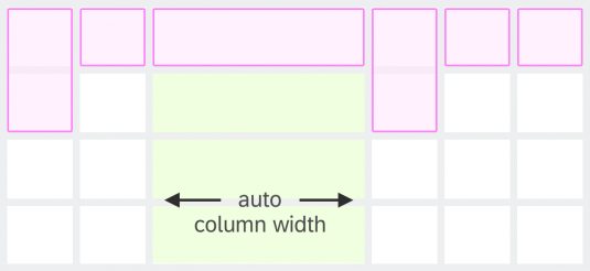
You can arrange layout elements so that the content displays or flows both horizontally and vertically in the flexible grid. If a column is set to auto-width and other columns have a fixed size, the auto-width column expands to the maximum width available, as defined by the overall grid width.
Here are two flow designs for the flexible grid:
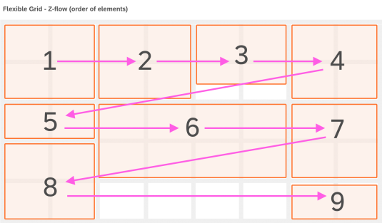
Z-Flow (default)
Grid items are displayed in a sequence row-by-row (or Z shape-pattern), top-to-bottom. The reading order is left-to-right (when RTL is enabled, it is right-to-left).
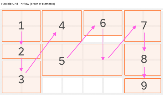
ᴎ-Flow
Grid items are displayed in a column-by-column, top-to-bottom sequence (or N-shape pattern). The reading order is left-to-right (when RTL is enabled, it is right-to-left).
Resizing the Screen
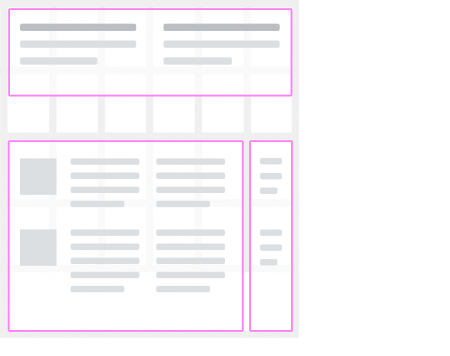
When resizing the screen, the grid layout adapts to the available space, and the grid elements are automatically rearranged based on their position in the sequence. This allows you to apply the flexible grid to a variety of devices and use cases.
Top Tips
Include UI elements and controls that make sense in a flexible grid layout. Their content should adapt appropriately when the grid is resized, or the elements rearranged.
Include UI elements for which you might want to customize both the vertical and horizontal alignment.
If you want to include nested grids, consider the UX investment you’ll need to make to achieve the desired visual and structural result with your grid layout.
We don’t recommend using several nested grids, as it might result in an over-complicated UI layout. Also, the UI elements in your grid might not align at all with other UI elements of the grid as intended.
Properties
sap.ui.layout.cssgrid.CSSGrid
The following additional properties are available for the flexible grid:
- The property width sets the width of the flexible grid.
- The property gridTemplateColumns defines the number of columns in the flexible grid.
- The property gridTemplateRows defines the number of rows in the flexible grid.
- The property gridColumnGap sets the width of the gap (gutter) between columns.
- The property gridRowGap sets the width of the gap (gutter) between rows.
Related Topics
Elements and Controls
- List (guidelines)
- Card (guidelines)
- Tile (guidelines)
- Responsive Spacing System (guidelines)
- Responsive Table (guidelines)
- Multi-Device Support: Responsive vs Adapative (guidelines)
Implementation
- Generic Tile (SAPUI5 samples)
- Simple Form (SAPUI5 samples)
- List Report and Object Page (developer guide)



 Your feedback has been sent to the SAP Fiori design team.