 Redesigning Entry into Applications
Direct Input of the Object
If the user does not have a chance to select the processing object from a list, the object can be entered in the upper area of the screen (initial area).
The option to select a processing object and a processing type becomes a component of the normal screen where the object is also processed.
The next example illustrates a simple solution for the following case:
- The functions "Create", "Change", and "Display" (in that order) appear to the right of field "Class" and "Class type", next to the input fields. The object-function approach is used here: the class and class type are entered first, and the function is then triggered
- The object can also be created with a template; implementation: pushbutton "Create with reference" (icon!), which appears to the right of the other functions, displays a dialogue window in which the complete object with the template is specified
- Other optional key fields, like "Change number" and "Valid from", can appear in the initial area, but are placed under the functions for selecting the processing type
- No illustration: If "Create" uses other key fields than "Change", then these fields are placed below the others, separated by a blank line. The "Create" function moves down and to the right, accordingly. A different group frame can be placed around these key fields and the "Create" function to emphasize that they belong together.
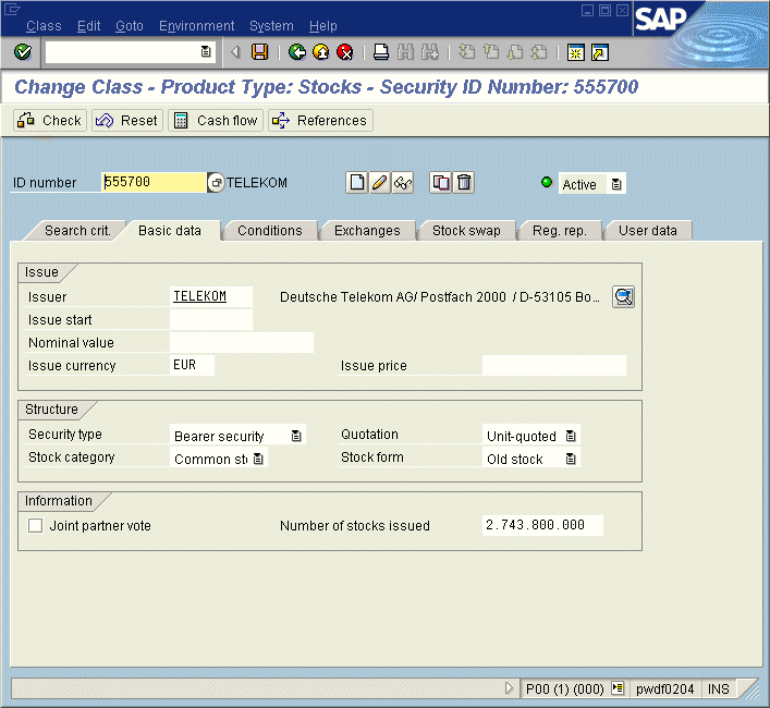
Figure 1: Direct Input of the Object
Click image to enlarge it!
The following example illustrates a somewhat different solution (compare diagram below; this diagram has been modified for the recommendations):
Because directly assigning the "Display", "Change", and "Create" functions would make it unclear which fields have to be filled first (different combinations for key entry are possible), all the functions have been consequently placed in the application toolbar. The user has to know, however, that the "Account group" field must be filled before "Create" can be used. Still, the blank line between company code and account group is a signal that these two fields are not related.
Merging the "Create" and "Create with reference" functions would be possible, and would save two lines. However, the "Create" function would always call a dialogue window, which would force the user into a modal dialogue. Which solution is better depends on how frequently the "Create" function is used.
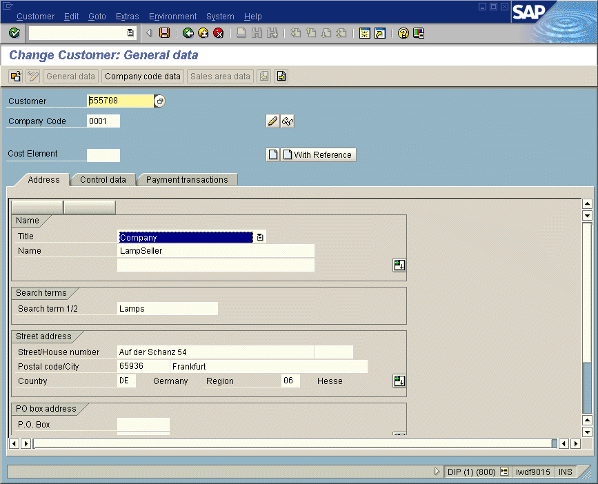
Figure 2: Alternative solution
Click image to enlarge it!
Questions and Answers
- How is the initial area separated from the data input area?
- A blank line should be used to separate the two areas.
- When the appropriate Basis elements are available: use a split bar to separate the areas; the individual screen components should be implemented as subscreens within a control container.
- What appears in the lower data input area when no object has been selected yet?
- Whenever possible, the default data input area with all input elements should be displayed; if the processing object has to be selected first, the input elements are initially inactive. Otherwise, these fields are ready for input. If no other possibilities exist, the area can initially be left blank (blank tab strip)
- Location of focus, and what does the Enter key do?
- A specific processing type should be assigned the default, depending on the user role. If the user enters the processing object in the upper initial area and presses the Enter key, the default processing type is triggered. Of course, the user can also select other functions.
- How can different authorizations be handled?
- All processing types that are possible within the application are displayed using pushbuttons. If a user is not authorized to perform certain processing types, the corresponding functions are hidden (at the present time, functions in the application toolbar can either be hidden or set to inactive; when in doubt, please set them to inactive).
- How should the functions be arranged?
- If the fields to fill are clearly identified, the processing functions should appear to the right of the respective field groups, next to the respective lowest row of a group; otherwise, it is better to place the functions in the application toolbar.
It Is Better to Select a Value than to Enter an Object Key
In the current initial screens, the selection/entry of the processing object is almost always performed by entering (combined) keys, and not through the selection via comprehensible, self-explanatory texts - i.e. the user types in the key.
It is better to allow the user to select the object from a list with self-explanatory texts. The Basis element drop-down listbox can be used for this purpose. If enough space is available on the screen, the objects can also be displayed directly in a list (e.g. table control). If there are seven or less fixed expressions, you can also use the radiobutton element.
Whenever possible, you should assign sensible default values to the fields. If a value is fixed for a certain user, then the corresponding field should be hidden/set to read-only at runtime.
Note
- The processing functions must be assigned to the (appropriate) F keys in the menu painter.
- If a user is not authorized to perform a function, that function is hidden.
- When the focus is in the initial area, the context menu should only contain those functions that affect the initial area (please follow the corresponding recommendation on context menus).
- Assign a sensible default function to the Enter key: The Enter key must be assigned one of the displayed functions. This default assignment should be user-specific (or user role-specific) and defined in customizing.
- In addition to the application name, the title must always also display the selected function (or default function), such as "Change Purchase Order".
- In addition, the application can be programmed such that the last processed object is displayed automatically when the transaction is started.
Remember
If there is no difference between "Create", "Change", or "Display" - that is, there is only one default function that can be executed for the object - then assign it to the Enter key and visualize it with the ICON_OKAY pushbutton.
The diagram below illustrates the input options for the above object with subsequent triggering of the Enter key. Of course, the object can also be selected directly from a tree (ALV tree).
Figure 3: Input options for object with subsequent triggering og the Enter key
Click image to enlarge it!
Entering Additional Details and/or Template/Reference
There are three possible alternatives for implementing and positioning additional input elements that do not fit in the default initial area:
- Use an additional pushbutton to open a dialogue window
The "Details..." pushbutton or "[ create icon ] or [ Create with reference... icon ]" displays a dialogue window where additional entries can be made. - Use a pushbutton to expand the initial area
A "Details" pushbutton with the "Expand" icon (ICON_Data_Area_Expand) is placed under the input fields (left-aligned). This function adds additional fields - which are surrounded by a group frame - to the initial area. When the expanded area is visible, the pushbutton changes to "Collapse" with the collapse icon (ICON_Data_Area_Collapse). - Split the initial area and data input area with a split bar; in this case, the additional fields are initially hidden and must be expanded to be visible
The additional input area should be surrounded with a group frame and an appropriate header.
You must decide on a case-by-case basis which approach is best. The disadvantage of the third alternative is that the user does not immediately see that the area can be expanded; but the status can be recorded. The second alternative is more explicit for the user and is therefore the preferred solution. The first alternative only makes sense when multiple fields are present but they are only rarely used.
Changing the Processing Object During Processing
If the application has a single key field with internal number assignment (see below) that uniquely identifies the object, the following sequence can be added to the upper right of the screen; it allows a different object to be selected during the processing of the current object:
[Field label] [Input field] [Pushbutton with icon for a different object]
The pushbutton with the "Other object" function can also appear in the application toolbar. When this function is triggered, a dialogue window is displayed in which the user can specify the object to process.
This solution allows the fields in the input area to be set to read-only when an object is already in processing, but the user can still switch to a different object.
Source: SAP R/3 Style Guide