What is the "New Paradigm"?
Until now, transactions in the SAP System have been characterized by relatively static screen sequences. Typically, users had to enter an application via an entry screen, only to be confronted with a series of deeply-nested data entry screens that had to be handled consecutively.
Starting with ENJOY, a new design pattern has emerged. For certain types of applications, the sequences have been replaced by so-called single-screen transactions, where all transaction areas can be accessed without changing screens. This new design represents a thorough overhaul of the existing applications, and thus requires some new and sometimes unusual redesign techniques.
This approach both improves navigation for the enduser and eliminates the forced sequence of the dialogue across multiple screens. There are still situations, however, in which the processing object has to be selected in a separate screen, such as for complex selections (queries) or situations in which there is no alternative to placing many fields or select options on one screen to determine the processing object.
Goals of the New Design
Combine entry and data screens into one window to simplify navigation and retain the context for the user.
Facilitate switching between Create, Change, and Display (for example, set a "standard" mode according to user authorizations). In some cases, there may be no need to differentiate between Change and Display.
- Change, (Display) [select object, then choose function]
- If possible, let user select object from list
- Double click chooses user’s default function (Change or Display)
- Put Change and Display on context menu
- Possible option: Different object with a dialogue box
- Create; Copy from
- Possibilities:
- Choose function, then select object
- Select object, then choose function
- Possible: Copy from presents a dialogue box
- Options: System remembers most recently copied reference(s)
- Presents most recent reference as default
- Presents drop down list
- Possibilities:
Make any object (such as invoices or purchase orders) directly accessible
- User selects objects from list / tree
- Position on screen: Left side
- Tip: Provide suitable views for object selection (for example, the ten objects last edited)
- User identifies object by entering values in fields
- If appropriate. Example: User enters document number
- Position on screen: Top left corner, or across the top
- User searches for object
- dialogue box with query and ranked list
- Ranked list as additional view in the tree
Retain the context after saving an object, that is, the user stays on the application screen
What does the "New Paradigm" mean in Detail?
Screen Areas

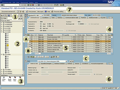
Figure 1: Screen areas within the new design
Click on an area to learn more about it! Click here for a larger version of the screenshot.
The (clickable) image above shows a sample window consisting of seven separate but interrelated areas. Each area serves a specific purpose. The content and naming of these areas depend on the user's current task. The following table provides an explanation of the specific sample functions.
| Filter, search, and other tree-related functions | |
| Object selection, in this example: using a tree | |
| Work items: Used for storing "remembered" or "prestored" objects and for displaying workflow items | |
| Header area containing data identifying the object | |
| Items (for example, of an order) | |
| Details for each of the items | |
| Application Toolbars |
A central goal of the new design is to facilitate user focus on the current task. Depending on the task at hand, users can concentrate on a specific area, while more or less ignoring irrelevant details. The following two methods support this task-oriented user guidance. You can use:
| Expand / Collapse of Areas | |
| Splitter | |
| Separating and Connecting the Areas |
Source: SAP R/3 Style Guide