The Screen Areas: A Closer Look
 |
 |
 |
 |
 |
 |
 |
 |
 |
 |
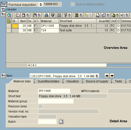
The new single-screen transactions have integrated numerous areas of an SAP transaction into a single window. These areas are described in greater detail below, using a sample transaction.
 |
Filter and Search Area |
The area for searching and/or filtering data can be used both to reduce the number of entries displayed (for example, in a tree) and to select a specific entry quickly.
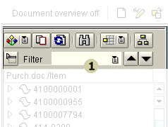
In addition to the filter/search function, this area can contain elements such as the toolbar of an ALV tree.
 |
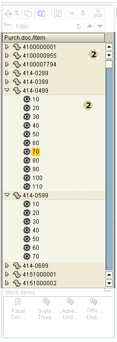
Object Selection |
The object selection area is used to find and select entries quickly within a larger quantity of related elements. Depending on the underlying data structure and the user's specific task, either list- or tree-like displays should be used.
 |
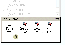
Work Items |
The work item area can contain current or temporarily available objects. These could be "remembered" or "prestored" objects that have to be edited later. It might be reasonable to incorporate items coming directly from a workflow as well.
 |
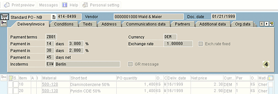
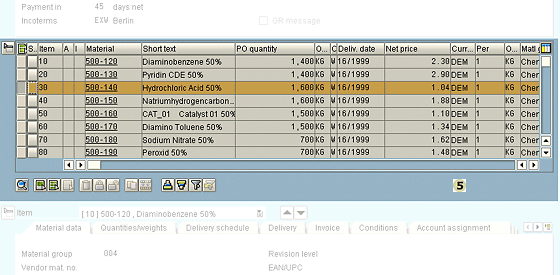
Header Area |
The header area contains information that unambiguously identifies an object. Additionally, it may display data from the master record which is relevant to the task. Furthermore, the header area can include entry fields for selecting another object, for example through direct entry of object values (see the following example).
Including these fields might lead to situations that are no longer unambiguous (to the system). For example, the user can change data in the items or detail area and subsequently enter a different object identifier (without saving the changes first). In this case, the application can no longer "decide" whether the item changes are intended for the "old" or the "new" object.
 |
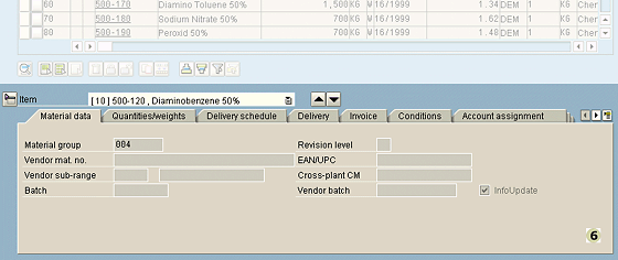
Items Area |
The items area contains a list of subobjects related to the object specified in the header area. These objects could be the single items belonging to an order, for example. This area aims to provide a compact overview of these single items. This is typically achieved by using a table control or an ALV grid control.
Changing items always causes the data displayed in the detail area to change accordingly. This means that the item and detail areas are always interrelated.
 |
Detail Area |
The detail area is used to display and change larger amounts of data associated with each item. This area usually has its own buttons for navigating between items. The navigation itself is reflected in the item area.
Because the detail and item areas are so tightly coupled, "precedence of navigation" rules must be implemented.
Note: Scrolling does not alter the explicit selection or change the details areas
 |
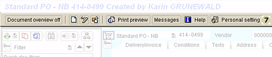
Application Toolbars |
As a consequence of the single-screen design, the application toolbar often only contains a small set of functions related to the entire selected object or the entire screen. These could include functions for displaying or hiding the object selection area, or for "creating with reference" or "remembering."
In an application that can do without screen changes, the navigation buttons Back, Exit, and Cancel may be assigned to different functions. The following table provides an overview of the current recommendations:
Icon |
Name |
Meaning |
 |
Back | Exits the application (after a confirmation message) and returns to the next higher level. |
 |
Exit | Exits the application (after a confirmation message) and returns to the application level. |
 |
Cancel | Empties the data entry fields (after a confirmation message) and enables the fields for object selection |
Most of the available functions will be placed directly in the appropriate areas and will thus be available to the user where they are most needed.
 |
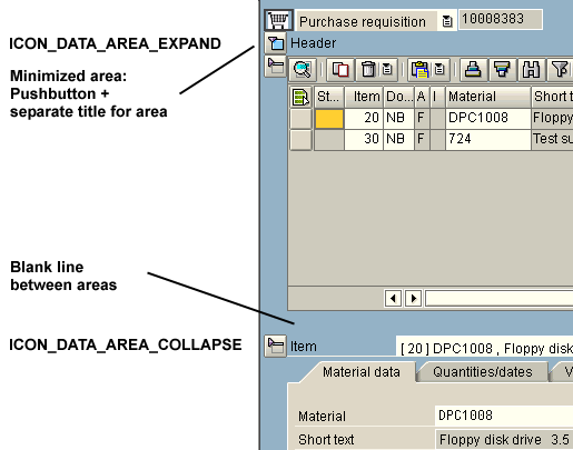
Expand/Collapse of Areas |
Expand and Collapse buttons are especially useful for horizontally subdivided areas. For example, at the push of a button you can resize the header area to a single line, yielding more space for the other areas. With this technique, users can choose between different layout combinations reflecting the focus and information need of the current task.
 |
Splitter |
 |
Separating and Connecting Areas |
- Separating the areas (subscreens)
- Use blank lines between areas
- Do not put a group box around tabstrip controls or table controls with table-related functions (except to group one of those elements with other elements)
- Connecting the items area and details area
- Choose detail is on F2; page in tab, choose in table
- Previous and Next in Details area moves selection mark line-by-line in table control (so does scrolling in Details area)
- Optimize Resize behavior of areas
- Scrolling does not alter the explicit selection or change the Details area
- Selected tab page is "remembered"
Guidelines for Interaction by Selecting Items in Overview Area
- Where you can select only one item
- When selected explicitly (item selection element on)
- Initially: Details empty
- Previous item, Next item goes to anywhere in table and selects the destination item
- When selected implicitly (cursor in row)
- Detail shown depends on cursor position: Set explicit selection in program
- Previous item, Next item goes to anywhere in table
- When selected explicitly (item selection element on)
- Where you can select multiple items
- When selected explicitly (no implicit details)
- Previous item, Next item goes to previous or next
selected row in table
- Previous item, Next item goes to previous or next
- When selected explicitly (no implicit details)
- In details screen:
- For context: top line in details:
Item <Text> <Previous pushbutton> <Next pushbutton > - Icons: Use the triangles pointing up and down
- Disable the Previous or Next pushbutton, as appropriate, when first or last item is current
- You could possibly have a Create icon pushbutton in the Details area (Row 1, right); or other pushbuttons, Delete, for example. This means users can enter data right in the Details area.
- For context: top line in details:
Source: SAP R/3 Style Guide