Arranging Fields and Field Groups
A good screen design essentially depends on the arrangement of the fields within the work area. This document specifies criteria on how you should arrange the fields on the current or adjacent - that is, the previous or next - screen.
There are two general guidelines, you should keep in mind:
- Keep templates consistent: Make sure that all colleagues involved in designing the screens for a particular task all follow the same criteria.
- Efficiency vs. good design: An efficient dialogue procedure has priority over a pleasant visual design of the work area.
Arranging Fields With Regard to the Screen Sequence
The sequence of screens should correspond to the work process of the user. Place important fields on the first screens of a task.
Complement this by implementing an efficient navigation: Allow the user to address individual screens as variably as possible and to go back and forth in a screen sequence.
A screen in a screen sequence should correspond to an idea or a partial task of the user. In the work area, display only the data that are essential for completing a task. Additional information should only be available on request or on a separate screen.
Arranging Fields in the Work Area
To arrange fields, observe the following criteria:
- If there is a typical hardcopy form, the work area should correspond to this form.
- Position general fields before specific fields.
- Position important fields in the upper left corner of the work area, because the user focusses his or her attention there.
- Generally, fields should appear at the upper left of the work area. On data screens position the first field in the first line.
Exception: On initial screens position the first field in the third line.
Arranging Fields in Blocks
Collate groups of field names and their respective I/O fields in blocks.
Both field names and I/O fields are left-aligned. The longest field name of a block group defines where the I/O fields begin.

Figure 1: Field names and I/O fields arranged in left-aligned blocks
Arranging Values to be Compared
Position fields whose values the user has to compare with each other one below the other.

Figure 2: Fields whose values are to be compared are arranged below each other
Exception: If many "From-To" value ranges are grouped close together in the work area of a report selection screen, use the arrangement as shown in the example. Alternatively, the "From" values may be preceded by "From".

Figure 3: Arrangement of a group of to be compared values
Repeating Name Elements in a Block
If two field names are in part identical, you should still use the full name for both field names.

Figure 4: The name element Material is repeated in the block
Arranging Blocks to Form a Block Group
Number of Blocks, Lines and Fields per Block Group - Maximum Number of Block Groups
- In the simplest case, a block group contains only one block.
- Limit block groups to two or three blocks with six or seven lines at most and a total of ten to twelve input fields.
- If there is a large number of fields, try to group them in two block groups.
- You should have not more than three or four block groups on a screen.
Group Heading/Group Box of a Block Group
Provide a block group with a group box and identify it with a group heading.
You can also include dynamic fields in the heading if these are not too long (less than 15-20 characters).
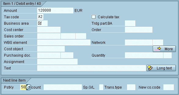
Figure 5: A block in a group box with identifying group heading (with dynamic field)
Exception: Header data is not provided with a group box. You start in the first line of the work area.
Separation of Elements in Blocks, Separation of Blocks
- Separators in block groups: Do not use separator lines, neither horizontal nor vertical, within a block group. Use blank lines to separate areas in block groups.
- Minimum horizontal spacing between two blocks of a block group: At least five characters between two blocks
Exception: If the longest field of the left block will most likely not be filled, you can reduce the space between blocks to one character. - Maximum horizontal spacing between two blocks of a block group: Not more than 10 to 15 characters
If you use group boxes these start at particularly marked locations, for example, at column 1 or 42. This also contributes to a consistent interface design.
Arranging Several Block Groups on a Screen
Blank Lines Between Block Groups
There is no blank line before a group heading (Exceptions: header data, group boxes on initial screens).
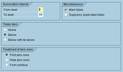
Figure 6: There are no blank lines before group headings
Aligning Blocks in Different Block Groups
Consider, you have block groups consisting of field names, input fields, another block of field names, etc. In this case you need not align the second or third blocks in block groups with the corresponding second or third block in an adjacent block group. You should arrange the blocks optimally within each block group, and then define the spacing for the blocks in the two adjacent block groups. If the distance is less than five to seven characters, you can align the leftmost block with the right-hand block. Otherwise, leave the left block as it is.
Example 1 - Optimizing by Aligning the Right Block Groups
In schematic terms, the fully filled work area originally looks as follows:
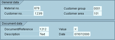
Figure 7a: Bad example for aligning right block groups
In this case, you should align the two right-hand blocks with each other to achieve a more harmonious arrangement:
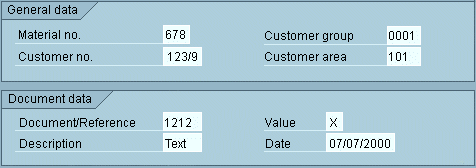
Figure 7b: Good example for aligning right block groups
Example 2 - Do not Align the Right Block Groups
If, schematically, the fully filled screen looks as below, you should not move the lower right block to the right to align it with the upper right block. Leave it close to the lower left group, instead.

Figure 8: Do not align the right block groups
Priorities
If possible, try to align both field names and input fields of the blocks in different block groups with each other. However, the alignment of I/O fields has priority over the alignment of field names. This applies particularly to the leftmost blocks in the various block groups.
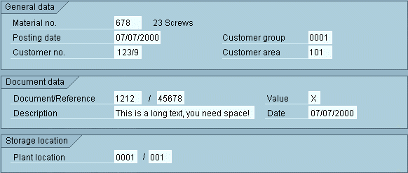
Figure 9: Align input fields instead of field names
In figure 9 the left block groups are left-aligned. The input fields of the right block groups are also left-aligned. The corresponding field names are not left- aligned because one does not want to shorten the field names in the upper block. In addition, the lower block group cannot be shifted further to the left because of the long text field.
Source: SAP R/3 Style Guide