 Tree Structures
Design and Layout
Trees are well-suited for navigating through hierarchically structured data and for manipulating these structures. They are less well suited - especially considering the limited space available (tree as docking control to the left of the main window) - for displaying large amounts of detailed information.
In this context, when you use a tree, you should make sure that it only contains the information that the user really needs to uniquely identify the contents.
Tree structures are used whenever you want to display more than two levels of a hierarchy. Due to the increasing complexity of the display, however, you should never model more than five levels in a tree.
Note: If you determine that you will need more than five levels, you should consider whether the amount of information at hand is too extensive for the screen. In this case, you should consider other options for displaying the additional information, such as navigation to a further main screen, calling a dialogue box, or structuring the additional information in a tabstrip.
Tree Variants
The tree control has three different variants: The Simple tree as the simplest form of the hierarchy, the List tree and the Column tree , which can be used primarily for trees with heterogeneous line structures.
Nodes, Scrolling, and Objects
The original concept of a tree consisted of a hierarchy of folders (nodes) and pages (documents, or "printed pages"). In many cases, this metaphor is not suitable for the objects that are involved in an application. Therefore, whenever you use a tree, you have to consider exactly which functions and views you intend to model with the different elements of the tree.
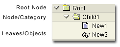
Figure 1: Elements of a Simple Tree
You may encounter problems when allocating the different "object types" to the corresponding elements of the tree. The following table lists an overview of possible combinations and the resulting problems.
| Object Type | Display |
|---|---|
| Objects (in the real world; applications) | Node / page |
| Functions (of an application) | Should not be contained in a tree |
| Attributes (of an object) | Columns in a column tree |
| Views (logical views; different lists / detailed views) | Sheets |
| Tasks (of a workflow) | Sheets (nodes if lower-level hierarchy structures exist) |
| Concepts | --- |
Table 1: Allocation of Objects to Tree Elements
- When objects are displayed as nodes (category), it is not always clear what to display in the work area when a category is selected. If an object/sub-object relation exists (object as node, sub-object as page), the object data is displayed in the work area when the node is selected, and the sub-object data is displayed in the work area when a page is selected.
- Functions (such as Create or Change) should generally not be displayed as elements of a tree. These functions are better placed in the toolbar of the tree itself (ALV tree) or in the application toolbar. The functions can also be contained in the context menu of the tree.
- Whenever possible, you should not use a root node if it merely represents the "header" of a tree. Instead, you should use the header area for displaying headers (in simple trees). By eliminating the root node, you save valuable space in the left screen area and reduce the visual complexity.
- Branches that only contain one additional node or one additional page are pointless, and should instead be summarized at the next-higher hierarchy level.
Header Area
The header area of a tree structure is generally used to identify the type of information in a list. In a simple tree, for example, this could be the name of the root node. In column trees, the header is used to describe the individual columns and change the respective column widths.
This results in the following recommendations for headers:
- In simple trees, you should use the header to describe the root node. As a result, you no longer have to model this node in the tree structure itself, and you can save a hierarchy level, making the tree clearer and easier to read.
- In a column tree, you should make it possible to display and hide the individual columns in the header. This enables the user to determine which degree of information is displayed in the tree. This is particularly useful for toggling between the objectives "simple, fast navigation" and "targeted browsing of detailed information".
Colors, Fonts, and Icons
Because the design options within the list technology were too restricted for structuring the information, list colors were created as an additional structuring option. This aid was also used for structuring within the list tree, but is no longer necessary thanks to a specialized user interface element.
As the table below shows, using colors in the SAPTree OCX is only sensible in a few places from an ergonomic and design standpoint.
| Attributes | List tree | SAPTree OCX |
|---|---|---|
| Hierarchy levels | Color | No color (except for the default background colors), since the hierarchy is already sufficiently visualized through indentation, icons, and/or lines. A tree control is an interface element that is optimized for displaying hierarchies. |
| Status | Color, symbols, and icons | Individual status with foreground color critical status and background color icon for object attribute |
| Object classes/type, attribute | Color, symbols, and icons | No color, but icons |
| Line/columns structure | Color | No other color is necessary, since lines, columns, and location make additional differentiation through color superfluous |
Table 2: Using Colors and Icons in a Tree
Notes
- The "folder" icon
 should
be used with great caution, since it symbolizes a container function!
However, R/3 only has a few objects that perform a "pure"
container function. This icon can be used sensibly to represent a work
list or user-defined views, for example. In this case, the "folder"
contains the elements and the folder characteristics can be filters
or selection criteria (example: see below)
should
be used with great caution, since it symbolizes a container function!
However, R/3 only has a few objects that perform a "pure"
container function. This icon can be used sensibly to represent a work
list or user-defined views, for example. In this case, the "folder"
contains the elements and the folder characteristics can be filters
or selection criteria (example: see below)
- If the lowest level of a tree represents different types of objects for which the system does not have any defined icons, you can use the so-called "unspecified" icons to differentiate between these types. These are the icons "Icon_unspecified_1" through "Icon_unspecified_5". These icons differ in both color and form.
Characteristics
Differentiating the status refers to the frequency with which a status appears in a tree. To indicate critical values, for example, it makes sense to choose an obvious background color, whereas obvious icons should be used to indicate object attributes that occur in nearly every line of the tree. The use of the foreground color to indicate the status is only sensible when you want to visualize a two-value element, since the selection of legible foreground colors is limited to black, blue, and red.
As a result, the following options for color-coding nodes are possible in the SAPTree OCX:
Figure 2: Color-Coding in Trees
Color are assigned in the SAPTree OCX using styles, which are defined through style constants. Styles cannot be combined with one another.
| Meaning | Color | Style Constant |
|---|---|---|
| Default | Black FG | TREEV_STYLE_DEFAULT |
| Positive importance | Blue FG | TREEV_STYLE_INTENSIFIED |
| Inactive status | Gray FG | TREEV_STYLE_INACTIVE |
| Negative importance | Red FG | TREEV_STYLE_INTENSIFD_CRITICAL |
| Negative threshold | Red BG | TREEV_STYLE_EMPHASIZED_NEGATIV |
| Positive threshold | Green BG | TREEV_STYLE_EMPHASIZED_POSITIV |
| General highlighting | Yellow BG | TREEV_STYLE_EMPHASIZED |
| Selection | Windows Standard | --- |
Table 3: Meaning of the Color Codes and Style Constants
Source: SAP R/3 Style Guide