General Design Guidelines for Lists
Clean Up First, Then Use Colors!
You cannot improve poorly structured lists by merely using colors. Try to come up with a clear list structure in the black/white display before you add any colors.
Arrangement
You can enhance legibility by:
- using alignments
- using extensive information units on the screen
- separating information units with blank lines
- inserting blank columns in lines to arrange the information clearly
One-Line vs. Multiple-Line Lists
Avoid multiple-line lists and use one-line lists instead. If you use multiple lines, try to align the subordinate physical lines to achieve a good display design.
Colors
Pre-Considerations
The color palette was developed based on the following considerations:
- Desaturated colors that harmonize with each other were chosen because they are less tiring on the eye.
- Each basic color has two shades (saturated and desaturated). This way, you can structure information much better.
Using Colors
When using colors, keep the following in mind:
- To avoid a mosaic effect, use only a few colors and apply them across large areas. Fill any gaps between colored areas. Extend colored areas beyond the length of the field to the borders of the list.
- Restrict gaps between columns and between the list body and the group box to one character, that is, to the separator line itself.
The List Color Scheme
Logical vs. Physical Colors
The following logical colors are reserved for particular list components. The color setting defines how logical colors look on a certain platform, that is, by assigning specific physical colors to the ABAP list colors.
Table 1 also gives the names of the physical colors as delivered with the standard setting. When coloring lists, you should refer to this setting. However, the users can change each of the listed colors to suit individual preferences. Leave the colors COL_POSITIVE and COL_NEGATIVE green or red, anyway, because they represent threshold values.
| # | Symbolic Color Name | Intensified | Intensified Off |
|---|---|---|---|
| 0 | COL_BACKGROUND | Background | Background |
| GUI-dependent | GUI-dependent | ||
| 1 | COL_HEADING | Headers | Secondary headers |
| grayish blue | bright grayish blue | ||
| 2 | COL_NORMAL | List body (1. stripe ) | List body (standard coloring or every 2nd stripe) |
| bright gray | almost white | ||
| 3 | COL_TOTAL | Totals, subtotals | Subtotals of higher degree |
| yellow | bright yellow | ||
| 4 | COL_KEY | Key columns | Highlighting lines/columns |
| bluish green | bright bluish green | ||
| 5 | COL_POSITIVE | Positive threshold value | Inserted lines |
| green | bright green | ||
| 6 | COL_NEGATIVE | Negative threshold value | Unused |
| red | bright red | ||
| 7 | COL_GROUP | Hierarchy header | Hierarchy information |
| violet | bright violet |
Table 1: Color settings
By default, INTENSIFIED is switched on.
The intensive colors (INTENSIFIED) are more saturated that the normal colors (INTENSIFIED OFF). When defining the physical list colors, a gray or white background (COL_BACKGROUND INTENSIFIED OFF) was assumed.
COL_BACKGROUND INTENSIFIED provides blue typeface on the background color to be compatible with the former display in highlighted form. COL_BACKGROUND INTENSIFIED OFF provides black typeface on the background.
Using Colors and Lines in Lists
We start with header information and one-line lists. For the other list categories we mention only the differences.
Note: You find example lists in the transaction LIBS. Information on how to program lines and colors is included in the ABAP online help on FORMAT and WRITE.
Header Information
The guidelines for the header area apply to all list categories.
Title
A title can optionally be issued in the work area (for example, if a report generates several lists).
The title is
- centered
- in COL_BACKGROUND INTENSIFIED
- and followed by a blank line
Object Information
Object information consists of field name, field value and, optionally, an explanatory text.
Object information is displayed
- as a one-column, two-column or multiple-column display as the display on normal screens, depending on whether there is enough space or not
- with no leading characters between field name and field value
- Field name: COL_BACKGROUND INTENSIFIED
- Field value and explanatory text: COL_BACKGROUND INTENSIFIED OFF
- and followed by a blank line
Action Performed on Lists
Action information is displayed as
- action and parameter are next to each other, separated by a colon and a blank character:
Action: Parameter
Example: Ascending sorting: Amount - if there is enough room, in two columns or multiple columns
- in COL_BACKGROUND INTENSIFIED OFF
- and directly followed by the list without blank line
One-Line Lists
The two following illustrations show typical one-line lists.
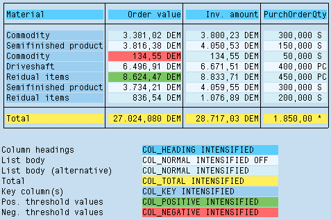
Figure 1: One-line list with striped list body
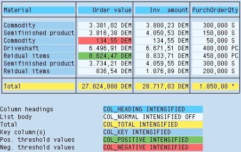
Figure 2: One-line list with uniform list body
Lines
Display one-line lists with a frame border. Separate columns and column titles by vertical lines. Separate column titles from the list body by a horizontal line. If there are hierarchical titles, separate these by horizontal lines as well. In addition, you may separate semantic groups of list rows by horizontal lines, if this increases readability of the list.
Column Headings
Align column headings like the respective data columns, for example: text information is left-aligned, formatted number formats are right-aligned, and column headings of higher levels are centered (compare figure 3).
Display column headings in color COL_HEADING INTENSIFIED.
If there are hierarchical column titles, display subtitles in color COL_HEADING INTENSIFIED OFF.
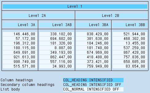
Figure 3: One-line list with hierarchical column headings
List Body
Display the list body in color
- Standard: COL_NORMAL INTENSIFIED OFF (uniform)
- Exception: If it is important to easily follow the lines or if the list is very wide: alternating COL_NORMAL INTENSIFIED and COL_NORMAL INTENSIFIED OFF (starting with COL_NORMAL INTENSIFIED)
Display key columns in color
- COL_KEY INTENSIFIED (uniform);
- Exception: If the list contains too many colors, use the color of the list body (this also applies to all other list categories).
Multiple-Line Lists
For multiple-line lists, the guidelines for one-line lists apply except for the exceptions or modifications described below.
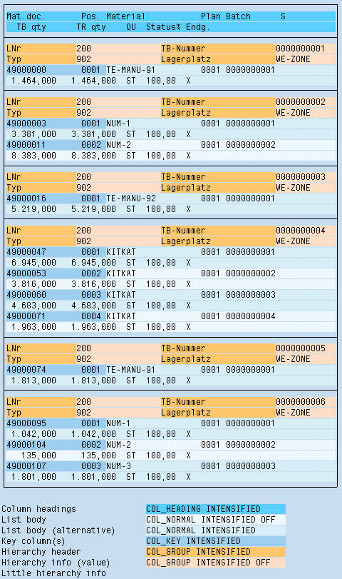
Figure 4: Multiple-line list
Lines
- Header rows: Separated from the list body as a whole by a horizontal line below the last physical header row; if it is possible to align the physical table columns, you can define vertical lines between the column headings.
- Columns: Usually separated from each other by at least two blanks; if it is possible to align the columns, you can also define vertical lines between the columns.
- List body: Do not separate individual logical rows from each other; you can, however, separate semantic groups of logical rows from each other by lines as in one-line lists to increase readability.
List Body
Display the list body with a stripe pattern from logical rows using the colors COL_NORMAL INTENSIFIED alternating with COL_NORMAL INTENSIFIED OFF (starting with COL_NORMAL INTENSIFIED).
In multiple-line lists, no columns are highlighted except for key columns.
You can highlight columns, however, if the columns are aligned with each other and if a continuous highlighting is useful with regard to the contents (see figure 4).
Hierarchical-Sequential Lists
Hierarchical-sequential lists are built from "groups" of lists which are introduced by their respective hierarchy information and put into a single frame border. Within this frame, separate groups from each other by horizontal lines.
Two cases are distinguished:
- The hierarchy information only consists of few criteria and key figures (orientation value: 4 criteria; decisive are transparency and storage requirement):
Display it just like object information, that is, field name, field value and explanatory text, if necessary. - The hierarchy information consists of a number of criteria and key figures:
The descriptions of the criteria and the key figures set up a separate header line on top of the normal header line. Display the corresponding values as normal line information above the list body for the group.
The actual data of a hierarchical-sequential list form a one-line or multiple-line list. With few exceptions, the guidelines for these list types apply to the list body.
Hint: If you already know beforehand that particular criteria do not vary, you should extract these criteria from the list and place them into the header information or into the hierarchy information. The list becomes more compact this way and the display is clearer.
Lines
- Column headings are not separated by vertical lines.
- Columns in a one-line list body are not separated by vertical lines.
- Groups: Each group of lines which is introduced by a hierarchy information is separated from the following group by a horizontal line.
List Body
- One-line design: COL_NORMAL INTENSIFIED OFF
- Multiple-line design: as multiple-line lists (stripe pattern from logical lines)
Hierarchy Information
As the hierarchy information creates the vertical global structure of the list - it indicates the beginning of a new group - it is highlighted in a special color.
Case 1: Hierarchy Information With Few Criteria and Key Figures
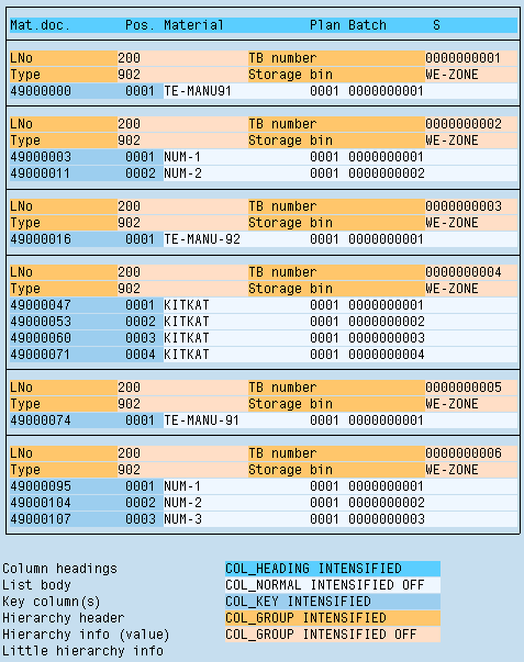
Figure 5: Hierarchical-sequential list with few criteria and key figures
The hierarchy information is placed in front of the actual data. This occurs in the same arrangement as on screens. Use the following colors:
- Field name of hierarchy information: COL_GROUP INTENSIFIED
- Field values and explanatory texts (if available): COL_GROUP INTENSIFIED OFF stored
Case 2: Hierarchy Information With Many Criteria and Key Figures
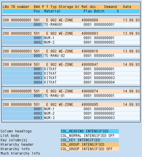
Figure 6: Hierarchical-sequential list with many criteria and key figures
Headers of the Hierarchy Information: Placed before the header line and structured like the column headings, however, with a separate column structure; there is no separator between them.
Color for Headers: COL_GROUP INTENSIFIED.
Hierarchy Information: Placed before the actual data; there is no separator between them.
Color for data: COL_GROUP INTENSIFIED OFF.
Matrix Lists
Column Headings and Row Headings
Display column headings and row headings in color
- Headers: COL_HEADING INTENSIFIED
- Subordinate headers: COL_HEADING INTENSIFIED OFF
Exception: A matrix list may result, for example, from grouping together data. In this case, data which used to be a key are now line headings. Here you can use COL_KEY INTENSIFIED for headers and COL_KEY INTENSIFIED OFF for subordinate headers to avoid changing colors.
List Body
The list body is uniformly displayed in color COL_NORMAL INTENSIFIED OFF.
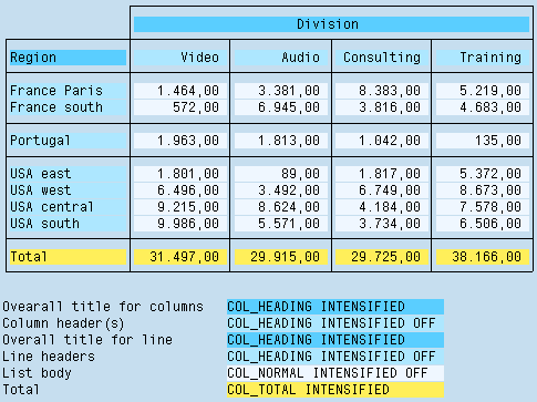
Figure 7: Matrix list
Source: SAP R/3 Style Guide