| You assign an icon to a function that is positioned
in one of the toolbars in the Menu Painter. The Menu Painter assists you
and makes suggestions for icons. However, you should check these suggestions,
before you assign an icon to a function.
Generally, most icons on pushbuttons should be used without a text label.
In addition, use them only for the suggested meanings in order to not
confuse the user. Avoid puzzles, that is, do not combine icons and text
to form new concepts. This may only be acceptable for standard functions
like Display, Delete, Print, Header, Overview
etc. that the users know well or where the icons aid in classifying functions.
Icons without Textual Label
The following functions use icons without a textual label:
- Execute, Find, Replace, Copy, Delete,
Sort, Total
- On detail screens: Previous entry (item, record), Next entry
(item, record)
- With screen sequences: Previous <object component/screen>,
Next <object/component/screen>
- With reports or hierarchies: Expand, Collapse, Previous/Next
hierarchy level
- With editing objects: Other <object>, Create,
Change, Display, Display <-> Change
- For selections: Select all, Deselect all, Select
Block
- Additional Functions (not yet standardized): Compare, Filter,
Rename, Find (next), Transport, Export,
Import
Icons with Textual Label
If there is enough room, you can include icons with a textual label for
special functions such as Refresh, Convert, Skip,
or Retrieve. Add text to the icon, when the icon only classifies
the class and a description is required to understand the full meaning
of the function.
Check if the pushbutton can be positioned next to the object in the work
area. Include only icons for application-wide functions in the application
toolbar.
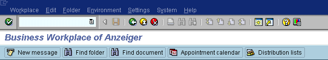
Order of Pushbuttons in the Application Toolbar
Try to observe the following order of pushbuttons in the application
toolbar:
- If applicable: icons for the functions Previous screen/Next
screen and then Previous <object component>/Next
<object component> (or item)
- Icon for the function Choose=F2
- Pushbuttons with icons alone
- Pushbuttons with icons and text labels
- Pushbuttons with text labels alone
- If applicable: less important functions with any of these presentation
forms
Try to present application-wide used functions with icon alone, that
is, to put them into group 3.
If in doubt, an aesthetically pleasing overall impression decides if
the icons should have a text label or not.
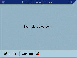
Icons on Pushbuttons in the Application Toolbar of Dialogue Boxes
Pushbuttons in the application toolbar of dialogue boxes can have icons,
too. The following guidelines apply to pushbuttons
with icons in dialogue boxes. They apply also to dialogue boxes without
an application toolbar.
|
 Pushbuttons
