Product Icon
Intro
SAP Fiori for Android product icons
The product icon of SAP mobile apps communicate the purpose of SAP’s mobile experience and supports business users in recognizing the app in the Play Store and on their home screens.
Our product icon design direction complements the Horizon visual design and creates a recognizable mobile brand. The balance between individual icon metaphors, characteristic shapes and coherent visual design embraces the SAP mobile product family.
We have created a guide that describes exactly how the style should look like and how to create a new icon.
Approach
As a base for the product icons, we use the same origin as the SAP Fiori icons. The best way to start creating app icons is to simply pick out an SAP Fiori icon that is the best metaphor for your app and then apply the style. It is not mandatory to use an icon as a base but it should follow the style.
Product icon metamorphosis
Anatomy
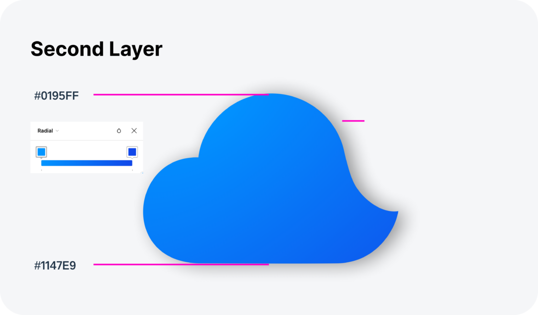
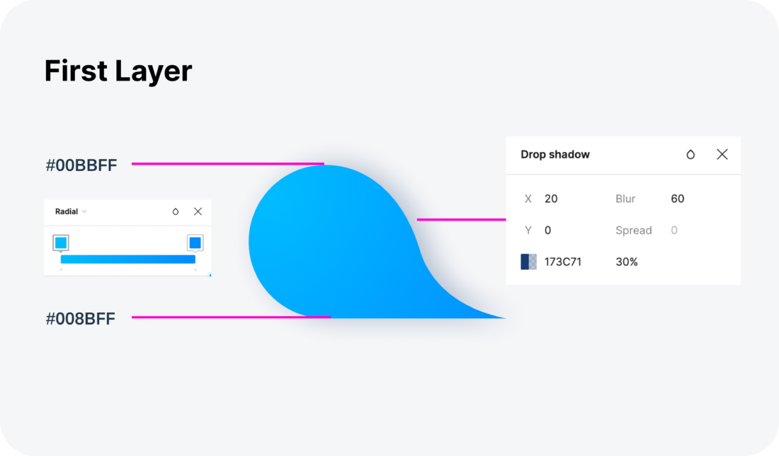
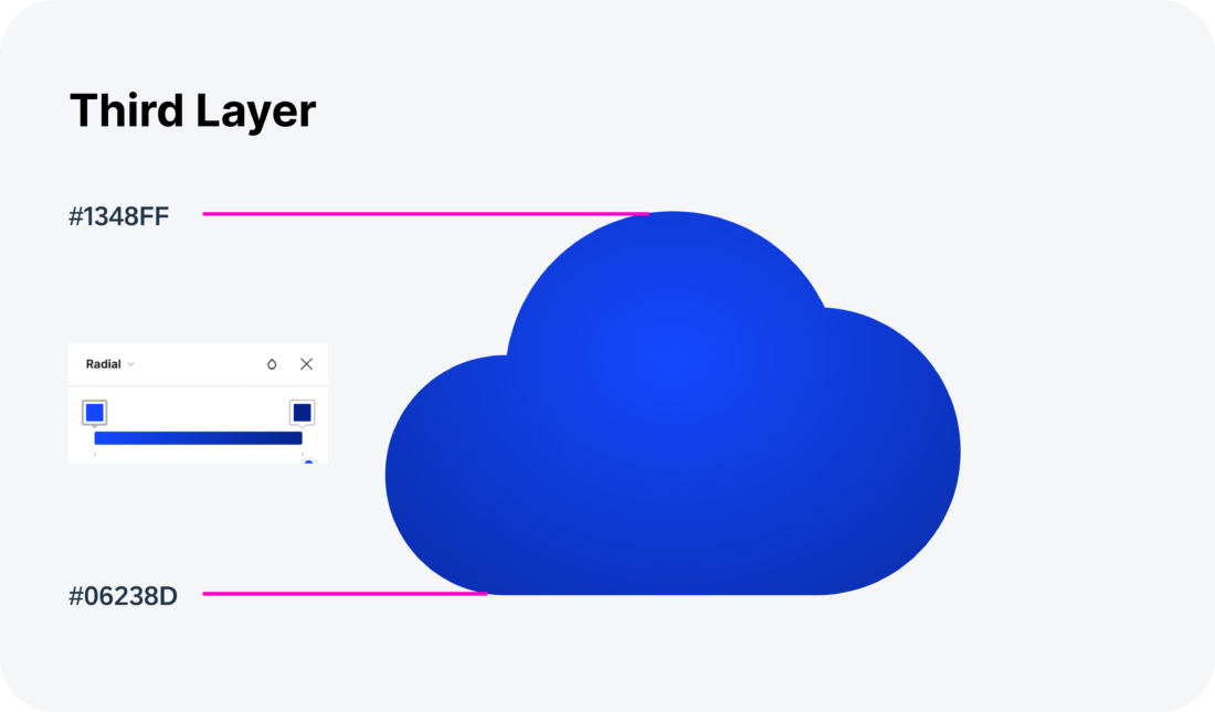
The product icon is composed of three layers and stand for the three-tier architecture.
- Database Layer
- Logic Layer
- UI Layer
The first level is the database layer and is the base shape of the app icon, then comes the second layer, this represents the logic layer and finally the UI layer which is the third layer of the product icon. For some icons there is also the possibility to use a highlight layer if needed.
Specification
Product Icon Creation
To learn more about the best practices and process for creating Android product icons, refer to the Material Design Product Icons article.
Resources
Material Design: Iconography – Product Icons


 Your feedback has been sent to the SAP Fiori design team.