
- Latest SAPUI Version 1.124
- SAPUI5 Version 1.122
- SAPUI5 Version 1.120
- SAPUI5 Version 1.118
- SAPUI5 Version 1.116
- SAPUI5 Version 1.114
- SAPUI5 Version 1.112
- SAPUI5 Version 1.110
- SAPUI5 Version 1.108
- SAPUI5 Version 1.106
- SAPUI5 Version 1.104
- SAPUI5 Version 1.102
- SAPUI5 Version 1.98
- SAPUI5 Version 1.96
- SAPUI5 Version 1.94
- SAPUI5 Version 1.92
- SAPUI5 Version 1.90
- SAPUI5 Version 1.88
- SAPUI5 Version 1.86
- SAPUI5 Version 1.84
- SAPUI5 Version 1.82
- SAPUI5 Version 1.80
- SAPUI5 Version 1.78
- SAPUI5 Version 1.76
- SAPUI5 Version 1.74
- SAPUI5 Version 1.72
- SAPUI5 Version 1.70
- SAPUI5 Version 1.68
- SAPUI5 Version 1.66
- SAPUI5 Version 1.64
- SAPUI5 Version 1.62
- SAPUI5 Version 1.60
- SAPUI5 Version 1.58
- SAPUI5 Version 1.56
- SAPUI5 Version 1.54
- SAPUI5 Version 1.52
- SAPUI5 Version 1.50
- SAPUI5 Version 1.48
- SAPUI5 Version 1.46
- SAPUI5 Version 1.44
- SAPUI5 Version 1.42
- SAPUI5 Version 1.40
- SAPUI5 Version 1.38
- SAPUI5 Version 1.36
- SAPUI5 Version 1.34
- SAPUI5 Version 1.32
- SAPUI5 Version 1.30
- SAPUI5 Version 1.28
- SAPUI5 Version 1.26
- Latest SAPUI Version 1.124
- SAPUI5 Version 1.122
- SAPUI5 Version 1.120
- SAPUI5 Version 1.118
- SAPUI5 Version 1.116
- SAPUI5 Version 1.114
- SAPUI5 Version 1.112
- SAPUI5 Version 1.110
- SAPUI5 Version 1.108
- SAPUI5 Version 1.106
- SAPUI5 Version 1.104
- SAPUI5 Version 1.102
- SAPUI5 Version 1.100
- SAPUI5 Version 1.98
- SAPUI5 Version 1.96
- SAPUI5 Version 1.94
- SAPUI5 Version 1.92
- SAPUI5 Version 1.90
- SAPUI5 Version 1.88
- SAPUI5 Version 1.86
- SAPUI5 Version 1.84
- SAPUI5 Version 1.82
- SAPUI5 Version 1.80
- SAPUI5 Version 1.78
- SAPUI5 Version 1.76
- SAPUI5 Version 1.74
- SAPUI5 Version 1.72
- SAPUI5 Version 1.70
- SAPUI5 Version 1.68
- SAPUI5 Version 1.66
- SAPUI5 Version 1.64
- SAPUI5 Version 1.62
- SAPUI5 Version 1.60
- SAPUI5 Version 1.58
- SAPUI5 Version 1.56
- SAPUI5 Version 1.54
- SAPUI5 Version 1.52
- SAPUI5 Version 1.50
- SAPUI5 Version 1.48
- SAPUI5 Version 1.46
- SAPUI5 Version 1.44
- SAPUI5 Version 1.42
- SAPUI5 Version 1.40
- SAPUI5 Version 1.38
- SAPUI5 Version 1.36
- SAPUI5 Version 1.34
- SAPUI5 Version 1.32
- SAPUI5 Version 1.30
- SAPUI5 Version 1.28
- SAPUI5 Version 1.26
Column Micro Chart
sap.suite.ui.microchart.ColumnMicroChart
Intro
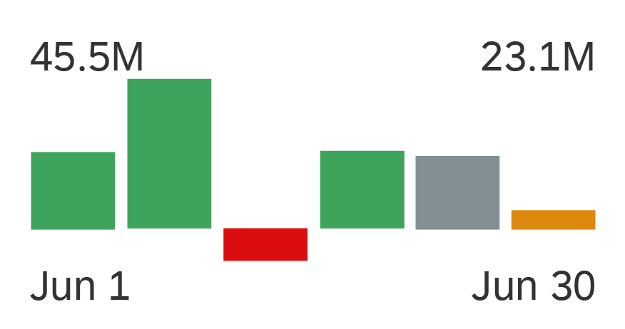
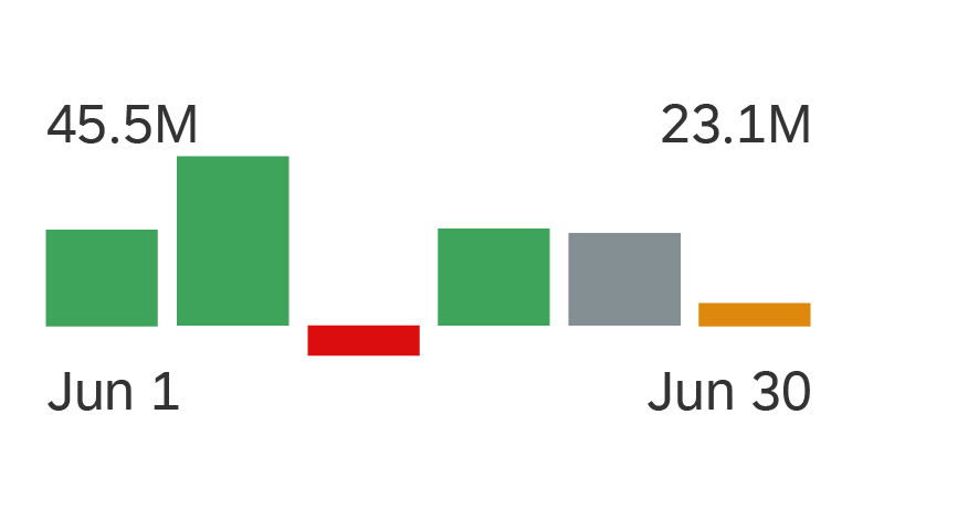
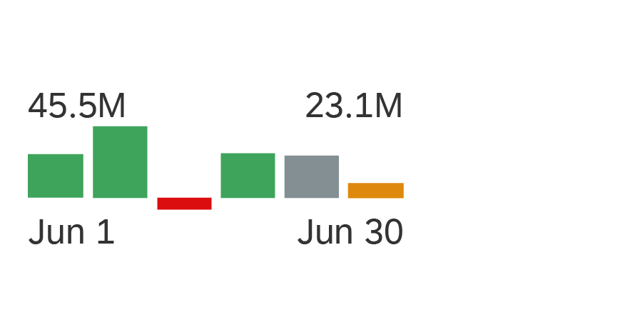
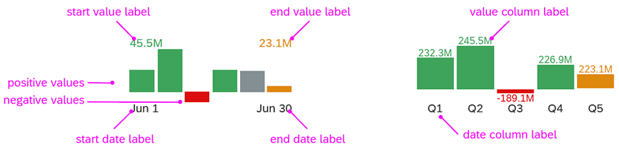
A column chart uses vertical bars to compare multiple values over time or across categories. One axis of the chart shows the categories being compared, the other axis represents a value. The bars of the column micro chart can represent both positive and negative values.
There are three main ways to visualize a column micro chart:
- View with top labels for start and end values, and bottom labels for start and end dates
- Detail view with labels for each vertical bar. This view can be used only if there is enough space for enough bars width in the container.
- No labels. In all cases, the label can be switched off.
You can use either the semantic chart palette or the qualitative chart palette.
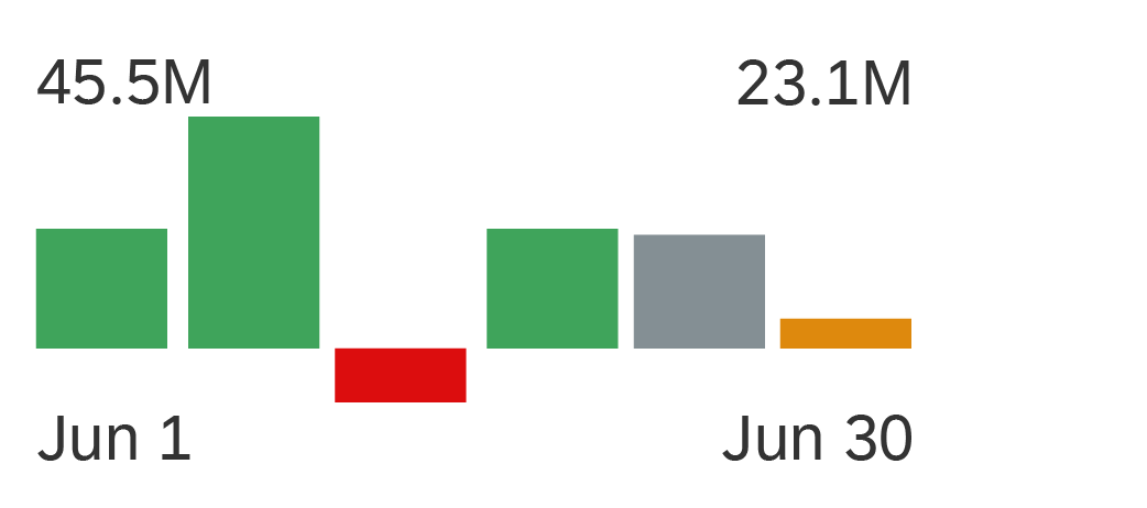
Column micro chart with top labels for start and end values, and bottom labels for start and end dates

Column micro chart without labels, using semantic colors
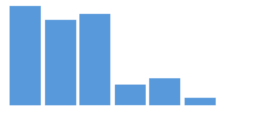
Column micro chart without labels, using qualitative colors
Usage
Use the column micro chart if:
- You want to visualize a trend.
- You want to compare multiple values over time or across categories.
Do not use the column micro chart if:
- You have a scenario that does not require a comparison over time.
Responsiveness
The column micro chart is fully responsive. The size adjusts dynamically based on the dimensions of the parent container. In addition, there are four fixed sizes: L, M, S and XS. Each fixed size is a snapshot of the fully responsive micro chart for specific dimensions.
Column micro chart - Size L
Column micro chart - Size M
Column micro chart - Size S

Column micro chart - Size XS
You can use size XS to embed the column micro chart in the cells of a grid table, analytical table, or tree table (also in condensed mode). Left-align the column micro chart in the table cell.
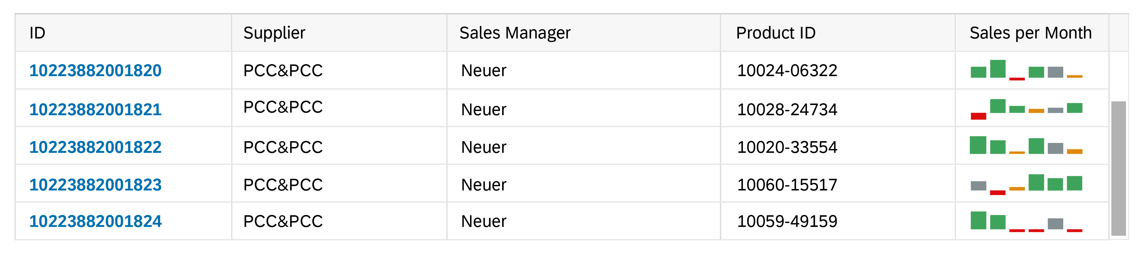
Column micro chart in size XS in a grid table
Maximum and Minimum Sizes
The column micro chart can have the following dimensions:
| Width | Height | |
| Maximum | 320 px | 94 px |
| Minimum | 64 px | 18 px |
If the chart height is less than 72 px, the column labels are hidden. Instead, the chart switches to the standard view, and shows the start and end values per chart, as well as start and end dates.
Components
Bars
The bars of the column micro chart can represent both positive and negative values.
We strongly recommend using only colours from the semantic palette for the bars (good, critical, bad, neutral). If your use case requires colours from the qualitative palette, use only one colour per chart.
Top and Bottom Labels
The labels for the column micro chart are optional. Use the bottom labels to indicate the beginning and the end of the time period. Use the top labels to show the corresponding values for the beginning and the end of the chart. The responsive behaviour of the chart hides labels if there is not enough space to display them (for XS size and smaller or if If the chart height is less than 56 px). Ensure that the labels for the values are not truncated.
Bar Labels
For a more detailed view of the chart, you can use bar labels. The bar labels are displayed only if the container is wide enough to accommodate a minimum number of bars. The bars must be at least as wide as the label. Otherwise, the responsive behavior of the chart automatically switches to the mode with only top and bottom labels displayed. Ensure that the labels for the values are not truncated.
Column micro chart - Components
Resources
Want to dive deeper? Follow the links below to find out more about related controls, the SAPUI5 implementation, and the visual design.
 Your feedback has been sent to the SAP Fiori design team.