- Latest Version 1.128
- Version 1.126
- SAPUI Version 1.124
- SAPUI5 Version 1.122
- SAPUI5 Version 1.120
- SAPUI5 Version 1.118
- SAPUI5 Version 1.116
- SAPUI5 Version 1.114
- SAPUI5 Version 1.112
- SAPUI5 Version 1.110
- SAPUI5 Version 1.108
- SAPUI5 Version 1.106
- SAPUI5 Version 1.104
- SAPUI5 Version 1.100
- SAPUI5 Version 1.98
- SAPUI5 Version 1.96
- SAPUI5 Version 1.94
- SAPUI5 Version 1.92
- SAPUI5 Version 1.90
- SAPUI5 Version 1.88
- SAPUI5 Version 1.86
- SAPUI5 Version 1.84
- SAPUI5 Version 1.82
- SAPUI5 Version 1.80
- SAPUI5 Version 1.78
- SAPUI5 Version 1.76
- SAPUI5 Version 1.74
- SAPUI5 Version 1.72
- SAPUI5 Version 1.70
- SAPUI5 Version 1.68
- SAPUI5 Version 1.66
- SAPUI5 Version 1.64
- SAPUI5 Version 1.62
- SAPUI5 Version 1.60
- SAPUI5 Version 1.58
- SAPUI5 Version 1.56
- SAPUI5 Version 1.54
- SAPUI5 Version 1.52
- SAPUI5 Version 1.50
- SAPUI5 Version 1.48
- SAPUI5 Version 1.46
- SAPUI5 Version 1.44
- SAPUI5 Version 1.42
- SAPUI5 Version 1.40
- SAPUI5 Version 1.38
- SAPUI5 Version 1.36
- SAPUI5 Version 1.34
- SAPUI5 Version 1.32
- SAPUI5 Version 1.30
- SAPUI5 Version 1.28
- SAPUI5 Version 1.26
- Latest Version 1.128
- Version 1.126
- SAPUI Version 1.124
- SAPUI5 Version 1.122
- SAPUI5 Version 1.120
- SAPUI5 Version 1.118
- SAPUI5 Version 1.116
- SAPUI5 Version 1.114
- SAPUI5 Version 1.112
- SAPUI5 Version 1.110
- SAPUI5 Version 1.108
- SAPUI5 Version 1.106
- SAPUI5 Version 1.104
- SAPUI5 Version 1.102
- SAPUI5 Version 1.100
- SAPUI5 Version 1.98
- SAPUI5 Version 1.96
- SAPUI5 Version 1.94
- SAPUI5 Version 1.92
- SAPUI5 Version 1.90
- SAPUI5 Version 1.88
- SAPUI5 Version 1.86
- SAPUI5 Version 1.84
- SAPUI5 Version 1.82
- SAPUI5 Version 1.80
- SAPUI5 Version 1.78
- SAPUI5 Version 1.76
- SAPUI5 Version 1.74
- SAPUI5 Version 1.72
- SAPUI5 Version 1.70
- SAPUI5 Version 1.68
- SAPUI5 Version 1.66
- SAPUI5 Version 1.64
- SAPUI5 Version 1.62
- SAPUI5 Version 1.60
- SAPUI5 Version 1.58
- SAPUI5 Version 1.56
- SAPUI5 Version 1.54
- SAPUI5 Version 1.52
- SAPUI5 Version 1.50
- SAPUI5 Version 1.48
- SAPUI5 Version 1.46
- SAPUI5 Version 1.44
- SAPUI5 Version 1.42
- SAPUI5 Version 1.40
- SAPUI5 Version 1.38
- SAPUI5 Version 1.36
- SAPUI5 Version 1.34
- SAPUI5 Version 1.32
- SAPUI5 Version 1.30
- SAPUI5 Version 1.28
- SAPUI5 Version 1.26
Card
sap.ui.integration.widgets.Card
Intro
A card represents an app or page. It can be used to launch the app or navigate to the page content. Integration cards are a way of making application content available to end users in a consistent manner.
Integration cards are similar to the cards on the overview page. However, unlike the overview page cards, integration cards can be used in different host environments.
A card can show details about a single app or page, or contain related information from multiple sources. An app or page can also be represented by several cards, which each focus on a different aspect of the content.
When to Use
You can offer cards on the SAP Fiori launchpad or embed them in other controls.
Offer a card if:
- You want to give users easy access to an app or page that is relevant for a business task.
- You want to show a KPI or a preview of the most important content for the task.
- You want to let users complete a simple action right away, without navigating to the underlying app.
Card Anatomy
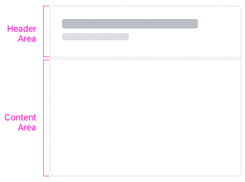
A card comprises a header and a content area, which are separated by a divider line. Both components are inside a card container, which includes the background and the border.
Header
The header shows what the card is about. There are two variants: the default header and the numeric header.
Default Header
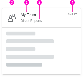
The default header shows the basic information about the card and has the following components:
- The title is mandatory and represents the “point of view” of the card. Titles longer than three lines are truncated with an ellipsis (…).
- Optional: You can use a subtitle to qualify the title or explain the context. Subtitles that exceed two lines are truncated.
- Optional: You can use an avatar to provide a visual hint on the card header (for example, an image, icon, or initials).
- If the content area contains multiple items, a counter is added to the header. It shows how many items are visible on the card in relation to the total number of relevant items (for example, “6 of 12”).
Numeric Header
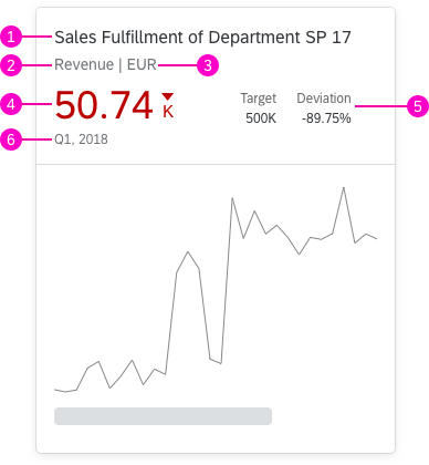
Use the numeric header if you need to display numeric information.
- Mandatory title
- You can add a subtitle with additional qualifying information (optional).
- If you specify a currency or unit of measurement, it also appears in the subtitle row. If you provide both a subtitle and a unit of measurement, the display format is: <subtitle text> | <unit of measurement>.
- In additional to the general information, you can configure the visualization for a numeric value, such as a KPI.
- If required, you can also show up to two additional indicators that relate to the main KPI.
- If required, you can display more information about the numeric value directly below it (for example, the period for which a KPI applies).
Content Area
The content area is reserved for showing information from the underlying source(s). Cards can represent different types of content, with several visualization options. This depends on which card type is used.
Card Types
The card type defines how content is presented (for example, as a list or table). The embedded controls govern the layout, navigation, and interaction in the card content area.
The following card types are available:
List Card
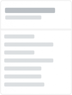
The list card can display multiple list items of various types.
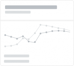
Analytical Card
The analytical card visualizes analytics data. It can contain a line chart, bar chart, or donut chart.
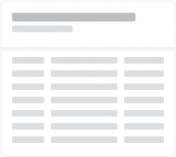
Table Card
The table card displays multiple items in a table view.
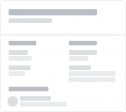
Object Card
You can use this card type to display information about an object in groups. Each group can contain as many items as needed.
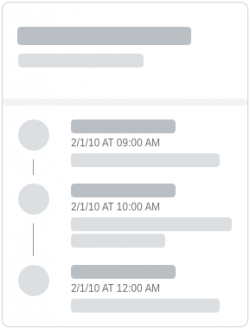
Timeline Card
The timeline card displays time-related content in chronological order.
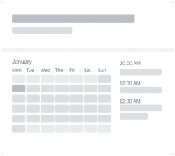
Calendar Card
The calendar card shows the schedule for a single entity (typically a person) for a selected day.
Component Card
The component card allows you to display a SAPUI5 component as content. This gives you significant flexibility in configuring the content.
Behavior and Interaction
Card Header
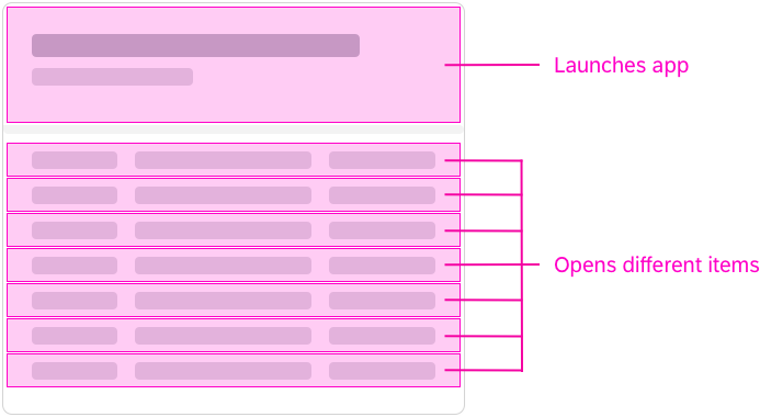
The whole header is clickable and is the navigation area for opening the underlying source. Clicking the header opens the app or page that relates to the card.
Card Content
The content area can have several click areas with different purposes. They depend on the control used and the structure of the content.
Responsiveness
The responsive behavior for integration cards depends on the container control of the host environment (for example, SAP Fiori launchpad). The size of the card adapts dynamically to the size of the container.
Top Tips
- Cards introduce users to the content in the underlying source. Make sure that your card focuses on the most relevant content.
- Use cards if supportive visualizations and meaningful navigations are helpful for users.
- Don’t use individual branding.
- Avoid unnecessary white space on the card.


 Your feedback has been sent to the SAP Fiori design team.