Skip to search Skip to content
  • Home
  • Get Started
    • Why Design Guidelines?
    • Navigating the Guidelines
    • Best Practices for Designing SAP Fiori Apps
  • Explore SAP Fiori
  • What’s New
  • SAP Fiori Design System
    • Overview
    • Design Principles
    • Design-Led Development
    • Accessibility
    • Multi-Device Support
    • Responsive Spacing
  • Look, Feel, and Wording
    • Overview
    • Design Tokens
    • Theming
    • Colors
      • Morning Horizon
      • Evening Horizon
      • Quartz Light
      • Quartz Dark
      • Belize
    • Iconography
      • Horizon
      • Quartz
    • Motion Design
    • Typography
      • Horizon
      • Quartz
    • UX Illustrations
    • UI Texts and In-App Help
      • UI Text Guidelines for SAP Fiori
      • Overview Page – UI Text Guidelines
      • Situation Handling Framework – UI Text Guidelines
      • SAP Companion
  • SAP Fiori Launchpad
    • Overview
    • Shell Bar
      • Overview
      • Enterprise Search
      • Notifications
      • Services
    • Home Page
    • Spaces
    • My Home
    • App Finder
    • Tile
  • AI and Joule Design
    • Overview
    • Guidelines
      • Design Principles
      • Building Trust
      • ———————————–
      • Explainable AI
      • Matching
      • Ranking
      • Recommendations
      • Situation Handling
      • User Feedback
    • Glossary
    • Helpful Links
    • Get in Touch with Us
  • General Patterns
    • Overview
    • Action Placement
    • Busy States
    • Collaboration
    • Content Density (Cozy & Compact)
    • Drafts
    • Empty States
    • Export to Spreadsheet
    • Flag and Favorite
    • Form Field Validation
    • Formatting
      • Overview
      • Dates
      • Numbers
      • Time
      • Units of Measurement
    • Navigation
    • Message Handling
      • Overview
      • Processing Multiple Items
    • Mobile Integration
    • Object Handling (Create, Edit, Delete)
      • Overview
      • Simple Objects (Create, Edit)
      • Complex Objects – Global Flow (Create, Edit)
      • Complex Objects – Local Flow (Create, Edit)
      • Copy
      • Create with Reference
      • Partial Edit
      • Mass Edit
      • Delete
    • Placeholder Loading
  • Page Layouts and Floorplans
    • Overview
    • When to Use Which Floorplan
    • Page Layouts
      • Comparison Pattern
      • Dynamic Page
      • Semantic Page
      • Flexible Column Layout
      • Letterboxing
      • Multi Instance
    • Floorplans
      • Analytical List Page
      • Initial Page
      • List Report
      • Object Page
      • Overview Page
      • Wizard
      • Worklist
  • UI Elements – SAPUI5
    • Overview
    • When to Use
      • Semantic Colors
      • Tooltips
      • Which Selection Control?
      • Which UI Element State?
      • Wrapping and Truncation
    • Action / Navigation
      • Action Sheet
      • Breadcrumb
      • Button
      • Icon Tab Bar
      • Link
      • Smart Link
    • Collaboration
      • Feed and Notes
      • Group Feed Component
      • Timeline
    • Data Visualization
      • 3D Viewport
      • Analytical Card
      • Calendar Card
      • Chart (VizFrame)
      • Gantt Chart
      • Interactive Chart
      • Map
      • Micro Chart
      • Micro Process Flow
      • Network Graph
      • Process Flow
      • Status Indicator
      • Timeline
    • Dialog / Popover
      • Dialog
      • Message Box
      • Select Dialog
      • Table Select Dialog
      • Value Help Dialog
      • ———————————–
      • Popover
      • Quick View
    • Display
      • Avatar
      • Avatar Group
      • Carousel
      • Currency
      • Expandable Text
      • Formatted Text
      • Generic Tag
      • HTML
      • Image
      • Infobar
      • Label
      • Lightbox
      • Object Display Components
      • PDF Viewer
      • Progress Indicator
      • Status Indicator
      • T Account
      • Text
      • Tile
      • Title
      • Token
    • Filter
      • Filter Bar
      • Icon Tab Bar
      • Infobar
      • Smart Filter Bar
      • Token
      • Visual Filter Bar
      • Views
        (Variant Management)
    • Form / Layout / Container
      • Card
      • Carousel
      • Dynamic Side Content
      • Flexible Grid
      • Form / Simple Form
      • Icon Tab Bar
      • Panel
      • Scroll Container
      • Side Panel
      • Smart Form
    • Loading / Processing
      • Busy Dialog
      • Busy Indicator
      • Busy State
    • Messaging
      • Illustrated Message
      • Message Box
      • Message Popover
      • Message Strip
      • Message Toast
      • Message View
    • Table / List / Tree
      • Overview
      • ———————————–
      • Analytical Table (ALV)
      • Grid Table
      • Responsive Table
      • Smart Table
      • Tree Table
      • ———————————–
      • Table Personalization
      • ———————————–
      • Grid List
      • List
      • Smart List
      • Tree
    • Toolbar
      • Overview
      • Chart Toolbar
      • Footer Toolbar
      • Header Toolbar
      • Table Toolbar
      • Tree Toolbar
    • User Input
      • Input Field
      • Multi-Input Field
      • Combo Box
      • Multi-Combo Box
      • Select
      • Smart Field
      • Mask Input
      • ———————————–
      • Select Dialog
      • Table Select Dialog
      • Value Help Dialog
      • ———————————–
      • Checkbox
      • Radio Button
      • Rating Indicator
      • Slider
      • Range Slider
      • Step Input
      • Switch
      • ———————————–
      • Date Picker
      • Time Picker
      • Date/Time Picker
      • Date Range Selection
      • Dynamic Date Range
      • Calendar Date Interval
      • Calendar
      • Planning Calendar
      • Single Planning Calendar
      • ———————————–
      • Color Palette
      • Color Palette Popover
      • Color Picker
      • Color Picker Popover
      • ———————————–
      • Feed and Notes
      • Rich Text Editor
      • Search
      • Text Area
      • Upload Set
    • Reuse Components
      • Calculation Builder
    • Smart Controls
      • Smart Field
      • Smart Filter Bar
      • Smart Form
      • Smart Link
      • Smart List
      • Smart Table
    • Support for Assistive Technologies
      • Invisible Message
      • Invisible Text
  • UI Elements – SAP Web Components NEW
    • Overview
    • Interaction Design Foundations
      • Value States
      • Wrapping and Truncation
    • Avatar
    • Avatar Group
    • Bar
    • Breadcrumbs
    • Busy Indicator
    • Button
    • Calendar
    • Card
    • Carousel
    • Checkbox
    • Color Palette
    • Color Palette Popover
    • Combo Box
    • Date Picker
    • Date Range Picker
    • Date/Time Picker
    • Dialog
    • Dynamic Side Content
    • Flexible Column Layout
    • Icon
    • Illustrated Message
    • Input
    • Label
    • Link
    • List
    • Menu
    • Menu Button
    • Message Strip
    • Multi-Combo Box
    • Multi Input
    • Page
    • Panel
    • Popover
    • Progress Indicator
    • Radio Button
    • Range Slider
    • Rating Indicator
    • Responsive Popover
    • Segmented Button
    • Select
    • Slider
    • Split Button
    • Step Input
    • Switch
    • Tab Bar
    • Table
    • Text Area
    • Time Picker
    • Title
    • Toast
    • Toggle Button
    • Toolbar
    • Tree
  • SAP S/4HANA Only
    • Integration of Classic SAP UIs
      (SAP Fiori Elements List Report)
    • SAP S/4HANA Product Home Page – My Home
    • System Information Bar
  • SAP Fiori Elements Framework
    • Overview
    • Analytical List Page / Overview Page
    • List Report / Worklist
      • Header
      • Content Area
      • Worklist
      • Integration of Classic SAP UIs
        (SAP Fiori Elements List Report)
    • Object Page
      • Overview
      • Header
      • Content Area
      • Footer Bar
    • Table / List
      • Table Types
      • Table Toolbar
      • Table Features
      • Table Rows
      • List
    • Replacing Placeholder Text
    • Terminology
  • Analytical Frameworks
    • Overview
    • Analysis Path Framework
    • SAP Smart Business
  • Designer Toolkit
    • Overview
    • UI Kit
      • Download Fonts
      • SAP S/4HANA Web UI Kit
    • Download User Research Method Cards
    • Ask the Community

Fiori for Web Design Guidelines

Explore SAP Fiori

Explore SAP Fiori

Categories

UI Element Types

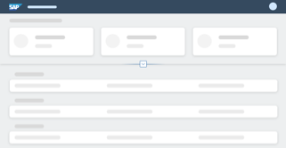
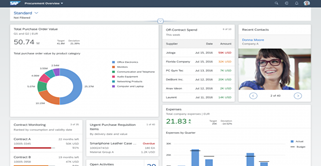
Analytical List Page Floorplan

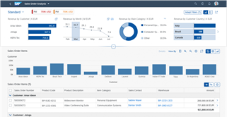
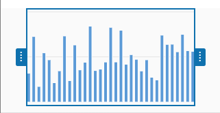
The analytical list page offers step-by-step analysis with data visualization for investigating root causes and taking action.

Category: Floorplans
Type: -

Analytical Table (ALV)

Analytical tables offer powerful options for working with the data, including advanced grouping and aggregations.

Category: UI Elements - SAPUI5
Type: Table / List / Tree

Carousel

The carousel is a control for browsing through a set of items one item at a time.

Category: UI Elements - SAPUI5
Type: Display, Form / Layout / Container

Chart – Color Palettes – Values and Names

This page provides all the color names in the chart palettes.

Category: UI Elements - SAPUI5
Type: Data Visualization

Chart – Range Selector

Range Selector Explore Image

The range selector is a user interface control that enables the user to select a range of data points in a data set.

Category: UI Elements - SAPUI5
Type: Data Visualization

Checkbox

Checkbox-Featured-Image

A checkbox indicates whether a state is true (checked) or false (unchecked). Users can check multiple options.

Category: UI Elements - SAPUI5
Type: User Input

Comparison Pattern

The comparison pattern displays information from multiple items side by side on the same page.

Category: Page Layouts
Type: -

Dynamic Page Layout

The dynamic page is a flexible, responsive layout control designed to support various floorplans and use cases.

Category: Page Layouts
Type: -

Flexible Column Layout

The flexible column layout displays multiple floorplans on a single page for faster and more fluid navigation.

Category: Page Layouts
Type: -

Grid Table

…threshold) is usually also based on the performance of the service, it should be safe to assume that the minimum selection limit is twice this size. In this case, loading the data would take as long as scrolling down and loading exactly one more block. Nevertheless, we recommend using larger…

Category: UI Elements - SAPUI5
Type: Table / List / Tree

Infobar

The infobar is a type of toolbar that appears above a list or panel, and shows filter or selection settings.

Category: UI Elements - SAPUI5
Type: Display, Filter

Input Field

Input Field - Featured image

…the examples below, the input field is shown in combination with the tabular autocomplete feature for different device sizes. Note that when tabular suggestions are used, the column headers stay sticky when scrolling within the suggestion list. Size S (Smartphones) Cozy mode: When the user clicks the input field, a…

Category: UI Elements - SAPUI5
Type: User Input

Message Popover

The message popover can display multiple messages without interrupting the user.

Category: UI Elements - SAPUI5
Type: Dialog / Popover, Messaging

Message Toast

A message toast is a non-disruptive popup for success messages, which disappears after a few seconds.

Category: UI Elements - SAPUI5
Type: Messaging

Multi-Combo Box

The multi-combo box lets users select one or more options from a predefined list, and has an input box for filtering.

Category: UI Elements - SAPUI5
Type: User Input

Object Display Components

Object display components represent key object attributes, such as the object ID or status.

Category: UI Elements - SAPUI5
Type: Display

Object Page Floorplan

The object page floorplan is the recommended floorplan for displaying, creating, and editing business objects.

Category: Floorplans
Type: -

Overview Page (OVP) Floorplan

The overview page is a data-driven SAP Fiori app that provides all the information a user needs in a single page.

Category: Floorplans
Type: -

Responsive Table

Responsive Table - Create01

…smartphones. Comparing items is a major use case. In this case, the analytical table or grid table might be more appropriate because each cell contains only one data point. By contrast, the responsive table offers greater flexibility within line items, including the ability to add more data points per cell…

Category: UI Elements - SAPUI5
Type: Table / List / Tree

Smart Field

…controlType, value: dropDownList Select Edm.String Configuration: controlType, value: selection Multi-line text Text Text area Edm.String MultiLineText Decimal numbers Text Object number One or two input fields (for number and unit) Edm.Int16, Edm.Int32, Edm.Int64, Edm.SByte, Edm.Byte, Edm.Single, Edm.Float, Edm.Double, Edm.Decimal Precision, Scale Status information Object status Edm.String criticality, criticalityRepresentationType Text and…

Category: UI Elements - SAPUI5
Type: Smart Controls, User Input

Smart Table

The smart table is a wrapper for SAP Fiori tables that lets you reuse back-end data structures and generic features.

Category: UI Elements - SAPUI5
Type: Smart Controls, Table / List / Tree

Switch

The toggle switch mimics a physical switch that allows users to turn things on or off.

Category: UI Elements - SAPUI5
Type: User Input

Table Toolbar

The table toolbar appears above a table and is used for key actions that impact the entire table.

Category: UI Elements - SAPUI5
Type: Toolbar

Tree Table

A tree table contains a hierarchical set of data that is structured in rows and columns and grouped into nodes.

Category: UI Elements - SAPUI5
Type: Table / List / Tree

Upload Set

The upload set control allows users to upload single or multiple files to an SAP Fiori app.

Category: UI Elements - SAPUI5
Type: User Input
© 2025 SAP SE. All rights reserved.
  • Privacy
  • Legal Disclosure
  • Copyright
  • Terms of Use
  • Go.SAP.com
  • SAP Community Network

The SAP Fiori Design Guidelines will soon be moving to the new SAP Design System portal. Check out the new experience here.

We'd appreciate your feedback!

Processing your feedback

Thank you Your feedback has been sent to the SAP Fiori design team.

Thank you for your helping us to improve our guidelines!

 
We'd appreciate your feedback!
Please fill out the form to send us your feedback.
    • Can you tell us why?

Your feedback is anonymous, so you won't receive a reply. If you'd like help with a specific question, please visit the SAP Fiori Community