
- Latest Version 1.128
- Version 1.126
- SAPUI Version 1.124
- SAPUI5 Version 1.120
- SAPUI5 Version 1.118
- SAPUI5 Version 1.116
- SAPUI5 Version 1.114
- SAPUI5 Version 1.112
- SAPUI5 Version 1.110
- SAPUI5 Version 1.108
- SAPUI5 Version 1.106
- SAPUI5 Version 1.104
- SAPUI5 Version 1.102
- SAPUI5 Version 1.100
- SAPUI5 Version 1.98
- SAPUI5 Version 1.96
- SAPUI5 Version 1.94
- SAPUI5 Version 1.92
- SAPUI5 Version 1.90
- SAPUI5 Version 1.88
- SAPUI5 Version 1.86
- SAPUI5 Version 1.84
- SAPUI5 Version 1.82
- SAPUI5 Version 1.80
- SAPUI5 Version 1.78
- SAPUI5 Version 1.76
- SAPUI5 Version 1.74
- SAPUI5 Version 1.72
- SAPUI5 Version 1.70
- SAPUI5 Version 1.68
- SAPUI5 Version 1.66
- SAPUI5 Version 1.64
- SAPUI5 Version 1.62
- SAPUI5 Version 1.60
- SAPUI5 Version 1.58
- SAPUI5 Version 1.56
- SAPUI5 Version 1.54
- SAPUI5 Version 1.52
- SAPUI5 Version 1.50
- SAPUI5 Version 1.48
- SAPUI5 Version 1.46
- SAPUI5 Version 1.44
- SAPUI5 Version 1.42
- SAPUI5 Version 1.40
- SAPUI5 Version 1.38
- SAPUI5 Version 1.36
- SAPUI5 Version 1.34
- SAPUI5 Version 1.32
- SAPUI5 Version 1.30
- SAPUI5 Version 1.28
- SAPUI5 Version 1.26
- Latest Version 1.128
- Version 1.126
- SAPUI Version 1.124
- SAPUI5 Version 1.122
- SAPUI5 Version 1.120
- SAPUI5 Version 1.118
- SAPUI5 Version 1.116
- SAPUI5 Version 1.114
- SAPUI5 Version 1.112
- SAPUI5 Version 1.110
- SAPUI5 Version 1.108
- SAPUI5 Version 1.106
- SAPUI5 Version 1.104
- SAPUI5 Version 1.102
- SAPUI5 Version 1.100
- SAPUI5 Version 1.98
- SAPUI5 Version 1.96
- SAPUI5 Version 1.94
- SAPUI5 Version 1.92
- SAPUI5 Version 1.90
- SAPUI5 Version 1.88
- SAPUI5 Version 1.86
- SAPUI5 Version 1.84
- SAPUI5 Version 1.82
- SAPUI5 Version 1.80
- SAPUI5 Version 1.78
- SAPUI5 Version 1.76
- SAPUI5 Version 1.74
- SAPUI5 Version 1.72
- SAPUI5 Version 1.70
- SAPUI5 Version 1.68
- SAPUI5 Version 1.66
- SAPUI5 Version 1.64
- SAPUI5 Version 1.62
- SAPUI5 Version 1.60
- SAPUI5 Version 1.58
- SAPUI5 Version 1.56
- SAPUI5 Version 1.54
- SAPUI5 Version 1.52
- SAPUI5 Version 1.50
- SAPUI5 Version 1.48
- SAPUI5 Version 1.46
- SAPUI5 Version 1.44
- SAPUI5 Version 1.42
- SAPUI5 Version 1.40
- SAPUI5 Version 1.38
- SAPUI5 Version 1.36
- SAPUI5 Version 1.34
- SAPUI5 Version 1.32
- SAPUI5 Version 1.30
- SAPUI5 Version 1.28
- SAPUI5 Version 1.26
Situation Handling Controls
Intro
Situation Handling comes with multiple controls for the UX pattern of progressive disclosure that improves usability by delivering users information and capabilities gradually: Initially, users see the minimal display for a situation. They can seek additional levels of detail about it, according to their needs and goals.
The controls are displayed in multiple places in the SAP Fiori UI.
They are:
- Situation indicator (XS)
- Situation description (S)
- Situation preview (M)
- Situation detail view (L)
Additionally, a standard dialog for closing a situation manually is part of various situation components.
Situation Indicator (XS)
The situation indicator illustrates that a business object is affected by a situation. It is the smallest control for flagging an issue.
Two types of situation indicator exist:
Situation Indicator
The situation indicator consists of an icon that represents a business situation.
Control
A situation corresponds to a warning so the general warning icon is used.
| Control | Icon | State |
| sap.m.ObjectStatus | sap-icon://alert | Warning |

Situation indicator
Usage
The situation indicator is displayed in front of a situation title in controls such as the situation description, the situation preview, or the situation page.
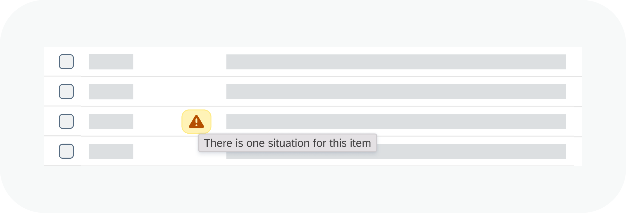
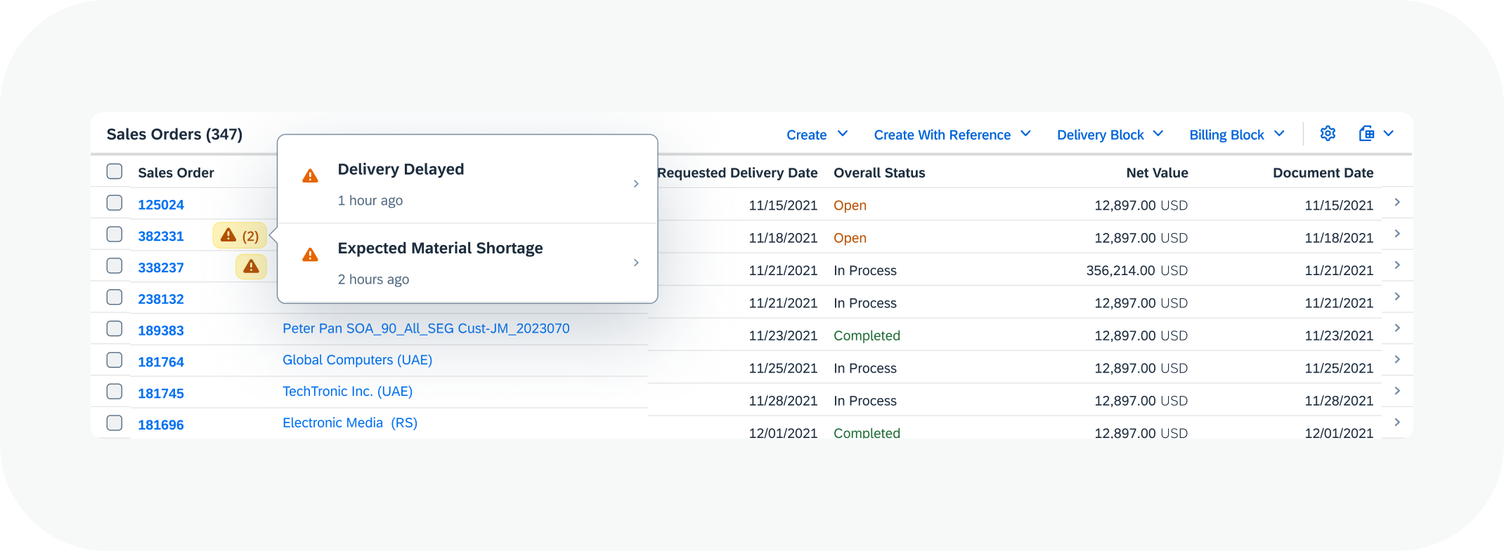
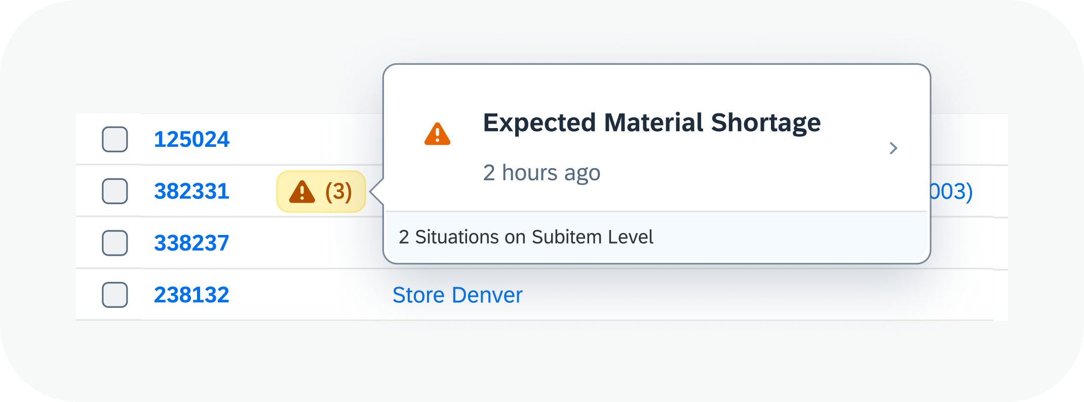
Interactive Situation Indicator
The interactive situation indicator is shown with the affected business object and acts as a button that allows users to see additional details, according to the principle of progressive disclosure.
Control
A situation icon indicates a single situation.
A situation icon is followed by a number indicates multiple situations.
| Control | Icon | Type |
| sap.m.Button | sap-icon://alert | Attention |

Interactive situation indicator for single and multiple situations
Usage
Use the interactive indicator to mark a business object that is affected by a situation. It is displayed after the object name. You use it for list items and object page headers in business app. You can also use it as standalone icon in a list column so users can to filter for items affected by a situation.
Interaction and Behavior
The behavior of the interactive situation indicator differs depending on if there is one or more situations.
Single Situation
When users hover over an interactive situation indicator, a tooltip displays the generic text: There is one situation for this item.
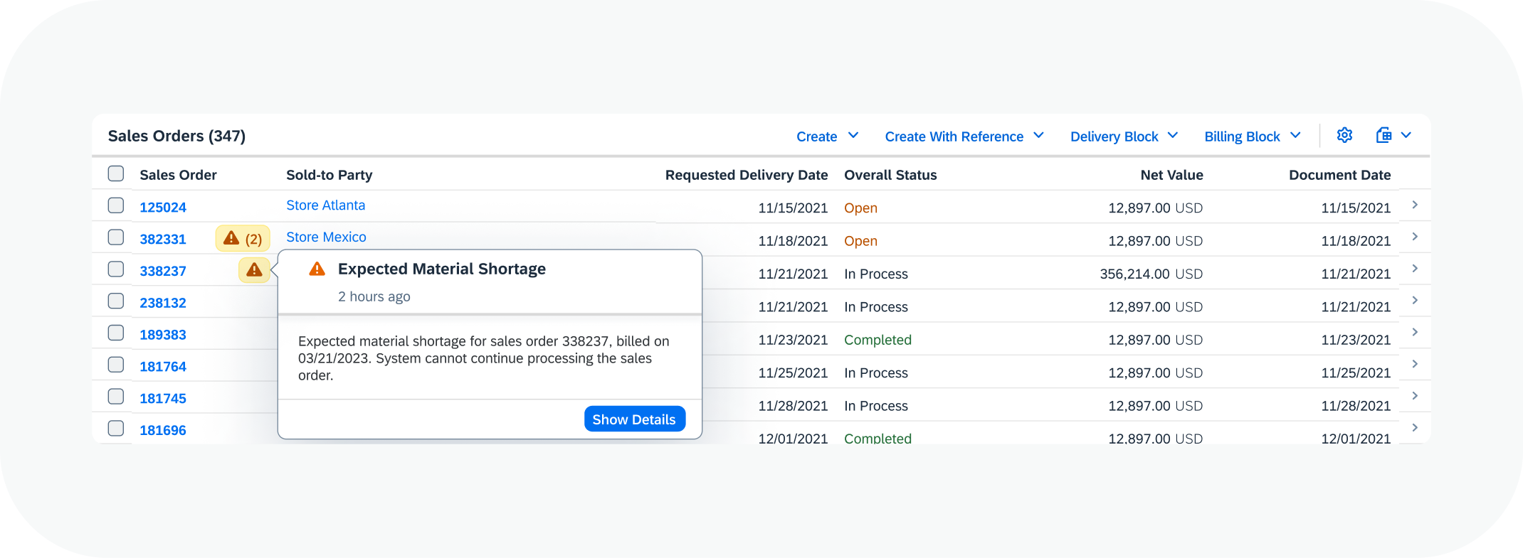
When they select an indicator, a popover displays a situation preview.
It contains the situation description and the Show Details button that takes users to the situation detail view.
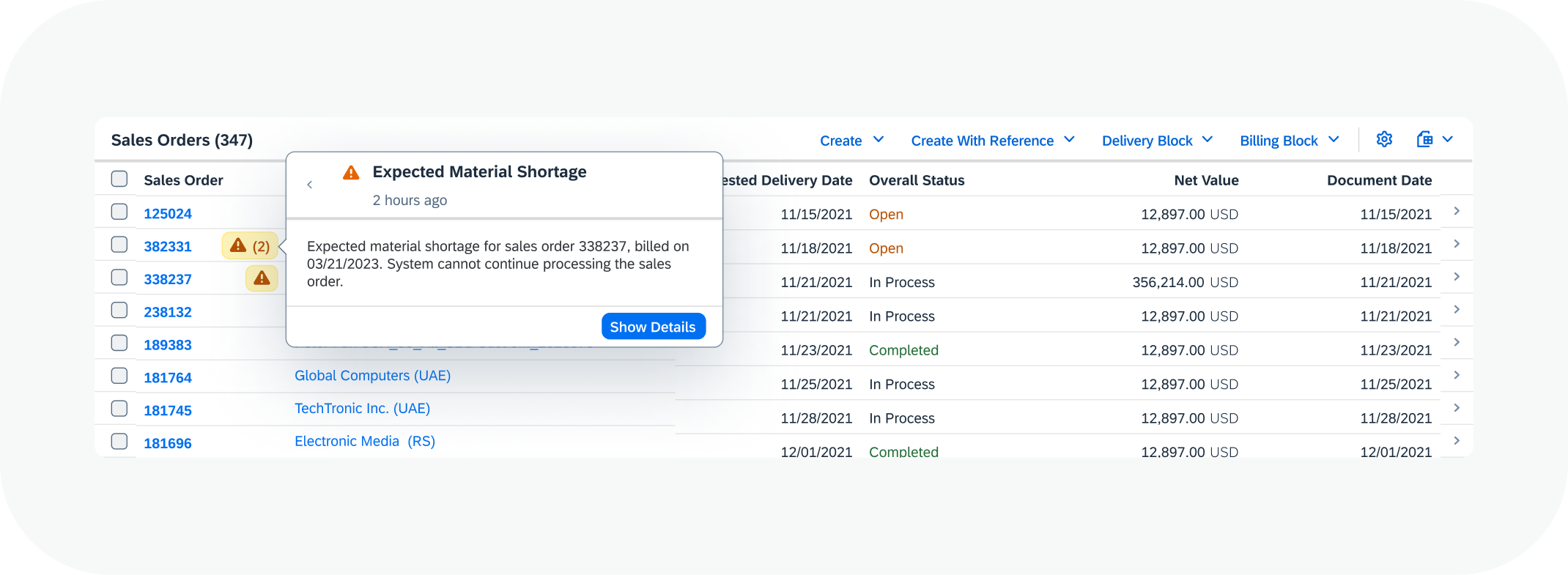
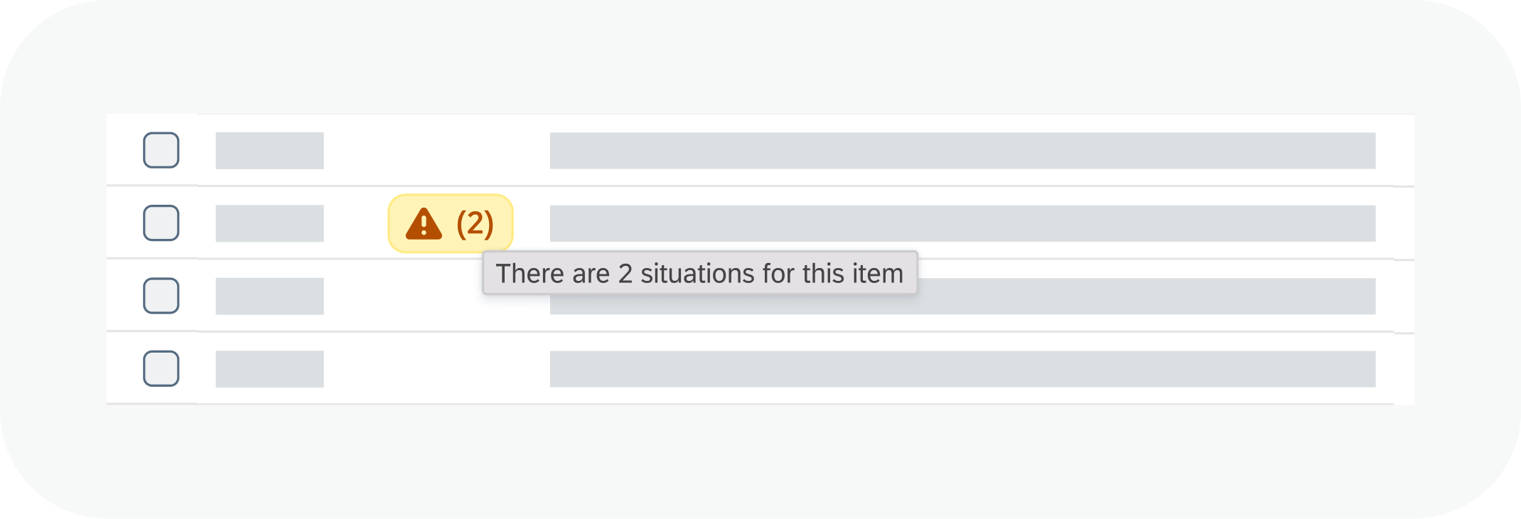
Multiple Situations
When users hover over an interactive situation indicator for multiple situations, a tooltip displays a generic text that includes the number of situations for the object, for example: There are 3 situations for this item.
When users select an interactive situation indicator, a popover is displayed with the situation switch.
They can select a situation from the list to open a situation preview that provides further details about the situation.
The Show Details button takes them to the situation detail view.
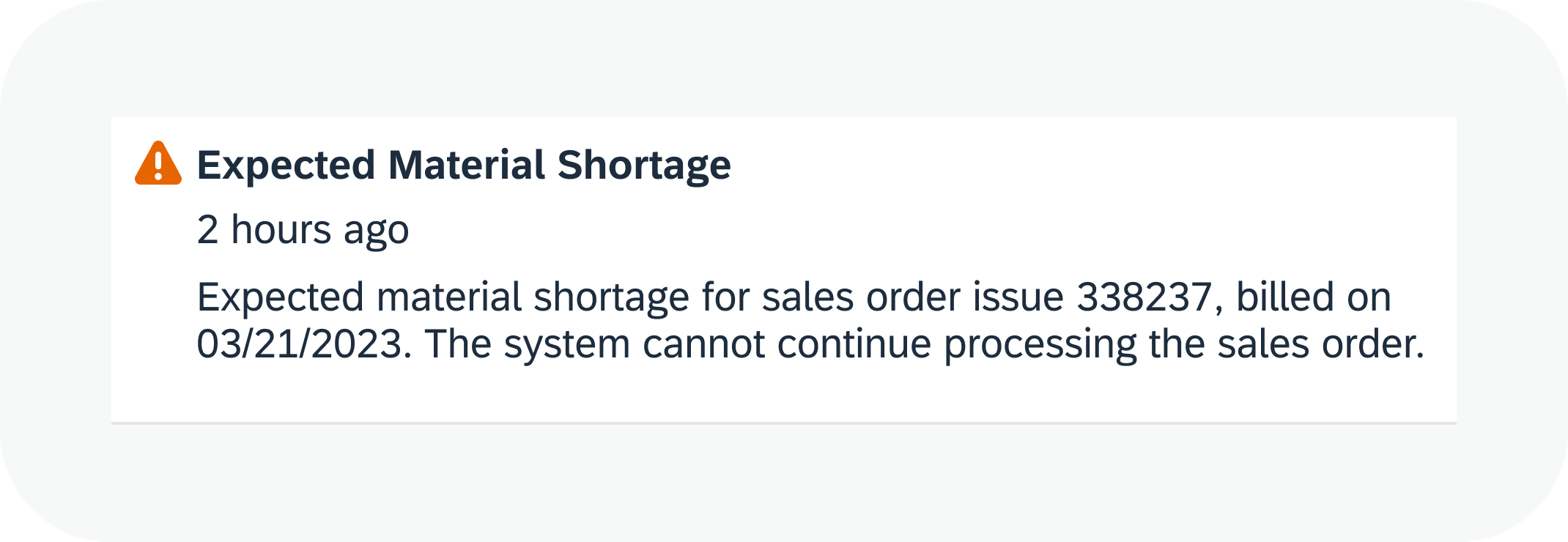
Situation Description (S)
The situation description is a summary of the exceptional circumstance and its date of occurrence. It includes the following elements:
- Situation indicator
- Situation title
- Situation text, a brief description of the situation
- Occurrence of the situation as relative date
It is displayed in various controls:
It is also shown on the situation page header.
Situation Notification
You use notifications to alert users about urgent and important situations on SAP Fiori launchpad.
Control
For layout details see: Notifications.
Usage
The notification is triggered automatically if it was configured in the Situation Type.
Interaction and Behavior
When users select a notification, they go to to the situation detail view.
If multiple situations are aggregated in one notification, it takes users to a filtered list of situations in the business app or to the aggregated notification view in the My Situations – Extended app, depending on the configuration.
Situation notification
Situation Card
The situation card is shown in the To-Dos section of My Home on SAP S/4HANA Cloud Fiori launchpad.
Usage
The latest situations in a user’s area of responsibility are displayed in the To-Dos section. The number of cards is automatically adapted to the screen width according to the responsive design. The number of cards displayed depends on the screen width,
Interaction and Behavior
Users select a card to go to the situation detail view.
Control
For layout details, see Cards.
Situation card
Situation List Item
The situation list item displays the situation description as a list item.
Control
For detailed layout see: Standard List Item.
Usage
The situation list item is displayed in the list view of the Situations app.
Interaction and behavior
Users select a situation list item to go to the situation detail view.
Situation list item
Situation Message Strip
The situation message strip is shown on an object page of a business app and is available only for the standard framework for Situation Handling. In addition to the other situation description controls, it can contain the following components:
- Link More Information (optional)
- Action Close Situation
- Situation Switch (dynamic)
Control
The control is based on the message strip.
Usage
The message strip is part of the situation section that dynamically appears as the first section on the object page in a business app. The situation section also contains contextual information and optional actions to resolve the situation.
Interaction and Behavior
The link More Information takes you to helpful information on, for example, a web page or a process handbook, which can be configured in the Situation Type.
The Close Situation action opens the close situation dialog.
The switch in the situation message strip appears dynamically as a transparent button if the business object is affected by more than one situation.
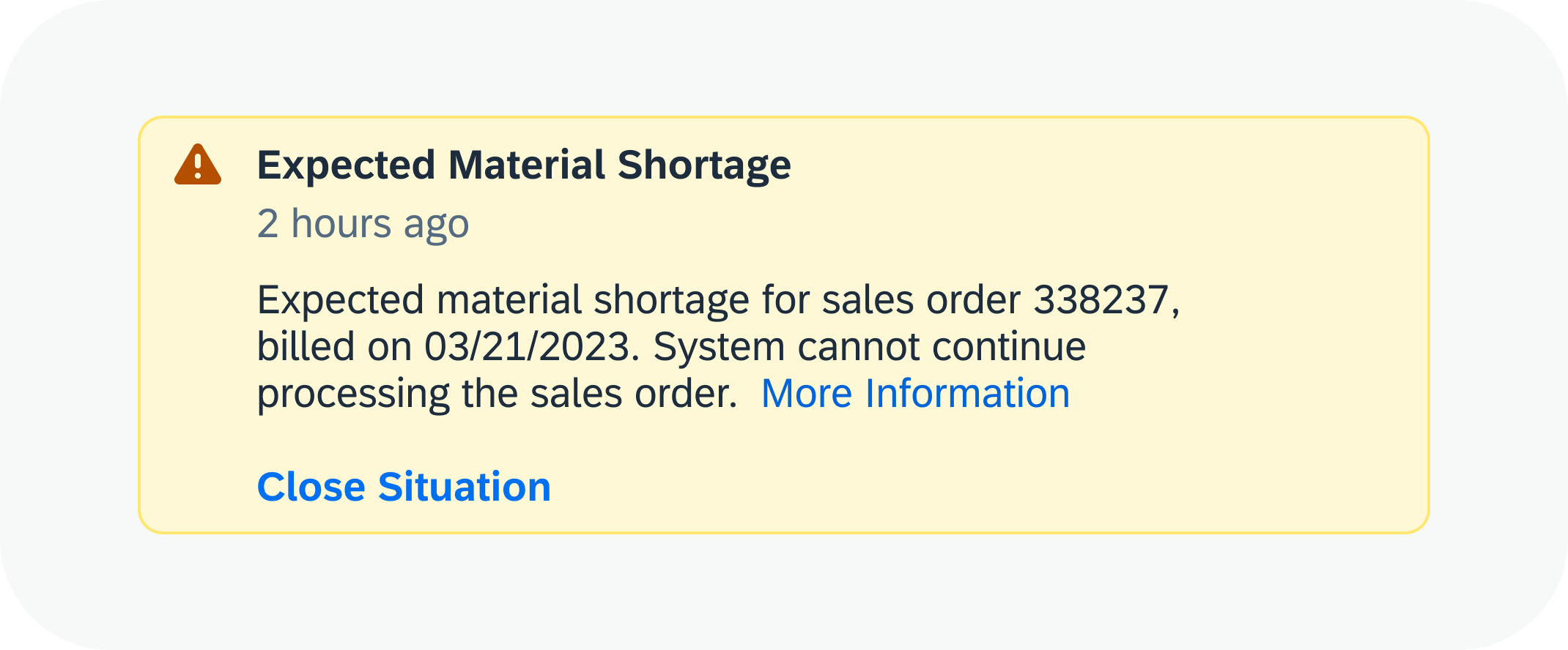
Situation message strip
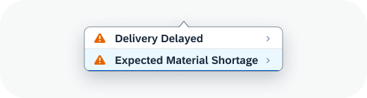
Situation Switch
If a business object is affected by more than one situation, the situation switch lets users choose one.
There are two kinds of situation switches:
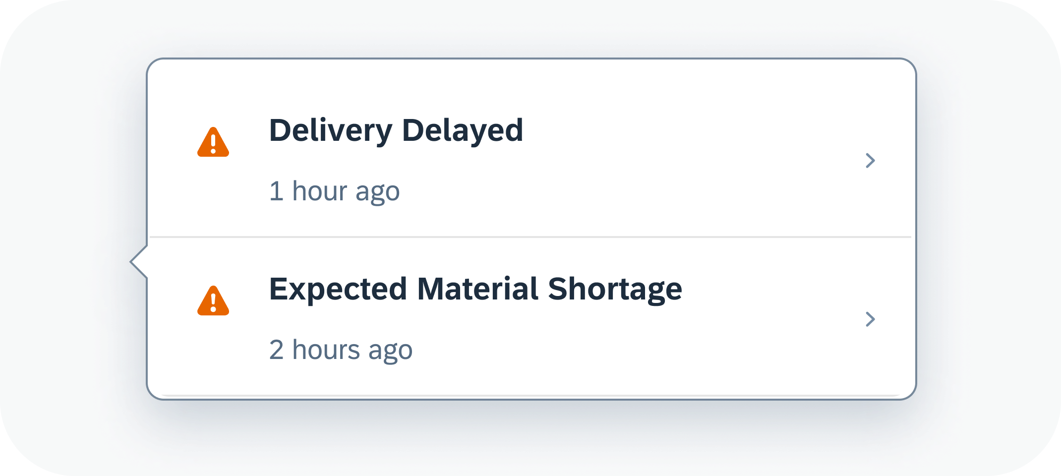
Situation switch
Switch for Interactive Situation Indicator
The switch for the interactive situation indicator contains the following components:
- Situation indicator
- Situation title
- Occurrence of situation as a relative date
Control
The control is based on the list Item.
Usage
The situation switch is displayed when the users select an interactive situation indicator for multiple situations. The popover contains a list of situations.
Interaction and Behavior
The situation switch contains a list of situations.
Users select a situation from the situation switch to open a situation preview that provides further details about the situation.

Multiple situations switch, the interactive situation indicator

Preview with situation details for the situation selected from a list
Hierarchical Situation Switch
The standard framework for Situation Handling also supports the hierarchical situation switch. This switch both displays the situations for the affected object and indicates when objects below it in the hierarchy are also affected by a situation, for example, on an item or schedule level.
Hierarchical situation switch
Switch for Situation Message Strip
The switch for the situation message strip is available only for the standard framework for Situation Handling. It contains the following components:
- Situation indicator
- Situation title
Control
The control is based on the list Item.
Usage
The situation switch is a popover that’s displayed when users select the arrow on the transparent button after the situation title in the situation message strip. contains the situation switch. The popover contains the situation switch
Interaction and Behavior
The situation switch contains a list of situations.
The selection of a situation from the situation switch changes both the data in the message strip and the contextual information in the situation section of the business app’s object page.
Switch for situation message strip
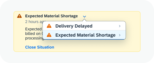
Multiple situations switch for the situation message strip
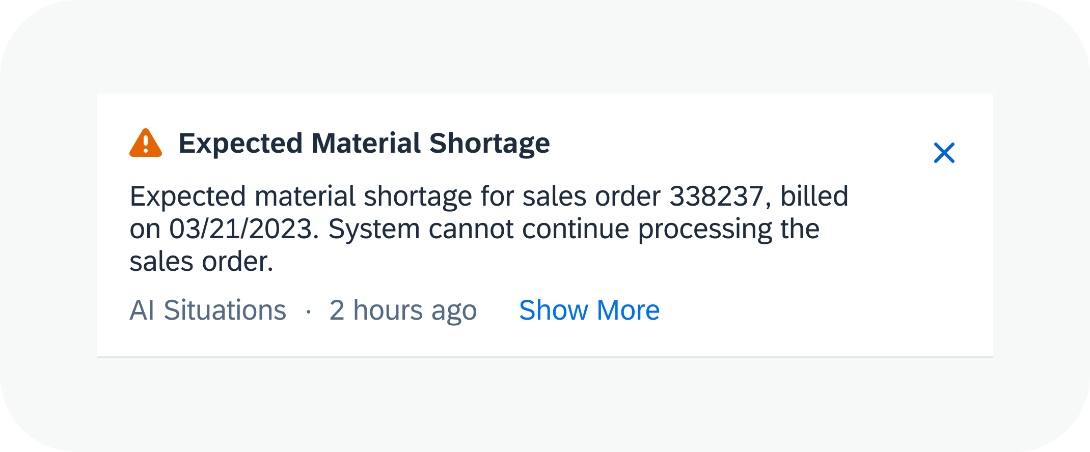
Situation Preview (M)
The situation preview provides information about the situation and an action. It contains the following components:
- Situation indicator
- Situation title
- Occurrence of situation
- Situation text
- Show Details button
Control
The control is based on the popover.
Usage
Users open the situation preview by selecting an interactive situation indicator or an item belonging to the situation switch.
Interaction and Behavior
When users choose the Show Details button they go to the situation detail view.
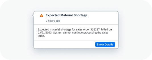
Situation preview
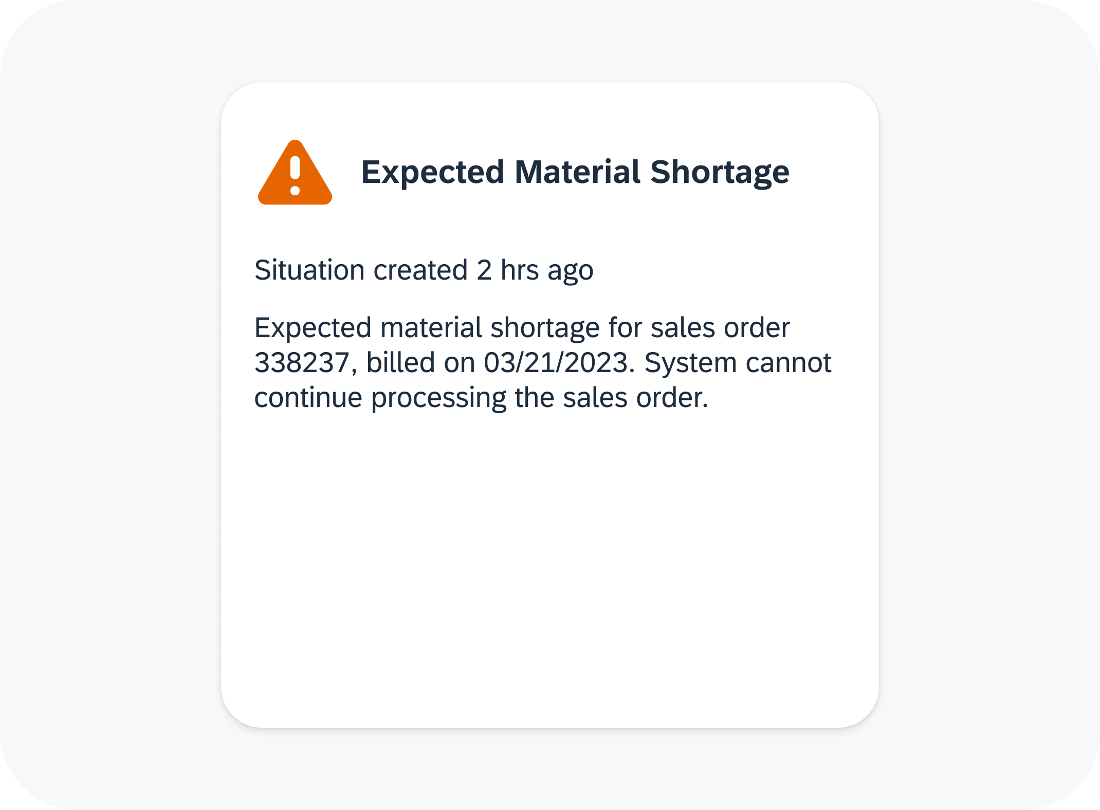
Situation Detail View (X)
The situation detail view contains all the information users need to solve a situation.
- Situation description
- Contextual information
- Actions to solve a situation, if applicable
There are two versions of the situation detail view:
- Situation page. The situation page is part of the My Situations – Extended app and available with the extended framework for Situation Handling.
- Object page in business app. The situation details are embedded in the object page in a business app and available with the standard framework for Situation Handling.
Close Situation Dialog
Users can close a situation manually with the Close Situation dialog.
Control
This control is based on a dialog of type Message and state Information.
Usage
Users can always close a situation manually. For example, in cases where the solution proposals offer no available quick actions or users want to overrule the system behavior because they resolved the situation through activities outside the system such as negotiating a new contract when the current one is about to expire. Sometimes, the situation may also be outdated or invalid. Users can provide the corresponding reason:
- Resolved – the situation is solved.
- Obsolete – the situation is outdated.
- Invalid – the situation is a false alarm.
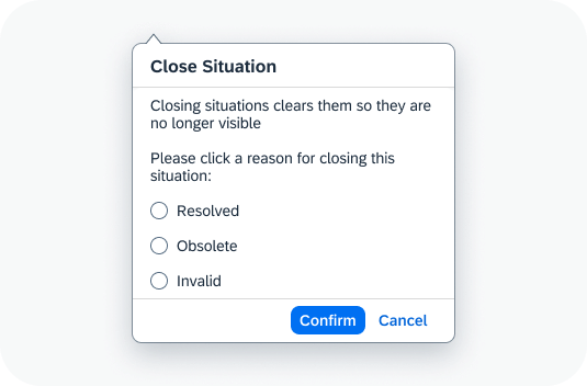
Close situation dialog
Interaction and Behavior
The close situation dialog opens when you select the Close Situation button. The button is available in various components, for example:
After the users select the feedback and confirm, the situation is closed. A success message toast is displayed.
Depending on where the user has closed the situation, the display changes as follows:
- List view: The selected situation list items are removed, and the number of situations is reduced accordingly.
- Situation page: The page closes and users go back to the list of situations. The corresponding list item is removed, and the number of situations reduced by one.
- Situation message strip: The situation section closes and users go to the object page. In case of multiple situations, the next situation is displayed.
After closing a situation, all the indicators in apps are removed.

 Your feedback has been sent to the SAP Fiori design team.