- Latest Version 1.128
- Version 1.126
- SAPUI5 Version 1.122
- SAPUI5 Version 1.120
- SAPUI5 Version 1.118
- SAPUI5 Version 1.116
- SAPUI5 Version 1.114
- SAPUI5 Version 1.112
- SAPUI5 Version 1.110
- SAPUI5 Version 1.108
- SAPUI5 Version 1.106
- SAPUI5 Version 1.104
- SAPUI5 Version 1.102
- SAPUI5 Version 1.100
- SAPUI5 Version 1.98
- SAPUI5 Version 1.96
- SAPUI5 Version 1.94
- SAPUI5 Version 1.92
- SAPUI5 Version 1.90
- SAPUI5 Version 1.88
- SAPUI5 Version 1.86
- SAPUI5 Version 1.84
- SAPUI5 Version 1.82
- SAPUI5 Version 1.80
- SAPUI5 Version 1.78
- SAPUI5 Version 1.76
- SAPUI5 Version 1.74
- SAPUI5 Version 1.72
- SAPUI5 Version 1.70
- SAPUI5 Version 1.68
- SAPUI5 Version 1.66
- SAPUI5 Version 1.64
- SAPUI5 Version 1.62
- SAPUI5 Version 1.60
- SAPUI5 Version 1.58
- SAPUI5 Version 1.56
- SAPUI5 Version 1.54
- SAPUI5 Version 1.52
- SAPUI5 Version 1.50
- SAPUI5 Version 1.48
- SAPUI5 Version 1.46
- SAPUI5 Version 1.44
- SAPUI5 Version 1.42
- SAPUI5 Version 1.40
- SAPUI5 Version 1.38
- SAPUI5 Version 1.36
- SAPUI5 Version 1.34
- SAPUI5 Version 1.32
- SAPUI5 Version 1.30
- SAPUI5 Version 1.28
- SAPUI5 Version 1.26
- Latest Version 1.128
- Version 1.126
- SAPUI Version 1.124
- SAPUI5 Version 1.122
- SAPUI5 Version 1.120
- SAPUI5 Version 1.118
- SAPUI5 Version 1.116
- SAPUI5 Version 1.114
- SAPUI5 Version 1.112
- SAPUI5 Version 1.110
- SAPUI5 Version 1.108
- SAPUI5 Version 1.106
- SAPUI5 Version 1.104
- SAPUI5 Version 1.102
- SAPUI5 Version 1.100
- SAPUI5 Version 1.98
- SAPUI5 Version 1.96
- SAPUI5 Version 1.94
- SAPUI5 Version 1.92
- SAPUI5 Version 1.90
- SAPUI5 Version 1.88
- SAPUI5 Version 1.86
- SAPUI5 Version 1.84
- SAPUI5 Version 1.82
- SAPUI5 Version 1.80
- SAPUI5 Version 1.78
- SAPUI5 Version 1.76
- SAPUI5 Version 1.74
- SAPUI5 Version 1.72
- SAPUI5 Version 1.70
- SAPUI5 Version 1.68
- SAPUI5 Version 1.66
- SAPUI5 Version 1.64
- SAPUI5 Version 1.62
- SAPUI5 Version 1.60
- SAPUI5 Version 1.58
- SAPUI5 Version 1.56
- SAPUI5 Version 1.54
- SAPUI5 Version 1.52
- SAPUI5 Version 1.50
- SAPUI5 Version 1.48
- SAPUI5 Version 1.46
- SAPUI5 Version 1.44
- SAPUI5 Version 1.42
- SAPUI5 Version 1.40
- SAPUI5 Version 1.38
- SAPUI5 Version 1.36
- SAPUI5 Version 1.34
- SAPUI5 Version 1.32
- SAPUI5 Version 1.30
- SAPUI5 Version 1.28
- SAPUI5 Version 1.26
SAP Fiori Launchpad Home Page
Intro
The SAP Fiori launchpad home page is the first page that users see after they have signed in. It is the main entry point to SAP Fiori apps on mobile and desktop devices.
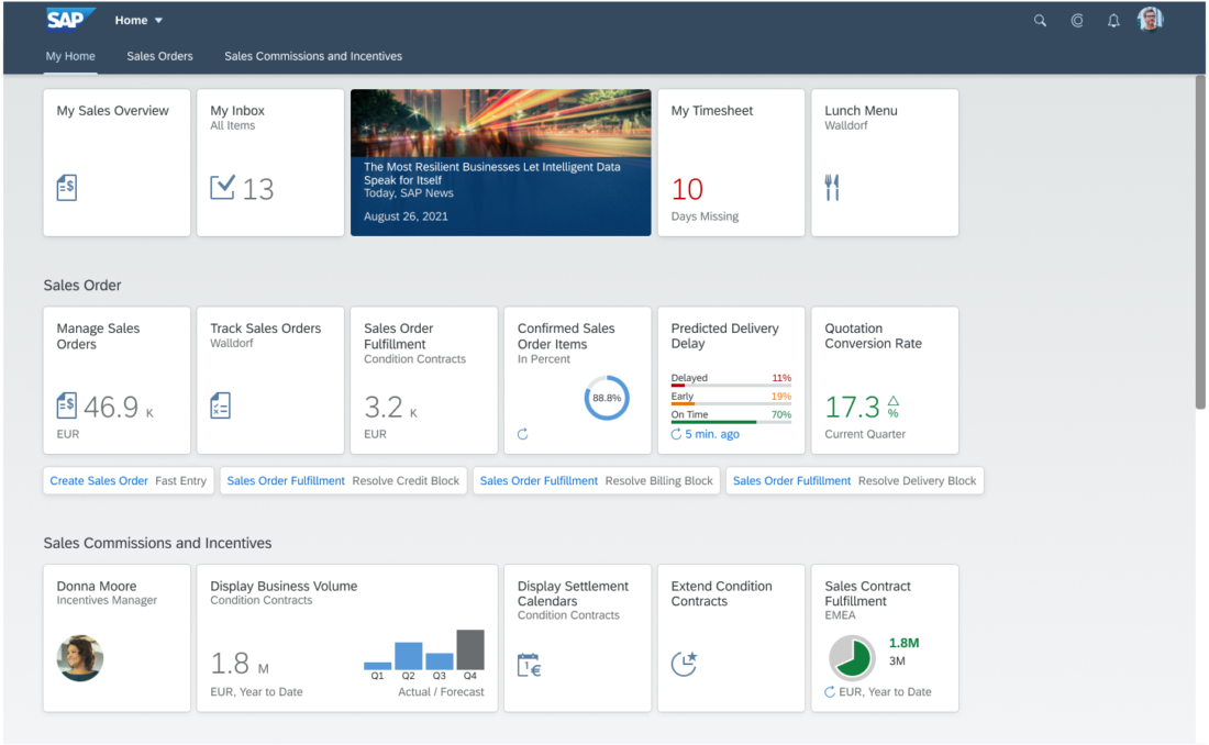
The launchpad home page displays tiles and links that allow the user to launch apps, and may also show additional information. The page can be personalized and apps can be added, removed, or bundled in groups.
The SAP Fiori launchpad home page must be used for all SAP Fiori apps.
Components
Tiles
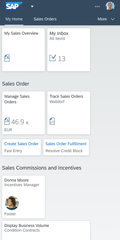
The tiles provide direct access to apps or content. They are similar to large icons and have a rectangular shape.
The launchpad home page comes with a predefined set of groups and tiles. However, the user can also personalize the launchpad home page to reflect their individual roles by choosing from a wide range of ready-to-use tiles from the app finder.
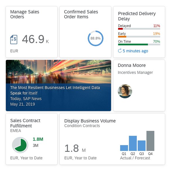
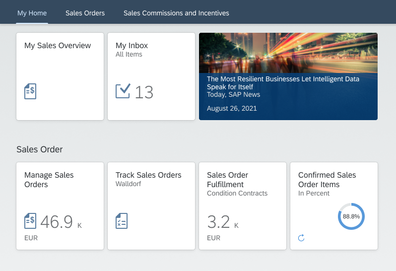
Tiles differ in the content they display. They can contain an icon, a title, some informative text, numbers, and charts. The information that is shown depends on the function of the tile or app.
The number of tiles visible on a page depends on the screen resolution. The tiles are placed below each other and are resized for smaller screens.
Links
Links are a different visual representation of a tile and always look the same: they consist of a title and an optional subtitle.
Links are collected in a dedicated area below the tiles area within each group. As with tiles, the user can modify the order of the links at any time.
Links are displayed inline, one after the other. It there is not enough space for the full link at the end of a row, the entire link moves to the next row. Links never break between rows.
Anchor Bar and Tab Bar
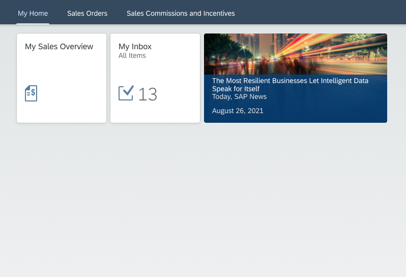
In the launchpad home page, tiles are usually clustered in groups. These groups are listed in an anchor bar or in a tab bar at the top of the page.
The anchor bar is the default setting. Optionally, users can choose the tab bar instead. Note: Both types are only shown when users have more than one group.
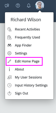
If you want to modify groups and tiles, select Edit Home Page from the user actions menu.
Anchor Bar
By default, all groups are displayed in the launchpad home page. These groups are listed in the anchor bar at the top of the page. When users select a group name, the page scrolls down to the selected group.
Tab Bar
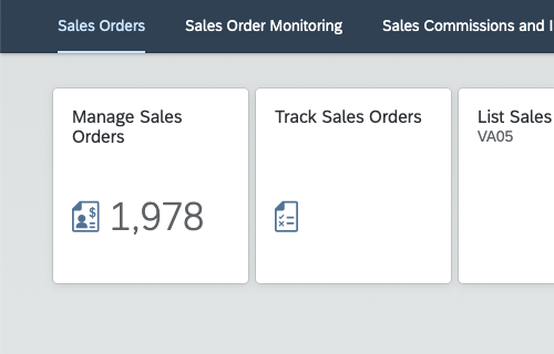
When the tab bar is selected, the groups are separated into tabs. Only one group is displayed at a time.
While this functionality reduces the overview of all groups, it allows the user to focus on a selection of tiles and improves the performance for users with a large number groups.
Modifying the Home Page in Tab Bar Mode
Users can personalize the home page in tab bar mode by choosing Edit Home Page in the user actions menu.
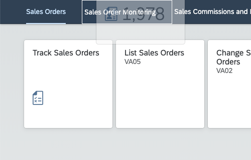
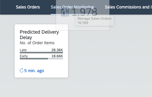
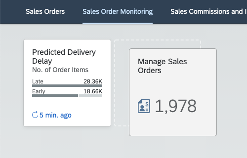
In addition, they can use Short Drop and Long Drop functions to move apps from one tab to another.
Short Drop
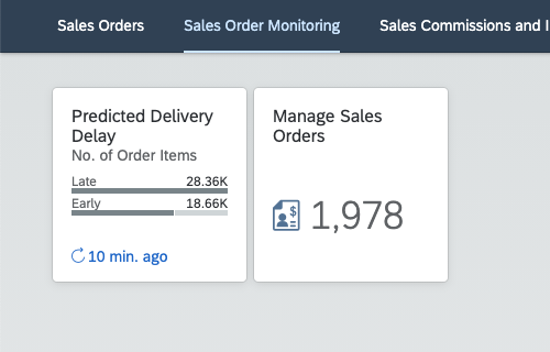
Drag and quickly drop any app onto another tab. It disappears from your current tab and is added as the last app on the new tab.
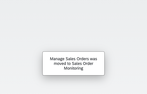
Note: The current tab stays in focus. The operation is invisible, but a message toast confirms that the app was moved.
Long Drop
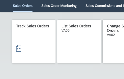
Drag any app onto another tab and keep it there for a short while. The selected tab opens, and you can position the app where you want it.
Note: The focus switches from the current tab to the selected tab. A message toast confirms that the app was moved.
Behavior and Interaction
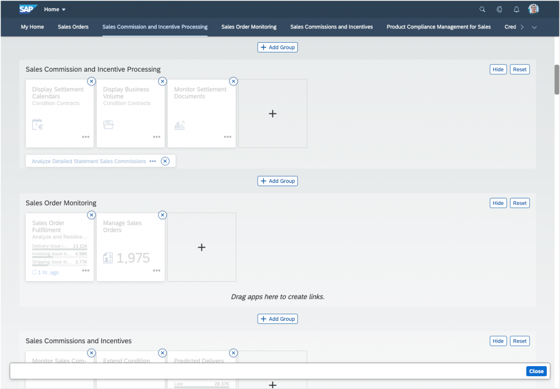
Users can personalize their home page in a variety of ways. Tiles can be rearranged directly, but most actions require the user to activate the edit mode. For example, edit mode needs to be active to rearrange groups or customize tiles.
To enable more enhanced personalization functions, the user needs to open the user actions menu, and then select Edit Home Page.
To quit personalization, the user selects Done in the footer toolbar.
Tile and Link Actions
Converting Tiles and Links
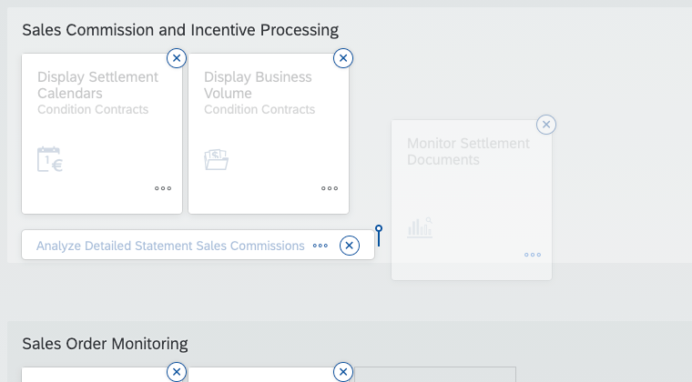
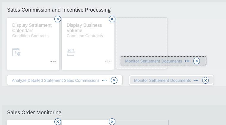
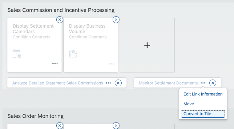
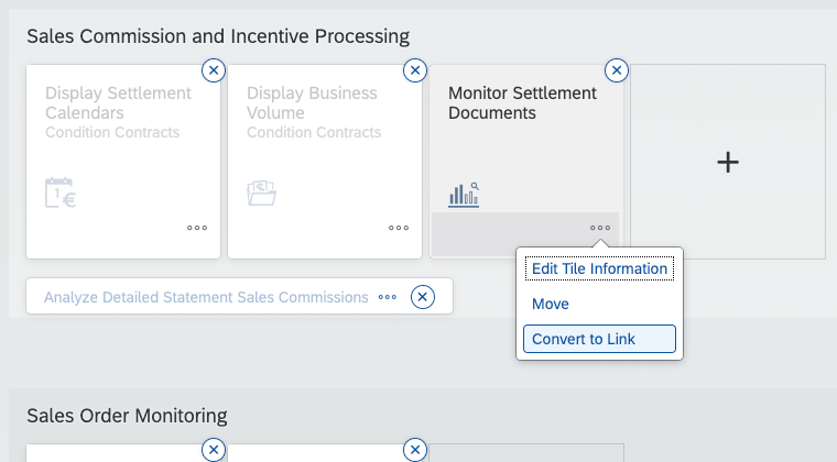
Unless the group is locked, users can rearrange apps at any time, and transform a tile to a link and vice versa.
This is possible in both normal mode and edit mode using a simple drag and drop action. In edit mode, users can also make use of the action sheet (see below).
Generic Actions
(via Edit Home Page only)
When Edit Home Page is activated and the user clicks a tile, an action sheet appears showing a list of generic actions:
- Settings opens a dialog in which the user can change the information that is displayed on a tile, such as the title or description.
- Move opens a dialog in which the user can move the selected tile to a different group.
- Convert to Link transforms a tile into a link, while Convert to Tile transforms a link into a tile.
Tile designers can also add further generic actions.
Remove
(via Edit Home Page only)
Users can remove tiles and links with the Remove icon .
Add
Users can add apps with the Add icon ( ), either from an empty group in edit mode, or by selecting App Finder in the user actions menu.
Move
Users can rearrange tiles and links by dragging them to a new location in the same group, or by dragging them to a different group.
Open
Clicking a tile or link opens the underlying app or content item.
Group Actions
Via Edit Home Page, users can customize groups to their needs:
Adding Groups
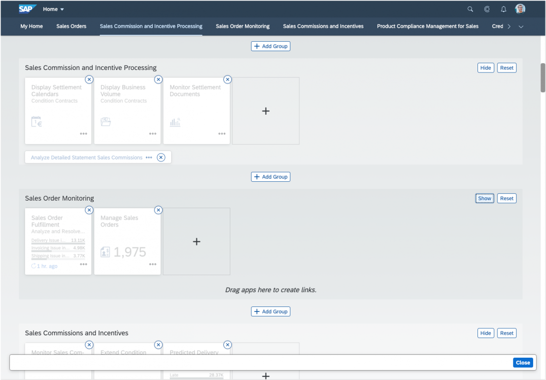
Users can add a new group by clicking the + Add Group button. The user will be prompted to enter a new group name. If the user doesn’t immediately enter a name, the placeholder text Enter group name will appear as the default name. Once the group is created, it will appear below + Add Group on the launchpad home page.
Moving Groups
The user can rearrange a group by dragging it to a new location in the group panel.
Renaming Groups
Users can rename groups by clicking a group name. A text box appears in which the user can enter the new name, which is then saved automatically. To discard a change while the text box is visible, the user must press Escape.
Deleting Groups
Users can delete groups they have created (including all the tiles they contain) by pressing Delete. Note that predefined groups, such as My Home, or locked groups (as defined by customers) cannot be deleted.
Resetting Groups
By clicking Reset, a user can reset a predefined group to its initial state as defined by an administrator.
Hiding Groups
Users can temporarily hide one or more groups on the launchpad home page. Note: The My Home group and locked groups cannot be hidden.
To hide a group, users go to Edit Home Page and select Hide on the top right corner of each group. The background of the hidden group is now shown with a darker transparency. To unhide a group, users select Show.
Resources
Want to dive deeper? Follow the links below to find out more about related controls, the SAPUI5 implementation, and the visual design.




 Your feedback has been sent to the SAP Fiori design team.