
- Latest SAPUI Version 1.124
- SAPUI5 Version 1.122
- SAPUI5 Version 1.120
- SAPUI5 Version 1.118
- SAPUI5 Version 1.116
- SAPUI5 Version 1.114
- SAPUI5 Version 1.112
- SAPUI5 Version 1.110
- SAPUI5 Version 1.108
- SAPUI5 Version 1.106
- SAPUI5 Version 1.104
- SAPUI5 Version 1.102
- SAPUI5 Version 1.100
- SAPUI5 Version 1.98
- SAPUI5 Version 1.96
- SAPUI5 Version 1.94
- SAPUI5 Version 1.92
- SAPUI5 Version 1.90
- SAPUI5 Version 1.88
- SAPUI5 Version 1.86
- SAPUI5 Version 1.84
- SAPUI5 Version 1.82
- SAPUI5 Version 1.80
- SAPUI5 Version 1.78
- SAPUI5 Version 1.76
- SAPUI5 Version 1.74
- SAPUI5 Version 1.72
- SAPUI5 Version 1.70
- SAPUI5 Version 1.68
- SAPUI5 Version 1.66
- SAPUI5 Version 1.64
- SAPUI5 Version 1.62
- SAPUI5 Version 1.60
- SAPUI5 Version 1.56
- SAPUI5 Version 1.54
- SAPUI5 Version 1.52
- SAPUI5 Version 1.50
- SAPUI5 Version 1.48
- SAPUI5 Version 1.46
- SAPUI5 Version 1.44
- SAPUI5 Version 1.42
- SAPUI5 Version 1.40
- SAPUI5 Version 1.38
- SAPUI5 Version 1.36
- SAPUI5 Version 1.34
- SAPUI5 Version 1.32
- SAPUI5 Version 1.30
- SAPUI5 Version 1.28
- SAPUI5 Version 1.26
- Latest SAPUI Version 1.124
- SAPUI5 Version 1.122
- SAPUI5 Version 1.120
- SAPUI5 Version 1.118
- SAPUI5 Version 1.116
- SAPUI5 Version 1.114
- SAPUI5 Version 1.112
- SAPUI5 Version 1.110
- SAPUI5 Version 1.108
- SAPUI5 Version 1.106
- SAPUI5 Version 1.104
- SAPUI5 Version 1.102
- SAPUI5 Version 1.100
- SAPUI5 Version 1.98
- SAPUI5 Version 1.96
- SAPUI5 Version 1.94
- SAPUI5 Version 1.92
- SAPUI5 Version 1.90
- SAPUI5 Version 1.88
- SAPUI5 Version 1.86
- SAPUI5 Version 1.84
- SAPUI5 Version 1.82
- SAPUI5 Version 1.80
- SAPUI5 Version 1.78
- SAPUI5 Version 1.76
- SAPUI5 Version 1.74
- SAPUI5 Version 1.72
- SAPUI5 Version 1.70
- SAPUI5 Version 1.68
- SAPUI5 Version 1.66
- SAPUI5 Version 1.64
- SAPUI5 Version 1.62
- SAPUI5 Version 1.60
- SAPUI5 Version 1.58
- SAPUI5 Version 1.56
- SAPUI5 Version 1.54
- SAPUI5 Version 1.52
- SAPUI5 Version 1.50
- SAPUI5 Version 1.48
- SAPUI5 Version 1.46
- SAPUI5 Version 1.44
- SAPUI5 Version 1.42
- SAPUI5 Version 1.40
- SAPUI5 Version 1.38
- SAPUI5 Version 1.36
- SAPUI5 Version 1.34
- SAPUI5 Version 1.32
- SAPUI5 Version 1.30
- SAPUI5 Version 1.28
- SAPUI5 Version 1.26
Merged Header
Intro
As of SAPUI5 version 1.40, the shell bar and the application page bar are merged into one single bar: the shell bar.
There are two main reasons that have led to this decision:
- Redundant space due to multiple bars on the screen.
- Lacking usability on mobile devices due to the collapsing shell.
Due to this change, an automatic approach has been developed by SAPUI5 to let existing apps adapt to the new concept.
In addition, the application page bar changed its visual appearance and other controls were adapted or will be updated to follow the new concept. For example, if the application header bar is displayed above the object header, the background color is the same as the object header.
Implications of the merged header
Behavior and Interaction
New Placement of Existing Features
Due to the merge of the shell and application header bar, as well as the evolution of the shell bar, some features moved their position and new features were introduced:
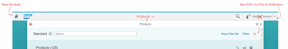
- New features include the toggle buttons for the viewports (Me Area, notifications area), the SAP CoPilot, and the navigation menu.
- The Back button and page title were repositioned to the shell bar
- The options menu has been removed from the shell bar. Former content such as Contact Support is now accessible via the Me Area. For more information on the available services, see SAP Fiori launchpad services.
The full merge is complete when there is only one bar displayed: the shell bar.
One Bar versus Two Bars
Whenever there are no actions in the application header bar, the automatic adaption completely removes the application header bar. An exception is made for the split-screen layout. Here, the two bars are still required to identify the master list and details area. In addition, there are cases in which existing applications still end up with two bars even after the adaption. For example, when an application has placed their own actions inside the application header bar.
One bar: The application header bar does not contain any actions. Full merge is complete.
Two bars: The application header bar contains actions. The app team has to reposition the actions manually.
Layouts
The adaption has the following implications on the following layouts:
Full Screen Layout
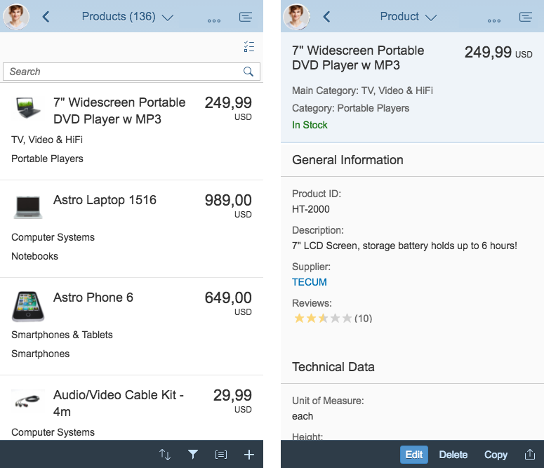
The title of the app becomes part of the shell bar and the app Back button will be set to hidden.
If the application header is not empty after applying the adapter, the application header bar will remain.
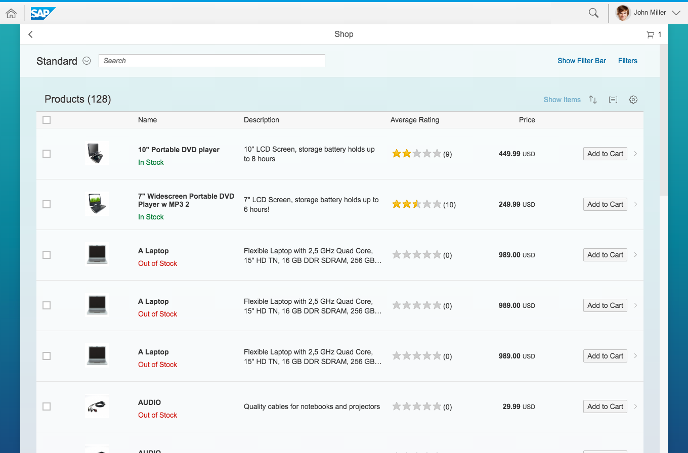
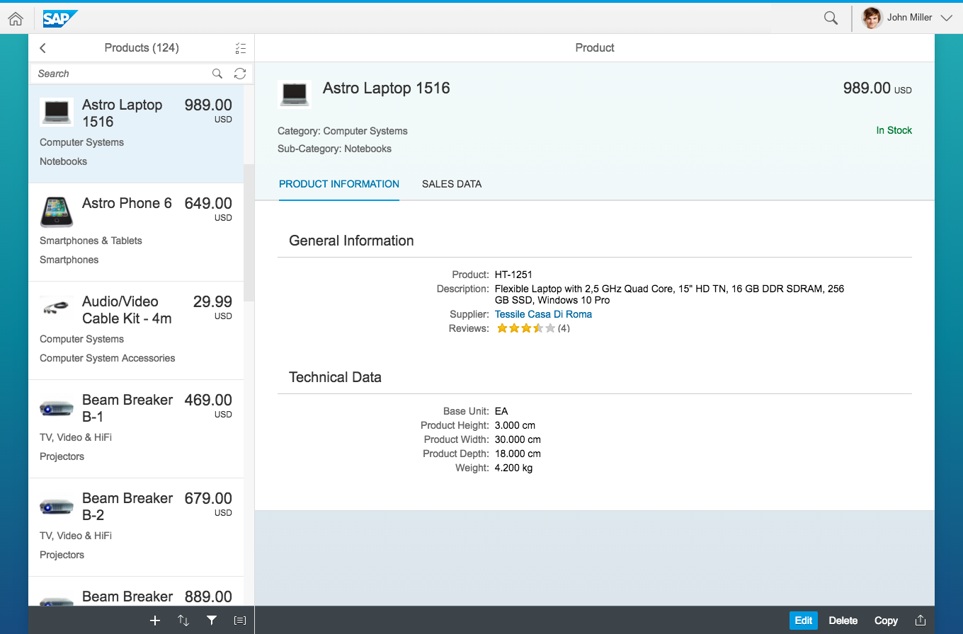
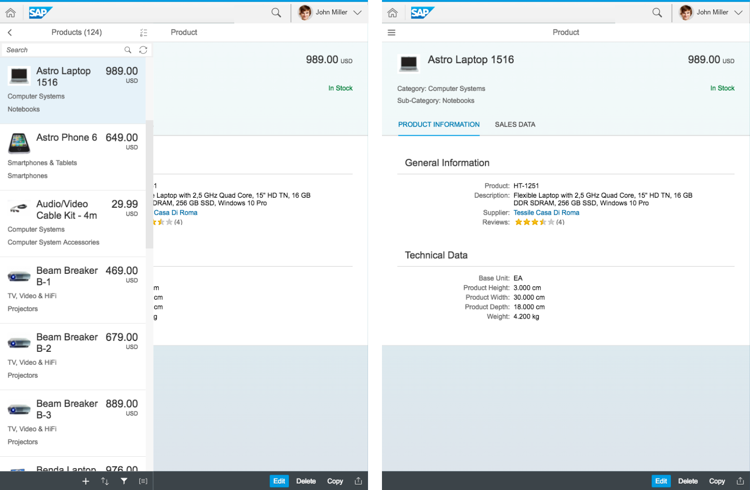
Before the merge: Full screen layout with two bars
After the merge with new shell bar: Full screen layout with two bars
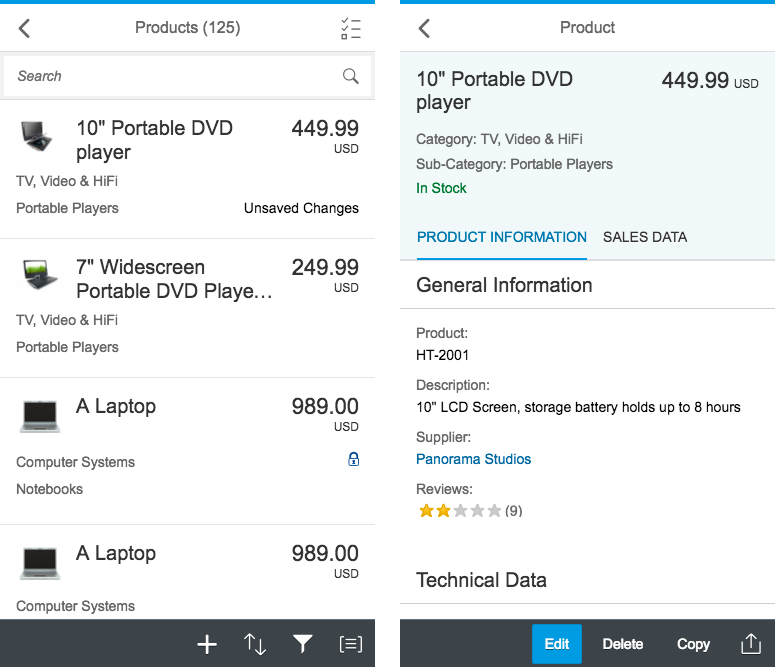
If the application header is empty, the bar will be collapsed:
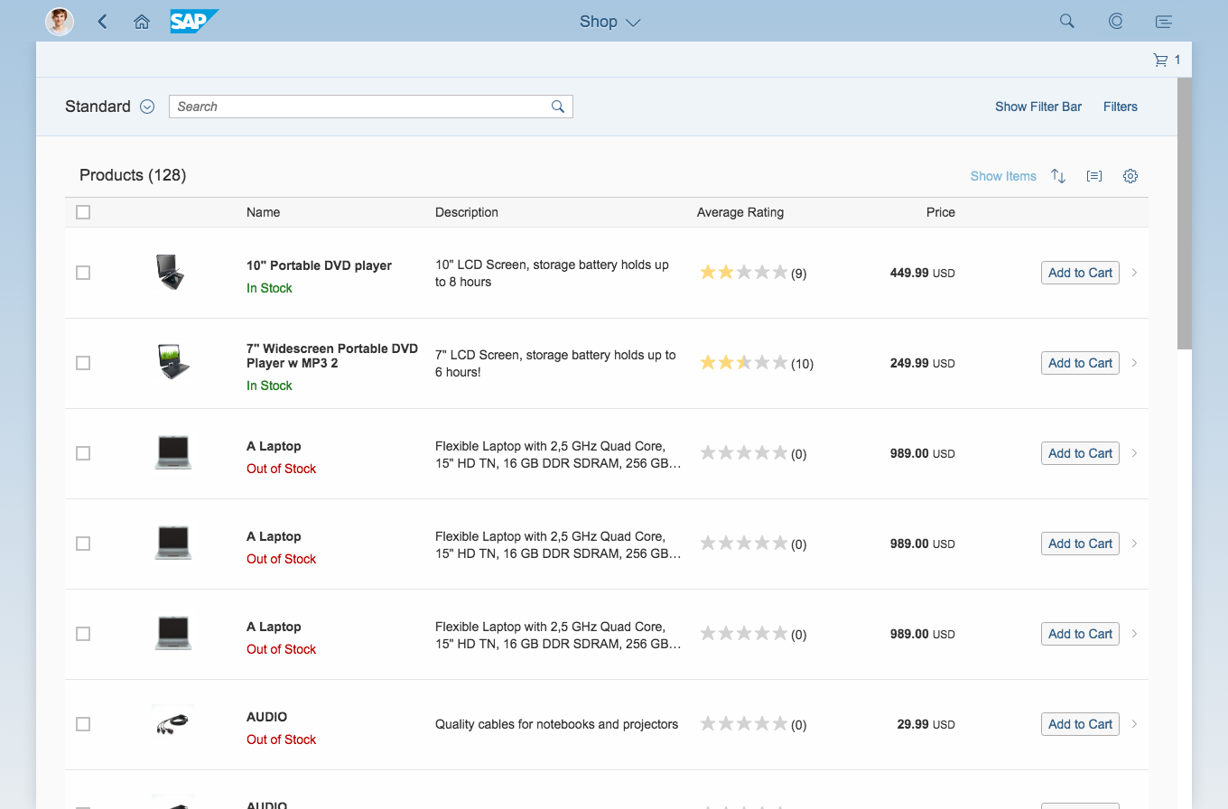
Before the merge: Full screen layout with shell bar only

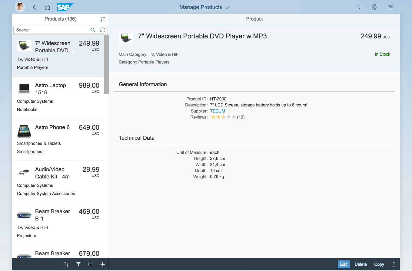
After the merge with new shell bar: Full screen layout with one bar
Split-Screen Layout
The shell bar displays the title of the app as configured in the app descriptor. The app Back button will be set to hidden on the initial app screen in the application header bar. A Back button will only be shown when the user has done a drilldown in the respective area of the split-screen layout. Other actions remain in the application header bars.
On size S there are some exceptions. The title that is displayed in the shell bar is depicted from the respective area. If the user is navigating to the details area, the title changes accordingly. Also here, if the application header is empty after applying the adapter, the application header bar will be collapsed.
Before the merge: Split-screen layout - Size L
Before the merge: Split-screen layout - Size M
Before the merge: Split-screen layout - Size M
After the merge with new shell bar: Split-screen layout - Size L

After the merge with new shell bar: Split-screen layout - Size M
After the merge with new shell bar: Split-screen layout - Size S
Resources
Want to dive deeper? Follow the links below to find out more about related controls, the SAPUI5 implementation, and the visual design.
Elements and Controls
- SAP Fiori Launchpad – Overview (guidelines)
- Shell Bar (guidelines)
- Services (guidelines)
 Your feedback has been sent to the SAP Fiori design team.