
- Latest SAPUI Version 1.124
- SAPUI5 Version 1.122
- SAPUI5 Version 1.120
- SAPUI5 Version 1.118
- SAPUI5 Version 1.116
- SAPUI5 Version 1.114
- SAPUI5 Version 1.112
- SAPUI5 Version 1.110
- SAPUI5 Version 1.108
- SAPUI5 Version 1.106
- SAPUI5 Version 1.104
- SAPUI5 Version 1.102
- SAPUI5 Version 1.100
- SAPUI5 Version 1.98
- SAPUI5 Version 1.96
- SAPUI5 Version 1.94
- SAPUI5 Version 1.92
- SAPUI5 Version 1.90
- SAPUI5 Version 1.88
- SAPUI5 Version 1.86
- SAPUI5 Version 1.84
- SAPUI5 Version 1.82
- SAPUI5 Version 1.80
- SAPUI5 Version 1.78
- SAPUI5 Version 1.76
- SAPUI5 Version 1.74
- SAPUI5 Version 1.72
- SAPUI5 Version 1.70
- SAPUI5 Version 1.68
- SAPUI5 Version 1.66
- SAPUI5 Version 1.64
- SAPUI5 Version 1.62
- SAPUI5 Version 1.60
- SAPUI5 Version 1.56
- SAPUI5 Version 1.54
- SAPUI5 Version 1.52
- SAPUI5 Version 1.50
- SAPUI5 Version 1.48
- SAPUI5 Version 1.46
- SAPUI5 Version 1.44
- SAPUI5 Version 1.42
- SAPUI5 Version 1.40
- SAPUI5 Version 1.38
- SAPUI5 Version 1.36
- SAPUI5 Version 1.34
- SAPUI5 Version 1.32
- SAPUI5 Version 1.30
- SAPUI5 Version 1.28
- SAPUI5 Version 1.26
- Latest SAPUI Version 1.124
- SAPUI5 Version 1.122
- SAPUI5 Version 1.120
- SAPUI5 Version 1.118
- SAPUI5 Version 1.116
- SAPUI5 Version 1.114
- SAPUI5 Version 1.112
- SAPUI5 Version 1.110
- SAPUI5 Version 1.108
- SAPUI5 Version 1.106
- SAPUI5 Version 1.104
- SAPUI5 Version 1.102
- SAPUI5 Version 1.100
- SAPUI5 Version 1.98
- SAPUI5 Version 1.96
- SAPUI5 Version 1.94
- SAPUI5 Version 1.92
- SAPUI5 Version 1.90
- SAPUI5 Version 1.88
- SAPUI5 Version 1.86
- SAPUI5 Version 1.84
- SAPUI5 Version 1.82
- SAPUI5 Version 1.80
- SAPUI5 Version 1.78
- SAPUI5 Version 1.76
- SAPUI5 Version 1.74
- SAPUI5 Version 1.72
- SAPUI5 Version 1.70
- SAPUI5 Version 1.68
- SAPUI5 Version 1.66
- SAPUI5 Version 1.64
- SAPUI5 Version 1.62
- SAPUI5 Version 1.60
- SAPUI5 Version 1.58
- SAPUI5 Version 1.56
- SAPUI5 Version 1.54
- SAPUI5 Version 1.52
- SAPUI5 Version 1.50
- SAPUI5 Version 1.48
- SAPUI5 Version 1.46
- SAPUI5 Version 1.44
- SAPUI5 Version 1.42
- SAPUI5 Version 1.40
- SAPUI5 Version 1.38
- SAPUI5 Version 1.36
- SAPUI5 Version 1.34
- SAPUI5 Version 1.32
- SAPUI5 Version 1.30
- SAPUI5 Version 1.28
- SAPUI5 Version 1.26
Chart – Value Display
Intro
This article describes how value labels are displayed and how to customize them.
Default Value Display
By default, values of the data points are automatically displayed close to the data point, so that the user does not have to select each point to check its value.
As a general rule:
- Values never overlap.
- Text can be truncated.
- Numeric values are never truncated.
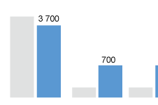
Columns
Values are displayed above the bar.

Value display in column chart
Stacked Columns
Values are displayed within each bar.
If the height of the bar is too small so that the bar cannot hold the value itself (bar height < text height), the text is hidden.
Bars
Values are displayed on the right side of the bars.

Value display in bar chart
Stacked Bars
Values are displayed within each bar.
If the width of the bar is too small so that the bar cannot hold the value itself (bar width < text width), the value is hidden.
Bubbles with Numeric Values
Values are displayed within the bubbles. If the numeric value does not fit in the bubble, it is hidden.
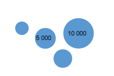
Value display in bubble charts
Bubbles with Text
Text are displayed within the bubbles. If the text does not fit in the bubble, it is truncated until a minimum of 3 characters. Below 3 characters, the text is hidden.
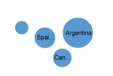
Value display in bubble charts
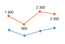
Line Chart
Values are displayed to avoid overlapping with the line and with the data point. In general, values are displayed above the data point, except when the line has a “V” shape (for example, when the values just before and after are larger than the current value). When the value is displayed above the data point, it can be slightly moved to the left or to the right to avoid overlapping.
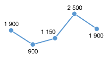
Value display in line charts
Custom Value Display
If there are too many data points, it is possible to hide all values or to hide some values.
Hide Values for a Series (Combined Chart)
When combining a line with bars, avoid displaying values for both series unless you are sure that both series will not overlap. Instead, please only show values for the most important series.
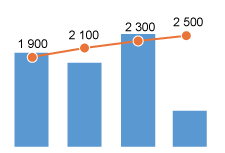
Combined chart
Hide Values of a Series (Clustered Bars)
In clustered bars, when a series is not the key focus of the chart, it may be better to hide its values.
Clustered column chart
Hide Values for a Series (Multiple Lines)
When multiple lines are displayed in a chart, avoid displaying values for all the lines. This leads to cluttered information. Instead, please show only values for the most important line.
Line chart with multiple lines
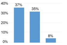
Hide Values for Categories
If the focus of the chart is on one specific category and its comparison with other categories, it may be better to hide all the values except the key category.

Column chart
Hide Values Based on Condition (Min, Max)
It is also possible to highlight the first and last values of a series, or the minimum and maximum value of a series.

Maximum and minimum values are highlighted
Formatting Values
Quantity Formatters
When values use quantity formatters such as short format or percentage, always display the formatters in the data point. For example, display 30M or 12% in the data point.
When appropriate, also show the formatters in the vertical or horizontal axis. For example, the vertical axis will display 10%, 20%, 30%…10%.
Quantity formatters
Locale
Be locale aware: Display numbers in the format corresponding to the user’s locale settings. For that purpose, use SAPUI5 number formatters.
Resources
Want to dive deeper? Follow the links below to find out more about related controls, the SAPUI5 implementation, and the visual design.
 Your feedback has been sent to the SAP Fiori design team.