
- Latest SAPUI Version 1.124
- SAPUI5 Version 1.122
- SAPUI5 Version 1.120
- SAPUI5 Version 1.118
- SAPUI5 Version 1.116
- SAPUI5 Version 1.114
- SAPUI5 Version 1.112
- SAPUI5 Version 1.110
- SAPUI5 Version 1.108
- SAPUI5 Version 1.106
- SAPUI5 Version 1.104
- SAPUI5 Version 1.102
- SAPUI5 Version 1.100
- SAPUI5 Version 1.98
- SAPUI5 Version 1.96
- SAPUI5 Version 1.94
- SAPUI5 Version 1.92
- SAPUI5 Version 1.90
- SAPUI5 Version 1.88
- SAPUI5 Version 1.86
- SAPUI5 Version 1.84
- SAPUI5 Version 1.80
- SAPUI5 Version 1.78
- SAPUI5 Version 1.76
- SAPUI5 Version 1.74
- SAPUI5 Version 1.72
- SAPUI5 Version 1.70
- SAPUI5 Version 1.68
- SAPUI5 Version 1.66
- SAPUI5 Version 1.64
- SAPUI5 Version 1.62
- SAPUI5 Version 1.60
- SAPUI5 Version 1.58
- SAPUI5 Version 1.56
- SAPUI5 Version 1.54
- SAPUI5 Version 1.52
- SAPUI5 Version 1.50
- SAPUI5 Version 1.48
- SAPUI5 Version 1.46
- SAPUI5 Version 1.44
- SAPUI5 Version 1.42
- SAPUI5 Version 1.40
- SAPUI5 Version 1.38
- SAPUI5 Version 1.36
- SAPUI5 Version 1.34
- SAPUI5 Version 1.32
- SAPUI5 Version 1.30
- SAPUI5 Version 1.28
- SAPUI5 Version 1.26
- Latest SAPUI Version 1.124
- SAPUI5 Version 1.122
- SAPUI5 Version 1.120
- SAPUI5 Version 1.118
- SAPUI5 Version 1.116
- SAPUI5 Version 1.114
- SAPUI5 Version 1.112
- SAPUI5 Version 1.110
- SAPUI5 Version 1.108
- SAPUI5 Version 1.106
- SAPUI5 Version 1.104
- SAPUI5 Version 1.102
- SAPUI5 Version 1.100
- SAPUI5 Version 1.98
- SAPUI5 Version 1.96
- SAPUI5 Version 1.94
- SAPUI5 Version 1.92
- SAPUI5 Version 1.90
- SAPUI5 Version 1.88
- SAPUI5 Version 1.86
- SAPUI5 Version 1.84
- SAPUI5 Version 1.82
- SAPUI5 Version 1.80
- SAPUI5 Version 1.78
- SAPUI5 Version 1.76
- SAPUI5 Version 1.74
- SAPUI5 Version 1.72
- SAPUI5 Version 1.70
- SAPUI5 Version 1.68
- SAPUI5 Version 1.66
- SAPUI5 Version 1.64
- SAPUI5 Version 1.62
- SAPUI5 Version 1.60
- SAPUI5 Version 1.58
- SAPUI5 Version 1.56
- SAPUI5 Version 1.54
- SAPUI5 Version 1.52
- SAPUI5 Version 1.50
- SAPUI5 Version 1.48
- SAPUI5 Version 1.46
- SAPUI5 Version 1.44
- SAPUI5 Version 1.42
- SAPUI5 Version 1.40
- SAPUI5 Version 1.38
- SAPUI5 Version 1.36
- SAPUI5 Version 1.34
- SAPUI5 Version 1.32
- SAPUI5 Version 1.30
- SAPUI5 Version 1.28
- SAPUI5 Version 1.26
Chart – Part to Whole
Intro
This article explains how to use charts to visualize the different parts of a whole (expressed as a percentage).
Example use case: The regional sales revenue contribution shown in comparison to the total sales revenue of a company.
Bar Charts
When designers think about visualising parts of a whole, they are invariably drawn toward the trusty pie chart. However, in many cases simple bars are in fact a far better option because you can:
- Compare parts to each other.
- Display category labels and value labels associated with each part.
- Display multiple values.
- Display small values in a better way.
- Avoid having to use multiple colors and a corresponding legend.
The first chart in this example below represents the cash position by currency.
If the order of the category items is not important, you should rank the items from the biggest value to the lowest value as illustrated below. This makes it easy to compare items and see the highest values and smallest values.
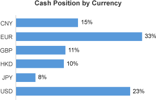
Part to whole shown using bars
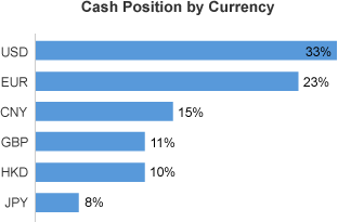
Part to whole in bars, ranked by percentage
Pie Charts
The pie chart (donut chart) is best used when there are only two or three slices to display, and when it’s not important to immediately have the exact value of each slice. Note that the values are ranked from the largest to the smallest to make reading and comparison easier, although you can use a different order if it’s important in the context of your application.
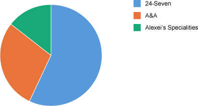
Part to whole in a pie chart
Pie charts are great to use if you’re primarily interested in seeing how much the largest values compare to the rest in percentage. In the chart below, a company has ten stores, but we are most interested in seeing how much percentage the three biggest stores represent. The rest of the stores have been grouped under a slice called ‘Other’. You can easily see that the first three stores represent approximatively 75-80%.
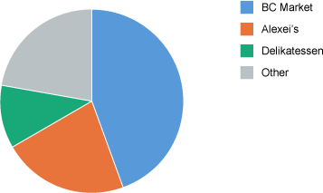
Pie chart with a slice “Other”
Variations Over Time
If you want to show how a part to whole evolves over time, you can use a line chart, multiple bar charts, or stacked columns. Generally speaking, the line chart is the best solution where you can use one line for each part of the whole as illustrated below.
Part to whole over time - Line chart
When there are a small number of time periods (between 2 and 4), you can use bar charts side by side as illustrated below. In this example, the chart represents the contribution of six product lines to the total revenue of a company over a period of four years. Because the first chart is ranked by percentage, you can easily identify when the shape of the different parts changes over time. You can see the contribution made by ‘Flat Screen TVs’ has increased over the last two years compared to the other product lines.
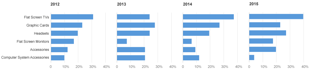
Part to whole over time, with few time periods
If there are only two parts in the whole, you can use a stacked column as illustrated below. Here the evolution of each part is immediately visible.
Part to whole over time - Stacked bar with 2 bars
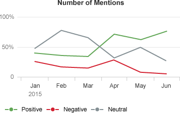
If there are more than two parts in the whole, the first and last values are easy to compare. However, it’s hard to grasp the evolution of parts that exist between the first and last parts. In the chart below the ‘neutral mentions’ are less important so it’s acceptable not to be able to compare them very easily, and only have a rough approximation of their evolution.
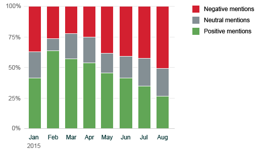
Part to whole over time - Stacked bar with 3 bars
Comparison
If you want to compare the composition of a whole between few items, use bar charts side by side. The chart below illustrates the contribution that five product lines make to the total revenue of three sales regions. Note that the first sales region is ranked by percentage, which makes easy to compare the shape of each chart.
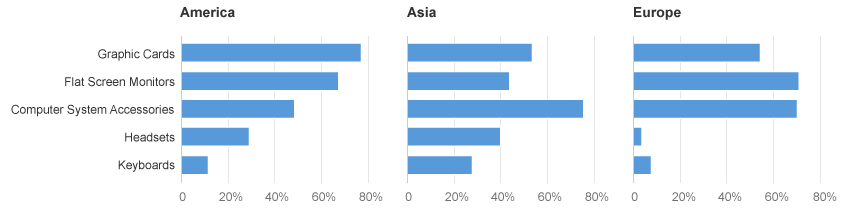
Part to whole comparison between few category items
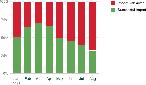
Stacked bars work well when you have only two parts. The chart below is used in the Cash Management app and displays the import status of bank statements for some banks expressed in percentages.
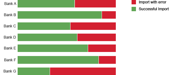
Part to whole comparison - 2 parts
If there is no reason to display the items in a specific order, you can rank by one of the measures. The chart below contains the same information as the chart above, except now the banks have been ranked according to the successful import rate.
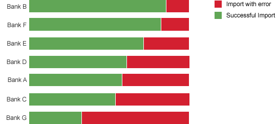
Part to whole comparison - 2 ranked parts
If there are more than two parts in the whole, the first and last values are easy to compare. However, it’s hard to grasp the evolution of parts that exist between the first and last parts.
The chart below displays the revenue contribution made by three sales regions of each for five product lines. In the context of the application, the ‘Asia’ sales region is less important so it’s acceptable not to be able to compare the values very easily, and only have a rough approximation of their evolution. The American sales region is also the most important, so it is displayed first in order to rank the product lines.
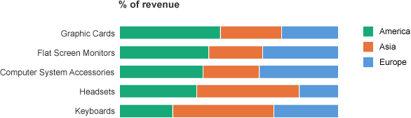
Part to whole comparison - 3 parts
If you want to know which items have the biggest values and how many of these items contribute to the total of the values, you can use a Pareto chart which is designed to illustrate the well-known 80%/20% rule. That is, 20% of the items contribute to 80% of the total.
The chart below displays the number of defects by type of defect, and we can see that 80% of the defects come from the first four types of defect.
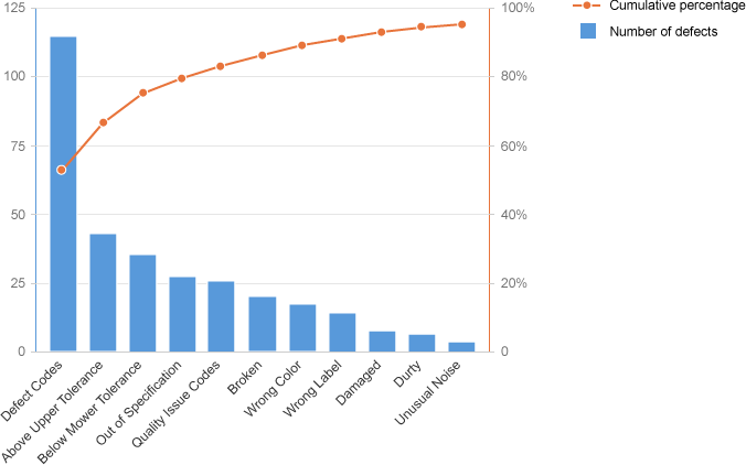
Part to whole - Pareto chart
Resources
Want to dive deeper? Follow the links below to find out more about related controls, the SAPUI5 implementation, and the visual design.
Implementation
- Bar Chart (SAPUI5 samples)
- Stacked Bar Chart (SAPUI5 samples)
- Pie Chart (SAPUI5 samples)
- Stacked Column Chart (SAPUI5 samples)
 Your feedback has been sent to the SAP Fiori design team.