- Latest SAPUI Version 1.124
- SAPUI5 Version 1.122
- SAPUI5 Version 1.120
- SAPUI5 Version 1.118
- SAPUI5 Version 1.116
- SAPUI5 Version 1.114
- SAPUI5 Version 1.112
- SAPUI5 Version 1.110
- SAPUI5 Version 1.108
- SAPUI5 Version 1.106
- SAPUI5 Version 1.104
- SAPUI5 Version 1.102
- SAPUI5 Version 1.100
- SAPUI5 Version 1.98
- SAPUI5 Version 1.96
- SAPUI5 Version 1.94
- SAPUI5 Version 1.92
- SAPUI5 Version 1.90
- SAPUI5 Version 1.88
- SAPUI5 Version 1.86
- SAPUI5 Version 1.84
- SAPUI5 Version 1.80
- SAPUI5 Version 1.78
- SAPUI5 Version 1.76
- SAPUI5 Version 1.74
- SAPUI5 Version 1.72
- SAPUI5 Version 1.70
- SAPUI5 Version 1.68
- SAPUI5 Version 1.66
- SAPUI5 Version 1.64
- SAPUI5 Version 1.62
- SAPUI5 Version 1.60
- SAPUI5 Version 1.58
- SAPUI5 Version 1.56
- SAPUI5 Version 1.54
- SAPUI5 Version 1.52
- SAPUI5 Version 1.50
- SAPUI5 Version 1.48
- SAPUI5 Version 1.46
- SAPUI5 Version 1.44
- SAPUI5 Version 1.42
- SAPUI5 Version 1.40
- SAPUI5 Version 1.38
- SAPUI5 Version 1.36
- SAPUI5 Version 1.34
- SAPUI5 Version 1.32
- SAPUI5 Version 1.30
- SAPUI5 Version 1.28
- SAPUI5 Version 1.26
- Latest SAPUI Version 1.124
- SAPUI5 Version 1.122
- SAPUI5 Version 1.120
- SAPUI5 Version 1.118
- SAPUI5 Version 1.116
- SAPUI5 Version 1.114
- SAPUI5 Version 1.112
- SAPUI5 Version 1.110
- SAPUI5 Version 1.108
- SAPUI5 Version 1.106
- SAPUI5 Version 1.104
- SAPUI5 Version 1.102
- SAPUI5 Version 1.100
- SAPUI5 Version 1.98
- SAPUI5 Version 1.96
- SAPUI5 Version 1.94
- SAPUI5 Version 1.92
- SAPUI5 Version 1.90
- SAPUI5 Version 1.88
- SAPUI5 Version 1.86
- SAPUI5 Version 1.84
- SAPUI5 Version 1.82
- SAPUI5 Version 1.80
- SAPUI5 Version 1.78
- SAPUI5 Version 1.76
- SAPUI5 Version 1.74
- SAPUI5 Version 1.72
- SAPUI5 Version 1.70
- SAPUI5 Version 1.68
- SAPUI5 Version 1.66
- SAPUI5 Version 1.64
- SAPUI5 Version 1.62
- SAPUI5 Version 1.60
- SAPUI5 Version 1.58
- SAPUI5 Version 1.56
- SAPUI5 Version 1.54
- SAPUI5 Version 1.52
- SAPUI5 Version 1.50
- SAPUI5 Version 1.48
- SAPUI5 Version 1.46
- SAPUI5 Version 1.44
- SAPUI5 Version 1.42
- SAPUI5 Version 1.40
- SAPUI5 Version 1.38
- SAPUI5 Version 1.36
- SAPUI5 Version 1.34
- SAPUI5 Version 1.32
- SAPUI5 Version 1.30
- SAPUI5 Version 1.28
- SAPUI5 Version 1.26
P13n Dialog
sap.m.P13nDialog
Intro
The p13n dialog control provides a dialog for tables that allows the user to personalize one or more of the following attributes:
- Columns (visibility and order of columns)
- Sort (sorting of table values)
- Filter (filtering of table values)
- Group (grouping for specific attributes)
These tabs can be shown in any combination, as the use case requires.
The P13n dialog is intended for complex tables with a large number of columns and the need for complex queries for sorting, grouping, and filtering.
For simple tables, see view settings dialog and table personalization dialog.
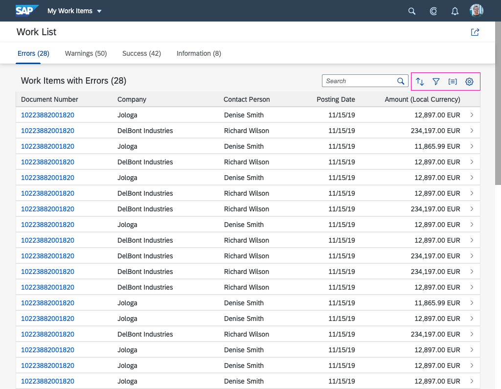
The P13n dialog can be triggered in the table toolbar using the corresponding buttons in the top right-hand corner of the table.
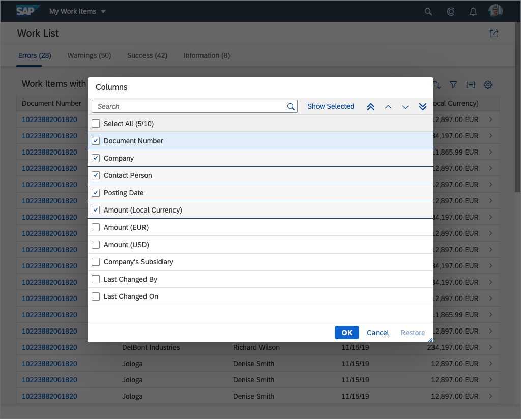
The dialog is shown centered, either as a dialog (on desktop and tablet devices) or as a full-screen dialog (on mobile devices).
Usage
Use the P13n dialog if:
- The user is able to personalize more than 20 or so columns.
- You need several functions for sorting, grouping, and so on.
- You are using the analytical table.
- Complex queries have to be built for the relevant table.
Do not use the P13n dialog if:
- The user is able to personalize fewer than about 20 columns.
- You only need a simple column show/hide feature.
Components
The P13n dialog consists of four different tabs that can be used separately or combined, as required by the use case:
- Sort
- Filter
- Group
- Columns
App developers can add more tabs manually.
Behavior and Interaction
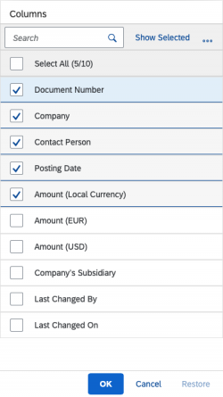
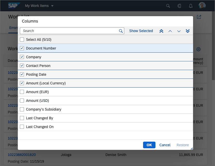
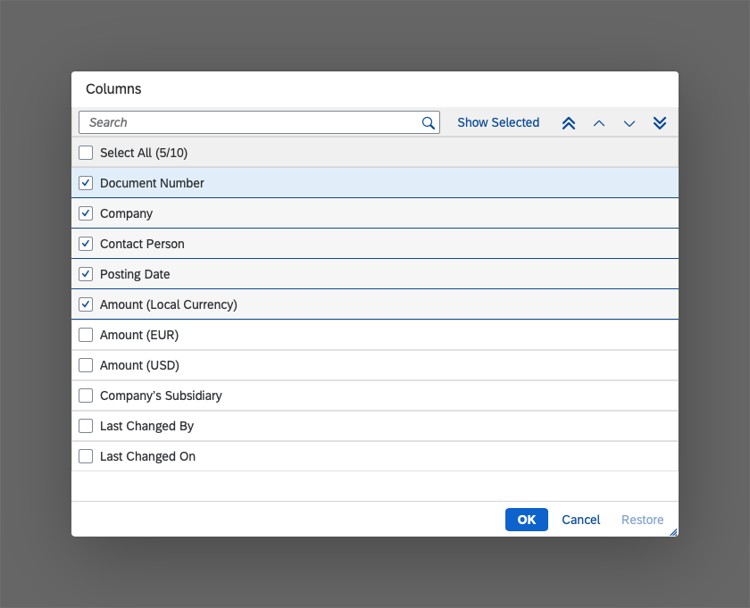
The first tab is the Columns tab. It allows the user to change the table columns that are shown and the order in which they are displayed.
The list contains all of the table’s possible columns in the form of list items with checkboxes. The checkboxes of the currently displayed columns are selected.
Another button next to the search field in the table toolbar allows the user to toggle between showing all columns and only those that are currently selected in the list.
Show/Hide
To show or hide a column, select or deselect the appropriate checkbox.
Reorder
To change the order of the columns, simply mark one list item and use the buttons on the right-hand side of the table toolbar to move them up or down. The order of the columns from top to bottom corresponds to the order on the table from left to right.
Search
If the table has numerous columns, the user can use the search field in the table toolbar to find a specific column more quickly. As soon as the user enters the first letter, the resulting columns are displayed instantly.
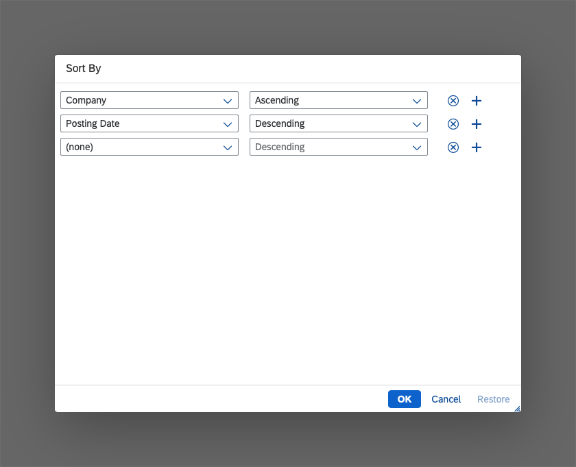
The second tab is the Sort tab, which allows the user to sort the table content according to the chosen attributes, and also in either ascending or descending order.
The sort criterion consists of two input fields. In the first field, the user can choose a column by which the table is to be sorted. In the second field, the user chooses the sort order (ascending or descending).
For more complex sorting needs, the user can add the required number of criteria by clicking the plus “ ” sign at the end of the line.
The order of the criteria is exactly the same as the order in which sorting is applied to the table.
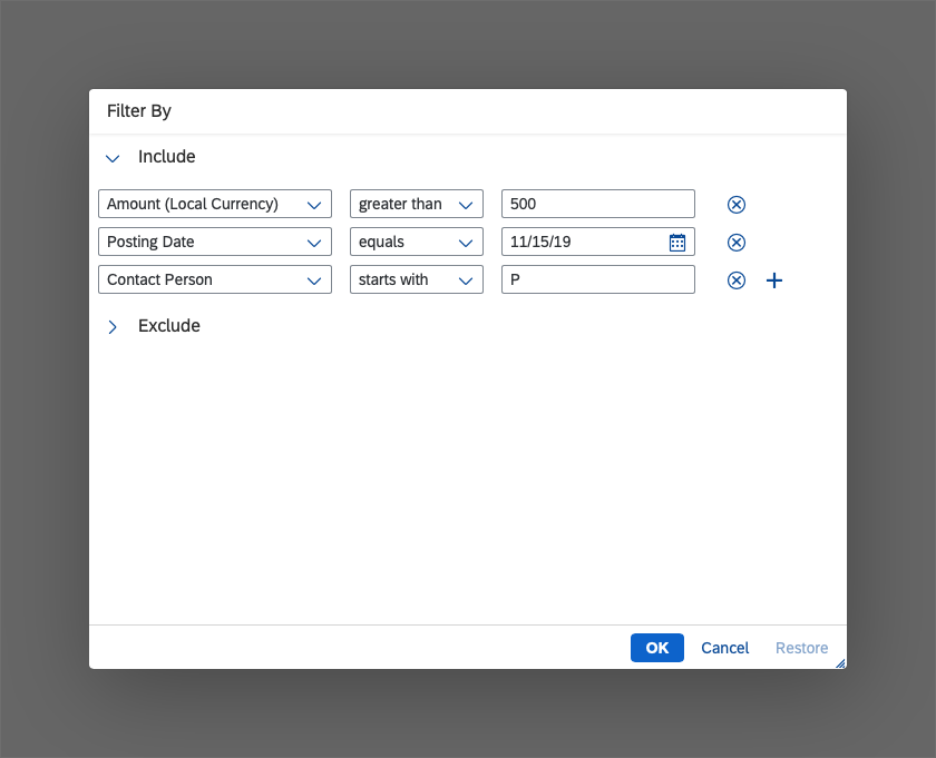
The third tab is the Filter tab, which allows the user to filter the table information according to specific criteria.
The filter criteria can be included or excluded in the relevant section of the filter.
Column
In the first input field, the user selects the column to be filtered. Any of the columns can be selected; even those that are not currently visible.
Option
The second field offers an operator for specifying the filter in more detail. The operators that are available depends on the data type of the selected column.
String (Text)
- between
- contains
- equal to
- begins with
- ends with
- greater than
- greater than or equal to
- less than
- less than or equal to
Number
- between
- equal to
- greater than
- greater than or equal to
- less than
- less than or equal to
Date
- between
- equal to
- after
- on or after
- before
- before or on
Boolean (true / false)
- equal to
The only available operator for excluding values from the filter results is equal to.
Value
The last field contains the value by which the selected column is filtered. The kind of input field that is provided depends on the data type of the selected column.
Two or even more fields can be provided as required by the use case.
For more complex cases, the user can add filters by clicking the plus “ ” button or remove them by clicking the Remove button at the end of each filter item.
The last tab is the Group tab, which enables the user to group the table data by one or more columns.
In the first selection field, all columns are provided for selection. The user can select a checkbox on the right of the column selection field if the selected field is to be displayed as a column anyway.
For more complex grouping scenarios, the user can add more grouping options by clicking the plus “ ” button on the right-hand side of each grouping line. This option only works with the analytical table.
The grouped table shows the selected field as the group header, which can be expanded or collapsed.
Under the group headers, all subgroup headers and all applicable table entries are displayed.
Guidelines
For opening the dialog from a table toolbar, use different buttons for each function (sort, filter, group, column settings). With each button, open the P13n dialog with just the corresponding tab. Do not display the other tabs.
Resources
Want to dive deeper? Follow the links below to find out more about related controls, the SAPUI5 implementation, and the visual design.
Elements and Controls
- Table Personalization Overview (guidelines)
- View Settings Dialog (guidelines)
- Table Personalization Dialog (guidelines)


 Your feedback has been sent to the SAP Fiori design team.