 Fields
Field Names and Short Descriptions
Field names
A field name is always assigned directly to an input or output field and briefly describes the contents of this field.
Appearance
Field names appear flat and in proportional typeface on the screen. The character font can set by the user and applies to all field names.

Figure 1: Example, showing the usage of field names
Design Guidelines
- Familiar Terms: Use words that are part of the user's working vocabulary. Do not use suffixes like "number" or "key" (Exception: personnel number).
- Uppercase: Always capitalize the first letter of a field name.
| Initial value | 12,6 | |
| Further value | 13,7 |
- Word Order: If a field name consists of two or more words, the part containing the important information should appear at the beginning.
- Length: A field name should be no longer than 10 to 15 characters. If the field has been used very often, you can abbreviate the field name.
- Number of Abbreviations: Do not use more than two or three abbreviations in a field name.
- Spacing Between Field Name and I/O Field: Leave at least two blanks between the field name and the I/O field.
Icons as Field Names
- Icons can represent field names. They may replace common terms such as telephone, fax, date or time.
- Address icon plus text "Shipping address" to distinguish from "Factory address".
- Copy icon next to the field names from and to.
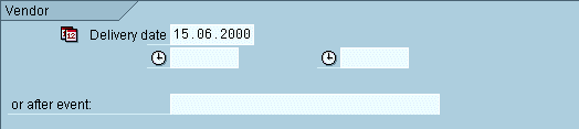
Figure 2: Field names implemented as text, icon, and icon plus text label
As an exception, icons can complete field names. In this case you should use either an icon plus a textual label or position the icon next to field names in order to indicate the relationship.
Short descriptions
Short descriptions (explanatory or check texts) are pure output fields. They follow an I/O field and explain what a numeric or alphanumeric key actually means.
Appearance
Check texts are usually displayed flat on the screen and in background color. If the check text has been entered by the user and not by the system, the check text appears on subsequent screens in 3D and background color.

Figure 3: Appearance of check text (right)
Check texts can be scrollable (see scrollable I/O fields). They are the primary candidates for scrollable, that is, shortened fields. A right pointing arrow at the end of the field indicates that the user can scroll the check text.

Figure 4: Appearance of scrollable check text
Design Guidelines
A check text follows an entry field, separated by three blanks. This makes sure that a possible entry-pushbutton does not hide the beginning of the check text.
Do not align the explanatory text with other fields on the screen if you have to move it so far away from the field to be explained that their spatial connection gets lost.
Exception: If the vertical alignment on a template is interrupted more than three or four times, you should redesign the template.
"23451-4" is the value of the output field, "Screws, nickel-plated" is the short description:
| Plant | 2 | Requisitioner | Piper | |||||
| Material | 23451-4 | Screws, nickel-plated |
If there is not enough room for the explanatory text field to the right of the value, place the text field in a separate line or make it scrollable. Define a separate field name for the text field in the first case.
Source: SAP R/3 Style Guide