 Fields
Group Boxes
Group boxes help you to achieve a clearly structured screen design. They collate related information together in a box and identify it with a group heading.
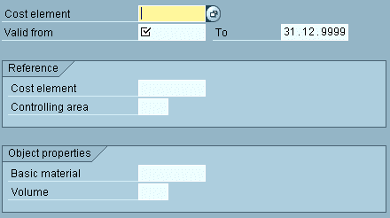
Figure 1: A typical R/3 screen with group boxes
Design Guidelines
Place larger groups of information units that you want to separate from other information in group boxes. Group boxes only contain particular groups, not the entire screen.
Exceptions
- Separate small information blocks that do not necessarily require separation from other information on the screen with a blank line only.
- Do not include header data in a group box. Use a blank line to separate them from other information on the screen.
- Dialogue boxes with only one information group do not contain a group box.
Headings
Every group box should have a group heading. Do not highlight the headings. You can also set headings at runtime.
Subscreens
When using subscreens, define the group box in the calling screen. You have to specify two extra lines for the box in the subscreen definition. The size of the area in the calling screen would have to be increased correspondingly.
Hiding
You can hide group boxes at runtime if all fields contained are also hidden.
Arrangement
Alignment of group boxes
Define group boxes according to the following guidelines, listed in terms of priority:
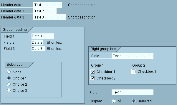
- Often, you can divide the screen into two large columns. Place the right border of the left-column box at the center of the screen (as far as column 40). Place the right border of the right-column boxes that extend almost to the edge of the window (from about column 60, that is) at the right window border.
- Align adjacent boxes, if you can achieve this by extending the border by a few blank columns or lines (orientation value: 2-3 blank lines or 5-10 blank columns).
- If the first two guidelines are not applicable, place group boxes directly around the fields of the group.
With fields without a permanently displayed possible entries pushbutton, make sure to leave spacing of at least three columns behind the field so that the pushbutton does not obscure the group box.
Horizontal Arrangement
- If two group boxes appear next to each other, distribute them regularly on the screen: Place the border of the boxes at the screen center and/or the screen border. Separate the boxes by approx. 1-2 columns. Position larger boxes to the left.
- Text without group box (particularly header data) starts in column 1; this also applies to dialogue boxes.
- Texts and selection elements (checkboxes, radio buttons) inside the box start in the column directly following the box frame.
Vertical Arrangement
- Do not separate two group boxes positioned below each other by blank lines.
Exception: On initial screens you can insert a blank line between the boxes to achieve a regular distribution. - Separate the header data of the following group always by a blank line.
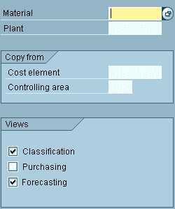
Figure 2: Illustration of guidelines for group boxes on entry screens
Tables
A group box may contain a table. The group heading serves as the table heading. Place pushbuttons for interacting with the table below the table inside the group box.
Last Check ...
When you have defined the group box following the above mentioned guidelines, check the screen if you should correct some of the elements slightly for a visually more pleasing result. A good overall impression has priority!