Pushbuttons Pushbuttons

Pushbuttons with no Fixed Position

Use pushbuttons with no fixed position to initiate functions that refer to individual fields, groups of fields, tables or lists and/or parts of them. You can use pushbuttons with no fixed position for example to show or hide information (texts, graphics, animation). On initial screens, use pushbuttons in the work area to call the most important functions that can be executed with the chosen objects.

Data Screens

Use pushbuttons on data screens for calling further information, execute immediate actions or, for instance, setting attributes. According to their positioning, we distinguish field-related, group-related and table related pushbuttons.
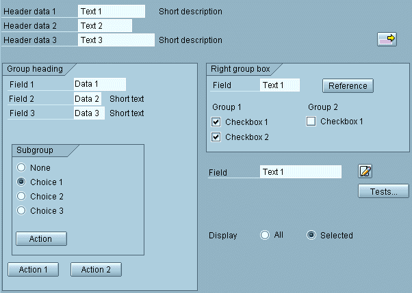
Figure 1: Examples for pushbuttons on screens for calling detailed information, for initiating actions and for setting screen attributes

Field-related pushbuttons refer to a single field or to a small number of fields. They are usually placed to the right of the field that they belong to. Align pushbuttons that are on top of each other. If placed in a group box, place them to the right of the group box, if possible. Yet, you should never place them too far away from the field, so that users would not know which field they refer to.

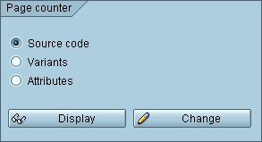
Figure 2: Pushbutton on the long text as an example of a field-related pushbutton


Group-related pushbuttons refer to a group of fields. Left-align them with the upper fields of the group box and let them generally start in the first three columns of a group box.

Figure 3: Example for group-related pushbuttons

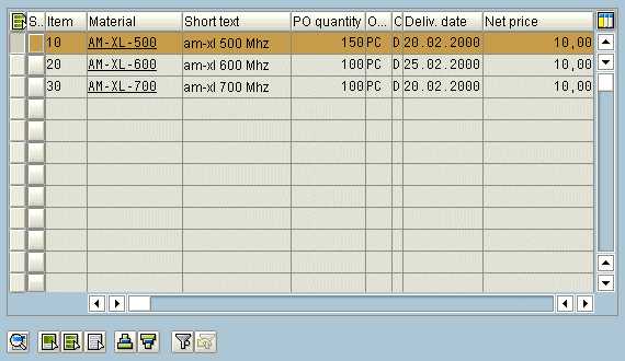
Table-related pushbuttons refer to a table. Separate them by one line from the table and usually include them in the group box of the table if it is provided. Such pushbuttons can be scroll functions, edit functions or functions for the positioning.

Figure 4: Pushbuttons for Table Control

See also Pushbuttons with Icons on Data Screens

Initial Screens

The initial screens of tool tasks differ from those of business applications in respect to the number of processing methods possible in a transaction. In tool tasks quite a number of object components or processing types are available. Therefore, these tasks differ in their initial screens from business applications by presenting the object components or processing types in the work area and not in the application toolbar. You may use the application toolbar for other less important functions, here. In addition, the object components or processing types are listed in the menu so that they are also available in the data screens.

If the user can only select one object component at time, design them as radio buttons, otherwise as checkboxes.

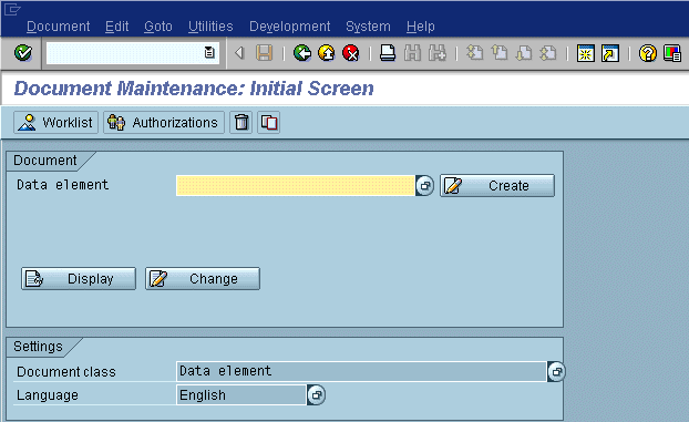
If processing types refer to the entire object, position the pushbuttons to the right of the input field for the object. If they refer to individual object components, arrange them within the group box that contains the object components or close to the object components.

If there is only one processing method, you need not provide an Edit pushbutton in the work area; in this case the ENTER pushbutton will do. On the other hand the number of pushbuttons should not exceed 10 in order not to lose transparency of the initial screen.

Figure 5: A typical initial screen

 See also Pushbuttons with Icons on Initial Screens


top top

Source:  SAP R/3 Style Guide