
Create
Intro
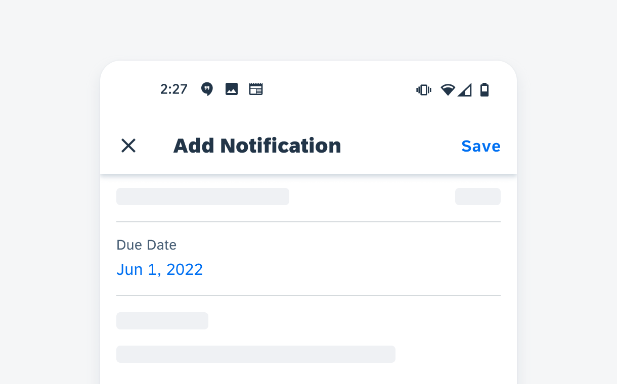
The create pattern presents users a form used to generate new objects and object details. It is typically triggered by “Create” or “Add” actions. The create pattern is presented in a full-screen dialog on mobile devices or modal dialog on tablets. In the dialog, users are able to input the information related to the object they are creating.
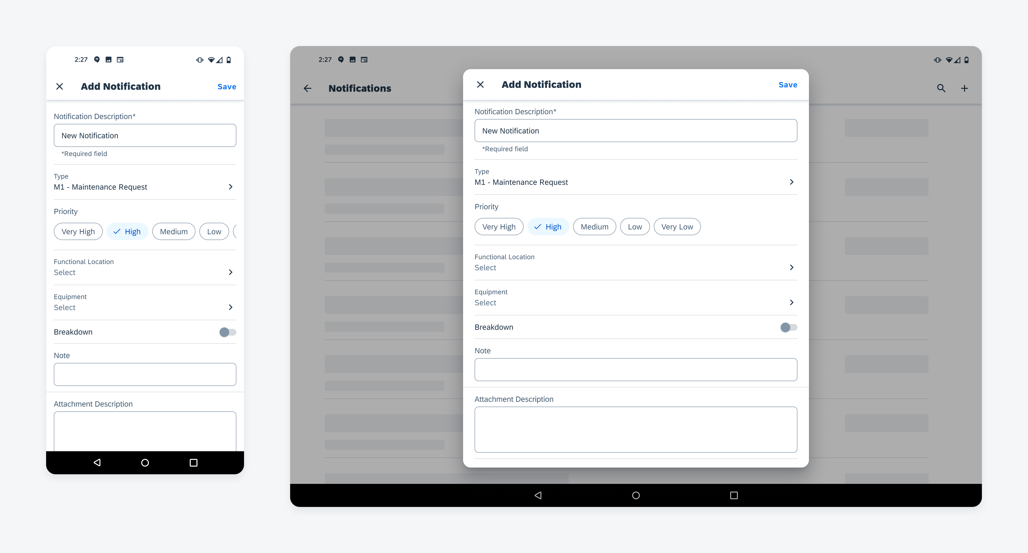
Create dialog on mobile (left) and tablet (right) devices
Anatomy
The create pattern follows the basic structure of a full-screen dialog. Based on object type and object detail, different types of data entry components are used. Hierarchy of data entry components should reflect the hierarchy of object detail.
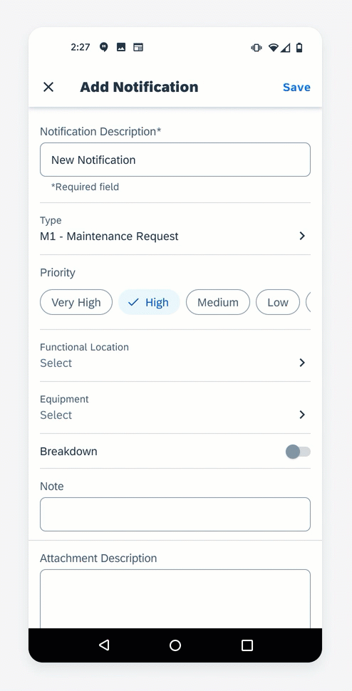
A. App Bar
The app bar contains:
- Screen title specifies the object it’s creating.
- “Close” icon on the left to discard the new object without saving.
- “Save” button on the right to generate the new object based on information filled in this dialog.
B. Key Information
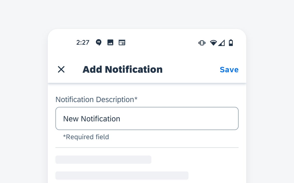
The data points that define the foundation of this new object are considered key information. This contains properties that help users to identify the object, such as the title of a new task. Usually, at least one of the key information is required for creating the object. The key information should be located at the top of the dialog so users can start with this first. In some cases, key information is pre-populated, and the user may or may not be able to edit these values. The type of information that appears in the key information section differs depending on the use case.
C. Property
Property details appear after the key information section to gather additional information for the object. In general, one form cell is used for one property. Cells can be grouped together based on the information hierarchy of the object. Choose the form cell that best serves the data type.
D. Accessory
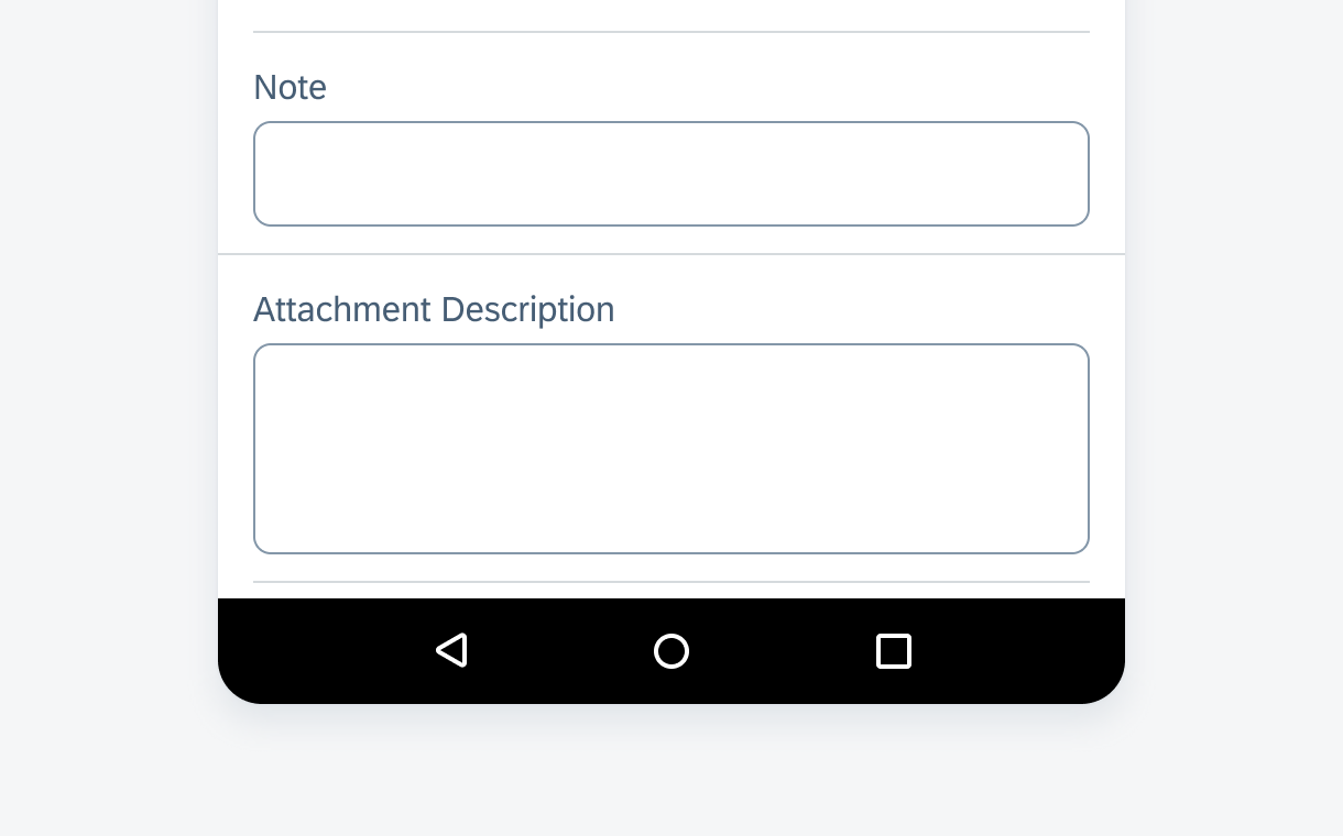
The accessory area is at the bottom of the dialog. It includes elements such as notes and attachments.
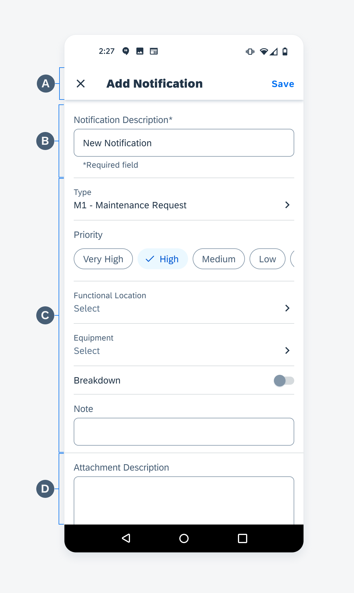
Create dialog anatomy
Control Types
Text Input
Simple Property Form Cell
Simple property form cell is best for gathering freestyle text input value for a certain property. The value is expected to be relatively short and without line breaks.
Simple property form cell in a create dialog
Note Form Cell
Note form cell is best for gathering long freestyle text input, such as note or comment. Users can use line breaks as they want.
Note form cell in a create dialog
Select
Chip Form Cell – Single or Multiple Selection
Use a chip form cell when users need to make selections from no more than eight predefined values. Use a choice chip form cell for single selection. Use a filter chip form cell for multiple selection. If the number of values is more than eight, or the text of value is too long to display within chips, use a list picker form cell instead.
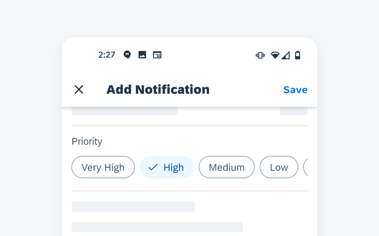
Chip form cell in a create dialog
List Picker Form Cell– Single or Multiple Selection
A list picker form cell is used when the property has long values or more than eight possible values. It is also used when the number of values is dynamic or unpredictable. With a list picker form cell, the user is able to search and select the data entry.
The selection on a list can be either single selection (use radio buttons) or multiple selection (use checkboxes), based on the definition of the property.
If a list is multi selection, the selections can be grouped in a “Selected” grouping to enable users to deselect without having to scroll down a large list.
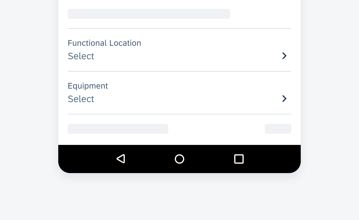
List picker form cell in a create dialog
Switch Form Cell
Use a switch form cell when the property has only two mutually exclusive states—on and off.
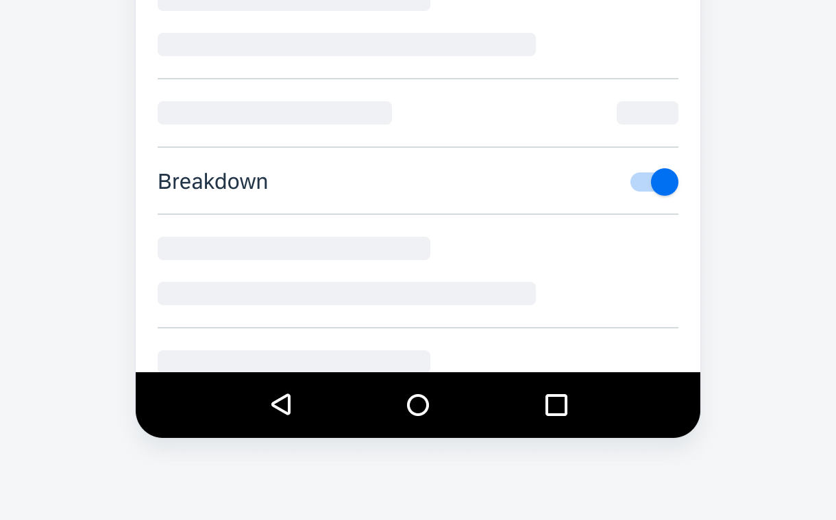
Switch form cell in a create dialog
Data Range
Slider Form Cell
A slider form cell enables the user to set the maximum value within a specified numerical range.
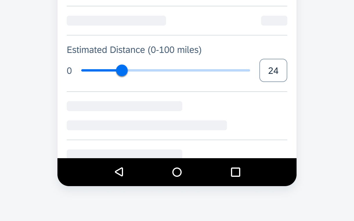
Slider form cell in a create dialog
Time Picker Form Cell
A time picker form cell is used to select time based data.
A date picker is used to set a specific date or time. A time duration picker is used to set a duration.
Time picker form cell in a create dialog
Attachment
An attachment is usually located at the end of the create pattern so that this section can descend freely as the user attaches more files.
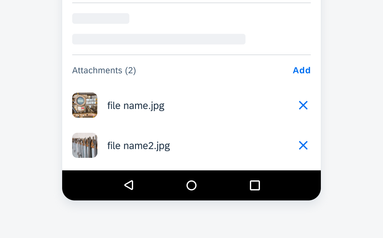
Attachment in a create dialog
Behavior and Interaction
Trigger
The create pattern is triggered when users tap on an “Add” icon or create/add menu options. The trigger should state clearly what object it is going to create.
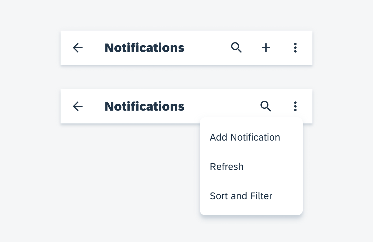
The create flow triggered by the create menu in app bar
Actions
“Close” Icon
The “Close” icon closes the dialog without having to commit. When nothing has been entered by the user, the dialog is closed directly. If there is unsaved input, a confirmation dialog shows up asking users to confirm their action.
“Save” Button
The “Save” button creates the object based on user input. By default, display the newly created object’s detail page after save so that users can see their changes.
If there’s no individual detail page of the object being created, show the parent page after saving, for example, taking reading for an equipment. Ideally, scroll to the part where user’s new changes are reflected.
Closing a create dialog with unsaved changes triggers a confirmation dialog
Navigation
The navigation within the create pattern is commonly used to drill down from a list picker form cell into a value list. The animation transition of the navigation should be a push to the next screen.
The app bar title in the new screen should be consistent with the label in the list picker form cell. Replace the “Close” icon with the “Back” icon to navigate back. There is no “Apply” button in the drill down page due to all changes being auto-saved. If the search function is available, use the expandable search and show the “Search” icon in the app bar.
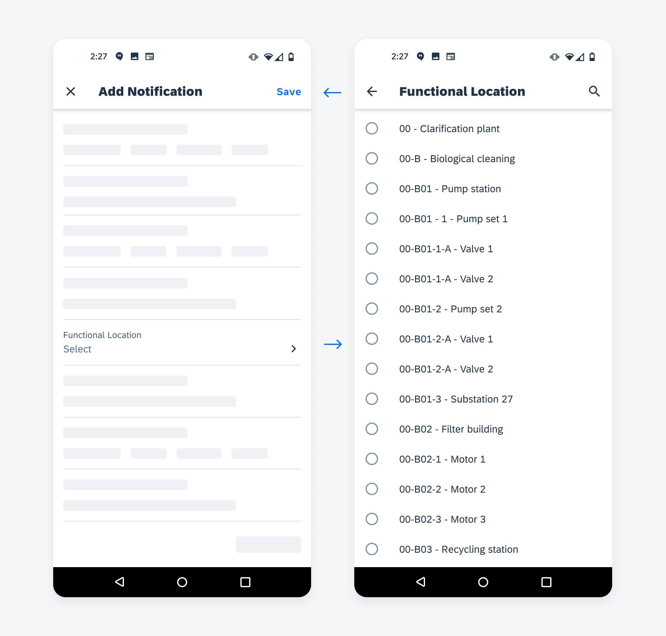
Navigation from a list picker form cell inside a create dialog
Resources
SAP Fiori for iOS: Create & Edit
 Your feedback has been sent to the SAP Fiori design team.