
Create & Edit
Intro
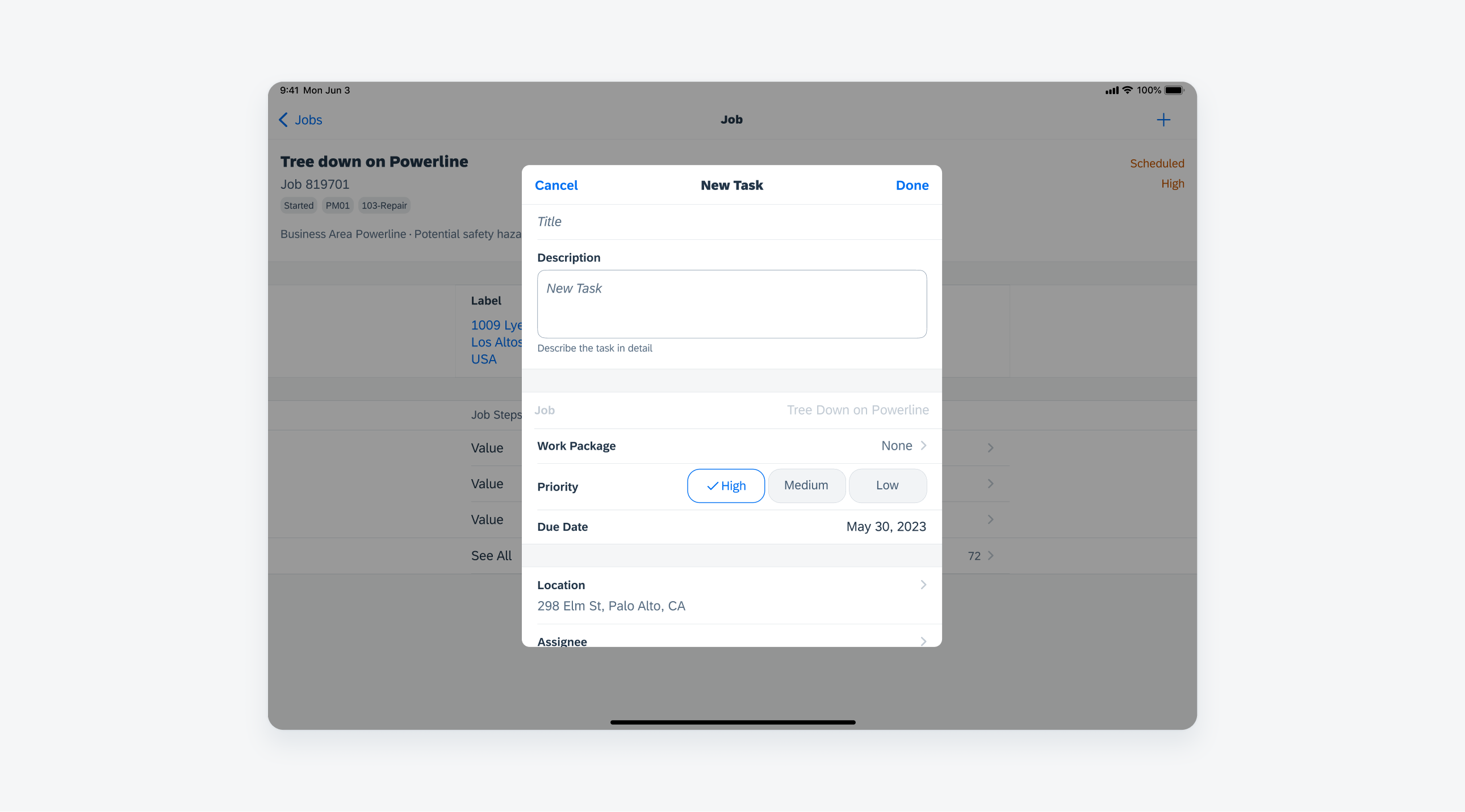
The create & edit pattern is used to generate or update object. It is presented to the user via a modal and typically triggered by the create or edit actions on the navigation bar. The pattern may include a variety of combination of form cells to allow users to input information related to the object.
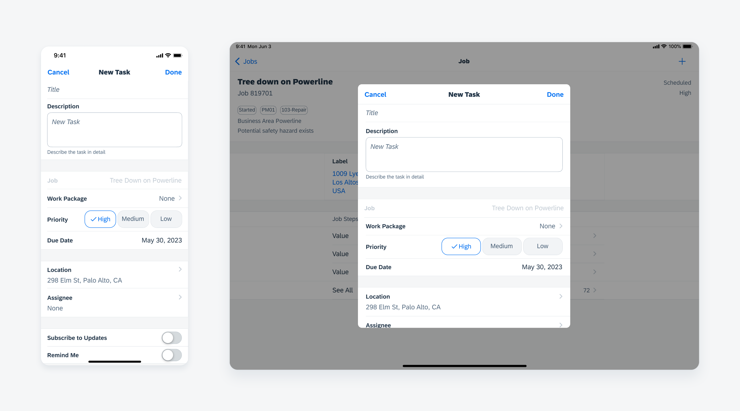
Create and edit form in compact width (left) and regular width (right)
A. Navigation Bar
Contains the screen title and actions for users to save the data or exit the modal by tapping on the “Cancel” button.
B. Key information
Allows a user to input the most important information about the object. Some input fields may be set to required to create the object. In some cases, input fields may be pre-populated depending on if the object is linked to other objects.
C. Property
Appears after the key information section to gather additional information of the object. In general, one form cell is used for one property. Cells can be grouped together based on the information hierarchy of the object. Choose the form cell that best serves the data type.
D. Accessory
Found at the bottom of the modal. It may include elements such as notes and attachments.
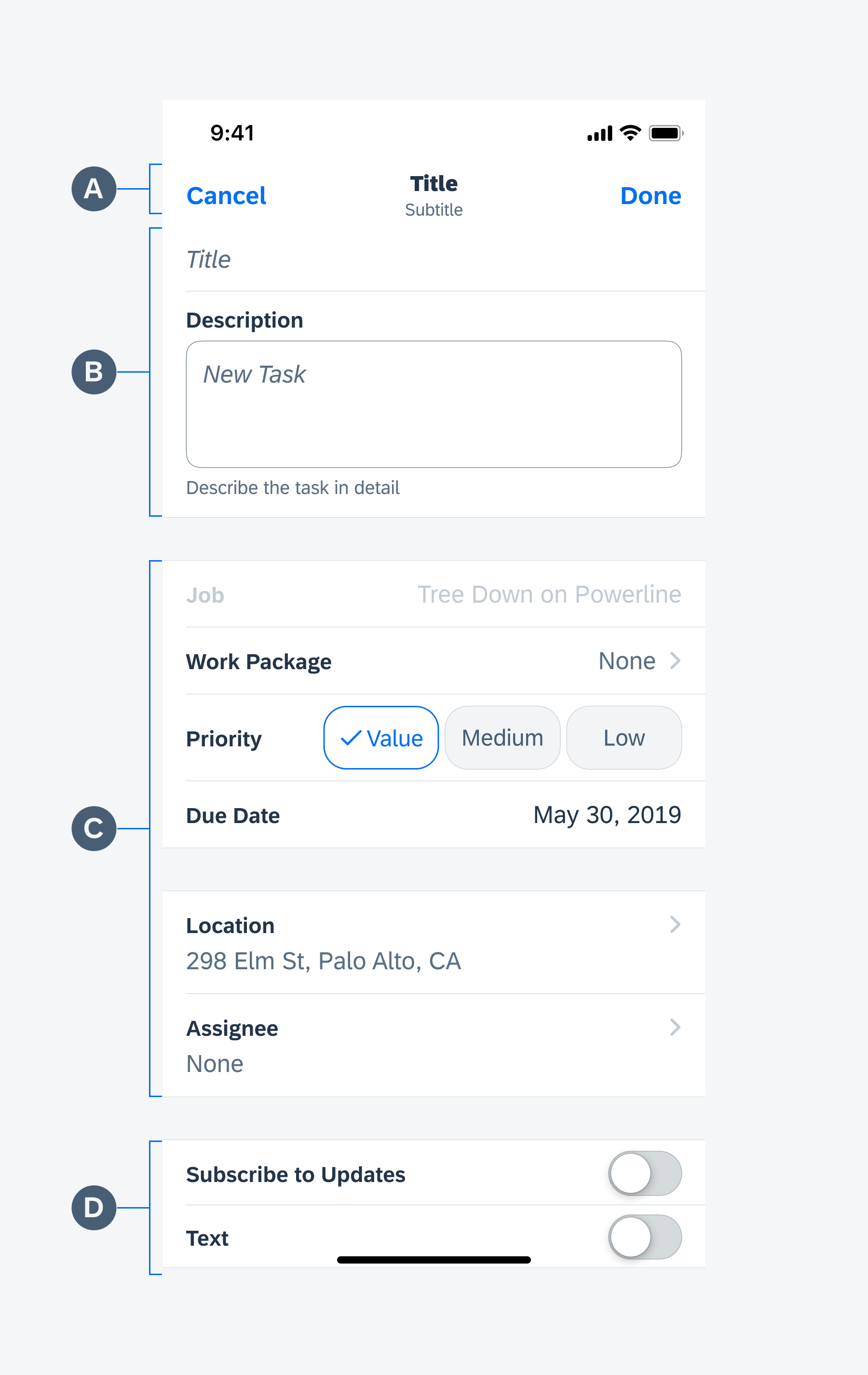
Create and edit anatomy
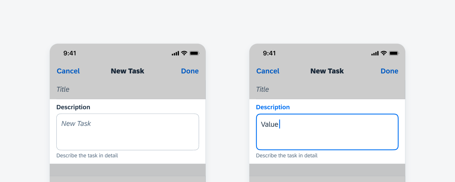
Title Form Cell (FUITitleFormCell)
A title form cell allows the user to enter a short string of information into a single-line input field with fixed height. If inputting multiple lines of text are required, use a note form cell instead.
Prompt text should be displayed clearly and concisely to communicate the purpose of the input field, such as “Title” or “Name”. Vague directions should be avoided, such as “Tap to Write”. If necessary, the content in text fields can be pre-populated. To learn more, see text input.
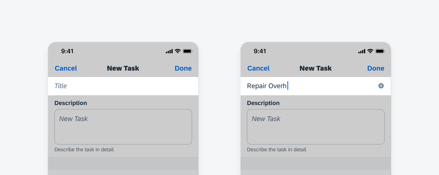
Title form cell
Text Field (FUITextFieldFormCell)
When the modal contains a large number of text input fields, such as a form used to generate a new contact, we recommend using the text field component. This component displays the label of the input field to provide users a better understanding of the purpose of each entry. The text field component has a stacked variant and a single-line variant. Select the appropriate variant depending on the length of the content and the screen size you are designing for.
Read more about the text field in text input.
Text field form cell
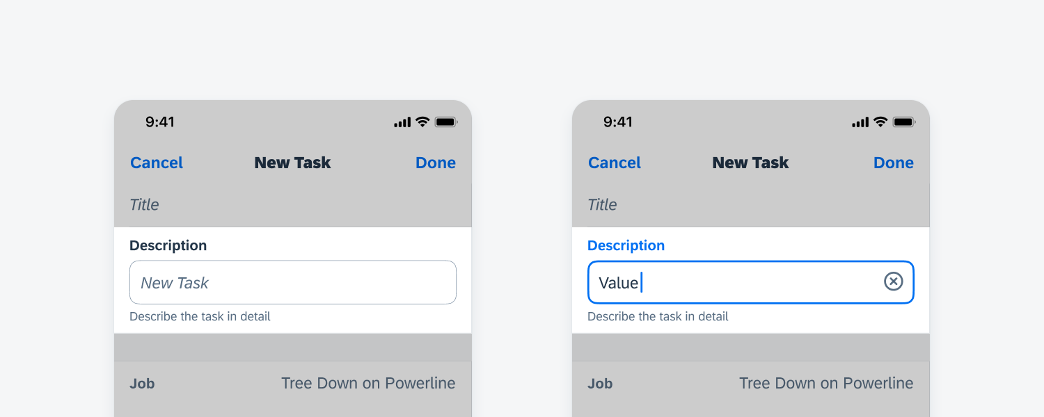
Key Value Form Cell (FUIKeyValueFormCell)
A key value form cell provides additional space for multi-line text entry. If additional accessories are present below the key value form cell, such as attachments, the height of the cell should be fixed, and a scroll bar will allow users to see the hidden content. If the key value form cell is the bottom-most component in the create pattern, the height of the cell can be flexible to grow downwards as the user inputs content into the cell. To learn more, see text input.
Key value form cell
List Picker Form Cell
A list picker allows for single selection or multiple selection among values within a defined category, for example, to choose a specific project when creating a new task. A search bar may be incorporated to assist the user to locate the item. Search to select provides similar functionality and may be used for selecting multiple objects.
To learn more, see list picker or search to select
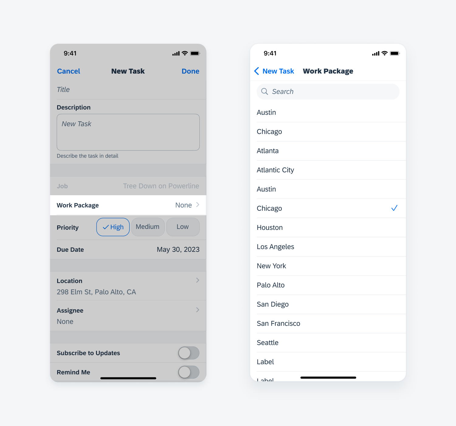
List picker form cell
Pickers
Pickers allow the user to make a selection within a short and predictable list of values. A date picker can be used for the user to select a date, a time in a day, or a combination of both. The default value of a date picker is usually the current date and time. To learn more, see pickers.
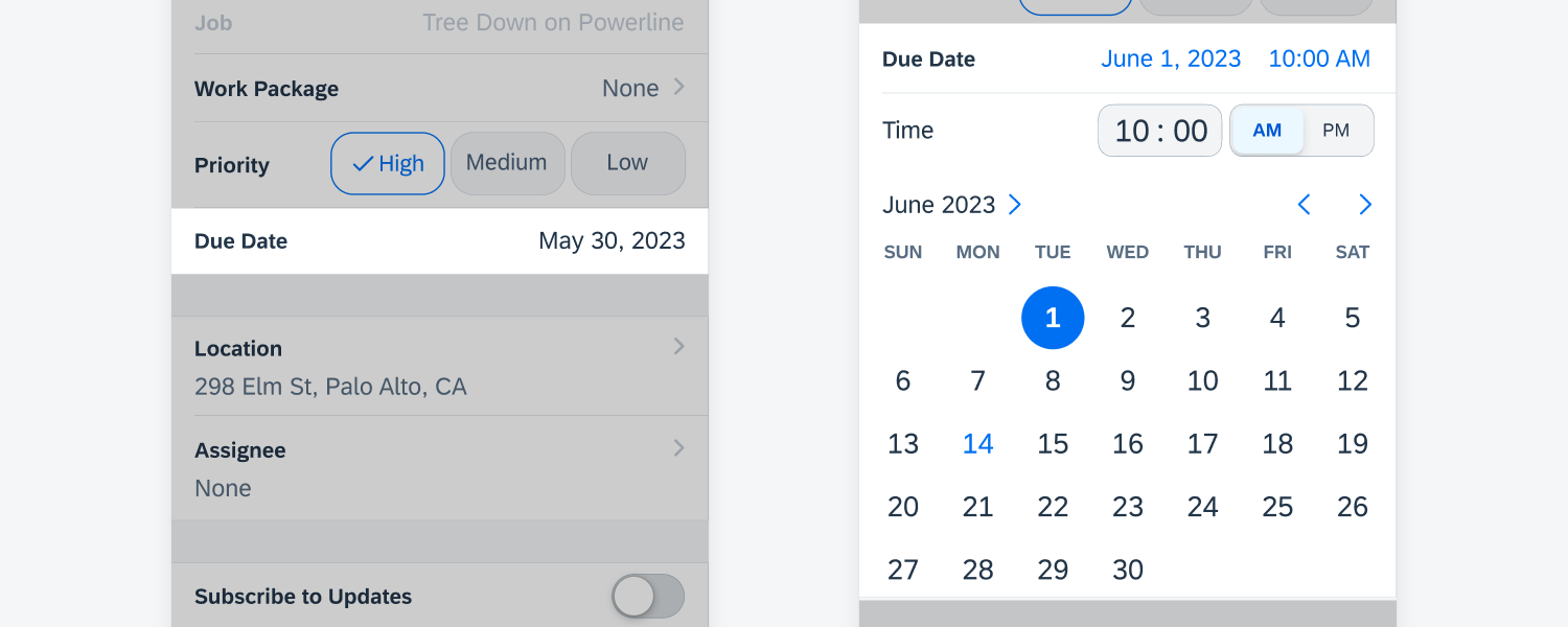
Picker form cell
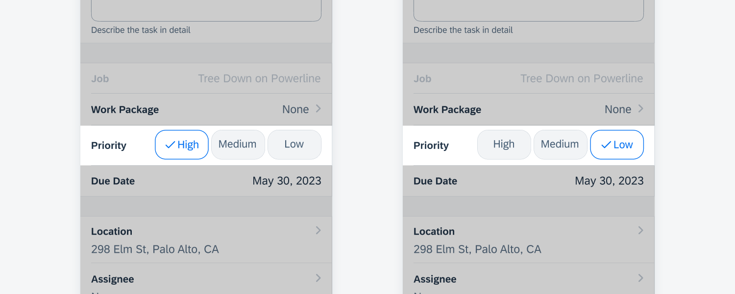
Segmented Control Form Cell
The segmented control form cell allows the user to quickly select from a small set of values by tapping on the buttons. It is typically used for single selection, and only contains short text strings. To learn more, see segmented control form cell.
Segmented control form cell
Switch Form Cell
A switch is used when a property has only two mutually-exclusive states—either on or off. In some use cases, when a switch is set to ‘on,’ additional fields can be displayed for the user to input data. To learn more, see switch.
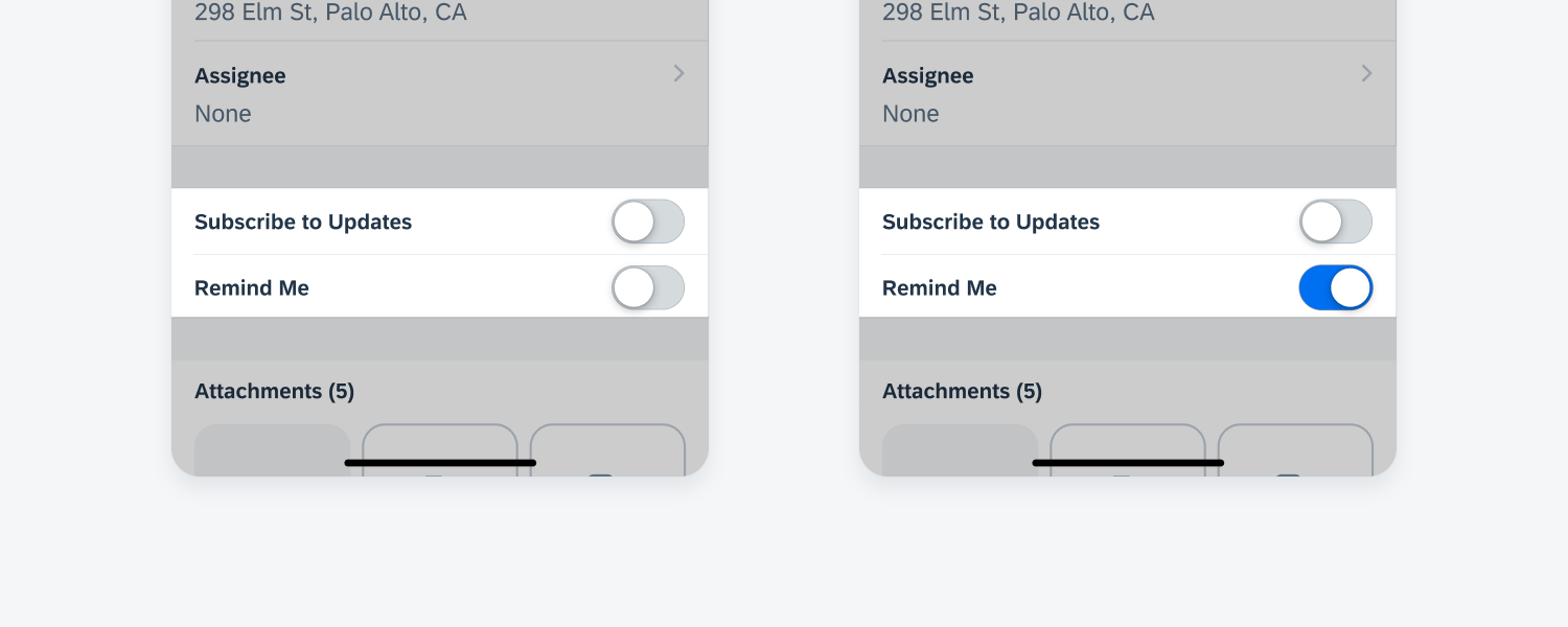
Switch form cell
Attachments Form Cell
The attachments component allows the user to upload items such as images, video and audio files. Tapping on a thumbnail will display a preview of the attachment. To read more, see attachments.
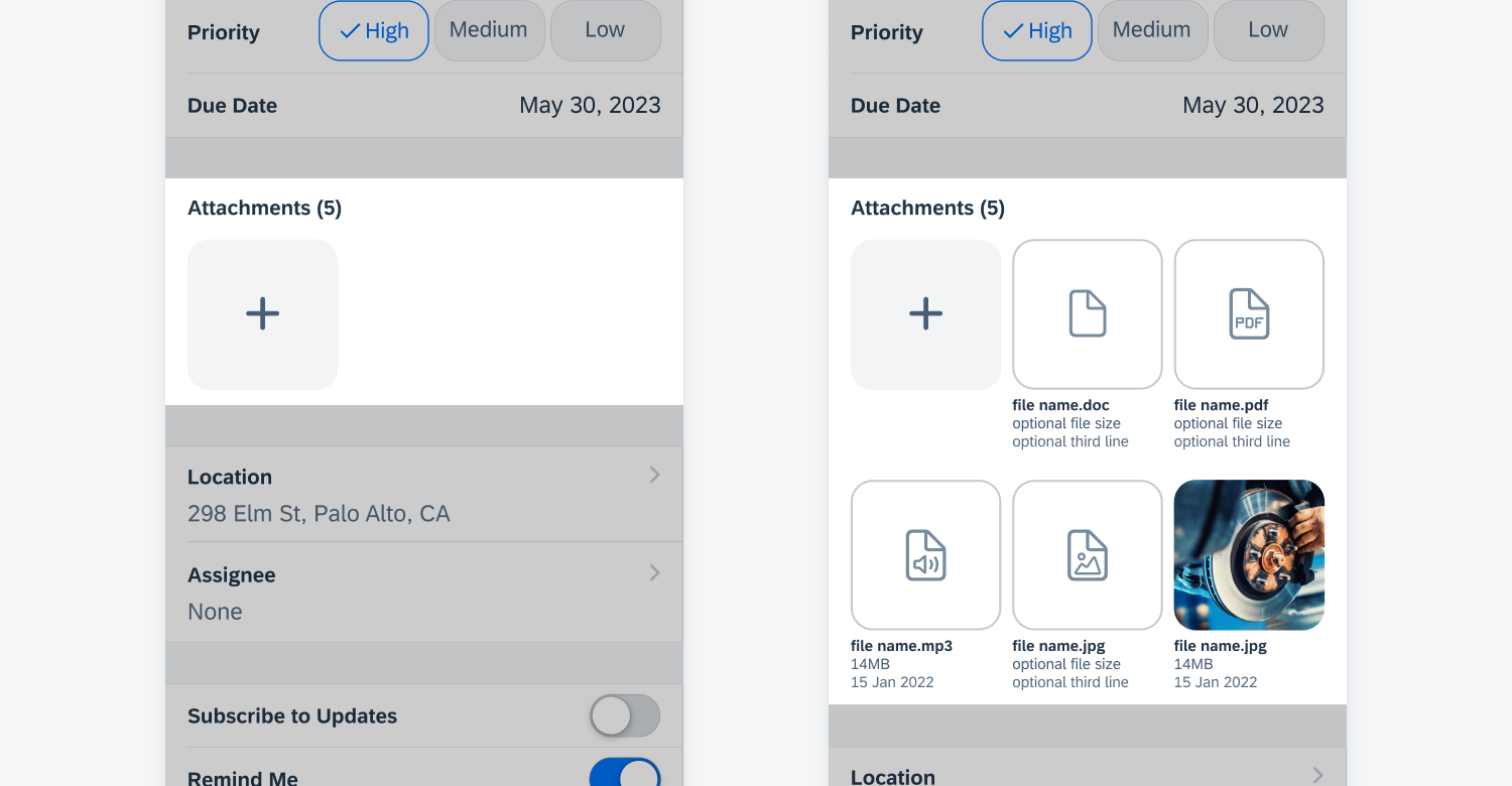
Attachments form cell
Launch
The create view modal is usually triggered by tapping the “+” button on the navigation bar, which presents the user with the option of adding a new item to the current screen.
Create/Edit Modal
A modal containing various form cells will be presented to the user to fill out the information needed to create the object. The edit modal should generally be identical to the create modal to avoid confusion.
Feedback
After the user taps on the “Save” or “Done” button on the top right of the create modal, feedback should be provided to the user. Display a toast message to communicate to the user that the object has been created or updates have been saved.
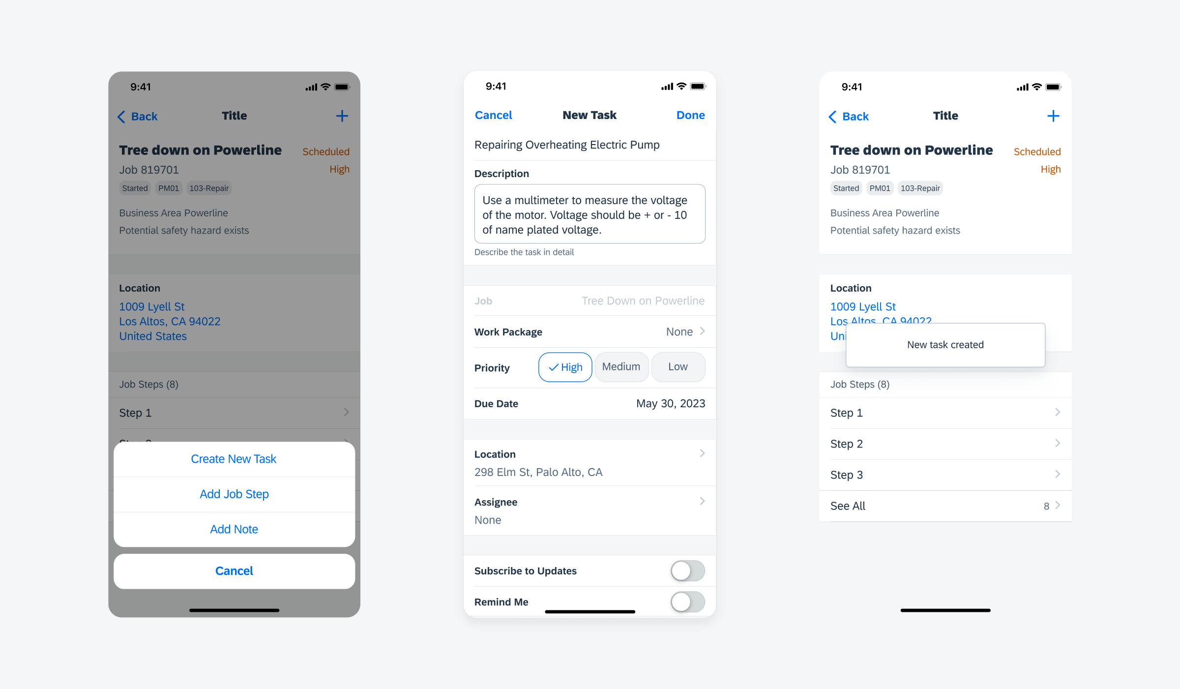
User launches modal (left), filled out modal (center), toast message indicates completion (right)
Regular Width
In regular width, if the create pattern is triggered in a list report where there is only one action under the “+” icon, it should be displayed in a popover.
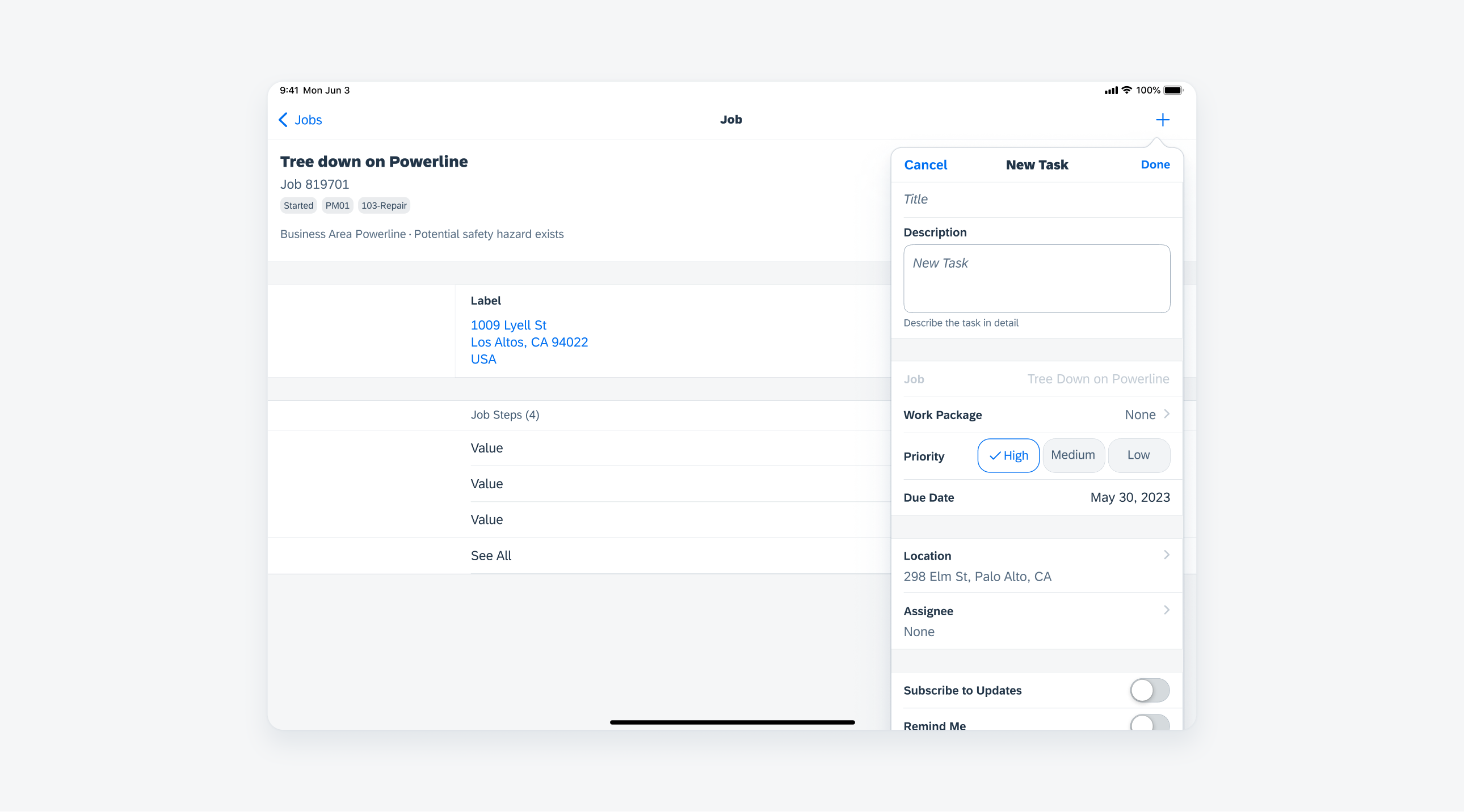
Create pattern in regular width as a popover
Form Sheet Modal
If there are multiple options behind the “+” action button, use the form sheet modal instead to present the create pattern. For further details, see modals.
Create pattern as a form sheet modal
Development: Create and Filter Patterns
SAP Fiori for Android: Create
 Your feedback has been sent to the SAP Fiori design team.