Date & Time Pickers
DatePicker, DateRangePicker, DatePickerDialog
Intro
The picker provides a dialog for date or time-based selections. It can be used to select a date, a range of dates, a time, or a duration of time.
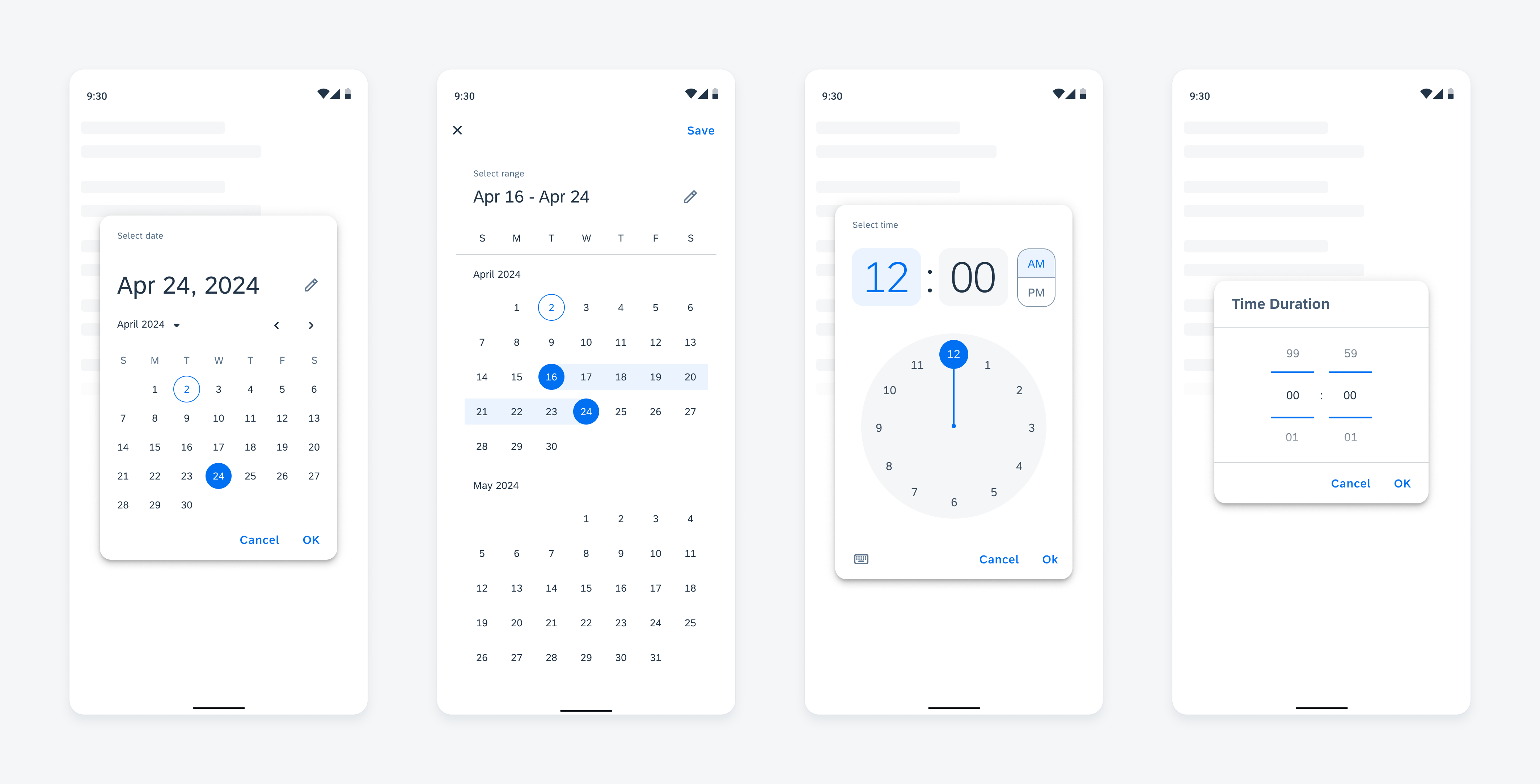
Picker types in compact size from left to right: date picker, range picker, time picker, duration picker
Usage
Use a picker for a time-related decision that the user needs to make.
- Don’t use a picker for picking a number that isn’t related to time.
- Don’t use the date picker for selecting a duration of time.
- Don’t use the time duration picker for selecting a date.
Anatomy
Date Picker
A. Header
Includes the selected date, helper text, and input icon button.
- The selected date is formatted: abbreviated month and date number, followed by the year.
- The helper text is customizable and helps remind the user to select a date.
- The input icon button allows users to switch to the input mode for the picker. See the Variations section for more information.
B. Year and Month Selector
Includes the year menu and month navigator.
- The year menu displays a list of years in place of the date labels. This helps ease navigating to dates far in the past or future. See the Behavior and Interaction section for more information.
- The left and right arrows of the month navigator navigate the dates shown to the previous or next month. See the Behavior and Interaction section for more information.
C. Weekday Label Container
Displays labels for the seven days of the week.
D. Date Label Container
Displays the dates of a month in a grid view.
E. Footer
Includes the “Cancel” and “OK” label buttons.
- The “Cancel” label button cancels any changes made to the selected date and closes the picker dialog.
- The “OK” label button saves any changes made to the selected date and closes the picker dialog.
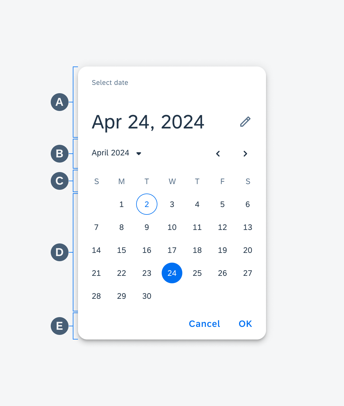
Anatomy of the date picker
Range Picker
The range picker is a full-page dialog.
A. Top App Bar
Includes the “Close” icon button and “Save” label button.
- The “Close” icon button cancels any changes made to the selected date range and closes the picker dialog.
- The “Save” label button saves any changes made to the selected date range and closes the picker dialog.
B. Header
Includes the selected date range, helper text, and input icon button.
- The selected date range is formatted: abbreviated month and date number for the start date to abbreviated month and date number for the end date.
- The helper text is customizable and helps remind the user what date range is being selected.
- The input icon button allows users to switch to the input mode for the picker. See the Variations section for more information.
C. Weekday Label Container
Displays labels for the seven days of the week.
D. Date Label Container
Displays the dates of the visible months in a grid view.
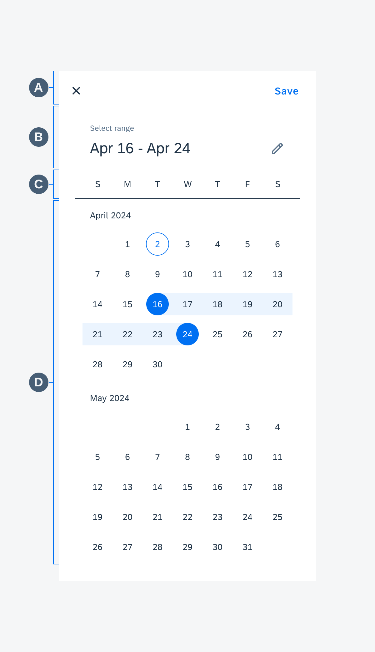
Anatomy of the range picker
Time Picker
A. Header
Includes the selected time, helper text, and AM/PM selector.
- The selected time is in a digital format (hh:mm). The hour and minute value containers can be selected to change what is shown in the clock. See the Behavior and Interaction section for more details.
- The helper text is customizable and helps remind the user what time is being selected.
- The AM/PM selector allows the user to choose between AM or PM time.
B. Clock
Displays an analog clock that includes a clock hand that can be rotated to select an hour or minute. See the Behavior and Interaction section for more information.
C. Footer
Includes the input icon button and “Cancel” and “OK” label buttons.
- The input icon button allows users to switch to the input mode for the picker. See the Variations section for more information.
- The “Cancel” label button cancels any changes made to the selected time and closes the picker dialog.
- The “OK” label button saves any changes made to the selected time and closes the picker dialog.
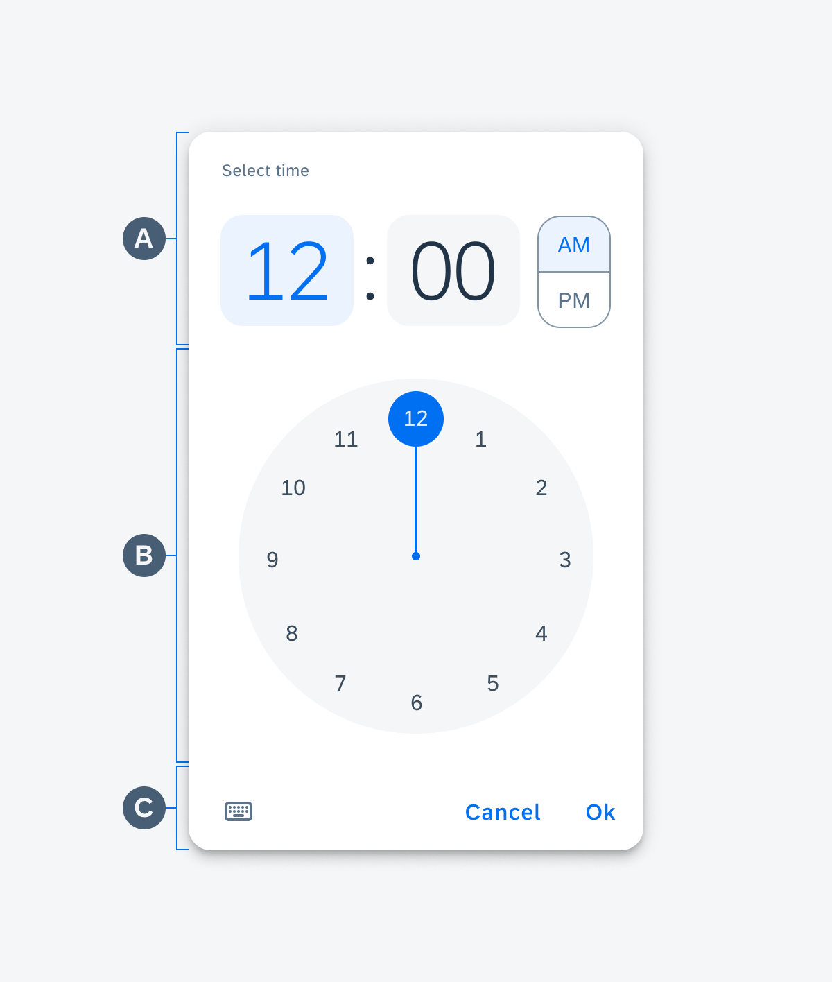
Anatomy of the time picker
Duration Picker
A. Header
Includes a customizable title to help remind the user what duration is being selected.
B. Previous Value Preview
Displays a preview of the previous value; the value that comes before the currently selected value.
C. Selected Value
Displays the currently selected value.
D. Next Value Preview
Displays a preview of the next value; the value that comes after the currently selected value.
E. Footer
Includes the “Cancel” and “OK” label buttons.
- The “Cancel” label button cancels any changes made to the selected duration and closes the picker dialog.
- The “OK” label button saves any changes made to the selected duration and closes the picker dialog.
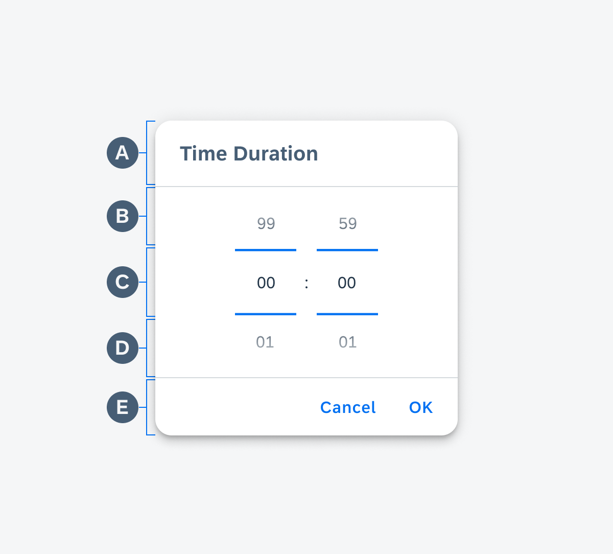
Anatomy of the duration picker
Behavior and Interaction
Date Picker
Selection
To select a date, users may tap on a date label. Today’s date is selected by default.
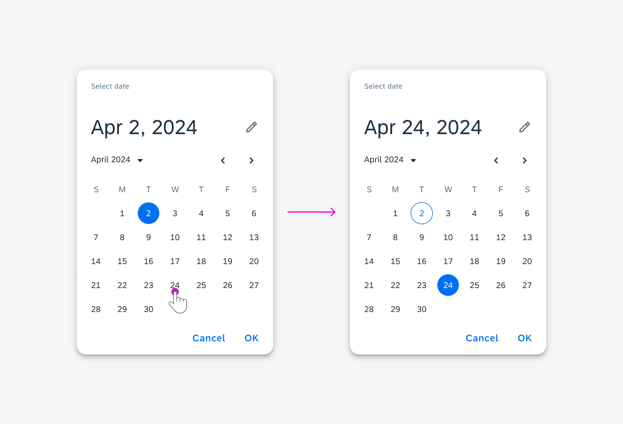
Selecting a date in the date picker
Navigation
To navigate between years, users may tap the year and month menu label and select a year. The picker navigates to the newly selected year with the already currently selected month.
To navigate between months, users may tap the left and right month selector icons or swipe the date label container area left and right.
The picker may also be navigated using an external keyboard and mouse for accessibility.
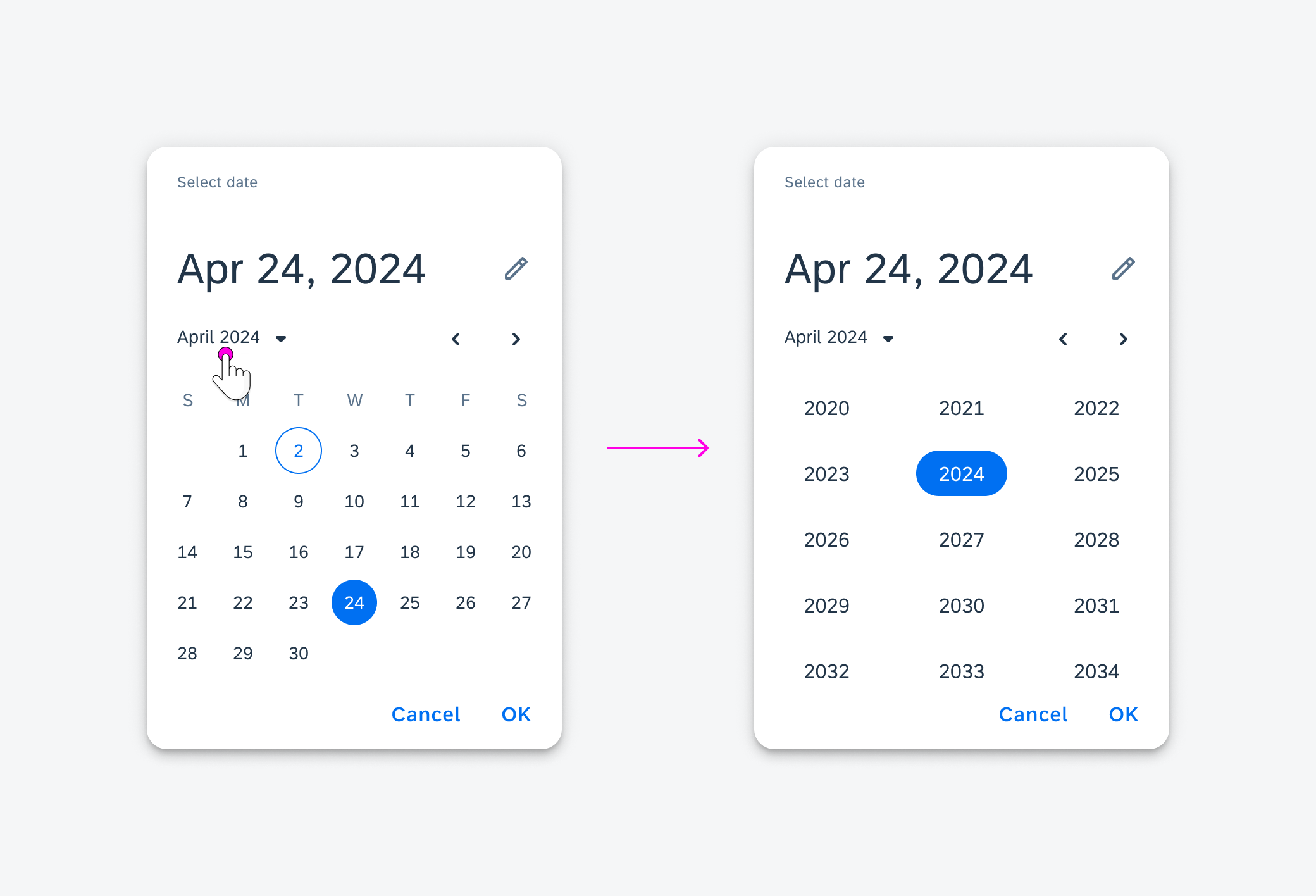
Navigating years in the date picker
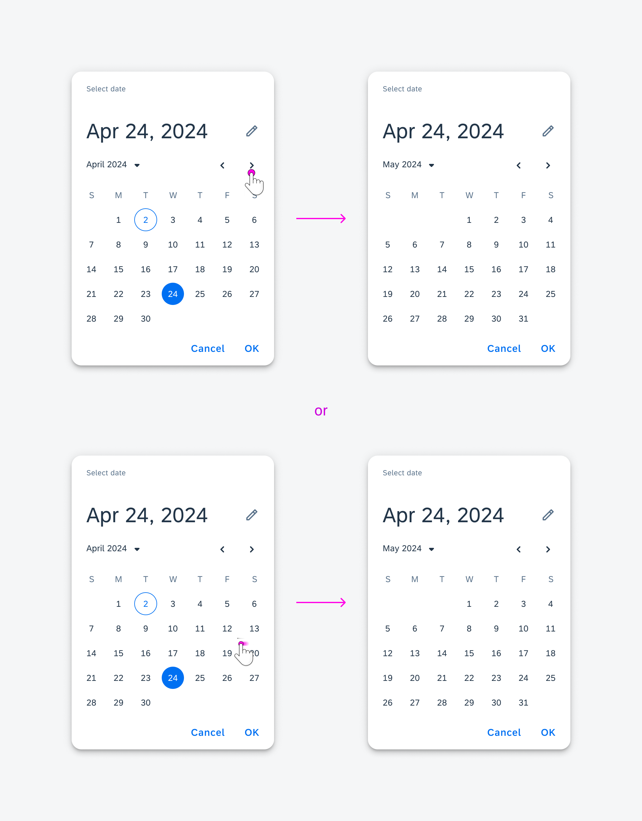
Navigating months in the date picker
Range Picker
Selection
To select a date range, users must tap on a starting date label followed by an end date label. The default selected range is today to today.
If a start date is already selected and the user selects a day before the selected start date, the newly selected date becomes the start date.
If a start and end date are already selected and the user selects a date, the newly selected date becomes the start date and the end date is cleared.
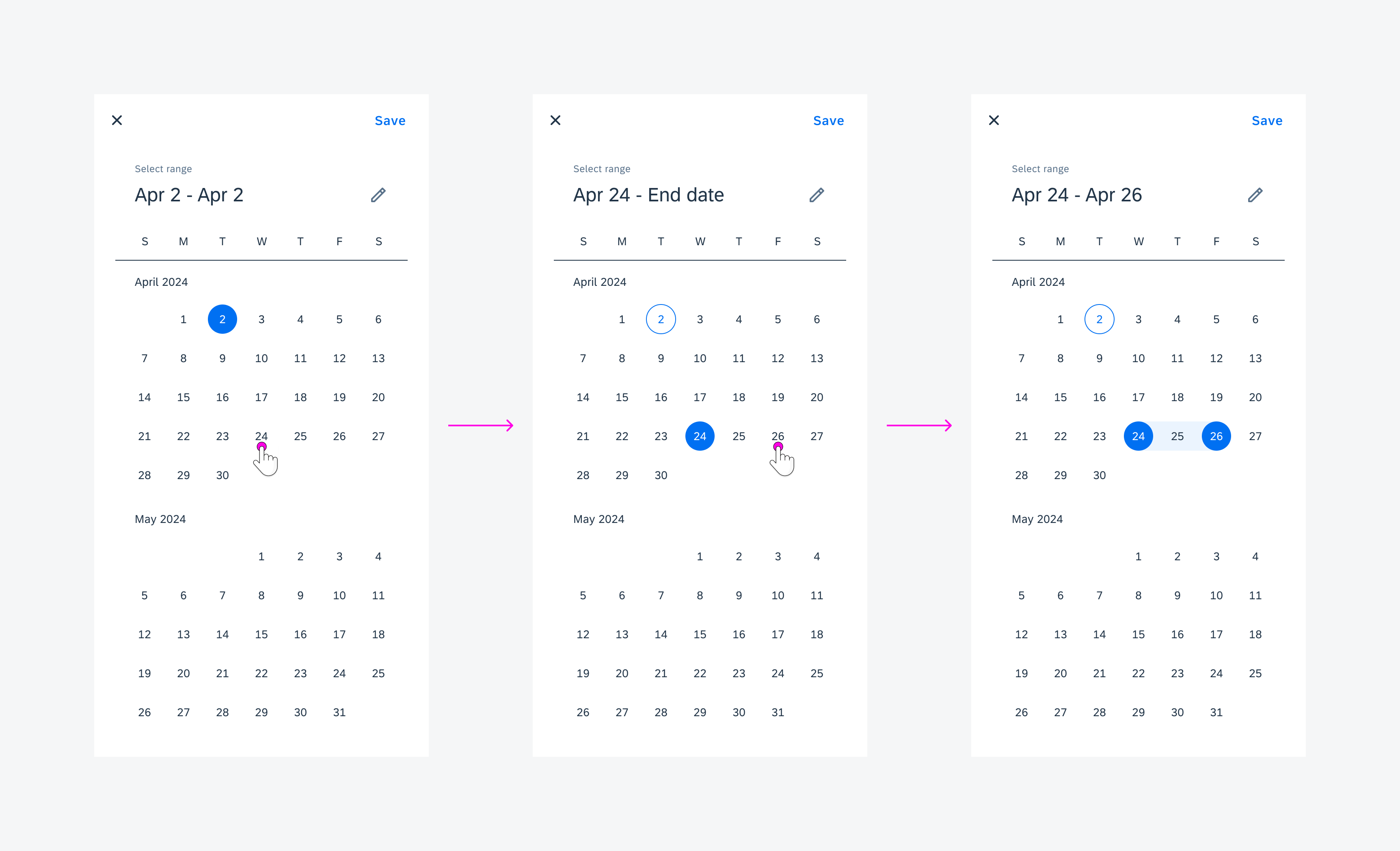
Selecting a range in the range picker
Navigation
To navigate between months, users may swipe up and down on the date label container area. The date labels scroll infinitely unless a minimum and/or maximum date has been defined. See the Variations section for more information.
The picker may also be navigated using an external keyboard and mouse for accessibility.
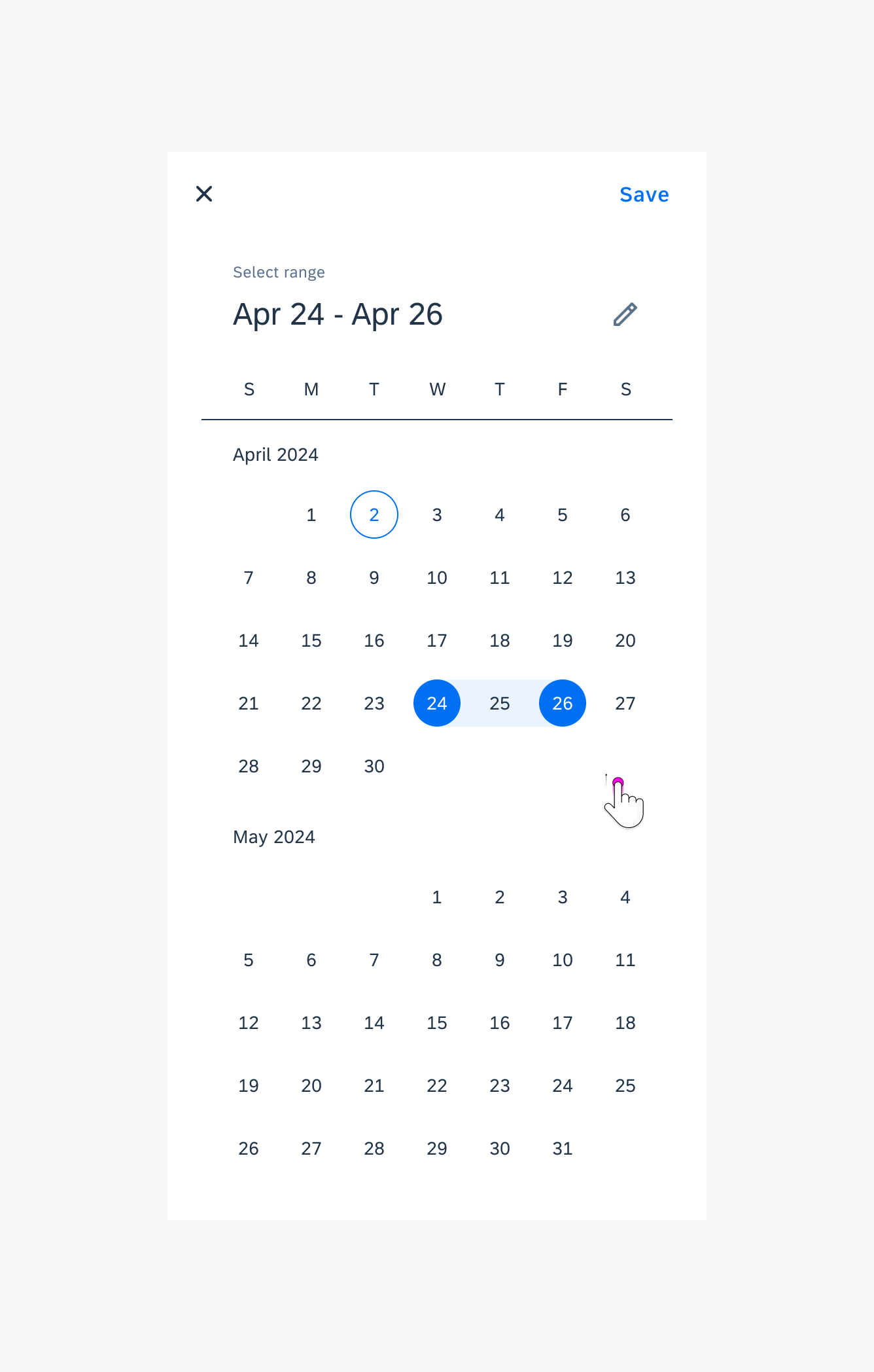
Navigating through months in the range picker
Time Picker
Selection
To select which value to update, users may tap on the hour or minute value containers. This changes the numbers displayed on the clock to hours or minutes.
To select an hour or minute value, the user may rotate the clock hand around the analog clock. This updates the selected hour or minute in the digital hour and time value containers. The default selected time is the current time.
The hour and minute values may be updated using the keyboard. The user may also navigate between them using the keyboard for accessibility.
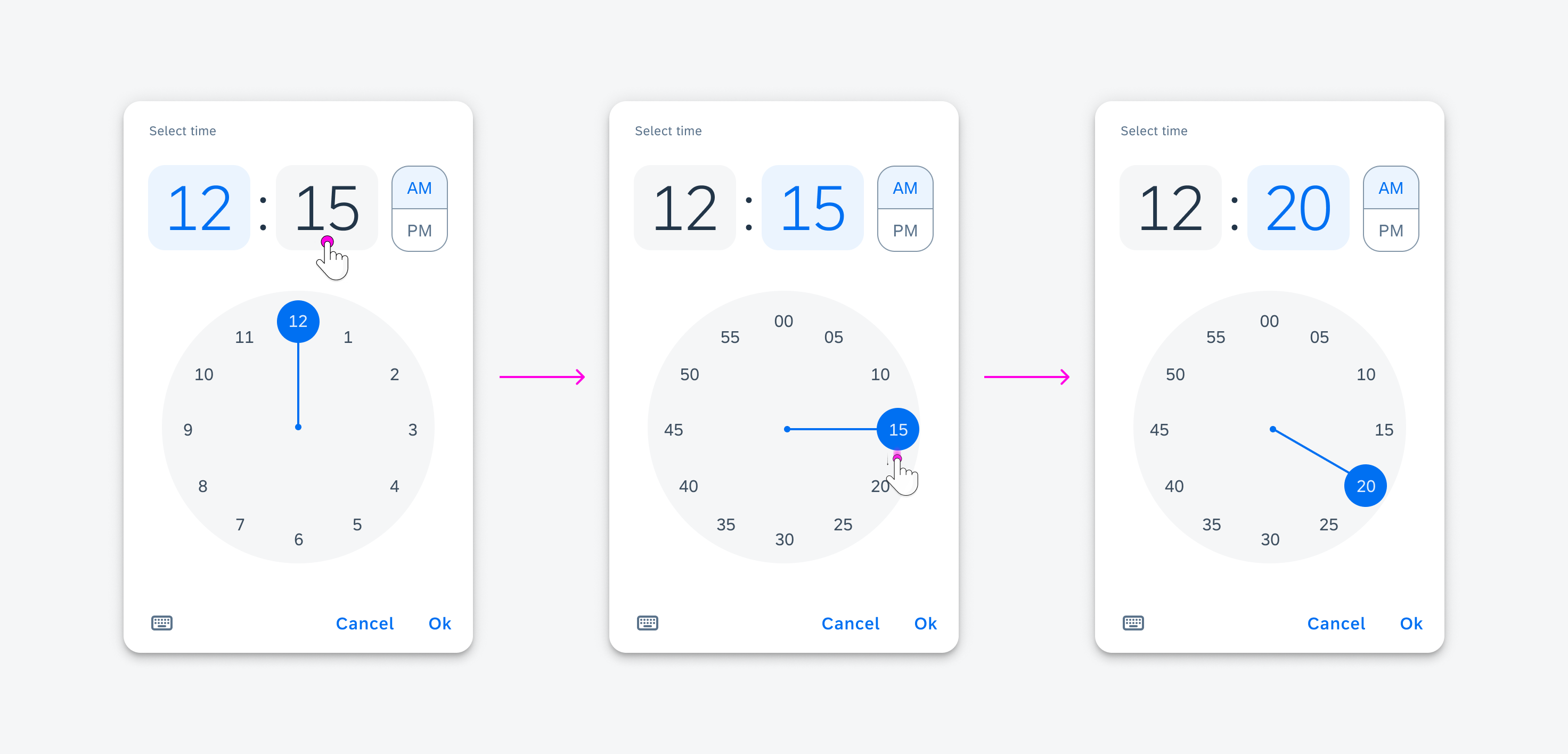
Selecting a time in the time picker
AM/PM
To select whether the time is AM or PM, the user may tap on AM or PM in the AM/PM selector.
The user may also navigate between them using the keyboard for accessibility.
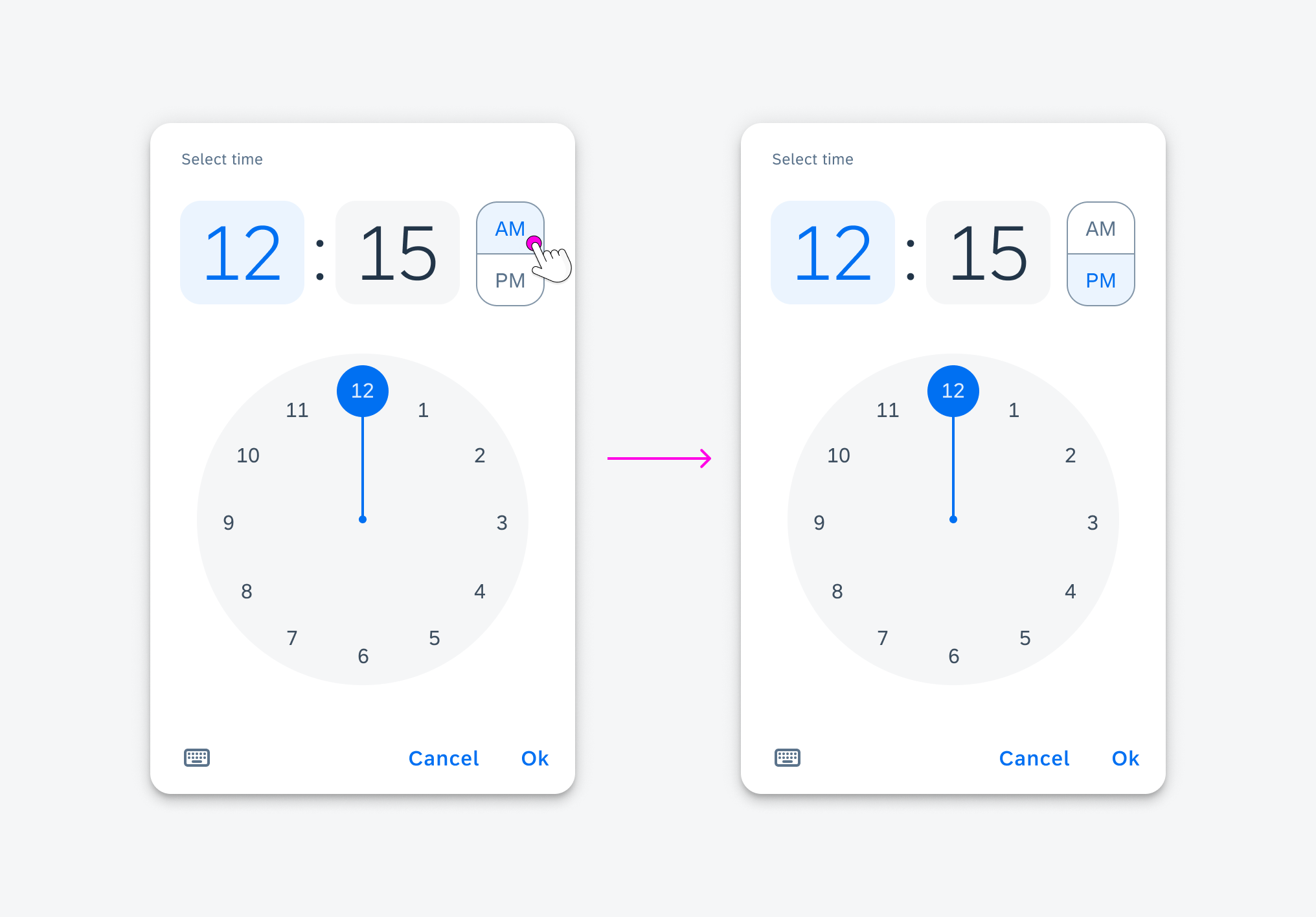
Switching from AM to PM in the time picker
Duration Picker
Selection
To select a time, users may scroll through a list of values. The value in the center is the selected value.
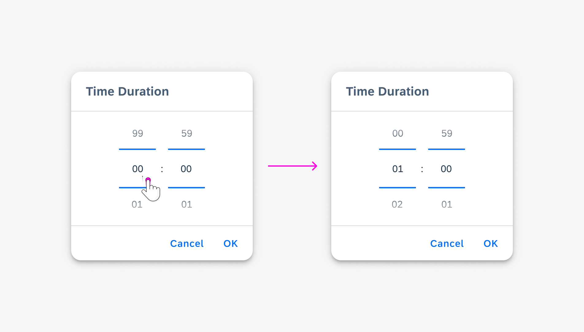
Selecting a duration in the duration picker
Variations
Input Mode
The date, range, and time pickers all include an input selection mode. This mode can be shown as the default dialog when the picker is triggered. They provide input dates for value selection for accessibility.
It is recommended to show the input selection mode for devices with small heights as the input-mode dialogs are smaller than the selection-mode dialogs.
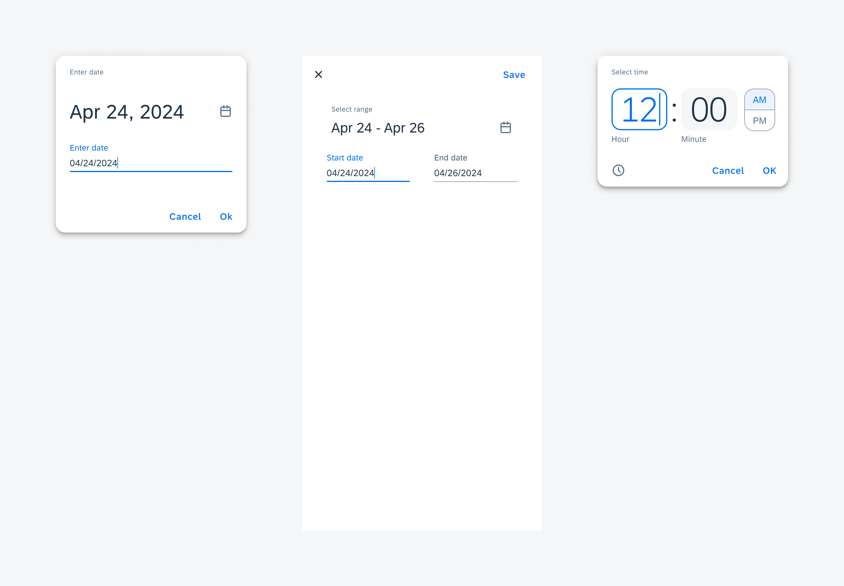
The input mode for the dialogs from left to right: date picker, range picker, time picker
Date Picker States
- Default – days of the month being displayed
- Today – the current system date
- Selected – The selected date
- Range start – the selected starting date when an end date is selected
- Range middle – dates between the selected starting and end dates
- Range end – the selected end date
- Disabled – dates that cannot be selected.
- Singular dates can be disabled the selected range may not include these dates in the middle.
- A minimum and/or maximum date can be defined. Dates before the minimum and/or after the maximum date will be in a disabled state.
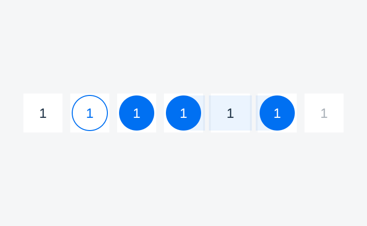
Range picker states from left to right: default, today, selected, range start, range middle, range end, disabled
Status Indicators
Date labels may also display additional information via a status indicator. The color and shape of the status indicator is customizable. The default is a circular dot in the blue call-to-action color.
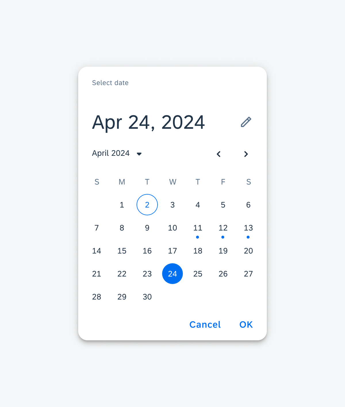
A date picker with the 11th, 12th, and 13th decorated with the default status indicator
Adaptive Design
The date, range, and time pickers adapt to different window sizes.
- For compact windows, the portrait mode of the pickers is shown.
- For medium and expanded windows, the landscape mode of the pickers is shown.
The input mode for the date, range, and time pickers may be shown as default or for medium and expanded window classes if desired.
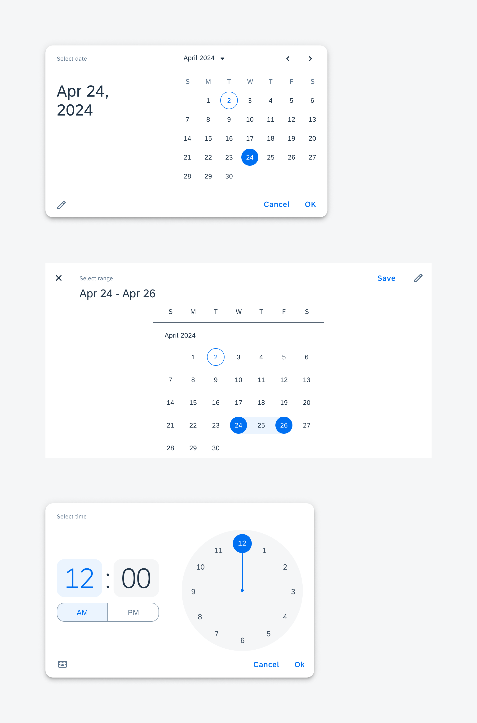
The landscape mode for the dialogs from left to right: date picker, range picker, time picker
Resources
Development: DateTimePickerFormCell, DurationPickerFormCell
SAP Fiori for iOS: Pickers
Material Design: Date Pickers, Time Pickers
Related Components/Patterns: Date & Time Picker Form Cell, Dialogs

 Your feedback has been sent to the SAP Fiori design team.