
Pickers
DatePicker, DateRangePicker, DatePickerDialog
Intro
The picker is used for time-based selections. Depending on your use case, you can use a date picker, time picker, or time duration picker. Pickers are always displayed in a dialog.
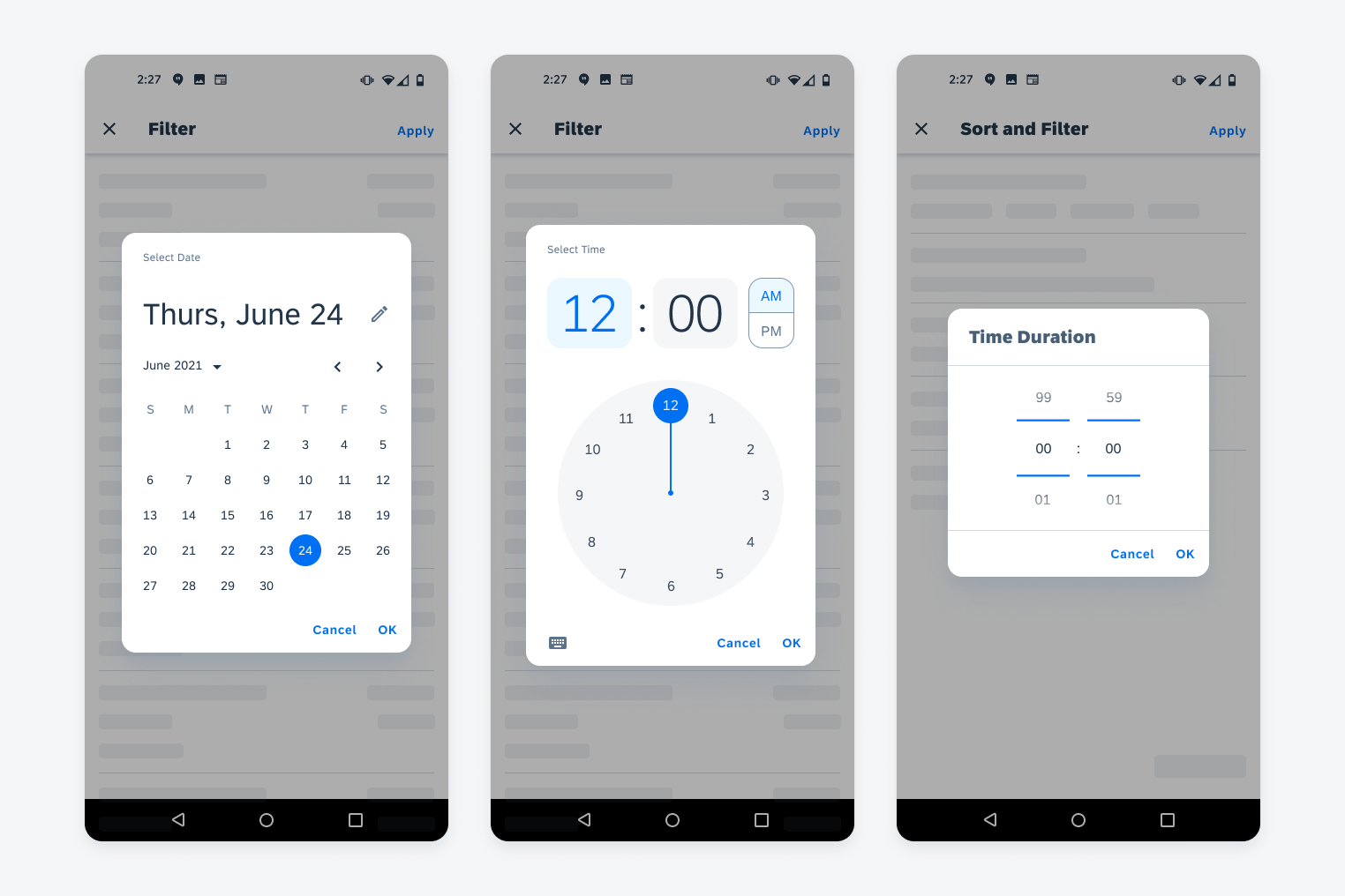
Date picker (left), time picker (middle) and time duration picker (right)
Usage
Use a picker for a time-related decision that the user needs to make.
- Don’t use a picker for picking a number that isn’t related to time.
- Don’t use the date picker for selecting a duration of time.
- Don’t use the time duration picker for selecting a date.
Anatomy
Date Picker
A. Header
Includes the title for the date picker and then the abbreviated name for the day of the week with the abbreviated name for month and the day.
B. Month Selector
The user can use the arrows to move a month up or down.
C. Day of the Week
The day of the week is represented by a single letter.
D. Calendar
The calendar shows all days of a month grouped by weekly rows.
E. Footer Bar
The footer bar houses the buttons for confirming or dismissing the dialog.
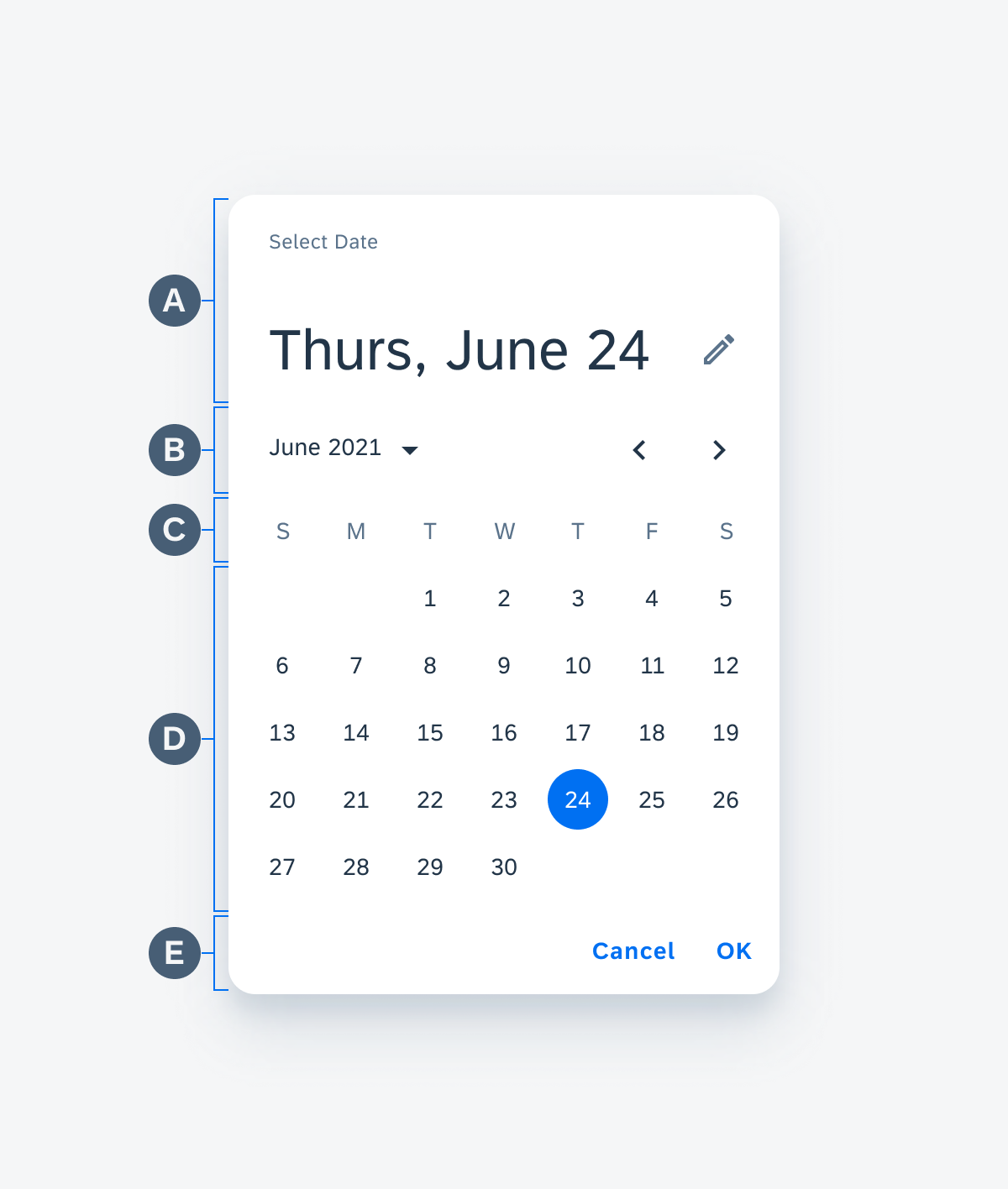
Anatomy of date picker
Time Picker
A. Header
Includes the text for the time for hour and minute with a selector for choosing AM or PM.
B. Clock
Imitates the look of an analog clock in order to display the time for the user to select.
C. Clock Hand
The clock hand shows what the user selects for the hour and the minute by rotating to the number the user chooses.
D. Footer Bar
The footer bar houses the buttons for confirming or dismissing the dialog and the input button allows the user to switch to the input time picker.
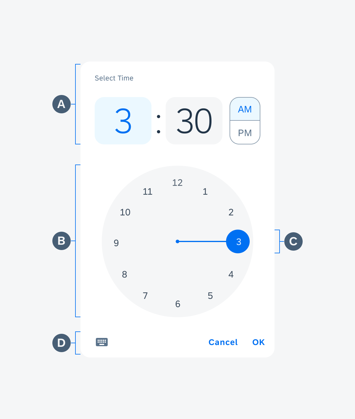
Anatomy of time picker
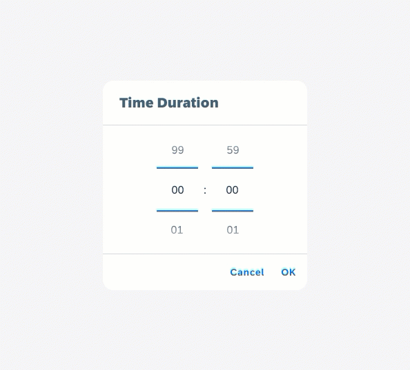
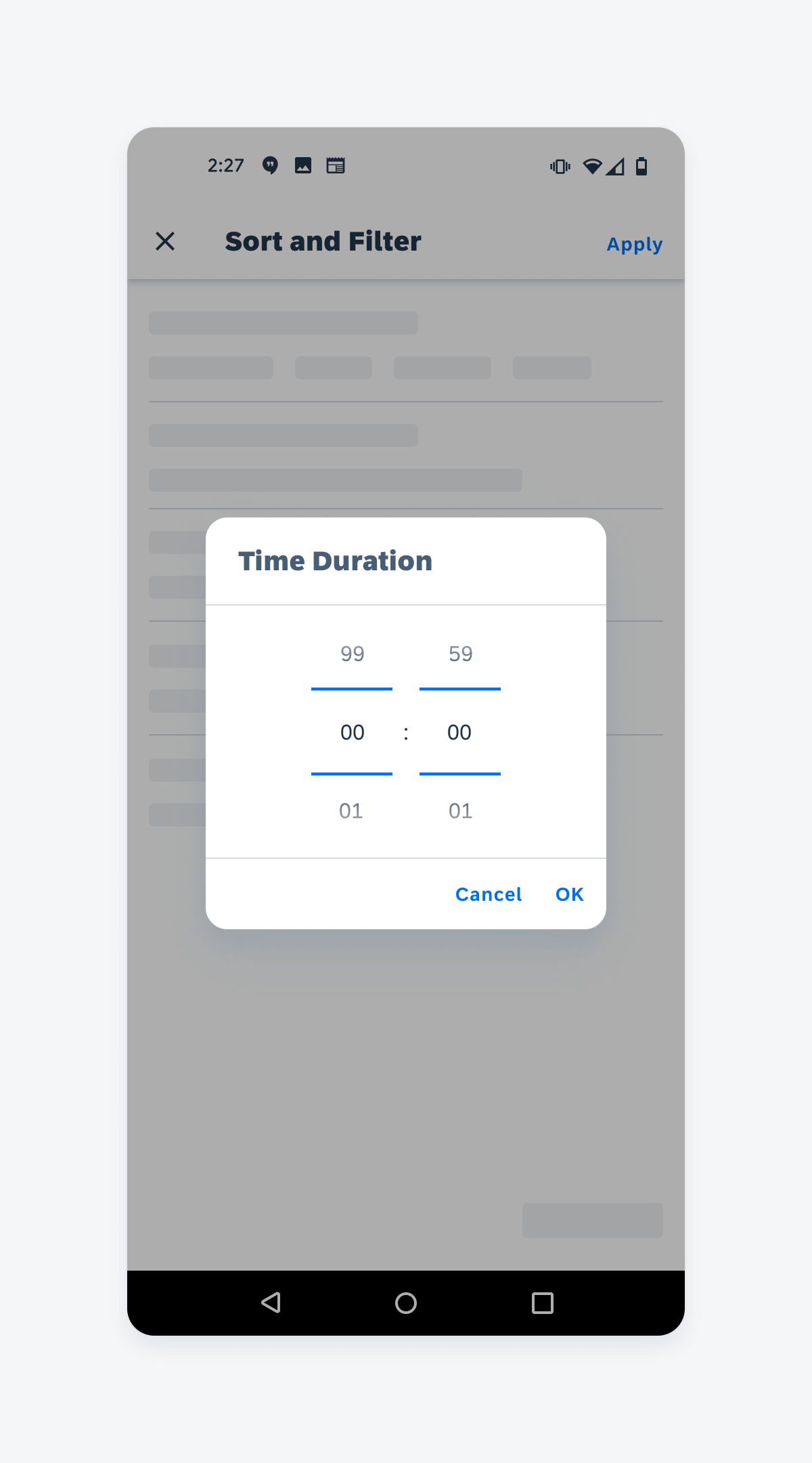
Time Duration Picker
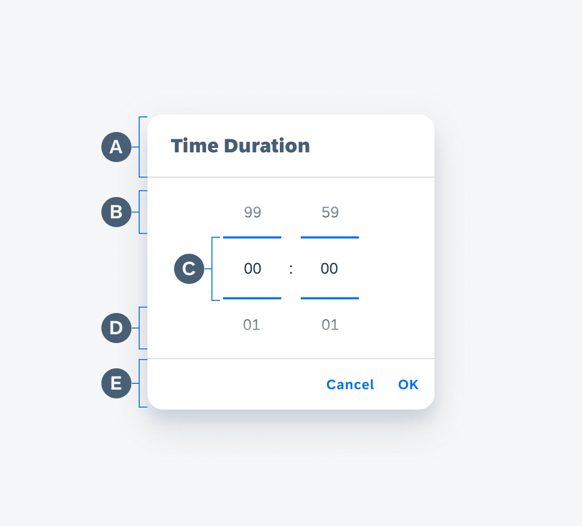
A. Title
Describes what this time duration picker is for or instructs the user on what to do.
B. Previous Value Preview
The value dial shows a preview of the previous value at the top. There is a slight white gradient on top of the numbers for less emphasis.
C. Selected Value
The value in the center, marked with a blue border on the top and bottom, is the selected value.
D. Next Value Preview
The value dial shows a preview of the next value at the bottom. There is a slight white gradient on top of the numbers for less emphasis.
E. Footer Bar
The footer bar houses the buttons for confirming or dismissing the dialog.
Anatomy of time duration picker
Behavior and Interaction
For more information about the behavior of pickers, see Dialogs.
To learn more about the form cell to trigger the dialog, see Time Picker Form Cell.
Time Duration Picker
The time duration picker is a spinning dial where the users rotate through the numbers to select the value they want at the center. It is formatted to show hours and minutes.
Interaction of time duration picker
Variations
Date & Time Picker
The date picker allows the user to select a specific date with the calendar and the Time Picker allows the user to select a specific time through the clock.
In some cases the picker may allow the selection of both date and time. If that is the case, the picker has two parts to the dialog, where the first dialog displays the interface for picking a month, day, and year, and the second dialog is for selecting the specific time based on an analog clock interface.
Date picker in portrait orientation (left) and time picker in landscape orientation (right)
Time Duration Picker
The time duration picker lets the user scroll through a list of values. The value in the center of the picker is the selected value to be used.
Time duration picker on mobile
Resources
Development: DatePicker, DateRangePicker, DatePickerDialog, MaterialDatePicker
SAP Fiori for iOS: Pickers
Material Design: Date Pickers, Time Pickers
 Your feedback has been sent to the SAP Fiori design team.