
Filter Feedback Bar
Fiori: FilterFeedbackBar
Intro
The filter feedback bar is a horizontal scroll area containing interactive chips that provide users quick access to filter controls. The bar appears below the app bar and above the list of objects. The interactive chips in the filter feedback bar indicate which filters have been applied and what filters are available.
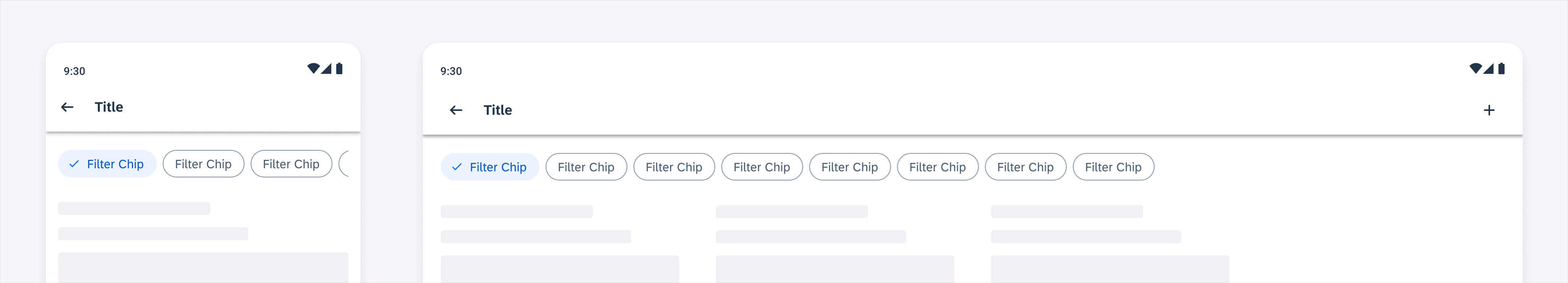
Filter feedback bar on a compact (left) and expanded screen (right)
Usage
- Use the filter feedback bar to provide direct access to frequently used filters.
- Use the filter feedback bar when filter options are relatively simple and straightforward.
- Use the filter feedback bar when users want to modify applied filters often.
- Don’t use the filter feedback bar if users require a large number of filters.
- Don’t use the filter feedback bar if filter options are difficult to represent by chips, for example, when filter options have very complex names and structures.
Anatomy
The filter feedback bar sits between the app bar and content area.
Filter Feedback Bar
A. Active Filters
Active filters indicate the sort (if it is a non-default sort) and filters currently applied to the list. They are represented by chips in the selected state. The active filters are always on the left side of inactive filters, with sort (if applicable) at the very left.
B. Inactive Filters (For Fast Filters)
Inactive filters are available filter options that are not currently applied to the list. Only fast filters will be shown as inactive filters. They are represented by chips in the non-selected state.
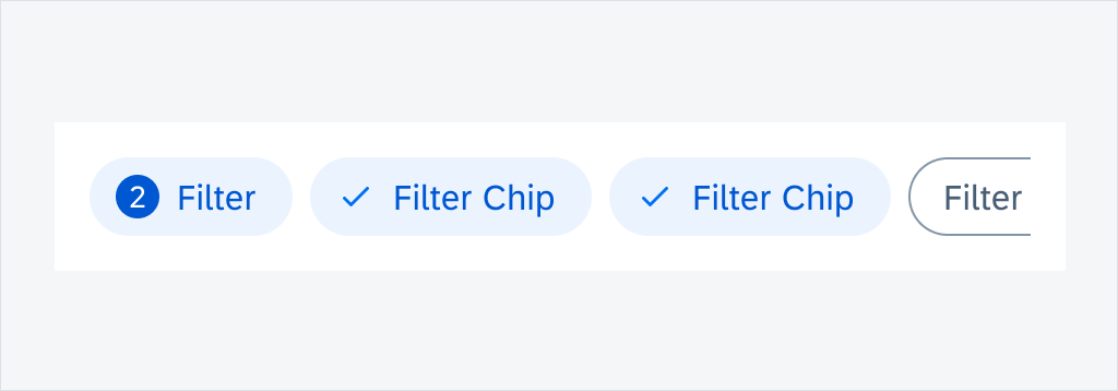
C. Filter Counter Chip (Optional)
The filter counter chip is an optional chip that can be added after the user activates the filter chip. It should be placed in front of the first filter chip to display the total number of active items in the filter. Once the filter is applied, the total number of items in the list is returned.
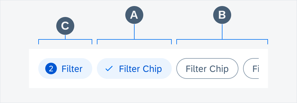
Filter feedback bar anatomy
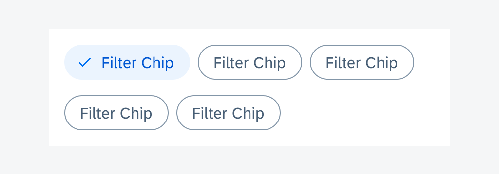
Filter Chip
A. Container
A filter chip container defines the boundary of each chip. All chip elements are wrapped in a filter chip container. The width of the container depends on the length of its content. Each container is a touch target.
B. Leading Icon (Optional)
A check mark appears when a filter chip is selected and disappears when it’s deselected.
C. Text
A text describes what each filter chip stands for. Text labels should be concise.
D. Trailing Icon (Optional)
A filter chip with a down arrow trailing icon indicates that an extended action is available. On mobile devices, the extended action is represented by a bottom sheet, while on tablet devices, it is represented by a dialog.

Filter chip anatomy
Behavior and Interaction
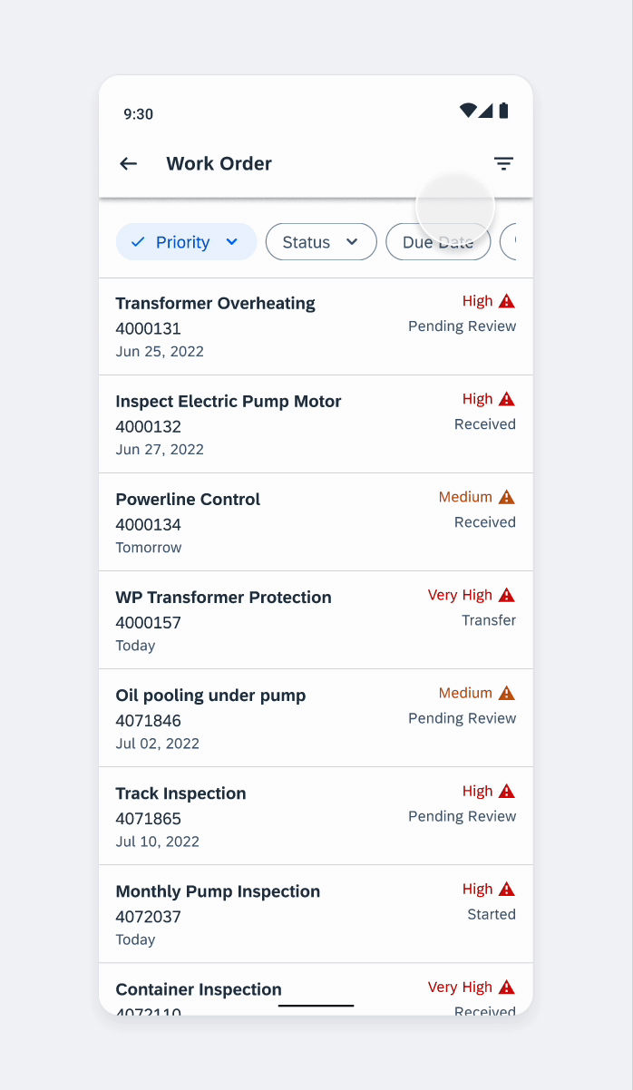
Horizontal Scroll
All filter options in the filter feedback bar are displayed in one row. Users can scroll horizontally to view all filters.
Horizontal scroll
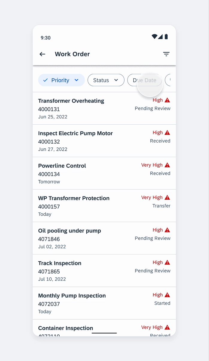
Applying Fast Filters
Users can apply a fast filter simply by tapping the chip. This will change the chip to the selected state and become an active filter. The active filter will move to the left of any inactive filters. Each time a fast filter is applied, the list below will be refreshed to show the filtered result.
Applying fast filters
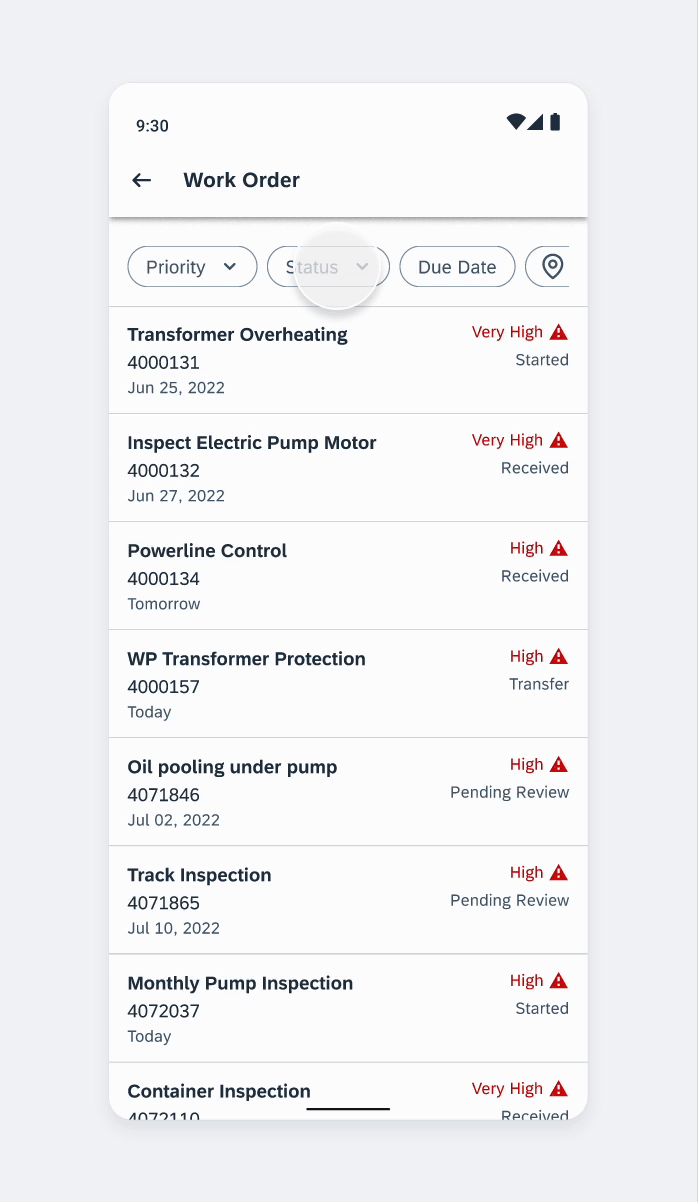
Removing Fast Filters
Users can remove a fast filter simply by tapping the chip. This will change the chip to non-selected state and back to an inactive filter. The inactive filter will move back to its original position as the fast filter. Users can only remove one fast filter at a time, and the list below will be refreshed to show the updated result.
Removing fast filters
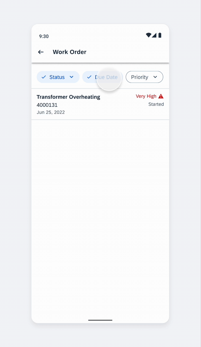
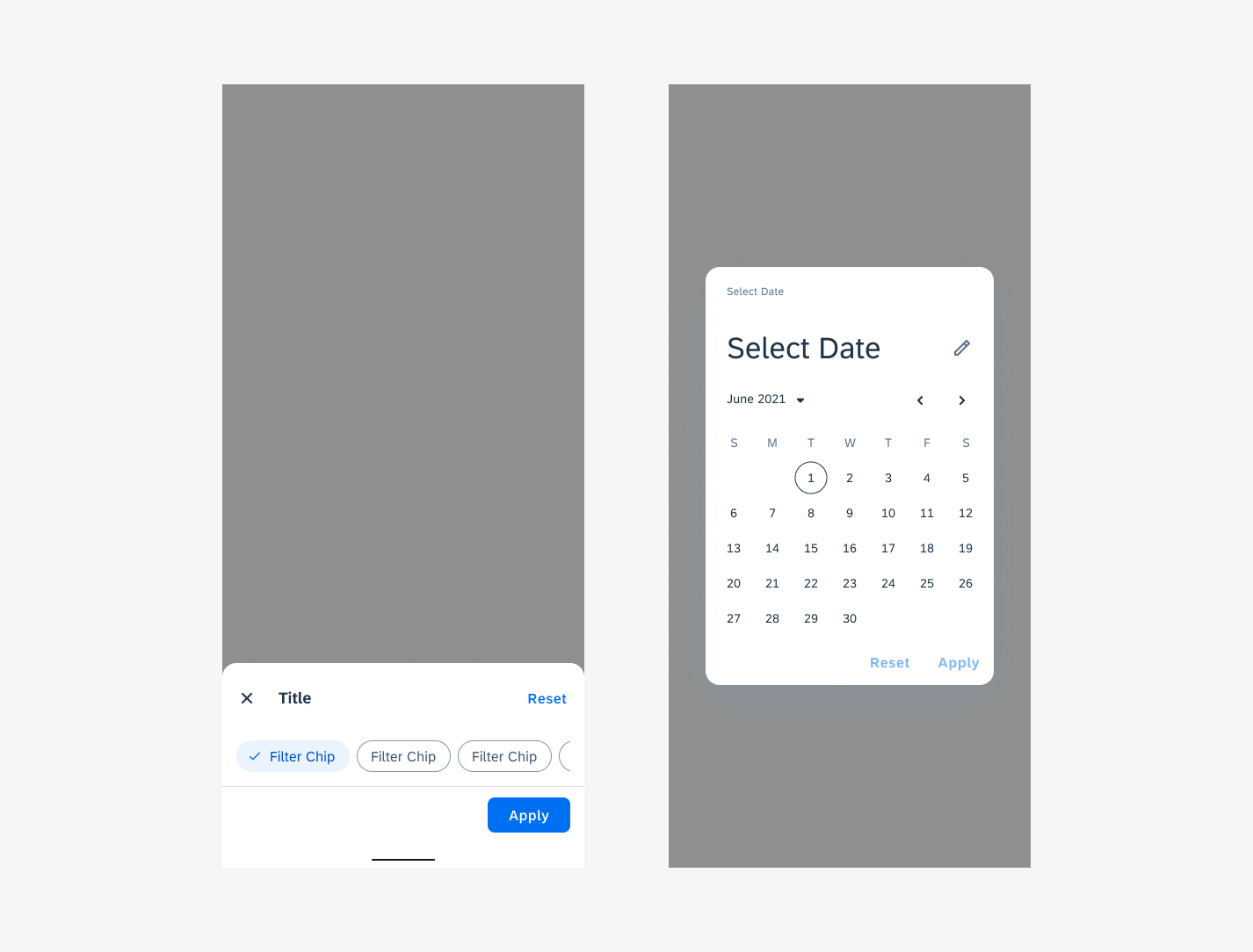
Applying Filters from the Filter Dialog
In the filter dialog, users can apply multiple filters at a time. All applied filters will be displayed in the feedback bar as active filters. An active chip from the filter dialog (no fast filter) will be added at the same position as it is in filter form.
In general, the active filters take the selected filter’s name or value directly. If the value or name is not clear enough, we recommend using both the label and value in the active filter. For example, a location value could represent arrival or departure, adding “Arr:” or “To:” and “Dep:” or “From:” to the location value would help users identify what the location stands for. By default, we recommend adding “Sort By:” to the sort value in the filter feedback bar for clarity.
Applying filters from the Filter dialog
Removing Filters from the Filter Dialog
Users can remove an applied filter from the filter dialog directly by tapping the chip in the filter feedback bar. If that option is not defined as a fast filter, it will disappear from the filter feedback bar. The user can also remove a filter by deselecting it in the filter dialog as the standard behavior of the filter dialog.
Removing applied filters from the Filter dialog
Variations
Wrapped View
A group of filter chips is typically displayed horizontally under the title. The title describes the meaning or purpose of the group. More than one row of chips can be wrapped to the next row, or overflow to the right with horizontal scroll to show more. Choose the layout that provides the best readability for your use case.
Filter feedback bar wrapped view
Filter Counter Chip
A filter counter chip is an optional chip that can be added after the user activates the filter chip. It should be placed in front of the first filter chip to display the total number of active items in the filter. Once the filter is applied, the total number of items in the list is returned.
Tapping on the filter counter chip navigates the user to the Sort and Filter page.
Active filter counter chip
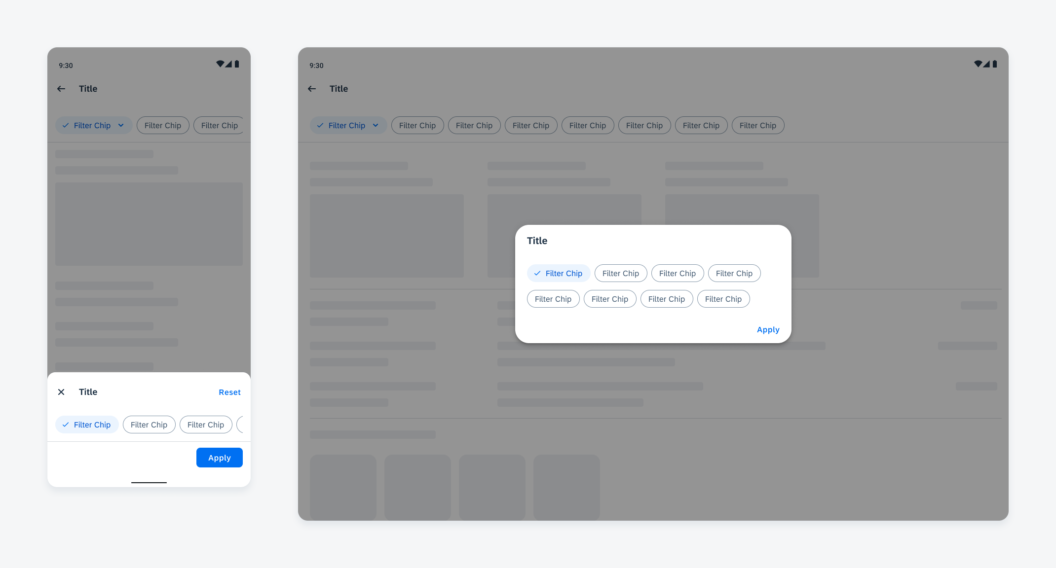
Selection View
A filter chip with a down arrow trailing icon indicates that an extended action is available. On compact screens, the selection view is represented by a bottom sheet or dialog, while on medium and expanded screens, it is represented by a dialog.
Selection view with bottom sheet (left) and dialog view (right)
Fast Filters
Fast filters are pre-defined filter options that remain visible in the filter feedback bar even when they are not applied. With fast filters, users can apply filters to the list directly in the page instead of opening the filter dialog. The fast filter options are defined by the app team. To make fast filters most effective, we recommend only including the most frequently used filters as fast filters.
Filter Feedback Bar with Fast Filters
With fast filters, the filter feedback bar is visible by default with all fast filters as inactive filters. Users can apply fast filters directly or through the filter dialog. All applied filters will be shown in the filter feedback bar as active filters.
Filter Feedback Bar without Fast Filters
When no fast filters are defined, the filter feedback bar is hidden by default. The default sort does not show up in the filter feedback bar. After the user has applied a filter or changed the sort option through the filter dialog, the filter feedback bar will appear to show the active filters.
Adaptive Design
The selection view adapts to different screen sizes. On compact screens, the selection view appears as a bottom sheet or dialog. On medium and expanded screens, the selection view appears as a dialog. The other features remain the same on both device types.
Filter feedback bar selection view on a compact screen (left) and medium and expanded screen (right)
Resources
Development: FilterFeedbackBar
SAP Fiori for iOS: Filter Feedback Bar
 Your feedback has been sent to the SAP Fiori design team.