
Filter Feedback Bar
FUIFilterFeedbackControl
Intro
The filter feedback bar is a horizontal bar that appears above a list of content. It uses interactive buttons to communicate which filters have been applied to the list and allows users to quickly apply frequently used filters. It is typically used in list report or work list floorplans.
Use a filter feedback bar when there are frequently used filter options.
Don’t use a filter feedback bar when there are many filters that need to be applied to the list or if the filters have complex names. Use the count as feedback in the filter button instead.
The filter feedback bar sits below the navigation bar and, if available, beneath the search bar, positioned directly above the content area.
Filter Buttons
There are two types of filter buttons in the filter feedback bar.
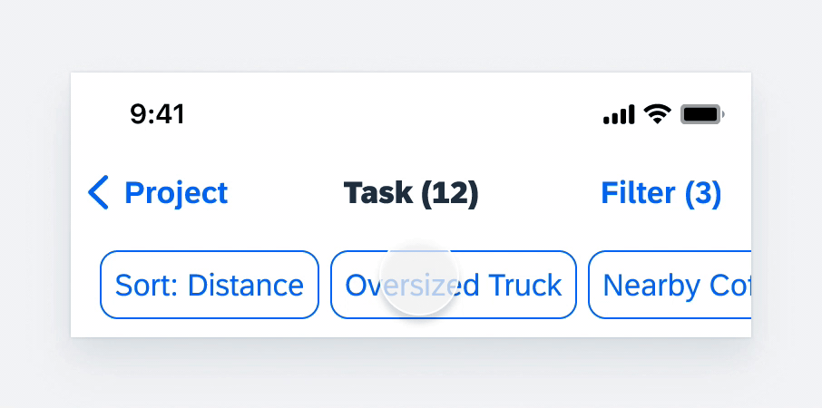
A. Active Filter Buttons
Active filter buttons are those that have been selected. They indicate a sort button (if it is a non-default sort) and the filters currently applied to the list. They are always placed to the left of any visible inactive filter buttons.
B. Inactive Filter Buttons
Inactive filter buttons will only appear in the filter bar for fast filters that are not currently selected by the user. More information on fast filters can be found in the Types section below.
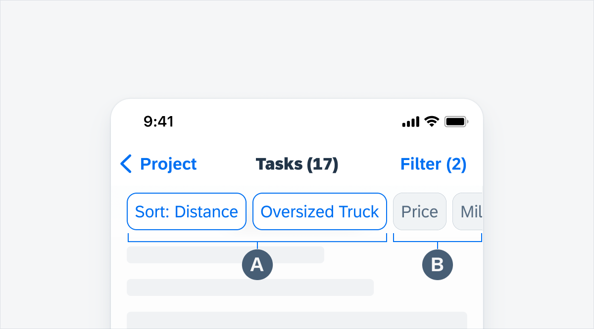
Active and inactive filter buttons
Filter Sheet
A Filter sheet is used when there is a complex filter action associated with a filter button in the filter feedback bar.
A. Navigation Bar
Contains sheet-level control actions such as “Cancel” and “Reset”.
B. Component Area
This area is interchangeable with some components from the Input & Selection section (filter form cell, slider, calendar, etc.) for a more seamless option to set fast filters in a modal sheet.
C. Toolbar Container
The toolbar container in the modal sheet contains one button. The toolbar is always visible, even when users scroll down.
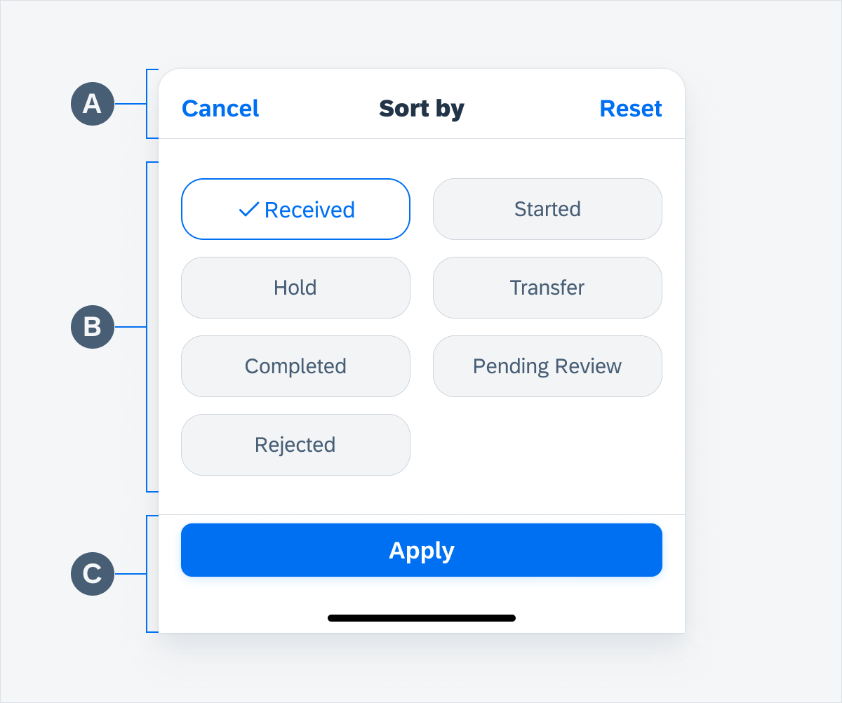
Filter sheet
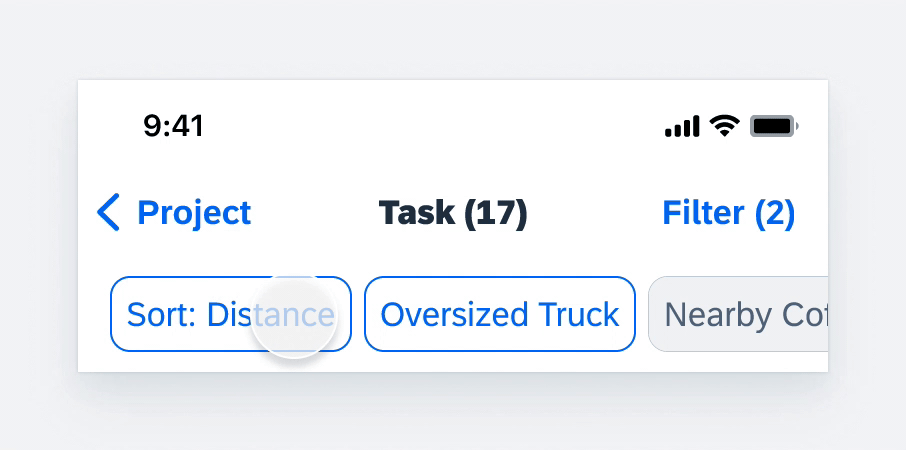
Applying Fast Filters
When the user taps a fast filter button, it is applied to the content list and its button takes on active status.
Applying fast filters in filter feedback bar
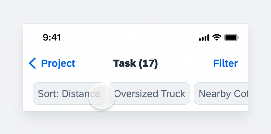
Removing Filters
To remove a filter, users can tap on its active filter button in the filter feedback bar or deselect it within the filter modal window. If a filter sheet is being used, users can tap on “Reset” and then “Apply” to remove the filter.
Filters buttons remain in the filter feedback bar even when inactive, whereas filters from the modal window that are not originally in the filter feedback bar, will disappear from the filter feedback bar when deactivated.
Removing filters in filter feedback bar
Applying Filters from the Filter Sheet
When the user selects a filter button with a downward chevron icon from the filter feedback bar, it means that there is a more complex filter action associated with it. A filter modal sheet will appear on the bottom of the screen for users to interact with and apply filters accordingly.
Applying filters from the filter sheet
Applying Filters from the Filter Modal
When the user selects a filter from the filter modal window, it is applied to the content list and an active filter button appears on the left side of the filter feedback bar (to the right of the sort button, if available).
Applying filters from the filter modal
Filter Buttons
There are various types of filter buttons: a default filter button, a default filter button with a chevron, a descriptive icon filter button, and a descriptive icon filter button with a chevron.
If you are using a descriptive icon filter button, you must ensure that all the buttons in the feedback bar have a corresponding descriptive icon. You may not use a default filter button together with a descriptive icon filter button. Any filter button with a chevron may be used with the default filter button or the descriptive icon filter button.
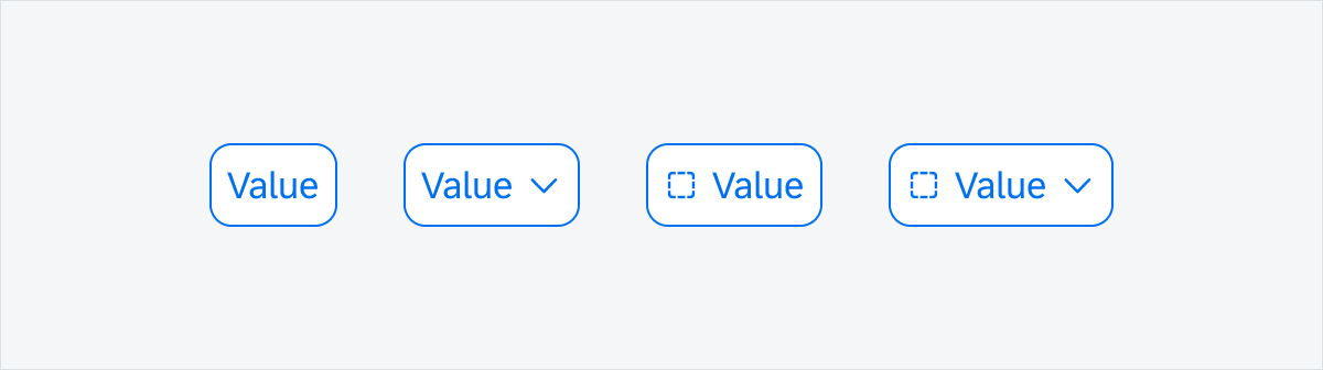
Default button, default button with chevron, descriptive icon button, descriptive icon button with chevron
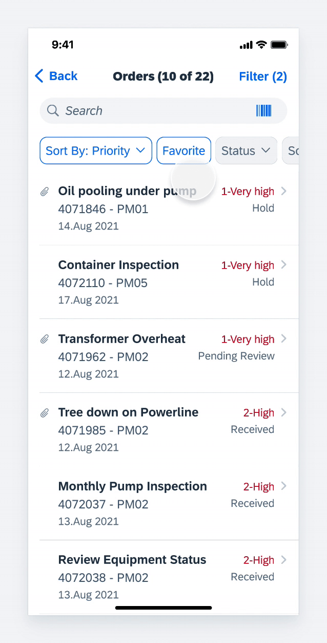
Filter Feedback Bar with Filter Button
Filters buttons in the filter feedback bar are buttons that remain visible even when they are not currently applied to the content list below. They provide users with quick access to the most frequently used filter options. It is up to you to define which filters should be included in the filter feedback bar – users cannot customize them within the app.
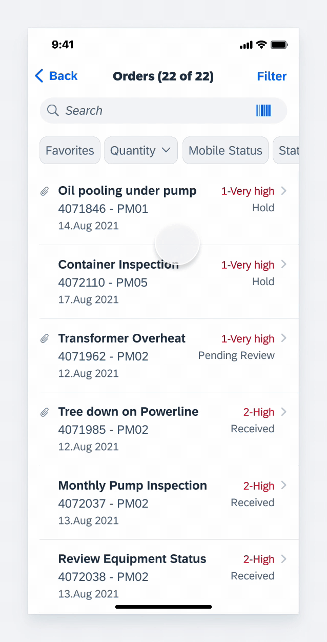
Filter Feedback Bar without Filters Buttons
When there are no filter buttons predefined for the app, the filter feedback bar is hidden by default. It only appears after the user has either applied a filter or changed the sort option within the filter modal. Only new sorts are available in the filter feedback bar. Please note that default sort does not appear in the filter feedback bar.
Development: FUIFilterFeedbackControl
SAP Fiori for Android: Filter Feedback Bar
Related Components/Patterns: Sort and Filter
 Your feedback has been sent to the SAP Fiori design team.