
AR Markers
Fiori: ArSceneRepository, navigation_ar_stickers_edit_mode
Intro
AR markers represent an annotated object in the world view. When a user selects an AR marker, the AR card appears at the bottom to display relevant information about the marker.
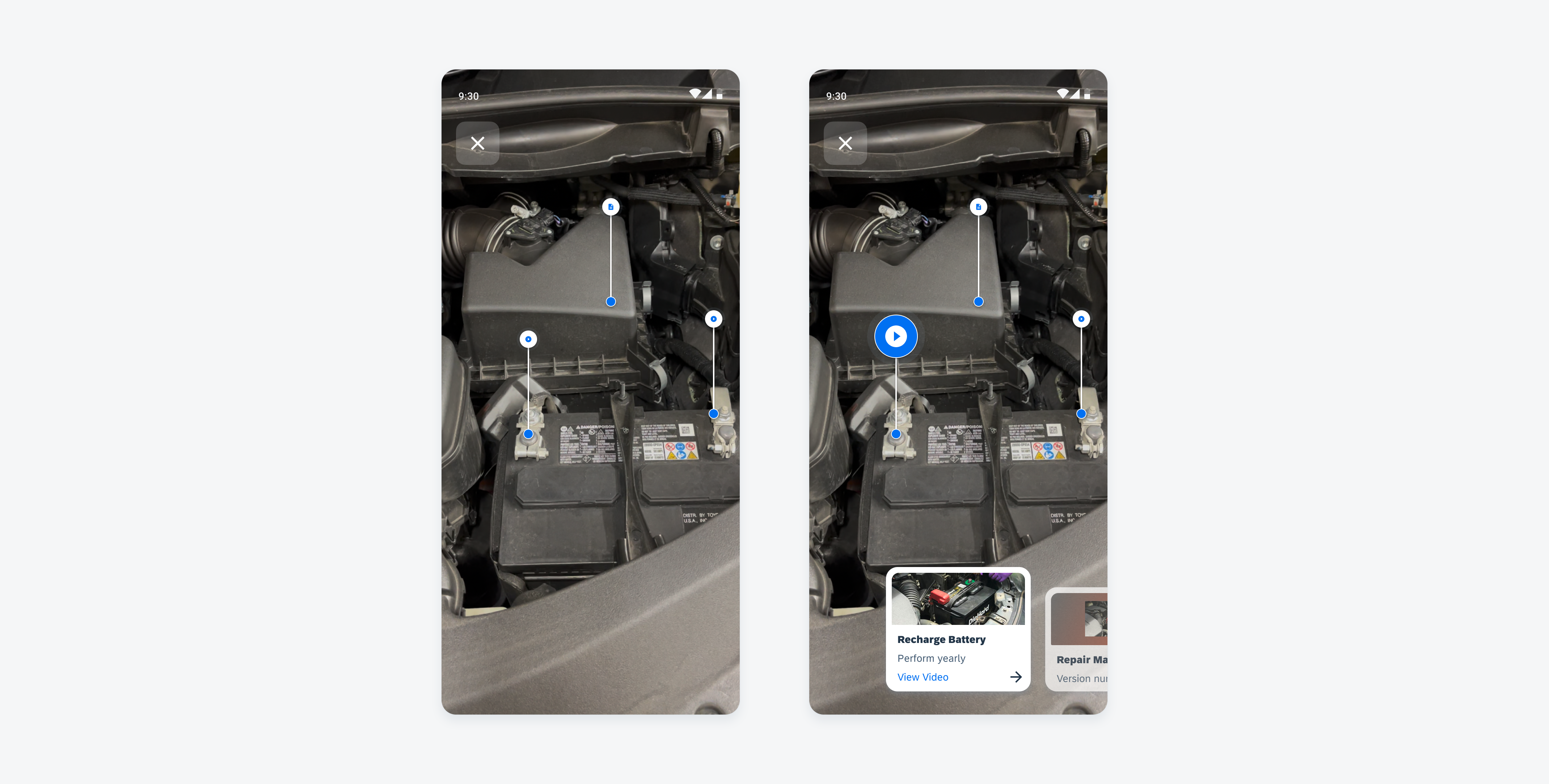
Unselected AR markers (left) and a selected AR marker with AR card (right)
Anatomy
Marker
A. Outer Circle
B. Inner Circle
C. Icon
Depending on the type of content, the marker will display an icon.
Connector
D. Connector
The connector joins the marker to the object indicator, with the line length being flexible. If there are many annotated objects near one another, adjust the lines so the markers do not overlap.
Object Indicator
E. Object Indicator
The object indicator is displayed at the annotated object. Tying the object indicator to the marker ensures that the annotation is pointing at the exact annotated area.
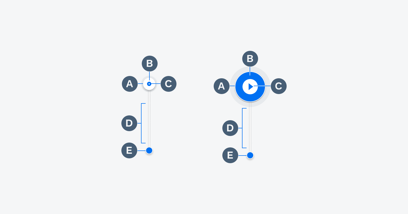
Default AR marker (left) and selected AR marker (right)
Behavior and Interaction
AR markers have a selected and an unselected state. The line guidance appears when the user interacts with the marker or AR cards in the screen view.
A. Default State
After a user scans a facility on an object, all relevant AR markers will appear in the default state on the world view’s screen.
B. Pulse State
A pulse animation temporarily appears when a user interacts with the AR card or AR markers.
C. Selected State
The AR marker changes size and color when selected by a user.
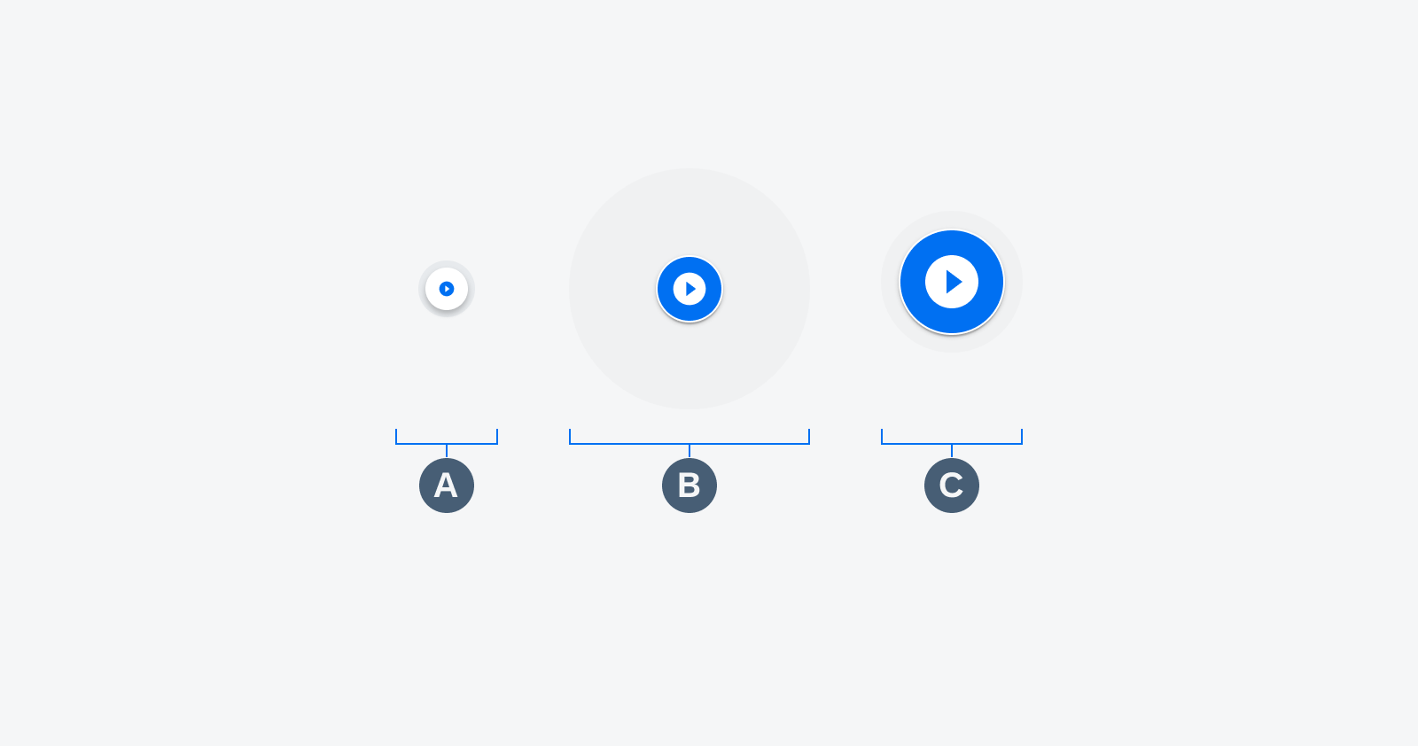
Default state (left), pulse state (middle) and selected state (right)
Tap on Marker
When the user taps on a marker, the pulse will animate, and the line guidance appears promptly. The default marker will change to the selected state.
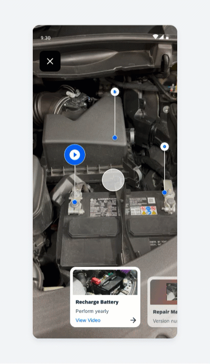
Tapping a marker changes its state to selected state
Variations
Depending on the object in the world view, the marker will display an icon relevant to the object. The user can input various kinds of content such as a document, information, video or link to an application, webpage, or barcode.
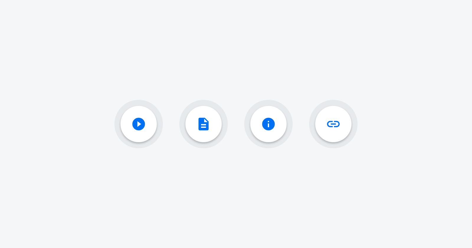
Examples of different AR marker icons
Resources
Development: ArSceneRepository, navigation_ar_stickers_edit_mode
SAP Fiori for iOS: AR Markers
 Your feedback has been sent to the SAP Fiori design team.