
Navigation Rail
FioriNavigationRail
Intro
The navigation rail provides a top-level navigation to three to seven core destinations in an app.
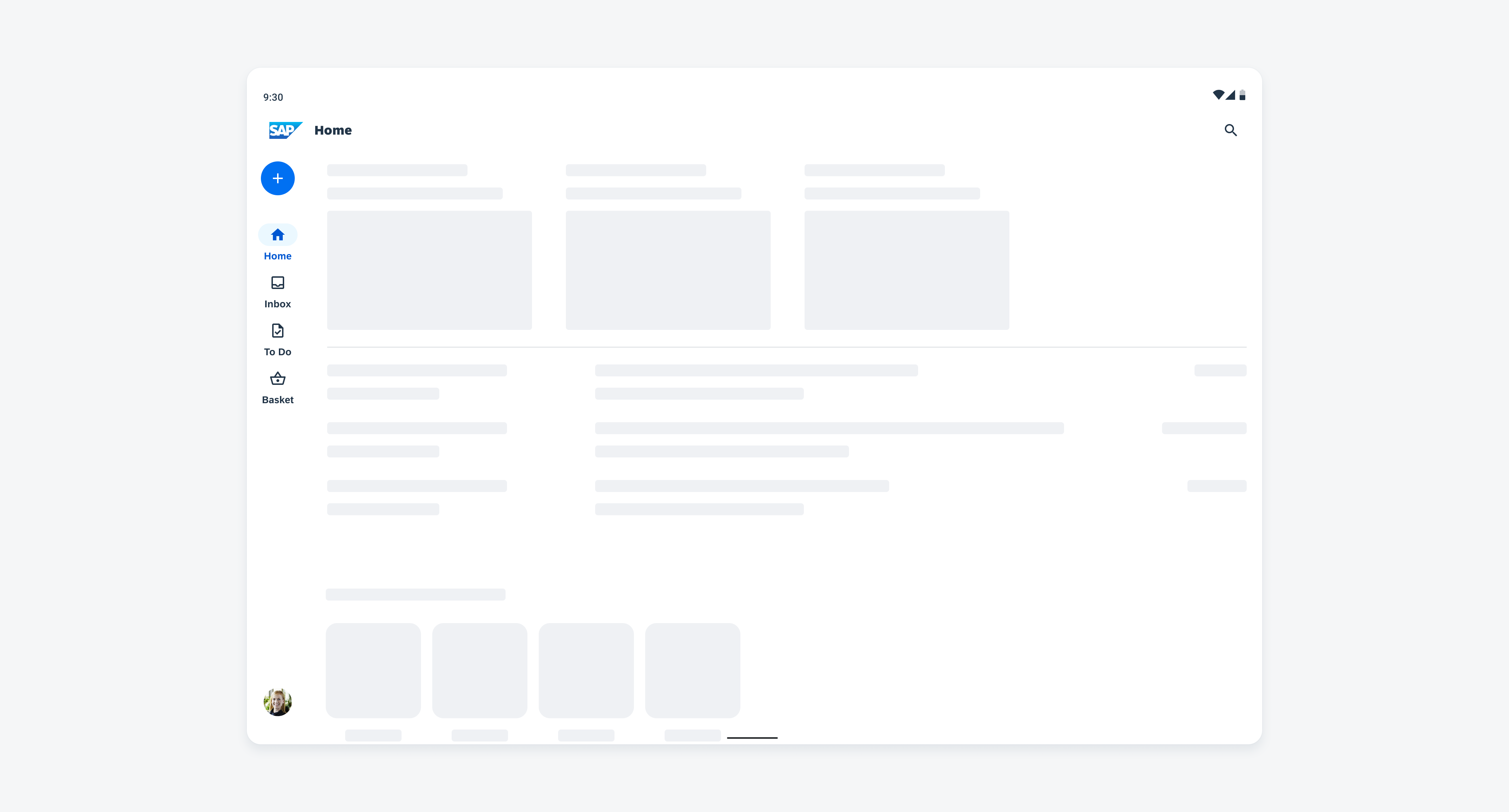
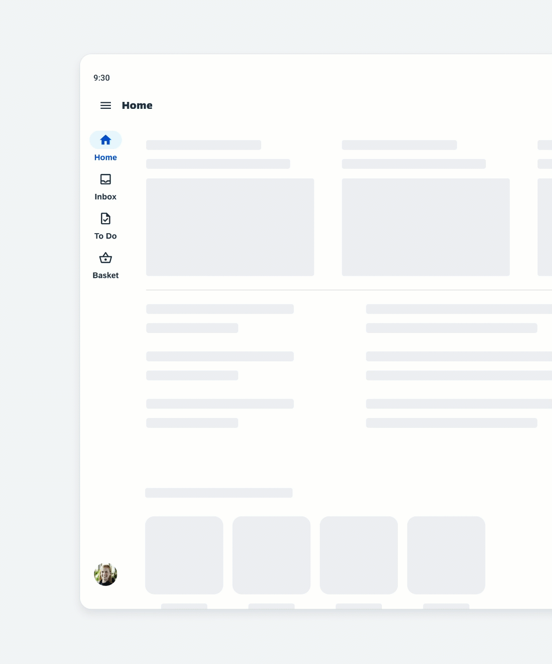
Navigation rail with floating action button, profile, and four destinations
Usage
A rail can be used as the sole navigation component on larger screens, such as tablet or desktop devices.
- Use the navigation rail for three to seven main destinations.
- Use the navigation rail on tablet and desktop interfaces.
- Represent each destination with an icon and label or icon only.
- Keep the label of destinations short and concise.
- Don’t use the navigation rail if there are fewer than three destinations, instead use tabs.
- Don’t use the navigation rail if there are more than seven destinations, use the navigation drawer instead.
- Don’t use the navigation rail on mobile devices, use the navigation bar or the modal navigation drawer instead.
- Don’t truncate or shrink text
- Avoid text wrapping.
Anatomy
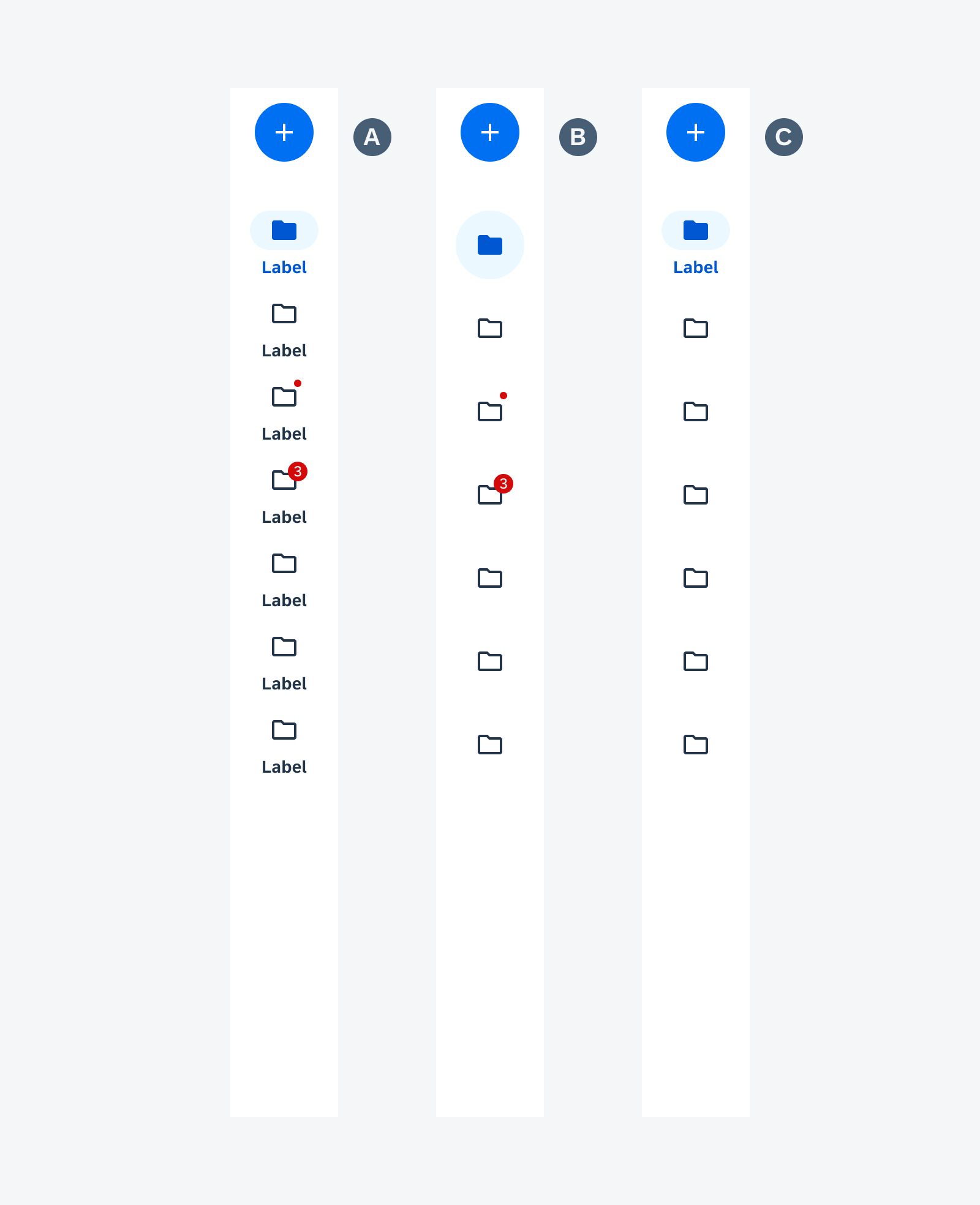
A. Container
The container includes all destinations including icons, labels, active indicator, and optional elements, such as a floating action button (FAB) and profile.
B. Icon
Meaningful icons visualize the app destinations. Use filled icons for the selected destination and unfilled icons for unselected destinations.
C. Label Text (Optional)
The label text provides a short and concise description of the destination.
D. Active Indicator
The active indicator highlights the selected destination.
E. Small Badge (Optional)
The small badge can be used to display a change, for example, a new notification.
F. Large Badge with Value (Optional)
The large badge with value can be used to show a number for status changes.
G. Floating Action Button (Optional)
The floating action button (FAB) can be placed above the navigation destination for the app’s key action.
H. Profile/Avatar/Initials (Optional)
We recommend using an image so that the user can quickly identify the person the profile belongs to. Images of people should always be in a circle. The profile can be top or bottom aligned. If you have a FAB and profile in the navigation rail, you can only use the bottom aligned profile.
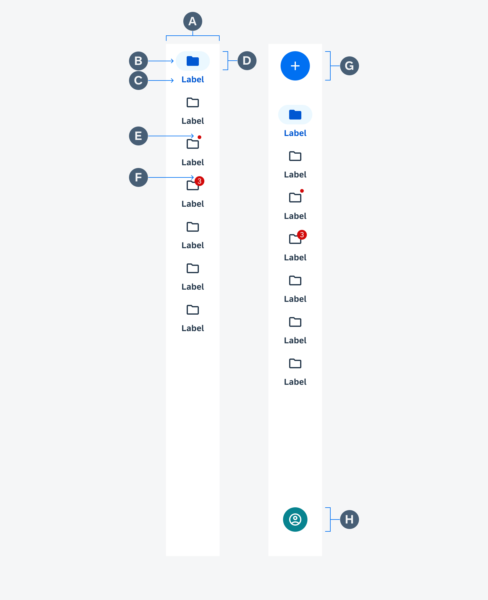
Navigation rail anatomy
Behavior and Interaction
When the user taps on a destination or one is focused in the navigation rail, the user is directed to the navigation destination associated with that icon and label. Selected destinations are visually highlighted by the active indicator and the filled icon.
The navigation rail is placed on the edge of the screen. On the left side for left-to-right languages and on the right side for right-to-left languages.
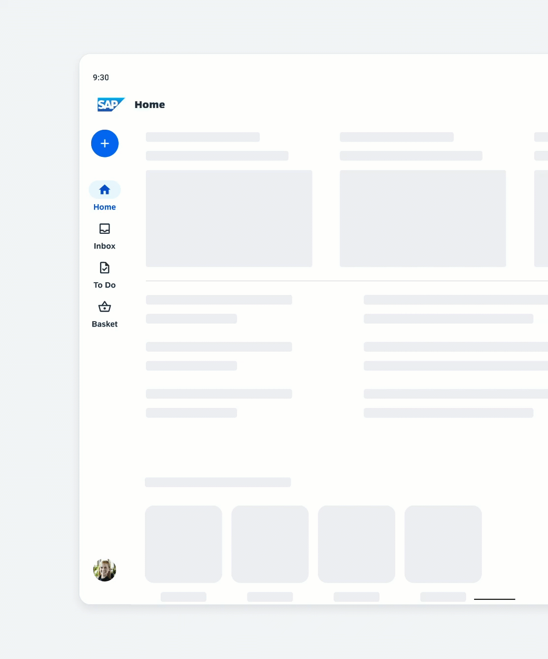
Selecting another destination in the navigation rail
Scrolling
While scrolling vertically and horizontally, the navigation rail remains fixed. If the content scrolls horizontally, the navigation rail increases elevation and lets the content scroll behind it.
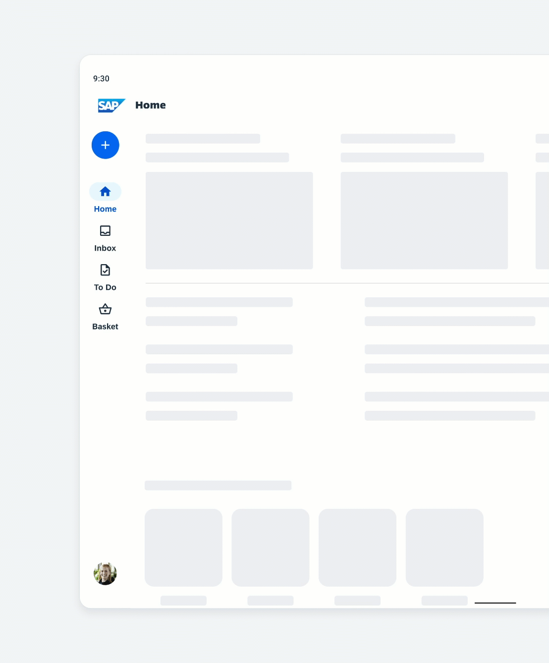
Behavior of navigation rail when scrolling vertically
Adaptive Design
Use a navigation rail uses 100% of the screen height. The destinations are aligned as a group on top of the rail. On small screens, replace the navigation rail with a more appropriate component, such as a navigation bar or modal navigation drawer.
A modal navigation drawer can be combined with the navigation rail when there are secondary destinations or actions that don’t belong in the navigation rail. The modal navigation drawer can repeat the navigation destinations from the navigation rail and can include additional navigation destinations, such as secondary destinations or settings. By tapping the menu icon, the user can open and close the modal navigation drawer.
Combination of a navigation rail with a navigation drawer
Variations
A. Label and Icon
The default navigation rail consists of a label and an icon.
B. Icon Only
For a simplified navigation rail, the labels can be omitted. The icons should always be unambiguous for users.
C. Mixed
The mixed variation is used to emphasize the selected destination with label and icon and the unselected destinations are displayed with icon only. Use this variation only if the icons have a clear meaning to users.
Navigation rail with label and icon (left), icon only (middle), and label with icon only for selected destination (right)
Resources
Development: FioriNavigationRail
Material Design: Navigation rail
 Your feedback has been sent to the SAP Fiori design team.