
Date & Time Picker Form Cell
Fiori: DateTimePickerFormCell, DurationPickerFormCell
Intro
The date and time picker form cell is used for selecting time-based data types.
Time picker form cells in compact (left) and expanded layouts (right)
Anatomy
Single Value Picker Form Cell
Single value picker form cells are used for selecting only a single value, which includes the date picker, range picker, time picker, and duration picker. A single dialog will be opened when these form cells are selected.
A. Label
The label describes the topic or the name of the picker. It may have an asterisk next to it to indicate that users need to select a value.
B. Value
The value shows the selected date, date range, time, or duration value of the picker.
C. Icon
Unique icons are shown for the different picker form cell types. These icons help the user quickly understand what value can be picked.
D. Helper Text
The helper text provides additional information about the form cell.
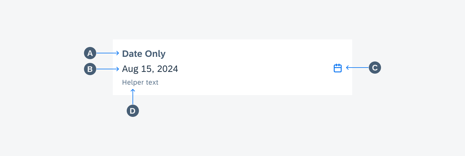
Anatomy of single value picker form cell
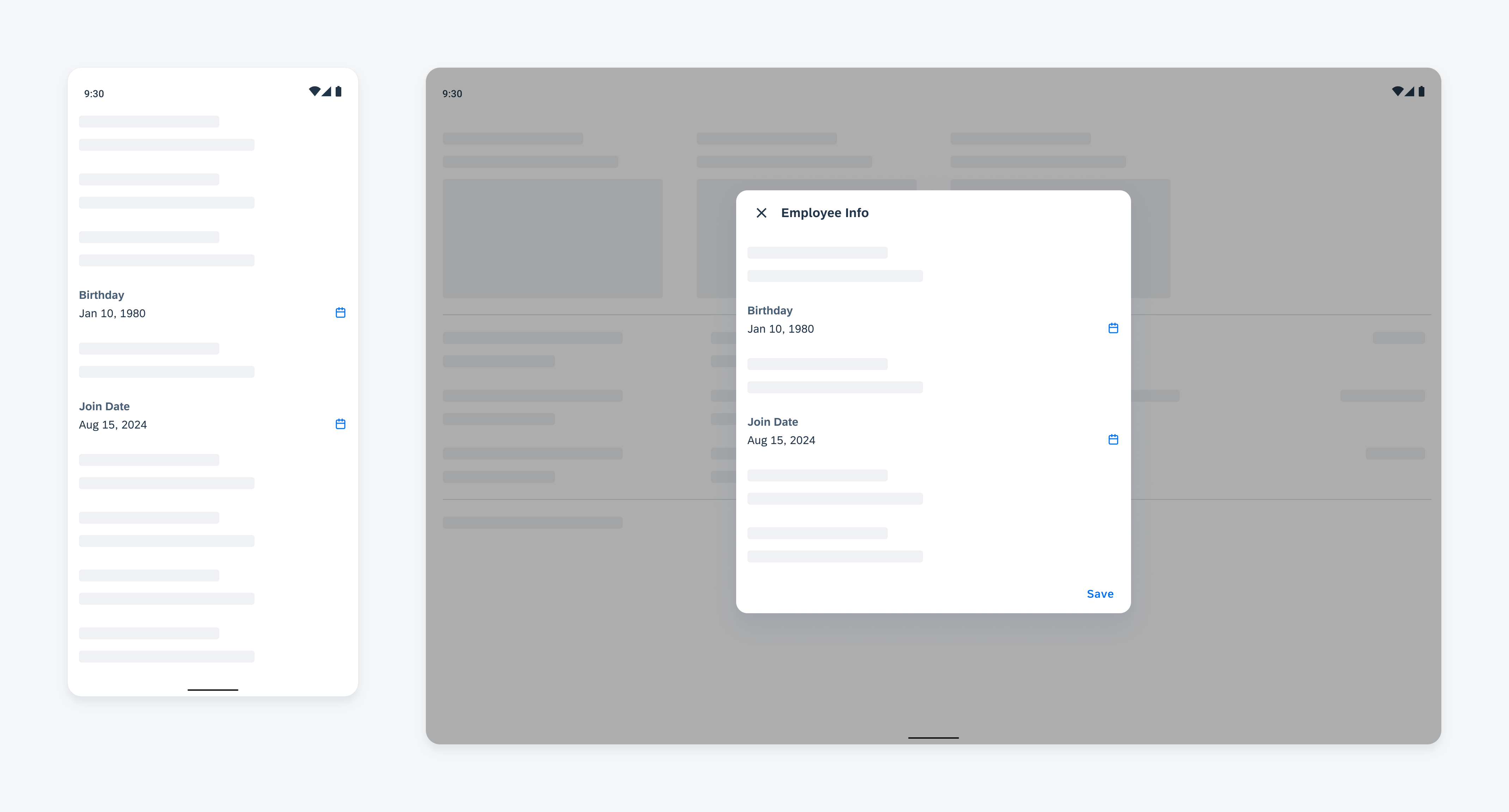
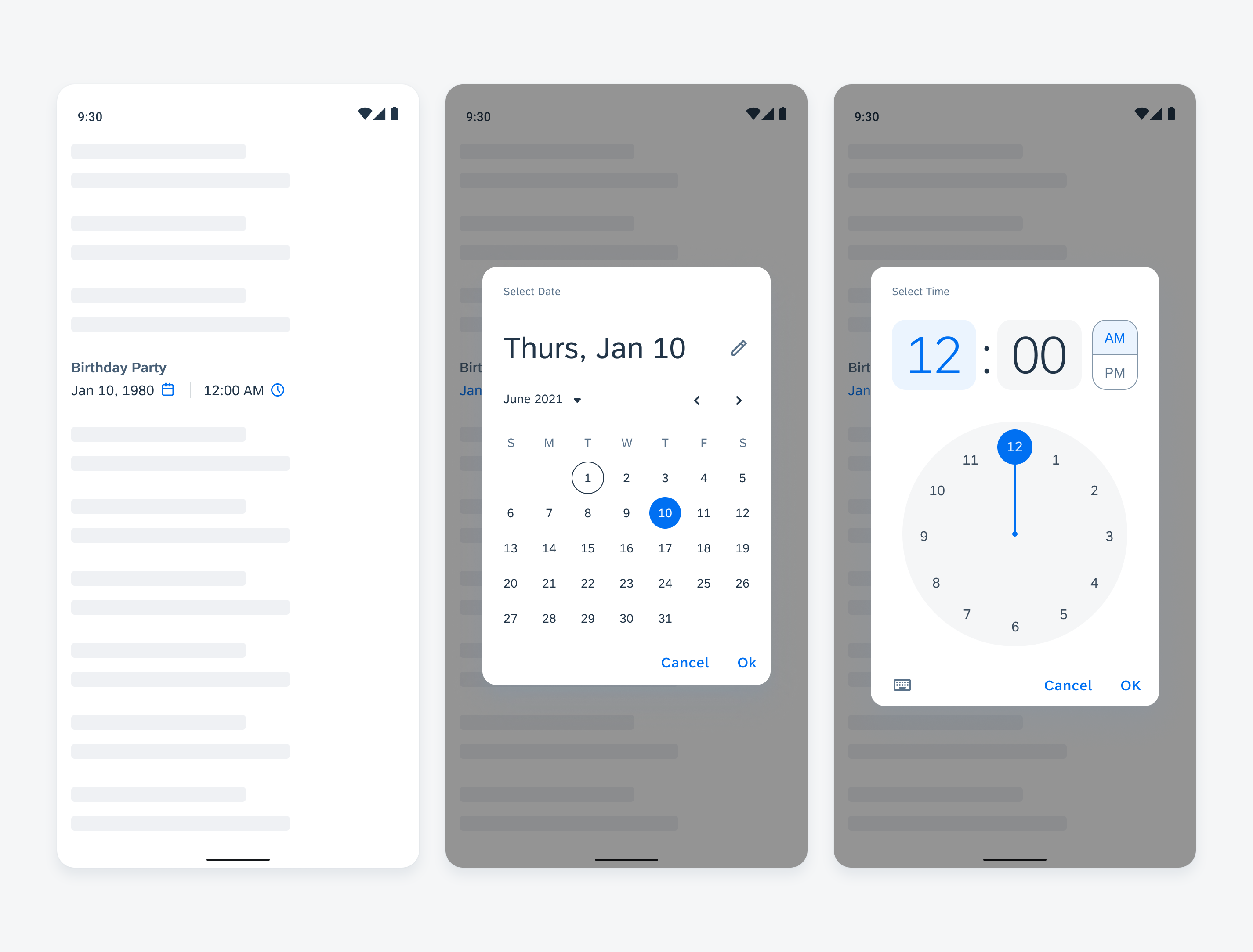
Date and Time Picker Form Cell
The date and time picker form cell allows users to open two dialogs: the date picker when the date value is selected and the time picker when the time value is selected.
A. Label
The label describes the topic or the name of the picker. It may have an asterisk next to it to indicate that users need to select a value.
B. Date Value
The date value shows the selected date. It can be tapped to open the date picker dialog.
C. Time Value
The time value shows the selected time. It can be tapped to open the time picker dialog.
D. Helper Text
The helper text provides additional information about the form cell.
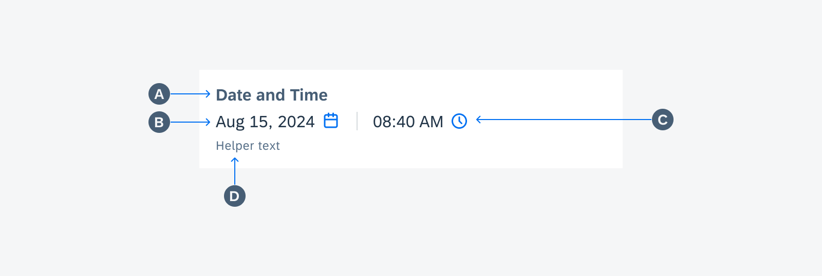
Anatomy of date & time picker form cell
Variations
Date Picker Form Cell
When this cell is used to define a specific date, users can tap on the cell to trigger the date picker dialog found in the date/time picker. Users then make their selection in the dialog. When they close the dialog, the value they selected is displayed in the form cell.

Date picker form cell
Date Range Picker Form Cell
When this cell is used to define a specific date range, users can tap on the cell to trigger the full-page range picker dialog found in the date/time picker. Users then make their selection in the dialog. When they close the dialog, the value they selected is displayed in the form cell.

Date range picker form cell
Time Picker Form Cell
When this cell is used to define a specific time, users can tap on the cell to trigger the time picker dialog found in the date/time picker. Users then make their selection in the dialog. When they close the dialog, the value they selected is displayed in the form cell.
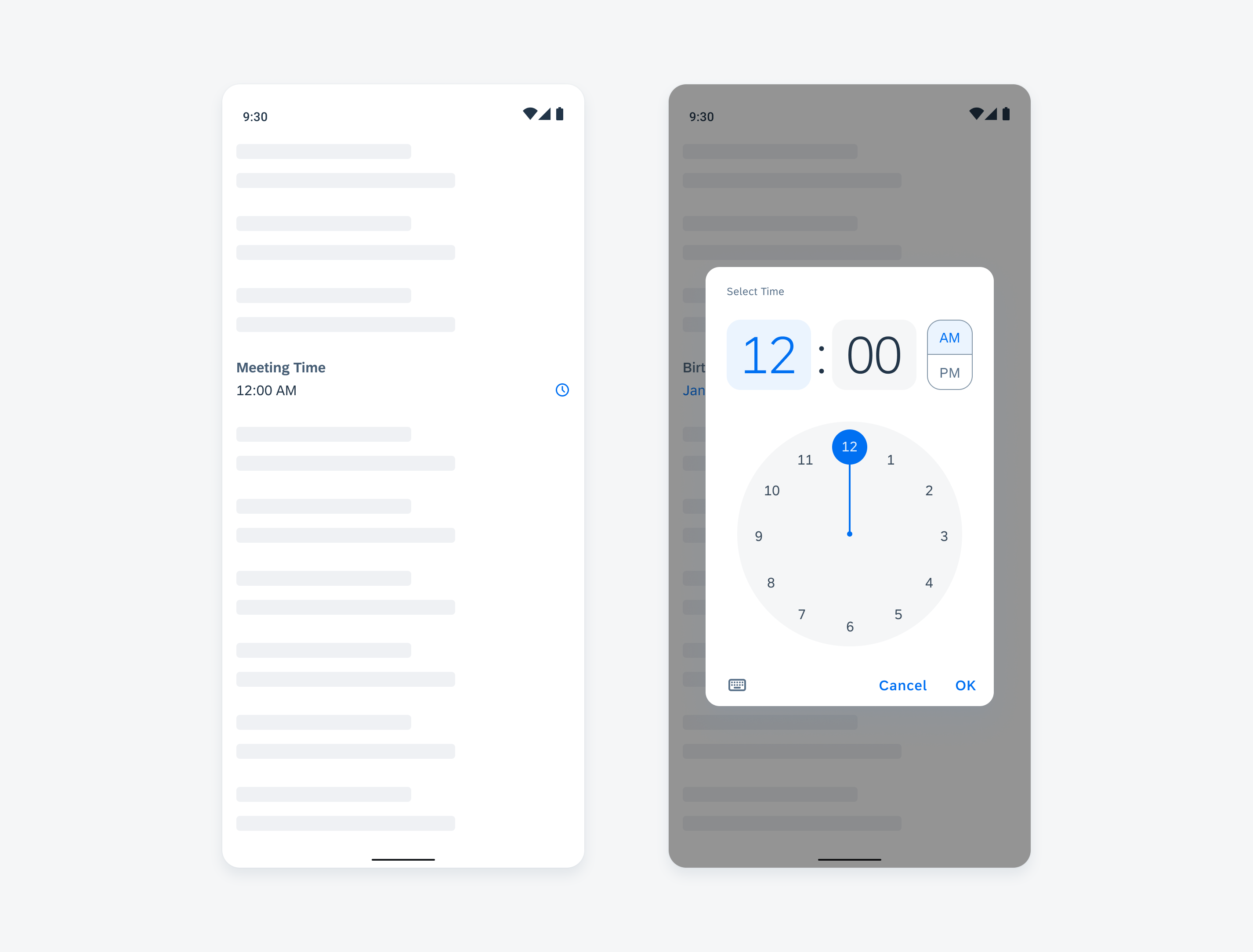
Time picker form cell
Date and Time Picker Form Cell
When this cell is used to define a specific date and time, users can tap on either the date value or the time value to open the associated dialogs found in the date/time picker. Users then make their selection in the dialog. When they close the dialog, the value they selected is displayed in the form cell.
Date and time picker form cell
Duration Picker Form Cell
When this cell is used to set a time duration, users can tap on the cell to trigger the time duration picker. Users then make their selection in the dialog. When users close the dialog, the value they selected will be shown in the cell.
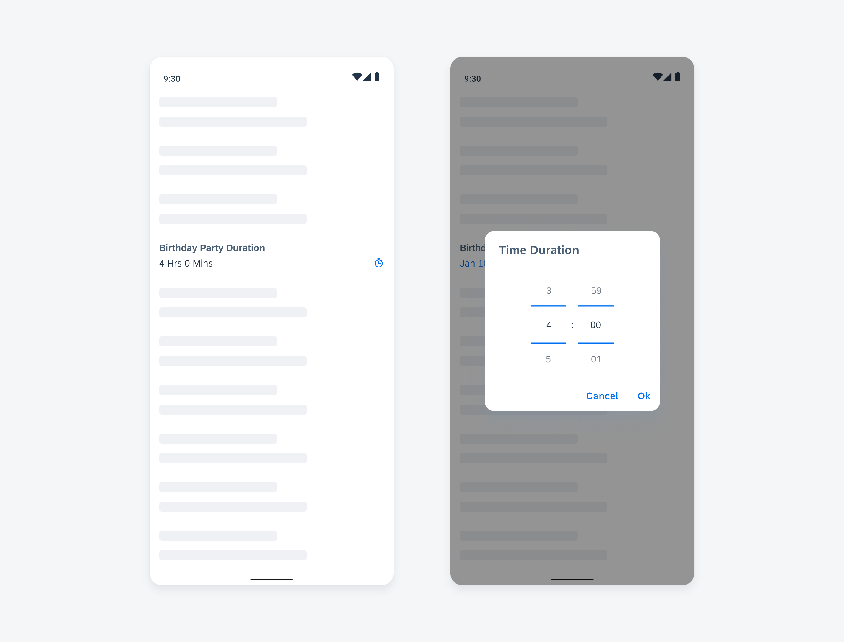
Duration picker form cell
Adaptive Design
The full width of time picker form cells adapts to different screen sizes.
Time picker form cells in compact (top) and expanded (bottom) layouts
Resources
Development: DateTimePickerFormCell, DurationPickerFormCell
SAP Fiori for iOS: Pickers
Material Design: Date Pickers
 Your feedback has been sent to the SAP Fiori design team.